Benvenuto nelle Font Più Popolari — dove popolarità e qualità si incontrano. Qui trovi i font più scaricati e usati dell'anno. Se cerchi scelte sicure per logo, web o social, inizia da qui.
Ogni font top si distingue per equilibrio, leggibilità e versatilità. Troverai sans serif moderne, script eleganti, serif vintage e display minimalisti.
-
( Fonts by AEnigma - www.aenigmafonts.com )
A bold, slanted font with a futuristic and dynamic design.
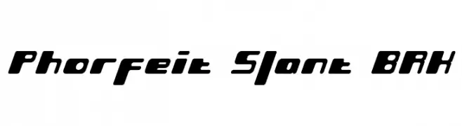 Scaricare 314 Downloads@WebFont
 -
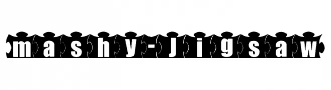
![mashy-Jigsaw font caratteri gratis]() Scaricare 314 Downloads@WebFont
Scaricare 314 Downloads@WebFont -
( Fonts by Matthew Austin Petty - www.disturbed.com )
A playful, handwritten-style font with bold, irregular characters.
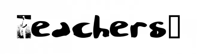
![Teachers? font caratteri gratis]() Scaricare 314 Downloads@WebFont
Scaricare 314 Downloads@WebFont -
( www.behance.net/Poemhaiku )
A playful, casual handwritten font with smooth, flowing strokes.
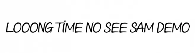
![Looong time no see Sam Demo font caratteri gratis]() Scaricare 314 Downloads@WebFont
Scaricare 314 Downloads@WebFont -
( Fonts by Kurnia Setyadi )
A playful, rounded font with consistent stroke thickness and a slightly condensed style.
![Cherry Caramel font caratteri gratis]() Scaricare 314 Downloads@WebFont
Scaricare 314 Downloads@WebFont -
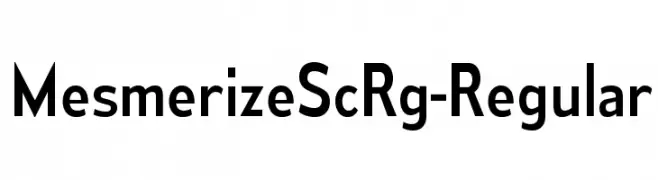
( Typodermic Fonts - Ray Larabie - www.typodermicfonts.com/ )
A modern sans-serif font with geometric shapes and uniform strokes.
![MesmerizeScRg-Regular font caratteri gratis]() Scaricare 314 Downloads@WebFont
Scaricare 314 Downloads@WebFont -
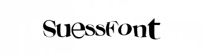
![SuessFont font caratteri gratis]() Scaricare 314 Downloads@WebFont
Scaricare 314 Downloads@WebFont -
( Fonts by junkohanhero )
A thin, hand-drawn font with a playful and informal style.
![Thin king font caratteri gratis]() Scaricare 314 Downloads@WebFont
Scaricare 314 Downloads@WebFont -
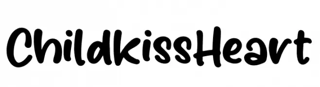
( Fonts by Perspectype Studio )
Playful handwritten font with rounded edges.
![Childkiss Heart font caratteri gratis]() Scaricare 314 Downloads@WebFont
Scaricare 314 Downloads@WebFont -
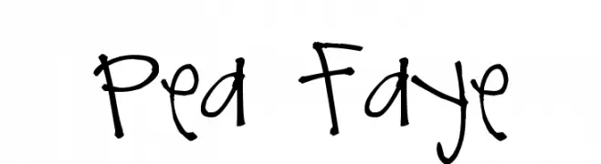
( Free for a personal use. For a commercial use please visit www.kevinandamanda.com )
A playful, handwritten font with a whimsical and informal style.
![Pea Faye font caratteri gratis]() Scaricare 314 Downloads@WebFont
Scaricare 314 Downloads@WebFont -
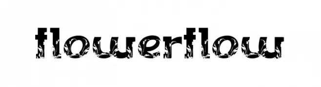
( Fonts by billyargel.blogspot.com - Billy Argel )
A playful, decorative font with floral elements and bold, artistic letterforms.
![FLOWERFLOW font caratteri gratis]() Scaricare 314 Downloads@WebFont
Scaricare 314 Downloads@WebFont -
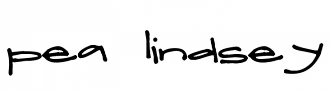
( Free for a personal use. For a commercial use please visit www.kevinandamanda.com )
A playful, handwritten font with smooth, flowing lines and a friendly appearance.
![Pea Lindsey font caratteri gratis]() Scaricare 314 Downloads@WebFont
Scaricare 314 Downloads@WebFont -
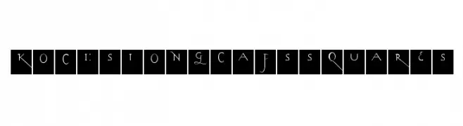
( Fonts by Manfred Klein - manfred-klein.ina-mar.com )
A decorative font with elongated, elegant letterforms enclosed in squares, featuring thin strokes and subtle curves.
![KochsLongCapsSquares font caratteri gratis]() Scaricare 314 Downloads@WebFont
Scaricare 314 Downloads@WebFont -
![KR Tulips font caratteri gratis]() Scaricare 314 Downloads@WebFont
Scaricare 314 Downloads@WebFont -
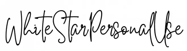
( Fonts by Din Studio - Donis Miftahudin - Personal-use only. For commercial use please contact owner. )
A dynamic and expressive handwritten font with fluid strokes.
![White Star Personal Use font caratteri gratis]() Scaricare 314 Downloads@WebFont
Scaricare 314 Downloads@WebFont -
( Fonts by Iconian Fonts )
A bold, italic, and expanded font with a playful and dynamic style.
![Shablagoo Expanded Italic font caratteri gratis]() Scaricare 314 Downloads@WebFont
Scaricare 314 Downloads@WebFont -
( l8estobsession.blogspot.com )
A playful, hand-drawn font with sketch-like, irregular characters.
![madness font caratteri gratis]() Scaricare 314 Downloads@WebFont
Scaricare 314 Downloads@WebFont -
![Sepet font caratteri gratis]() Scaricare 314 Downloads@WebFont
Scaricare 314 Downloads@WebFont -
( Fonts by Daniel Zadorozny - www.iconian.com - Free for personal use )
A futuristic, italicized font with bold, angular characters.
![Dodger Laser Italic font caratteri gratis]() Scaricare 314 Downloads@WebFont
Scaricare 314 Downloads@WebFont -
![Grixel Acme 7 Wide Bold Xtnd font caratteri gratis]() Scaricare 314 Downloads@WebFont
Scaricare 314 Downloads@WebFont -
( Free for a personal use. For a commercial use please visit www.kevinandamanda.com )
A playful, hand-drawn font with bold, uneven strokes and a casual style.
![Pea Tinapay font caratteri gratis]() Scaricare 314 Downloads@WebFont
Scaricare 314 Downloads@WebFont -
( Fonts by NendesKombet - Husain Assyahid - Personal-use only. For commercial use please contact owner. )
A bold, high-contrast serif font with a modern yet classic style.
![SealandFr font caratteri gratis]() Scaricare 314 Downloads@WebFont
Scaricare 314 Downloads@WebFont -
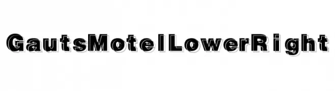
( Fonts by Daniel Gauthier )
A bold, three-dimensional font with strong shadow effects and geometric structure.
![GautsMotelLowerRight font caratteri gratis]() Scaricare 314 Downloads@WebFont
Scaricare 314 Downloads@WebFont -
![Crystalline Outline font caratteri gratis]() Scaricare 314 Downloads@WebFont
Scaricare 314 Downloads@WebFont -
( Fonts by Vladimir Nikolic - www.creativefabrica.com/designer/vladimirnikolic/ - Personal-use only. For commercial use please contact owner. )
A bold, geometric font with a three-dimensional effect and modern style.
![Eros Regular font caratteri gratis]() Scaricare 314 Downloads@WebFont
Scaricare 314 Downloads@WebFont -
( Fonts by Tokopress )
A bold, playful font with rounded strokes and a friendly appearance.
![Big Jano font caratteri gratis]() Scaricare 314 Downloads@WebFont
Scaricare 314 Downloads@WebFont -
( jaydegarrow.wix.com/jaydefonts )
A bold, textured decorative font with a vintage style.
![Print Oldyz font caratteri gratis]() Scaricare 314 Downloads@WebFont
Scaricare 314 Downloads@WebFont -
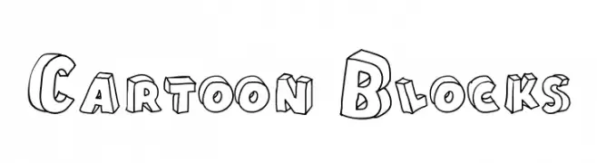
( Fonts by Galdino Otten - galdinootten.com )
A playful, 3D block-style font with bold outlines and a cartoonish flair.
![Cartoon Blocks font caratteri gratis]() Scaricare 314 Downloads@WebFont
Scaricare 314 Downloads@WebFont -
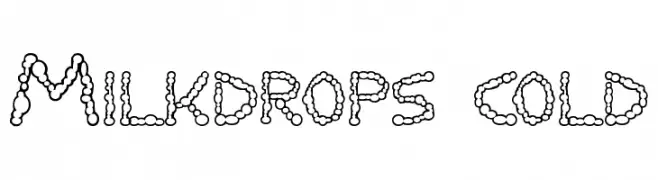
( Fonts by Dieter Schumacher )
A playful, bubble-like font with rounded, droplet-inspired characters.
![Milkdrops cold font caratteri gratis]() Scaricare 314 Downloads@WebFont
Scaricare 314 Downloads@WebFont -
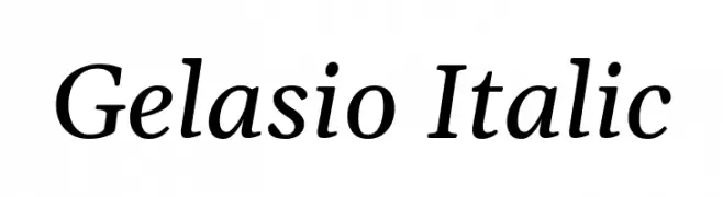
( Copyright 2019 The Gelasio Project Authors (https://github.com/sorkintype/Gelasio) )
An elegant serif font with a classic italic style and smooth, flowing characters.
![Gelasio Italic font caratteri gratis]() Scaricare 314 Downloads@WebFont
Scaricare 314 Downloads@WebFont -
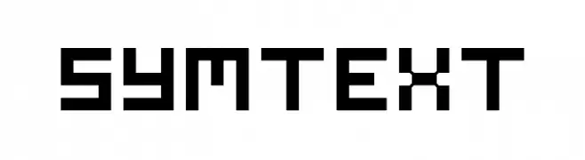
( Fonts by a Neale Davidson - www.pixelsagas.com. Personal-use only. For commercial use please contact owner. )
A pixelated, retro-style font with a uniform, blocky design.
![Symtext font caratteri gratis]() Scaricare 314 Downloads@WebFont
Scaricare 314 Downloads@WebFont -
( گالری فانت فارسی پژوهش آريانا - only compatible with Farsi and Arabic )
A cursive, handwritten-style font with flowing, artistic strokes.
![Kabul Type font caratteri gratis]() Scaricare 314 Downloads@WebFont
Scaricare 314 Downloads@WebFont -
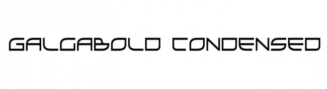
( Fonts by Daniel Zadorozny - www.iconian.com - Free for personal use )
A futuristic, geometric font with a sleek, condensed style.
![GalgaBold Condensed font caratteri gratis]() Scaricare 314 Downloads@WebFont
Scaricare 314 Downloads@WebFont -
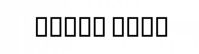
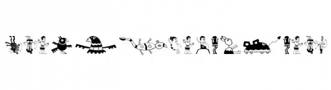
( Fonts by Manfred Klein. Free for private and charity use. Free for commercial with donation to organizations )
A collection of whimsical and abstract illustrations, not a traditional font.
![20thCenturyArt01 font caratteri gratis]() Scaricare 314 Downloads@WebFont
Scaricare 314 Downloads@WebFont -
![Janmeja2002N font caratteri gratis]() Scaricare 314 Downloads@WebFont
Scaricare 314 Downloads@WebFont


Quali sono i font più popolari adesso?
Poppins, Roboto, Montserrat, Open Sans e Lato sono molto usati per le forme pulite e l'ampia applicabilità — dall'identità di marca alle landing page e ai poster.
Quali font si usano spesso nei loghi?
Le sans serif geometriche (es. Poppins, famiglie in stile Gotham) sono scelte comuni per un branding pulito e scalabile. Per un tocco personale restano valide script e stili manoscritti. Abbina un display deciso per i titoli a un corpo testo neutro per riconoscibilità ed equilibrio.
Ogni quanto si aggiorna la lista?
Con regolarità, in base ai download e all'attività reale. Torna spesso per scoprire in anticipo le nuove preferite.
💡 Consiglio: aggiungi ai preferiti — le tendenze cambiano in fretta e i font top di oggi possono ispirare il rebranding di domani.