Benvenuto nelle Font Più Popolari — dove popolarità e qualità si incontrano. Qui trovi i font più scaricati e usati dell'anno. Se cerchi scelte sicure per logo, web o social, inizia da qui.
Ogni font top si distingue per equilibrio, leggibilità e versatilità. Troverai sans serif moderne, script eleganti, serif vintage e display minimalisti.
-
 Scaricare 3928 Downloads@WebFont
 -
( Fonts by gluk )
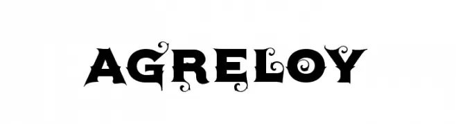
A bold, decorative font with intricate swirls and flourishes.
![Agreloy font caratteri gratis]() Scaricare 3927 Downloads@WebFont
Scaricare 3927 Downloads@WebFont -
( Fonts by a Youssef Habchi - youssef-habchi.com. Personal-use only. For commercial use please contact owner. )
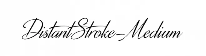
An elegant, high-contrast script font with a flowing, cursive style.
![DistantStroke-Medium font caratteri gratis]() Scaricare 3927 Downloads@WebFont
Scaricare 3927 Downloads@WebFont -
![IwonaMedium-Regular font caratteri gratis]() Scaricare 3927 Downloads@WebFont
Scaricare 3927 Downloads@WebFont -
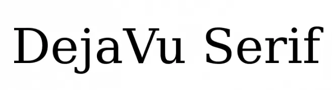
![DejaVu Serif font caratteri gratis]() Scaricare 3925 Downloads@WebFont
Scaricare 3925 Downloads@WebFont -
![VietVu font caratteri gratis]() Scaricare 3925 Downloads
Scaricare 3925 Downloads -
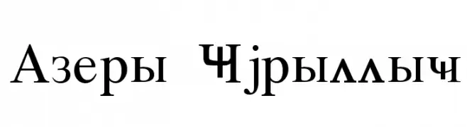
![Azeri Cyrillic font caratteri gratis]() Scaricare 3925 Downloads@WebFont
Scaricare 3925 Downloads@WebFont -
![ElFont font caratteri gratis]() Scaricare 3925 Downloads@WebFont
Scaricare 3925 Downloads@WebFont -
( Fonts by Guaraldo Fonts - Personal-use only. For commercial use please contact owner. )
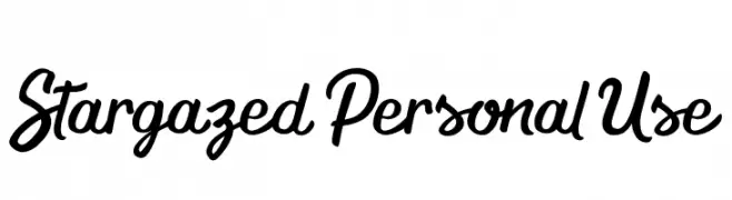
A bold and expressive script font with dynamic, flowing strokes.
![Stargazed Personal Use font caratteri gratis]() Scaricare 3924 Downloads@WebFont
Scaricare 3924 Downloads@WebFont -
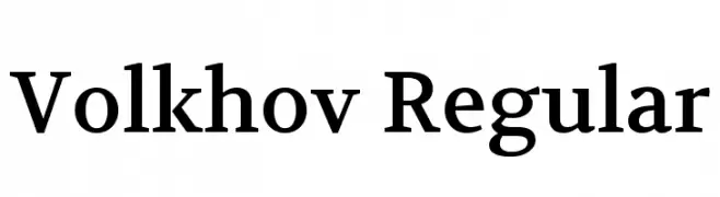
( Copyright (c) 2011, Cyreal (www.cyreal.org) )
A classic serif font with moderate contrast and elegant readability.
![Volkhov Regular font caratteri gratis]() Scaricare 3924 Downloads@WebFont
Scaricare 3924 Downloads@WebFont -
( Copyright (c) 2010, Santiago Orozco (hi@typemade.mx) )
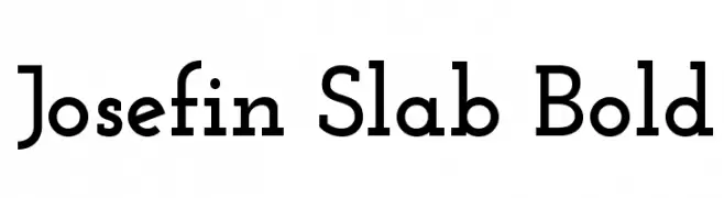
A geometric slab serif font with a modern and elegant design.
![Josefin Slab Bold font caratteri gratis]() Scaricare 3924 Downloads@WebFont
Scaricare 3924 Downloads@WebFont -
![EucrosiaUPC font caratteri gratis]() Scaricare 3923 Downloads@WebFont
Scaricare 3923 Downloads@WebFont -
![TeXGyrePagella-Bold font caratteri gratis]() Scaricare 3923 Downloads@WebFont
Scaricare 3923 Downloads@WebFont -
( Fonts by Octotype - www.foundmyfont.com - Personal-use only. For commercial use please contact owner. )
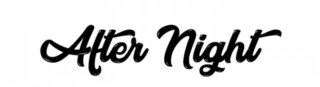
A bold, flowing script font with elegant curves and medium contrast.
![After Night font caratteri gratis]() Scaricare 3922 Downloads@WebFont
Scaricare 3922 Downloads@WebFont -
![Dsignes Bold font caratteri gratis]() Scaricare 3922 Downloads@WebFont
Scaricare 3922 Downloads@WebFont -
( Fonts by Tup Wanders - Personal-use only. For commercial use please contact owner. )
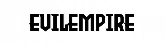
A bold, geometric font with a strong, industrial aesthetic.
![Evil Empire font caratteri gratis]() Scaricare 3921 Downloads@WebFont
Scaricare 3921 Downloads@WebFont -
( Fonts by Peter Wiegel - www.peter-wiegel.de )
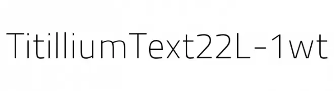
A modern, geometric sans-serif font with a clean and balanced design.
![TitilliumText22L-1wt font caratteri gratis]() Scaricare 3920 Downloads@WebFont
Scaricare 3920 Downloads@WebFont -
![Amar Ujala font caratteri gratis]() Scaricare 3920 Downloads@WebFont
Scaricare 3920 Downloads@WebFont -
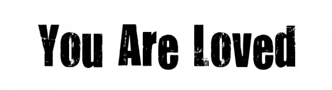
( Fonts by Kimberly Geswein - kimberlygeswein.com )
A bold, distressed font with a vintage, grunge texture.
![You Are Loved font caratteri gratis]() Scaricare 3920 Downloads@WebFont
Scaricare 3920 Downloads@WebFont -
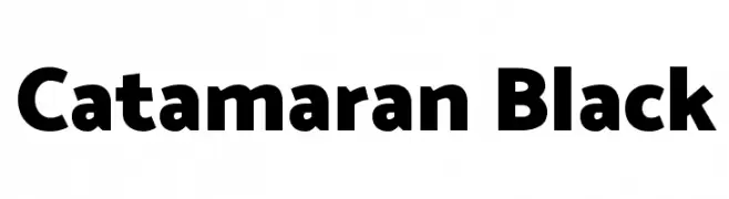
( Copyright 2014 The Catamaran Authors (pria.ravichandran@gmail.com) )
A bold, modern sans-serif typeface with a strong and confident appearance.
![Catamaran Black font caratteri gratis]() Scaricare 3919 Downloads@WebFont
Scaricare 3919 Downloads@WebFont -
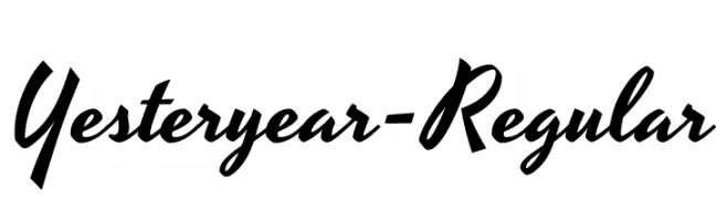
( Copyright (c) 2011 by Brian J. Bonislawsky DBA Astigmatic (AOETI) )
A vintage, cursive script font with a bold, flowing style.
![Yesteryear-Regular font caratteri gratis]() Scaricare 3919 Downloads@WebFont
Scaricare 3919 Downloads@WebFont -
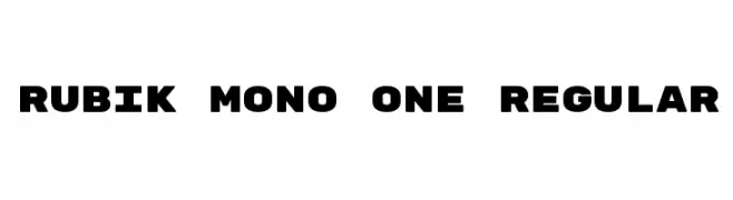
( Copyright 2015 The Rubik Project Authors (mail@hubertfischer.com) )
A bold, monospaced typeface with a modern, geometric design.
![Rubik Mono One Regular font caratteri gratis]() Scaricare 3918 Downloads@WebFont
Scaricare 3918 Downloads@WebFont -
( Fonts by www.pia-frauss.de )
A classic calligraphic font with elegant, flowing lines and historical sophistication.
![FranciscoLucas Llana font caratteri gratis]() Scaricare 3918 Downloads@WebFont
Scaricare 3918 Downloads@WebFont -
![Bison font caratteri gratis]() Scaricare 3918 Downloads@WebFont
Scaricare 3918 Downloads@WebFont -
![Aguizard Tryout font caratteri gratis]() Scaricare 3917 Downloads@WebFont
Scaricare 3917 Downloads@WebFont -
( Fonts by BLKBK Fonts - www.blkbk.shop - Personal-use only. For commercial use please contact owner. Commerciali Caratteri )
A bold, energetic script font with a handwritten feel.
![Anything Goes font caratteri gratis]() Scaricare 3916 Downloads
Scaricare 3916 Downloads -
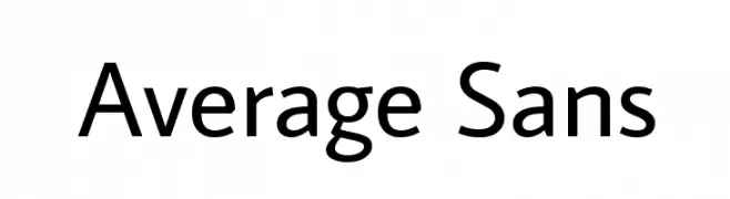
( Copyright (c) 2012, Eduardo Tunni (http://www.tipo.net.ar), with Reserved Font Name 'Average' )
A clean and modern sans-serif font with consistent stroke width and balanced spacing.
![Average Sans font caratteri gratis]() Scaricare 3916 Downloads@WebFont
Scaricare 3916 Downloads@WebFont -
( Fonts by Edumorcel Smash )
A bold, dynamic font with a strong, modern presence.
![Intensa Fuente font caratteri gratis]() Scaricare 3915 Downloads@WebFont
Scaricare 3915 Downloads@WebFont -
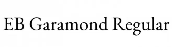
( Copyright 2017 The EB Garamond Project Authors (https://github.com/octaviopardo/EBGaramond12) )
A classic serif typeface with elegant proportions and refined serifs.
![EB Garamond Regular font caratteri gratis]() Scaricare 3914 Downloads@WebFont
Scaricare 3914 Downloads@WebFont -
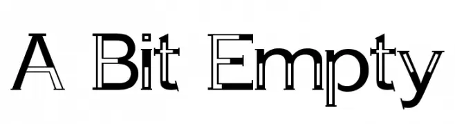
( Fonts by Marcin Leskow - www.martinleskow.pl )
A modern, decorative font with hollow, outlined characters.
![A Bit Empty font caratteri gratis]() Scaricare 3914 Downloads@WebFont
Scaricare 3914 Downloads@WebFont -
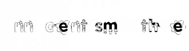
Caratteri di KiddieFonts. For commercial use please contact the owner.
![Innocent Smoothie font caratteri gratis]() Scaricare 3913 Downloads@WebFont
Scaricare 3913 Downloads@WebFont -
( Fonts by CannotIntoSpaceFonts - KineticPlasma Fonts - Personal-use only. For commercial use please contact owner. )
A bold, modern font with tall, narrow letterforms and high contrast.
![Warsaw Gothic font caratteri gratis]() Scaricare 3912 Downloads@WebFont
Scaricare 3912 Downloads@WebFont -
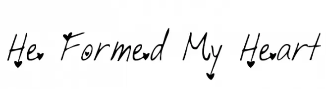
![He Formed My Heart font caratteri gratis]() Scaricare 3912 Downloads@WebFont
Scaricare 3912 Downloads@WebFont -
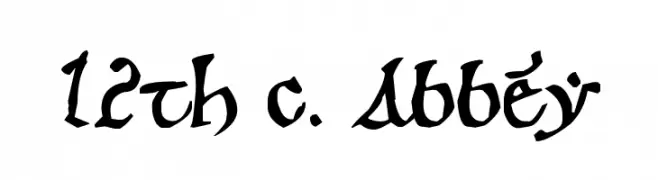
![12th c. Abbey font caratteri gratis]() Scaricare 3912 Downloads@WebFont
Scaricare 3912 Downloads@WebFont -
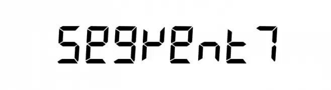
![Segment7 font caratteri gratis]() Scaricare 3911 Downloads@WebFont
Scaricare 3911 Downloads@WebFont


Quali sono i font più popolari adesso?
Poppins, Roboto, Montserrat, Open Sans e Lato sono molto usati per le forme pulite e l'ampia applicabilità — dall'identità di marca alle landing page e ai poster.
Quali font si usano spesso nei loghi?
Le sans serif geometriche (es. Poppins, famiglie in stile Gotham) sono scelte comuni per un branding pulito e scalabile. Per un tocco personale restano valide script e stili manoscritti. Abbina un display deciso per i titoli a un corpo testo neutro per riconoscibilità ed equilibrio.
Ogni quanto si aggiorna la lista?
Con regolarità, in base ai download e all'attività reale. Torna spesso per scoprire in anticipo le nuove preferite.
💡 Consiglio: aggiungi ai preferiti — le tendenze cambiano in fretta e i font top di oggi possono ispirare il rebranding di domani.