Benvenuto nelle Font Più Popolari — dove popolarità e qualità si incontrano. Qui trovi i font più scaricati e usati dell'anno. Se cerchi scelte sicure per logo, web o social, inizia da qui.
Ogni font top si distingue per equilibrio, leggibilità e versatilità. Troverai sans serif moderne, script eleganti, serif vintage e display minimalisti.
-
 Scaricare 309 Downloads@WebFont
 -
![DTPDingbats font caratteri gratis]() Scaricare 309 Downloads@WebFont
Scaricare 309 Downloads@WebFont -
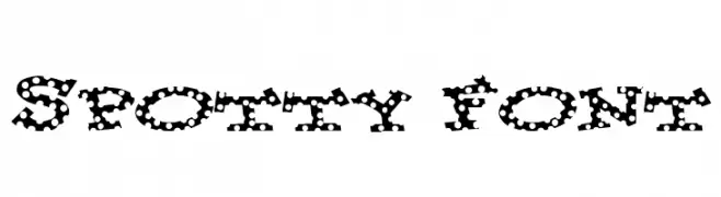
![Spotty Font font caratteri gratis]() Scaricare 309 Downloads@WebFont
Scaricare 309 Downloads@WebFont -
( Fonts by tentenprojects - Personal-use only. For commercial use please contact owner. )
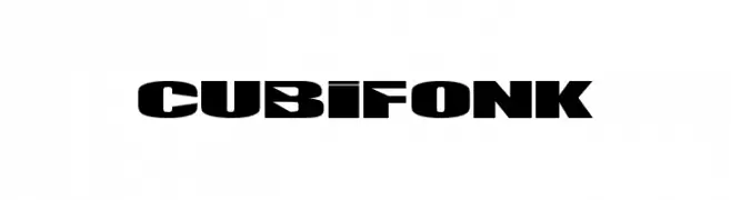
A bold, geometric font with a strong, modern aesthetic.
![CUBIFONK font caratteri gratis]() Scaricare 309 Downloads@WebFont
Scaricare 309 Downloads@WebFont -
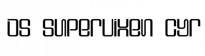
![DS Supervixen Cyr font caratteri gratis]() Scaricare 309 Downloads@WebFont
Scaricare 309 Downloads@WebFont -
( Fonts by Rokas Cicenas - www.roci.lt )
A bold, distressed font with a grunge aesthetic and irregular, dripping edges.
![Map font caratteri gratis]() Scaricare 309 Downloads@WebFont
Scaricare 309 Downloads@WebFont -
( Fonts by backpacker.gr )
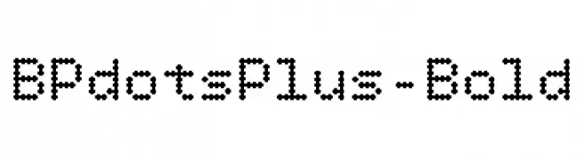
A dot-based, pixelated font with a retro digital style.
![BPdotsPlus-Bold font caratteri gratis]() Scaricare 309 Downloads@WebFont
Scaricare 309 Downloads@WebFont -
( Fonts by Abo Daniel Studio )
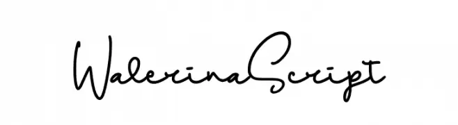
A flowing, cursive script font with elegant, interconnected strokes.
![Walerina Script font caratteri gratis]() Scaricare 309 Downloads@WebFont
Scaricare 309 Downloads@WebFont -
( Fonts by Jecko Development - www.jeckodevelopment.com )
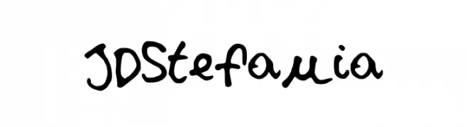
A playful, casual handwritten font with irregular strokes and a lively feel.
![JDStefania font caratteri gratis]() Scaricare 309 Downloads@WebFont
Scaricare 309 Downloads@WebFont -
( Fonts by Yadhie Setiawan - typelinestudio.com - Personal-use only. For commercial use please contact owner. )
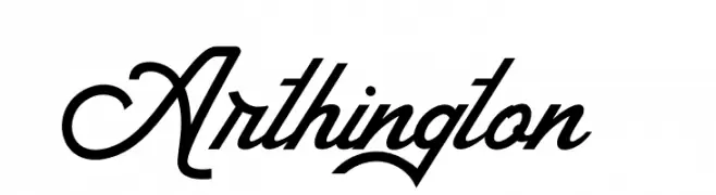
A dynamic and elegant script font with flowing cursive design.
![Arthington font caratteri gratis]() Scaricare 309 Downloads@WebFont
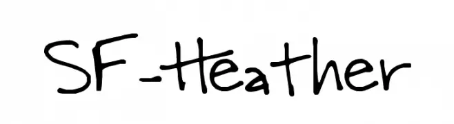
Scaricare 309 Downloads@WebFont -
![SF-Heather font caratteri gratis]() Scaricare 309 Downloads@WebFont
Scaricare 309 Downloads@WebFont -
( Fonts by Youssef Habchi - youssef-habchi.com - Personal-use only. For commercial use please contact owner. )
A bold, playful font with a three-dimensional, bubble-like design.
![Reglisse font caratteri gratis]() Scaricare 309 Downloads@WebFont
Scaricare 309 Downloads@WebFont -
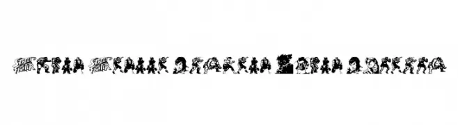
( www.davidpustansky.com/fonts )
Highly stylized, illustrative display font using video game character art.
![Super Street Fighter Hyper Fonting font caratteri gratis]() Scaricare 309 Downloads@WebFont
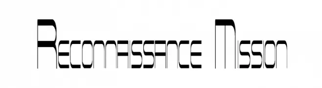
Scaricare 309 Downloads@WebFont -
![Reconnaissance Mission font caratteri gratis]() Scaricare 309 Downloads@WebFont
Scaricare 309 Downloads@WebFont -
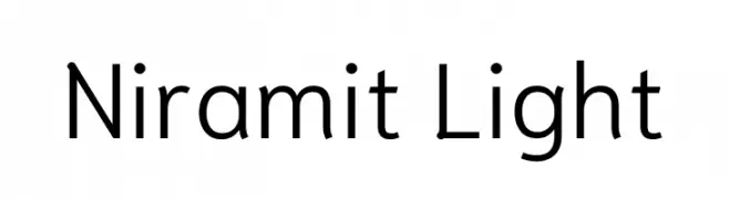
( Copyright 2018 the Niramit Project Authors (https://github.com/cadsondemak/Niramit) )
A modern, light sans-serif font with clean lines and balanced proportions.
![Niramit Light font caratteri gratis]() Scaricare 309 Downloads@WebFont
Scaricare 309 Downloads@WebFont -
![Serifadow font caratteri gratis]() Scaricare 309 Downloads@WebFont
Scaricare 309 Downloads@WebFont -
( Fonts by Wahyu Studio )
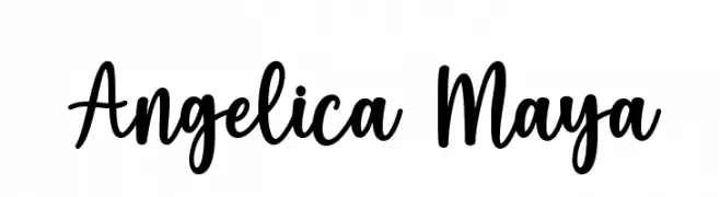
A playful, handwritten script font with dynamic, flowing characters.
![Angelica Maya font caratteri gratis]() Scaricare 309 Downloads@WebFont
Scaricare 309 Downloads@WebFont -
( Fonts by Faraz Ahmad )
A tall, slender, and elegant font with elongated characters.
![Adouliss font caratteri gratis]() Scaricare 309 Downloads@WebFont
Scaricare 309 Downloads@WebFont -
( Fonts by wep )
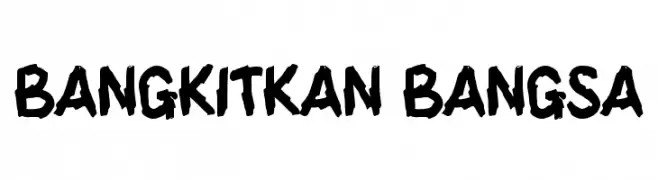
A bold, hand-drawn font with a rough, expressive style.
![BANGKITKAN BANGSA font caratteri gratis]() Scaricare 309 Downloads@WebFont
Scaricare 309 Downloads@WebFont -
( Fonts by Daniel Zadorozny - www.iconian.com - Free for personal use )
A bold, italicized font with a sporty, three-dimensional look.
![Tigershark Pro Italic font caratteri gratis]() Scaricare 309 Downloads@WebFont
Scaricare 309 Downloads@WebFont -
![Tombouctou DEMO Regular font caratteri gratis]() Scaricare 309 Downloads@WebFont
Scaricare 309 Downloads@WebFont -
![Sonic Superpowers font caratteri gratis]() Scaricare 309 Downloads@WebFont
Scaricare 309 Downloads@WebFont -
( Fonts by Heinrich Lischka www.fontboutique.de - Personal-use only. For commercial use please contact owner. )
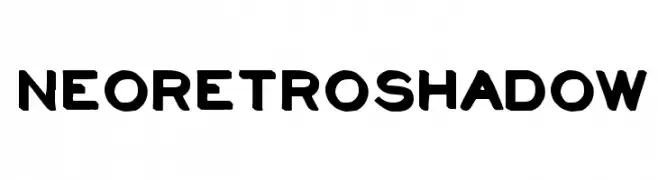
A bold, playful font with a retro shadow effect.
![NeoRetroShadow font caratteri gratis]() Scaricare 309 Downloads@WebFont
Scaricare 309 Downloads@WebFont -
( Fonts by Apostrophic Lab )
A modern Art Deco-inspired font with geometric and elegant elements.
![Diehl Deco - Alts font caratteri gratis]() Scaricare 309 Downloads@WebFont
Scaricare 309 Downloads@WebFont -
( Vladimir Nikolic - www.coroflot.com/vladimirnikolic )
Bold, italicized font with a flat shadow effect for dynamic designs.
![Casino Flat Shadow Italic font caratteri gratis]() Scaricare 309 Downloads@WebFont
Scaricare 309 Downloads@WebFont -
( Fonts by Nick Curtis - Personal-use only. For commercial use please contact owner. )
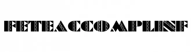
A bold, decorative font with intricate patterns and high contrast.
![FeteAccompliNF font caratteri gratis]() Scaricare 309 Downloads@WebFont
Scaricare 309 Downloads@WebFont -
( Fonts by Nafis Maulidul )
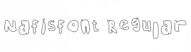
A playful, hand-drawn font with bold, rounded characters and a whimsical style.
![Nafisfont Regular font caratteri gratis]() Scaricare 309 Downloads@WebFont
Scaricare 309 Downloads@WebFont -
( Fonts by Castcraft Software - opti.netii.net - check the website before use )
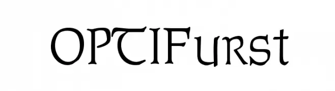
A medieval-inspired font with sharp serifs and a modern touch.
![OPTIFurst font caratteri gratis]() Scaricare 309 Downloads@WebFont
Scaricare 309 Downloads@WebFont -
( Fonts by Adien Gunarta - fontasticindonesia.blogspot.com )
A bold, italicized font with a dynamic, comic-inspired style.
![Manga speak 2 stocky Bold Italic font caratteri gratis]() Scaricare 309 Downloads@WebFont
Scaricare 309 Downloads@WebFont -
( A Spoonful of Sugar - www.asos.jp.org/ )
A bold, geometric font with a modern, industrial feel.
![HDF font caratteri gratis]() Scaricare 309 Downloads@WebFont
Scaricare 309 Downloads@WebFont -
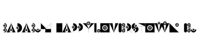
![badabum-happyloverstown.eu font caratteri gratis]() Scaricare 309 Downloads@WebFont
Scaricare 309 Downloads@WebFont -
( Fonts by Knackpack Studio - www.knackpack.studio - Personal-use only. For commercial use please contact owner. )
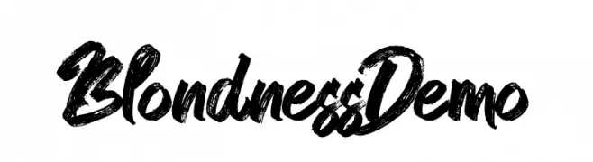
A bold, brush-style font with dynamic, hand-painted strokes.
![Blondness Demo font caratteri gratis]() Scaricare 309 Downloads@WebFont
Scaricare 309 Downloads@WebFont -
( Fonts by Daniel Zadorozny - www.iconian.com )
A bold, playful font with rounded, hand-drawn characters.
![Whatafont Expanded font caratteri gratis]() Scaricare 309 Downloads@WebFont
Scaricare 309 Downloads@WebFont -
![Bardeng font caratteri gratis]() Scaricare 309 Downloads@WebFont
Scaricare 309 Downloads@WebFont -
( 7NTypes - Situjuh Nazara - 7ntypes.com )
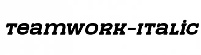
A bold, italic font with strong, dynamic strokes and a modern style.
![TeamWork-Italic font caratteri gratis]() Scaricare 309 Downloads@WebFont
Scaricare 309 Downloads@WebFont


Quali sono i font più popolari adesso?
Poppins, Roboto, Montserrat, Open Sans e Lato sono molto usati per le forme pulite e l'ampia applicabilità — dall'identità di marca alle landing page e ai poster.
Quali font si usano spesso nei loghi?
Le sans serif geometriche (es. Poppins, famiglie in stile Gotham) sono scelte comuni per un branding pulito e scalabile. Per un tocco personale restano valide script e stili manoscritti. Abbina un display deciso per i titoli a un corpo testo neutro per riconoscibilità ed equilibrio.
Ogni quanto si aggiorna la lista?
Con regolarità, in base ai download e all'attività reale. Torna spesso per scoprire in anticipo le nuove preferite.
💡 Consiglio: aggiungi ai preferiti — le tendenze cambiano in fretta e i font top di oggi possono ispirare il rebranding di domani.