Benvenuto nelle Font Più Popolari — dove popolarità e qualità si incontrano. Qui trovi i font più scaricati e usati dell'anno. Se cerchi scelte sicure per logo, web o social, inizia da qui.
Ogni font top si distingue per equilibrio, leggibilità e versatilità. Troverai sans serif moderne, script eleganti, serif vintage e display minimalisti.
-
 Scaricare 311 Downloads@WebFont
 -
( Fonts by Youssef Habchi - youssef-habchi.com - Personal-use only. For commercial use please contact owner. )
A bold, playful font with a three-dimensional, bubble-like design.
![Reglisse font caratteri gratis]() Scaricare 311 Downloads@WebFont
Scaricare 311 Downloads@WebFont -
( www.davidpustansky.com/fonts )
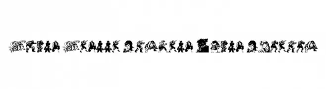
Highly stylized, illustrative display font using video game character art.
![Super Street Fighter Hyper Fonting font caratteri gratis]() Scaricare 311 Downloads@WebFont
Scaricare 311 Downloads@WebFont -
( Noto is a trademark of Google Inc. Noto fonts are open source. All Noto fonts are published under the SIL Open Font License, Version 1.1 )
A bold, robust font with thick strokes and strong presence.
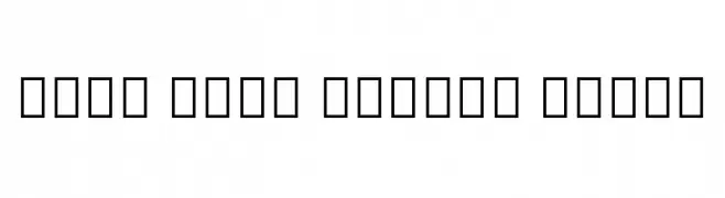
![Noto Sans Arabic Black font caratteri gratis]() Scaricare 311 Downloads@WebFont
Scaricare 311 Downloads@WebFont -
( Fonts by Google )
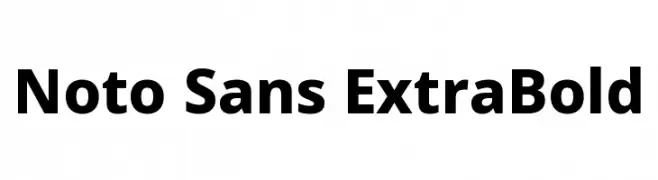
A bold, modern sans-serif font with a clean and strong appearance.
![Noto Sans ExtraBold font caratteri gratis]() Scaricare 311 Downloads@WebFont
Scaricare 311 Downloads@WebFont -
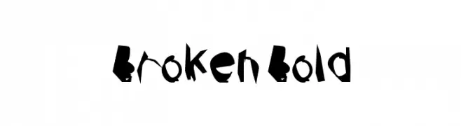
![Broken Bold font caratteri gratis]() Scaricare 311 Downloads@WebFont
Scaricare 311 Downloads@WebFont -
( Fonts by tragedienne - Personal-use only. For commercial use please contact owner. )
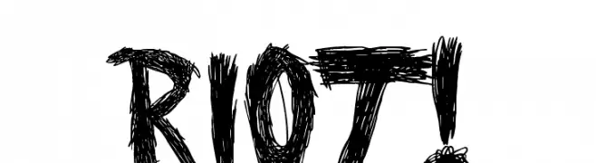
A bold, hand-drawn font with a rough, textured appearance.
![RIOT! R font caratteri gratis]() Scaricare 311 Downloads@WebFont
Scaricare 311 Downloads@WebFont -
( Fonts by www.houseoflime.com )
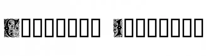
An ornate and decorative font with intricate patterns and swirls.
![Cheshire Initials font caratteri gratis]() Scaricare 311 Downloads@WebFont
Scaricare 311 Downloads@WebFont -
( Fonts by Wahyu Studio )
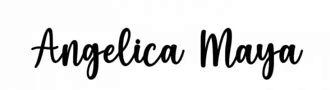
A playful, handwritten script font with dynamic, flowing characters.
![Angelica Maya font caratteri gratis]() Scaricare 311 Downloads@WebFont
Scaricare 311 Downloads@WebFont -
( Rajendra Bitling - www.rbitling.com )
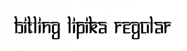
A modern, angular font with a futuristic and bold design.
![Bitling lipika Regular font caratteri gratis]() Scaricare 311 Downloads@WebFont
Scaricare 311 Downloads@WebFont -
( Fonts by Kreative Korporation - www.kreativekorp.com )
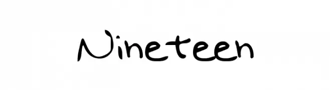
A playful, handwritten font with a casual and informal style.
![Nineteen font caratteri gratis]() Scaricare 311 Downloads@WebFont
Scaricare 311 Downloads@WebFont -
( Fonts by Faraz Ahmad )
A tall, slender, and elegant font with elongated characters.
![Adouliss font caratteri gratis]() Scaricare 311 Downloads@WebFont
Scaricare 311 Downloads@WebFont -
( Fonts by Daniel Zadorozny - www.iconian.com - Free for personal use )
A bold, italicized font with a sporty, three-dimensional look.
![Tigershark Pro Italic font caratteri gratis]() Scaricare 311 Downloads@WebFont
Scaricare 311 Downloads@WebFont -
( Fonts by Woodcutter Manero - http://www.woodcutter.es - Personal-use only. For commercial use please contact owner. )
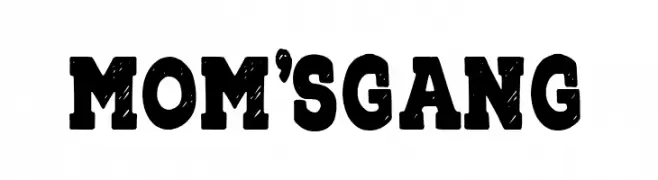
A bold, distressed font with a vintage, handcrafted appearance.
![Mom's Gang font caratteri gratis]() Scaricare 311 Downloads@WebFont
Scaricare 311 Downloads@WebFont -
( Fonts by Billy Argel Fonts - www.billyargel.com - Personal-use only. For commercial use please contact owner. )
A bold, geometric font with a halftone texture for striking visual impact.
![SNORTER PERSONAL USE Regular font caratteri gratis]() Scaricare 311 Downloads@WebFont
Scaricare 311 Downloads@WebFont -
( Fonts by Typefar )
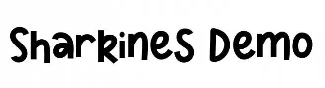
A bold, playful font with rounded edges and a whimsical style.
![Sharkines Demo font caratteri gratis]() Scaricare 311 Downloads@WebFont
Scaricare 311 Downloads@WebFont -
( Ana - www.anasfonts.com/ )
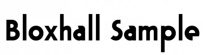
A bold, geometric font with a modern and assertive style.
![Bloxhall Sample font caratteri gratis]() Scaricare 311 Downloads@WebFont
Scaricare 311 Downloads@WebFont -
( Vladimir Nikolic - www.coroflot.com/vladimirnikolic )
Bold, italicized font with a flat shadow effect for dynamic designs.
![Casino Flat Shadow Italic font caratteri gratis]() Scaricare 311 Downloads@WebFont
Scaricare 311 Downloads@WebFont -
( laritelanjang.net/category/font-2/ )
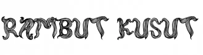
A decorative font with intricate, swirling lines and a bold, organic style.
![rambut kusut font caratteri gratis]() Scaricare 311 Downloads@WebFont
Scaricare 311 Downloads@WebFont -
( Fonts by Nick Curtis - Personal-use only. For commercial use please contact owner. )
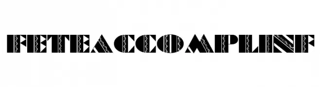
A bold, decorative font with intricate patterns and high contrast.
![FeteAccompliNF font caratteri gratis]() Scaricare 311 Downloads@WebFont
Scaricare 311 Downloads@WebFont -
( Fonts by Andrew McCluskey - nalgames.com )
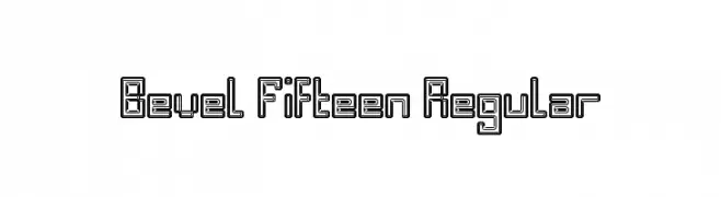
A geometric, beveled font with a three-dimensional, outlined design.
![Bevel Fifteen Regular font caratteri gratis]() Scaricare 311 Downloads@WebFont
Scaricare 311 Downloads@WebFont -
( www.davidpustansky.com/fonts )
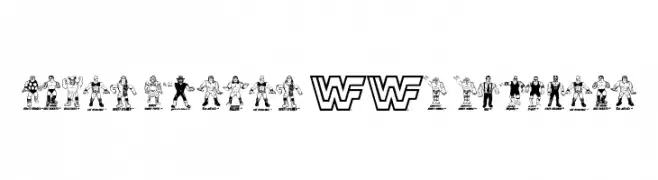
A bold, hand-drawn decorative font with a retro, comic-inspired look.
![Retro Hasbro WWF Figures font caratteri gratis]() Scaricare 311 Downloads@WebFont
Scaricare 311 Downloads@WebFont -
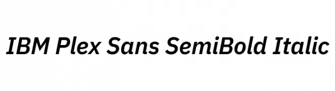
( Copyright © 2017 IBM Corp. with Reserved Font Name "Plex" )
A modern, semi-bold, italic sans-serif font with a clean and dynamic style.
![IBM Plex Sans SemiBold Italic font caratteri gratis]() Scaricare 311 Downloads@WebFont
Scaricare 311 Downloads@WebFont -
( Fonts by a Max Infeld - XEROGRAPHER FONTS - xerographer.blogspot.com . Personal-use only. For commercial use please contact owner. )
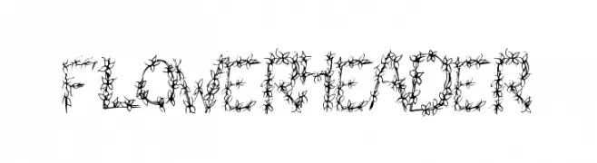
A decorative font with intricate floral designs forming each character.
![FlowerHeader font caratteri gratis]() Scaricare 311 Downloads@WebFont
Scaricare 311 Downloads@WebFont -
( Fonts by Mickey Rossi - www.subflux.com )
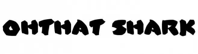
A bold, jagged font with a playful, shark-like appearance.
![OhThat Shark font caratteri gratis]() Scaricare 311 Downloads@WebFont
Scaricare 311 Downloads@WebFont -
( Fonts by www.seansart.net )
An ornate, decorative font with intricate flourishes and a vintage gothic style.
![The Tomb [winter and spring] 1 font caratteri gratis]() Scaricare 311 Downloads@WebFont
Scaricare 311 Downloads@WebFont -
( Fonts by Craft Supply Co - Personal-use only. For commercial use please contact owner. )
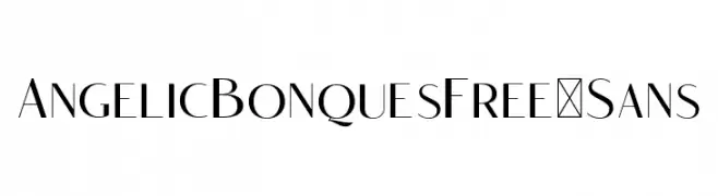
A sleek, modern sans-serif font with high contrast and elegant design.
![AngelicBonquesFree-Sans font caratteri gratis]() Scaricare 311 Downloads@WebFont
Scaricare 311 Downloads@WebFont -
( Hanoded - David Kerkhoff - www.hanodedfonts.com )
A playful, crayon-like font with a textured, hand-drawn appearance.
![DK Cool Crayon font caratteri gratis]() Scaricare 311 Downloads@WebFont
Scaricare 311 Downloads@WebFont -
( Fonts by Knackpack Studio - www.knackpack.studio - Personal-use only. For commercial use please contact owner. )
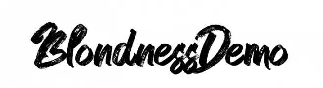
A bold, brush-style font with dynamic, hand-painted strokes.
![Blondness Demo font caratteri gratis]() Scaricare 311 Downloads@WebFont
Scaricare 311 Downloads@WebFont -
![Mistwetter font caratteri gratis]() Scaricare 311 Downloads@WebFont
Scaricare 311 Downloads@WebFont -
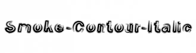
![Smoke-Contour-Italic font caratteri gratis]() Scaricare 311 Downloads@WebFont
Scaricare 311 Downloads@WebFont -
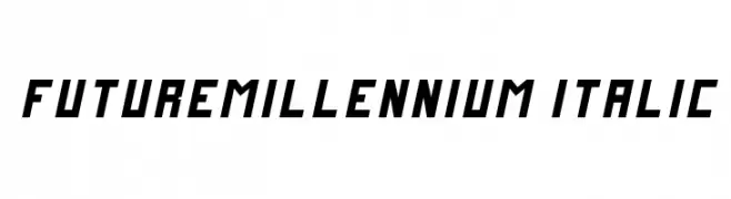
( Fonts by Zdenek Gromnica - www.futuremillennium.com )
A futuristic, angular italic font with a bold and dynamic style.
![FutureMillennium Italic font caratteri gratis]() Scaricare 311 Downloads@WebFont
Scaricare 311 Downloads@WebFont -
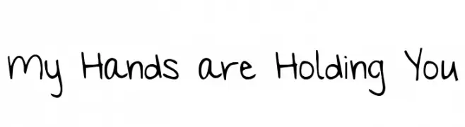
( Fonts by www.kimberlygeswein.com - Kimberly Geswein )
A playful, handwritten font with a casual and friendly style.
![My Hands are Holding You font caratteri gratis]() Scaricare 311 Downloads@WebFont
Scaricare 311 Downloads@WebFont -
( Fonts by Klaus Johansen - www.listemageren.dK )
A playful, domino-inspired font with characters in square tiles featuring dot patterns.
![Domino square font caratteri gratis]() Scaricare 311 Downloads@WebFont
Scaricare 311 Downloads@WebFont -
( Fonts by Daniel Zadorozny - www.iconian.com )
A bold, industrial font with a distressed, vintage texture.
![Frank-n-Plank Bold font caratteri gratis]() Scaricare 311 Downloads@WebFont
Scaricare 311 Downloads@WebFont


![The Tomb [winter and spring] 1 font caratteri gratis](https://d144mzi0q5mijx.cloudfront.net/img/T/H/The-Tomb-winter-and-spring-1.webp)


Quali sono i font più popolari adesso?
Poppins, Roboto, Montserrat, Open Sans e Lato sono molto usati per le forme pulite e l'ampia applicabilità — dall'identità di marca alle landing page e ai poster.
Quali font si usano spesso nei loghi?
Le sans serif geometriche (es. Poppins, famiglie in stile Gotham) sono scelte comuni per un branding pulito e scalabile. Per un tocco personale restano valide script e stili manoscritti. Abbina un display deciso per i titoli a un corpo testo neutro per riconoscibilità ed equilibrio.
Ogni quanto si aggiorna la lista?
Con regolarità, in base ai download e all'attività reale. Torna spesso per scoprire in anticipo le nuove preferite.
💡 Consiglio: aggiungi ai preferiti — le tendenze cambiano in fretta e i font top di oggi possono ispirare il rebranding di domani.