Benvenuto nelle Font Più Popolari — dove popolarità e qualità si incontrano. Qui trovi i font più scaricati e usati dell'anno. Se cerchi scelte sicure per logo, web o social, inizia da qui.
Ogni font top si distingue per equilibrio, leggibilità e versatilità. Troverai sans serif moderne, script eleganti, serif vintage e display minimalisti.
-
( Fonts by Daniel Gauthier )
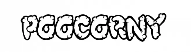
A playful, cartoon-like font with bold, rounded characters and a bubbly appearance.
 Scaricare 307 Downloads@WebFont
 -
( Fonts by Khurasan™ )
Playful handwritten font.
![Rosellia font caratteri gratis]() Scaricare 307 Downloads@WebFont
Scaricare 307 Downloads@WebFont -
( Fonts by Casady & Greene )
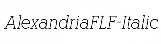
A refined italic font with elegant, slanted characters and smooth curves.
![AlexandriaFLF-Italic font caratteri gratis]() Scaricare 307 Downloads@WebFont
Scaricare 307 Downloads@WebFont -
( Free for personal use - new.myfonts.com/foundry/Intellecta_Design/?refby=paulow )
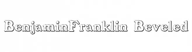
A beveled serif font with a three-dimensional, classic appearance.
![BenjaminFranklin Beveled font caratteri gratis]() Scaricare 307 Downloads@WebFont
Scaricare 307 Downloads@WebFont -
( Fonts by Manfred Klein - manfred-klein.ina-mar.com )
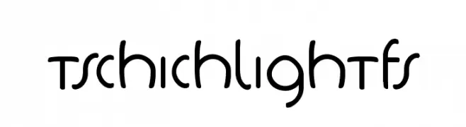
A playful, modern font with rounded edges and consistent stroke width.
![TschichLightFS font caratteri gratis]() Scaricare 307 Downloads@WebFont
Scaricare 307 Downloads@WebFont -
( Fonts by www.typodermicfonts.com - Ray Larabie )
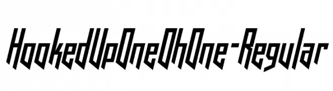
A bold, angular font with a futuristic and dynamic slant.
![HookedUpOneOhOne-Regular font caratteri gratis]() Scaricare 307 Downloads@WebFont
Scaricare 307 Downloads@WebFont -
![fanya font caratteri gratis]() Scaricare 307 Downloads@WebFont
Scaricare 307 Downloads@WebFont -
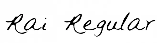
![Rai Regular font caratteri gratis]() Scaricare 307 Downloads@WebFont
Scaricare 307 Downloads@WebFont -
( Fonts by Daniel Zadorozny - www.iconian.com - Free for personal use )
A futuristic, semi-italic font with bold, angular characters and a modern aesthetic.
![Future Forces Semi-Italic font caratteri gratis]() Scaricare 307 Downloads@WebFont
Scaricare 307 Downloads@WebFont -
( Fonts by Douglas Vitkauskas - www.vtksdesign.com. Personal-use only. For commercial use please contact owner. )
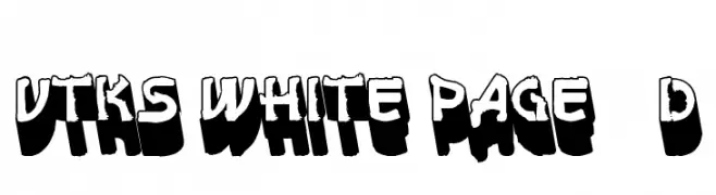
A bold, 3D shadow font with a rugged, textured edge for dramatic impact.
![vtks white page 3d font caratteri gratis]() Scaricare 307 Downloads@WebFont
Scaricare 307 Downloads@WebFont -
( Fonts by Daniel Zadorozny - www.iconian.com - Free for personal use )
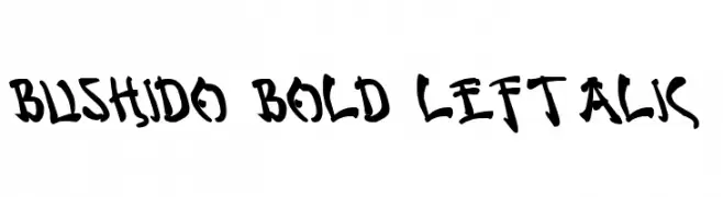
A bold, left-leaning italic font with a brush-like, artistic style.
![Bushido Bold Leftalic font caratteri gratis]() Scaricare 307 Downloads@WebFont
Scaricare 307 Downloads@WebFont -
( Fonts by 177Studio )
A modern, geometric font with sharp angles and clean lines.
![The Queenís Gambit Regular font caratteri gratis]() Scaricare 307 Downloads@WebFont
Scaricare 307 Downloads@WebFont -
![KR Christmas Dings 2004 Four font caratteri gratis]() Scaricare 307 Downloads@WebFont
Scaricare 307 Downloads@WebFont -
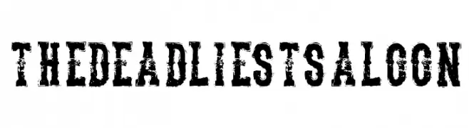
( Free for personal use - www.chrisvile.com/ )
A bold, distressed font with a vintage, western saloon style.
![TheDeadliestSaloon font caratteri gratis]() Scaricare 307 Downloads@WebFont
Scaricare 307 Downloads@WebFont -
![Maryellen font caratteri gratis]() Scaricare 307 Downloads@WebFont
Scaricare 307 Downloads@WebFont -
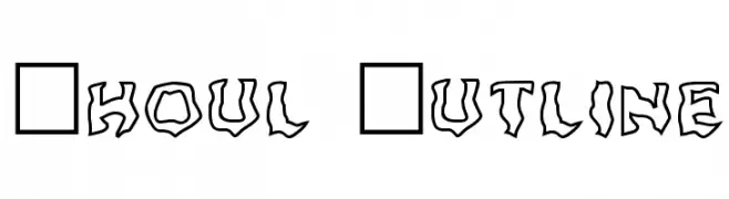
Caratteri di foopy. For commercial use please contact the owner.
![Ghoul Outline font caratteri gratis]() Scaricare 307 Downloads@WebFont
Scaricare 307 Downloads@WebFont -
( Nght's Place - www.crosswinds.net/~nghtmvs/font/fonts1.html )
A bold, decorative font with a unique brick pattern filling each character.
![101! Brick Layer font caratteri gratis]() Scaricare 307 Downloads@WebFont
Scaricare 307 Downloads@WebFont -
( Fonts by joeBob graff-X )
A playful, handwritten font with varied stroke thickness and a casual, informal style.
![JoeHand1 font caratteri gratis]() Scaricare 307 Downloads@WebFont
Scaricare 307 Downloads@WebFont -
![Curly font caratteri gratis]() Scaricare 307 Downloads@WebFont
Scaricare 307 Downloads@WebFont -
( Fonts by Apostrophic Lab )
A modern, narrow sans-serif font with clean lines and consistent stroke widths.
![Street Corner Narrower font caratteri gratis]() Scaricare 307 Downloads@WebFont
Scaricare 307 Downloads@WebFont -
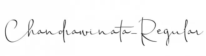
( Zulkhairi M Saleh - fontbundles.net/zulkhairilettering )
A modern, elegant handwritten font with flowing, cursive letterforms.
![Chandrawinata-Regular font caratteri gratis]() Scaricare 307 Downloads@WebFont
Scaricare 307 Downloads@WebFont -
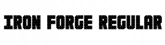
( Fonts by Daniel Zadorozny - www.iconian.com )
A bold, industrial-style font with geometric shapes and textured cut-outs.
![Iron Forge Regular font caratteri gratis]() Scaricare 307 Downloads@WebFont
Scaricare 307 Downloads@WebFont -
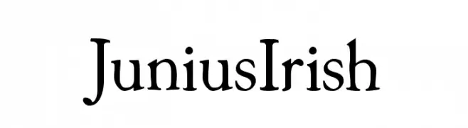
( Fonts by Manfred Klein. Free for private and charity use. Free for commercial with donation to organizations )
A unique serif font with bold strokes and elegant curves, blending traditional and modern styles.
![JuniusIrish font caratteri gratis]() Scaricare 307 Downloads@WebFont
Scaricare 307 Downloads@WebFont -
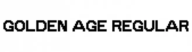
( imagex - www.imagex-fonts.com )
A bold, pixelated font with a retro digital style.
![Golden Age Regular font caratteri gratis]() Scaricare 307 Downloads@WebFont
Scaricare 307 Downloads@WebFont -
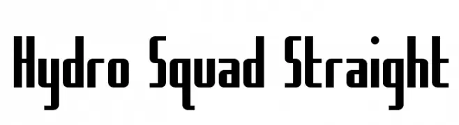
( Fonts by Daniel Zadorozny - www.iconian.com )
A bold, geometric font with strong vertical lines and sharp angles.
![Hydro Squad Straight font caratteri gratis]() Scaricare 307 Downloads@WebFont
Scaricare 307 Downloads@WebFont -
( Fonts by LJ Design Studios )
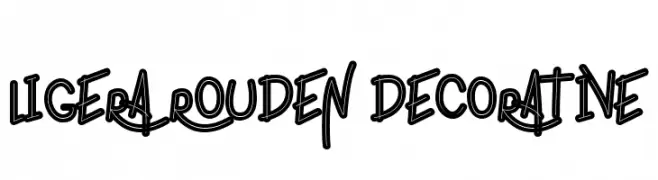
A bold, graffiti-inspired font with a playful, handwritten style.
![ligera rouden Decorative font caratteri gratis]() Scaricare 307 Downloads@WebFont
Scaricare 307 Downloads@WebFont -
( Fonts by Maulana Creative - Gilang Maulana - Personal-use only. For commercial use please contact owner. )
A bold, geometric font with a modern and confident style.
![Bermont Free Regular font caratteri gratis]() Scaricare 307 Downloads@WebFont
Scaricare 307 Downloads@WebFont -
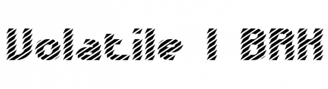
![Volatile 1 BRK font caratteri gratis]() Scaricare 307 Downloads@WebFont
Scaricare 307 Downloads@WebFont -
![RittswoodRedStar Regular_8 font caratteri gratis]() Scaricare 307 Downloads@WebFont
Scaricare 307 Downloads@WebFont -
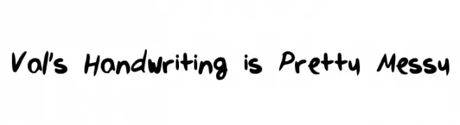
![Val's Handwriting is Pretty Messy font caratteri gratis]() Scaricare 307 Downloads@WebFont
Scaricare 307 Downloads@WebFont -
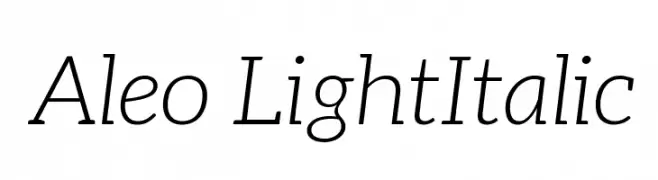
( Fonts by a www.fontfabric.com. Personal-use only. For commercial use please contact owner. )
A light, elegant italic font with a refined and sophisticated style.
![Aleo LightItalic font caratteri gratis]() Scaricare 307 Downloads@WebFont
Scaricare 307 Downloads@WebFont -
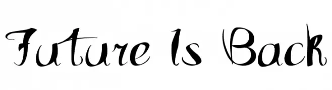
( Fonts by Marcin Leskow - www.martinleskow.pl )
A dynamic, high-contrast decorative font with cursive-like strokes and artistic flair.
![Future Is Back font caratteri gratis]() Scaricare 307 Downloads@WebFont
Scaricare 307 Downloads@WebFont -
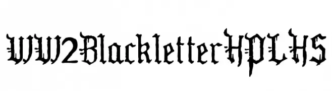
( Fonts by HPLHS Prop Fonts - Andrew H. Leman http://www.cthulhulives.org/toybox/propdocs/propfonts.html )
An ornate blackletter font with gothic, medieval influences.
![WW2BlackletterHPLHS font caratteri gratis]() Scaricare 307 Downloads@WebFont
Scaricare 307 Downloads@WebFont -
( Fonts by Vunira Design - Personal-use only. For commercial use please contact owner. )
A playful, bold handwritten font with smooth curves and a slightly condensed style.
![DreamlandFREE font caratteri gratis]() Scaricare 307 Downloads@WebFont
Scaricare 307 Downloads@WebFont -
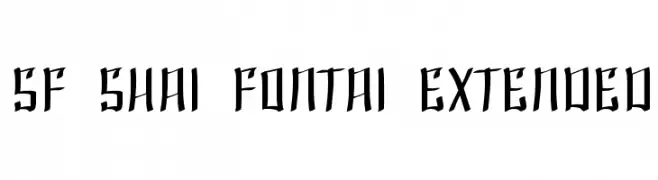
( Fonts by ShyFonts )
A bold, gothic-inspired font with sharp, angular edges.
![SF Shai Fontai Extended font caratteri gratis]() Scaricare 306 Downloads@WebFont
Scaricare 306 Downloads@WebFont


Quali sono i font più popolari adesso?
Poppins, Roboto, Montserrat, Open Sans e Lato sono molto usati per le forme pulite e l'ampia applicabilità — dall'identità di marca alle landing page e ai poster.
Quali font si usano spesso nei loghi?
Le sans serif geometriche (es. Poppins, famiglie in stile Gotham) sono scelte comuni per un branding pulito e scalabile. Per un tocco personale restano valide script e stili manoscritti. Abbina un display deciso per i titoli a un corpo testo neutro per riconoscibilità ed equilibrio.
Ogni quanto si aggiorna la lista?
Con regolarità, in base ai download e all'attività reale. Torna spesso per scoprire in anticipo le nuove preferite.
💡 Consiglio: aggiungi ai preferiti — le tendenze cambiano in fretta e i font top di oggi possono ispirare il rebranding di domani.