Benvenuto nelle Font Più Popolari — dove popolarità e qualità si incontrano. Qui trovi i font più scaricati e usati dell'anno. Se cerchi scelte sicure per logo, web o social, inizia da qui.
Ogni font top si distingue per equilibrio, leggibilità e versatilità. Troverai sans serif moderne, script eleganti, serif vintage e display minimalisti.
-
( Fonts by Kotak Kuning Studio - kotakkuning.com - Personal-use only. For commercial use please contact owner. )
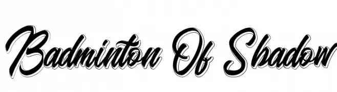
A bold, dynamic script font with interconnected letters and a shadow effect.
 Scaricare 302 Downloads@WebFont
 -
![Eygptian font caratteri gratis]() Scaricare 302 Downloads@WebFont
Scaricare 302 Downloads@WebFont -
![fanya font caratteri gratis]() Scaricare 302 Downloads@WebFont
Scaricare 302 Downloads@WebFont -
( Zetafonts - www.zetafonts.com )
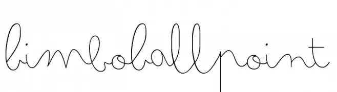
A playful, cursive handwritten font with a whimsical, fluid style.
![Bimbo Ballpoint font caratteri gratis]() Scaricare 302 Downloads@WebFont
Scaricare 302 Downloads@WebFont -
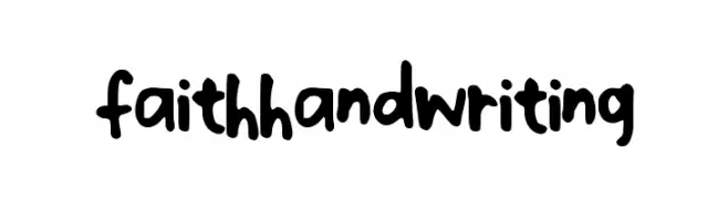
![faithhandwriting font caratteri gratis]() Scaricare 302 Downloads@WebFont
Scaricare 302 Downloads@WebFont -
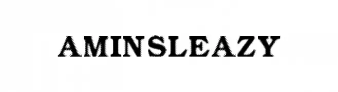
![Amin_Sleazy font caratteri gratis]() Scaricare 302 Downloads@WebFont
Scaricare 302 Downloads@WebFont -
![Dingle Berries font caratteri gratis]() Scaricare 302 Downloads@WebFont
Scaricare 302 Downloads@WebFont -
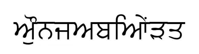
![PunjabiText font caratteri gratis]() Scaricare 302 Downloads@WebFont
Scaricare 302 Downloads@WebFont -
( Fonts by www.gliphmaker.com. Personal-use only. For commercial use please contact owner. )
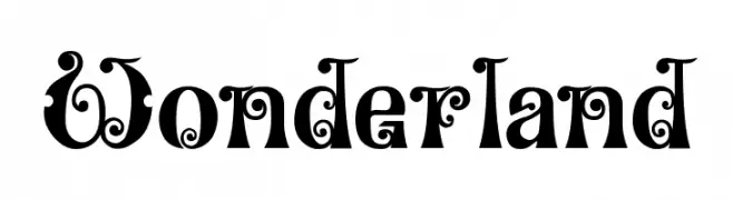
A whimsical and decorative font with intricate swirls and embellishments.
![Wonderland font caratteri gratis]() Scaricare 302 Downloads@WebFont
Scaricare 302 Downloads@WebFont -
( Free for Personal Use. To use commercially please visit the http://www.nymFont.com )
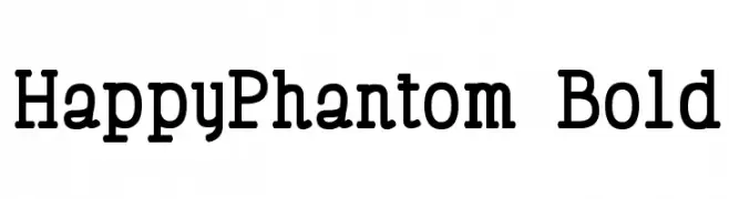
A bold, classic typewriter-style font with modern, clean lines.
![HappyPhantom Bold font caratteri gratis]() Scaricare 302 Downloads@WebFont
Scaricare 302 Downloads@WebFont -
( Fonts by Christian Robertson, Adam Twardoch, & Cristiano Sobral - Personal-use only. For commercial use please contact owner. )
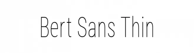
A thin, modern sans-serif font with a clean and elegant style.
![Bert Sans Thin font caratteri gratis]() Scaricare 302 Downloads@WebFont
Scaricare 302 Downloads@WebFont -
( Fonts by www.dcoxy.com )
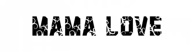
A bold, decorative font with intricate floral patterns.
![Mama Love font caratteri gratis]() Scaricare 302 Downloads@WebFont
Scaricare 302 Downloads@WebFont -
( Fonts by William Jeovah de Medeiros )
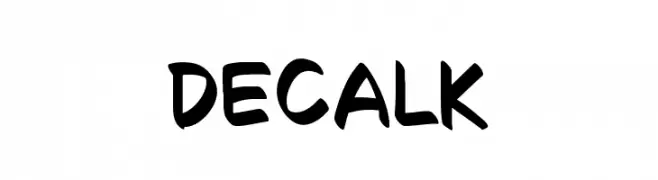
A playful, bold handwritten font with rounded strokes and an informal style.
![Decalk font caratteri gratis]() Scaricare 302 Downloads@WebFont
Scaricare 302 Downloads@WebFont -
( Muammar Khalid - creativemarket.com/kang1993 )
A playful, hand-drawn font with tall, narrow characters and a whimsical style.
![Spring Holiday font caratteri gratis]() Scaricare 302 Downloads@WebFont
Scaricare 302 Downloads@WebFont -
( Copyright 2012 The B612 Project Authors (https://github.com/polarsys/b612) )
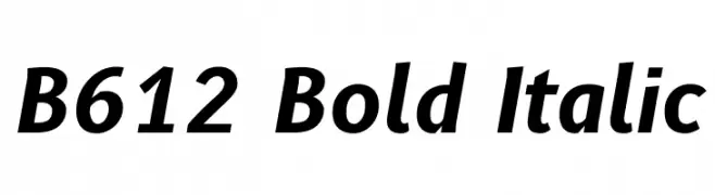
A bold, italicized font with a modern and dynamic style.
![B612 Bold Italic font caratteri gratis]() Scaricare 302 Downloads@WebFont
Scaricare 302 Downloads@WebFont -
( Fonts by Jeff Bensch )
A rugged, hand-drawn font with a rough, artistic texture.
![Rough Draught font caratteri gratis]() Scaricare 302 Downloads@WebFont
Scaricare 302 Downloads@WebFont -
![Vtks Tatuage2 font caratteri gratis]() Scaricare 302 Downloads@WebFont
Scaricare 302 Downloads@WebFont -
![Times_Hackers font caratteri gratis]() Scaricare 302 Downloads@WebFont
Scaricare 302 Downloads@WebFont -
![Bravado Block Regular font caratteri gratis]() Scaricare 302 Downloads@WebFont
Scaricare 302 Downloads@WebFont -
( Fonts by Hanoded )
A playful, handcrafted font with bold, irregular letterforms.
![DKSnippitySnap font caratteri gratis]() Scaricare 302 Downloads@WebFont
Scaricare 302 Downloads@WebFont -
![EllipticaBold font caratteri gratis]() Scaricare 302 Downloads@WebFont
Scaricare 302 Downloads@WebFont -
( Fonts by Thirtypath - Personal-use only. For commercial use please contact owner. )
A lively, cursive font with elegant loops and a handwritten style.
![Bammantoe font caratteri gratis]() Scaricare 302 Downloads@WebFont
Scaricare 302 Downloads@WebFont -
( Fonts by Caffeen Fonts - www.swank.ca/caffeen/fonts/ )
A playful, hand-drawn font with rounded edges and irregular strokes.
![Jim-teacher font caratteri gratis]() Scaricare 302 Downloads@WebFont
Scaricare 302 Downloads@WebFont -
( Fonts by www.fugit-tempus.de )
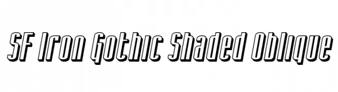
A bold, oblique font with a shaded, three-dimensional Gothic style.
![SF Iron Gothic Shaded Oblique font caratteri gratis]() Scaricare 302 Downloads@WebFont
Scaricare 302 Downloads@WebFont -
( Fonts by Iconian Fonts )
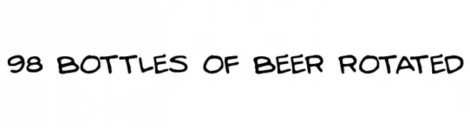
A playful, handwritten font with bold, rounded strokes and a casual style.
![98 Bottles of Beer Rotated font caratteri gratis]() Scaricare 302 Downloads@WebFont
Scaricare 302 Downloads@WebFont -
( Shareware - new.myfonts.com/foundry/Intellecta_Design/?refby=paulow )
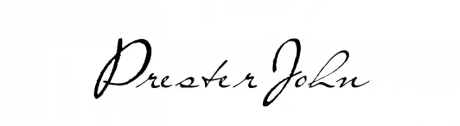
A graceful script font with elegant, flowing calligraphic style.
![PresterJohn font caratteri gratis]() Scaricare 302 Downloads@WebFont
Scaricare 302 Downloads@WebFont -
( Fonts by Thirtypath - Personal-use only. For commercial use please contact owner. )
A modern, handwritten font with thin, elongated strokes and a casual elegance.
![theraphiest font caratteri gratis]() Scaricare 302 Downloads@WebFont
Scaricare 302 Downloads@WebFont -
( Fonts by Faldy Kudo - Personal-use only. For commercial use please contact owner. )
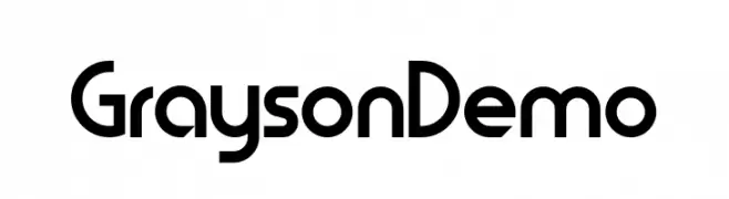
A modern, geometric sans-serif font with clean, rounded characters.
![GraysonDemo font caratteri gratis]() Scaricare 302 Downloads@WebFont
Scaricare 302 Downloads@WebFont -
![AMENO font caratteri gratis]() Scaricare 302 Downloads@WebFont
Scaricare 302 Downloads@WebFont -
( Fonts by appajid )
A modern, geometric sans-serif font with a sleek and elongated appearance.
![Chathura-Light font caratteri gratis]() Scaricare 302 Downloads@WebFont
Scaricare 302 Downloads@WebFont -
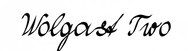
( Fonts by Peter Wiegel - www.peter-wiegel.de )
A dynamic and elegant script font with flowing, connected letterforms.
![Wolgast Two font caratteri gratis]() Scaricare 302 Downloads@WebFont
Scaricare 302 Downloads@WebFont -
( Fonts by Apostrophic Lab )
A bold, distressed decorative font with a rugged, geometric style.
![Karnivore Pump font caratteri gratis]() Scaricare 302 Downloads@WebFont
Scaricare 302 Downloads@WebFont -
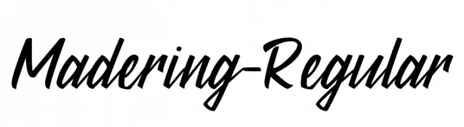
( Fonts by StringLabs - stringlabscreative.com - Personal-use only. For commercial use please contact owner. )
A dynamic and fluid script font with elegant curves and a lively style.
![Madering-Regular font caratteri gratis]() Scaricare 302 Downloads@WebFont
Scaricare 302 Downloads@WebFont -
( Fonts by ShyFonts )
A sleek, modern, and light oblique font with thin strokes and normal spacing.
![SF Arborcrest Light Oblique font caratteri gratis]() Scaricare 302 Downloads@WebFont
Scaricare 302 Downloads@WebFont -
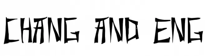
( Fonts by Typearound )
A bold, angular font with sharp lines and a distinctive, edgy style.
![Chang and Eng font caratteri gratis]() Scaricare 301 Downloads@WebFont
Scaricare 301 Downloads@WebFont


Quali sono i font più popolari adesso?
Poppins, Roboto, Montserrat, Open Sans e Lato sono molto usati per le forme pulite e l'ampia applicabilità — dall'identità di marca alle landing page e ai poster.
Quali font si usano spesso nei loghi?
Le sans serif geometriche (es. Poppins, famiglie in stile Gotham) sono scelte comuni per un branding pulito e scalabile. Per un tocco personale restano valide script e stili manoscritti. Abbina un display deciso per i titoli a un corpo testo neutro per riconoscibilità ed equilibrio.
Ogni quanto si aggiorna la lista?
Con regolarità, in base ai download e all'attività reale. Torna spesso per scoprire in anticipo le nuove preferite.
💡 Consiglio: aggiungi ai preferiti — le tendenze cambiano in fretta e i font top di oggi possono ispirare il rebranding di domani.