Benvenuto nelle Font Più Popolari — dove popolarità e qualità si incontrano. Qui trovi i font più scaricati e usati dell'anno. Se cerchi scelte sicure per logo, web o social, inizia da qui.
Ogni font top si distingue per equilibrio, leggibilità e versatilità. Troverai sans serif moderne, script eleganti, serif vintage e display minimalisti.
-
 Scaricare 23345 Downloads@WebFont
 -
![Fortuna Dot font caratteri gratis]() Scaricare 23255 Downloads@WebFont
Scaricare 23255 Downloads@WebFont -
( Copyright (c) 2010, ParaType Ltd. (http://www.paratype.com/public) )
A bold serif typeface with strong, classic letterforms and excellent readability.
![PT Serif Bold font caratteri gratis]() Scaricare 23237 Downloads@WebFont
Scaricare 23237 Downloads@WebFont -
![Creeper font caratteri gratis]() Scaricare 23236 Downloads@WebFont
Scaricare 23236 Downloads@WebFont -
( Fonts by or from www.graffitifonts.net )
A bold, graffiti-inspired font with dynamic and edgy strokes.
![08 Underground font caratteri gratis]() Scaricare 23236 Downloads@WebFont
Scaricare 23236 Downloads@WebFont -
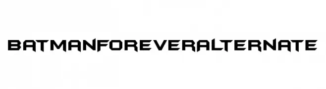
![BatmanForeverAlternate font caratteri gratis]() Scaricare 23130 Downloads@WebFont
Scaricare 23130 Downloads@WebFont -
![Moonshiner-Regular font caratteri gratis]() Scaricare 23099 Downloads@WebFont
Scaricare 23099 Downloads@WebFont -
![Saumil_guj2 font caratteri gratis]() Scaricare 23057 Downloads@WebFont
Scaricare 23057 Downloads@WebFont -
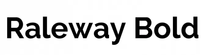
( Copyright (c) 2010, Matt McInerney (matt@pixelspread.com) )
A bold, modern sans-serif font with high legibility and balanced character spacing.
![Raleway Bold font caratteri gratis]() Scaricare 23030 Downloads@WebFont
Scaricare 23030 Downloads@WebFont -
![Spider-Man font caratteri gratis]() Scaricare 23023 Downloads@WebFont
Scaricare 23023 Downloads@WebFont -
![Bauhaus-Light-Light font caratteri gratis]() Scaricare 22994 Downloads
Scaricare 22994 Downloads -
( Fonts by www.TomzWeb.com - Thomas E. Harvey - NOT free - Commercial use requires license )
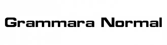
A bold, modern font with a geometric structure and strong visual impact.
![Grammara Normal font caratteri gratis]() Scaricare 22960 Downloads@WebFont
Scaricare 22960 Downloads@WebFont -
![Osaka font caratteri gratis]() Scaricare 22938 Downloads@WebFont
Scaricare 22938 Downloads@WebFont -
![Aller font caratteri gratis]() Scaricare 22868 Downloads@WebFont
Scaricare 22868 Downloads@WebFont -
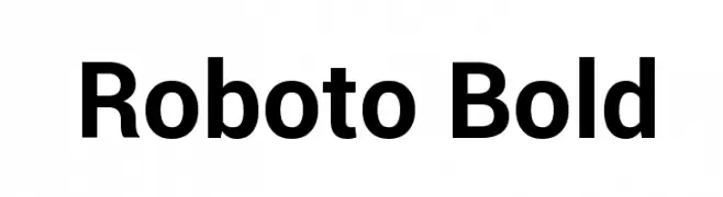
( Fonts by developer.android.com )
A modern, bold sans-serif font with a clean and geometric design.
![Roboto Bold font caratteri gratis]() Scaricare 22827 Downloads@WebFont
Scaricare 22827 Downloads@WebFont -
![Encient German Gothic font caratteri gratis]() Scaricare 22813 Downloads
Scaricare 22813 Downloads -
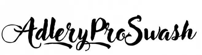
( Fonts by Zetafonts - Personal-use only. For commercial use please contact owner. )
A bold, expressive script font with ornate swashes and flowing cursive letterforms.
![Adlery Pro Swash font caratteri gratis]() Scaricare 22805 Downloads@WebFont
Scaricare 22805 Downloads@WebFont -
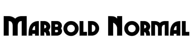
( Fonts by www.TomzWeb.com - Thomas E. Harvey - NOT free - Commercial use requires license )
A bold, geometric font with sharp edges and a modern style.
![Marbold Normal font caratteri gratis]() Scaricare 22803 Downloads@WebFont
Scaricare 22803 Downloads@WebFont -
![Army Thin font caratteri gratis]() Scaricare 22768 Downloads
Scaricare 22768 Downloads -
![MLB Block font caratteri gratis]() Scaricare 22726 Downloads@WebFont
Scaricare 22726 Downloads@WebFont -
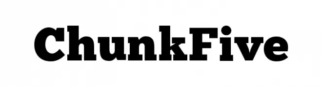
( Fonts by The League of Moveable Type - theleagueofmoveabletype.com )
A bold slab serif font with strong, block-like serifs and consistent weight.
![ChunkFive font caratteri gratis]() Scaricare 22654 Downloads@WebFont
Scaricare 22654 Downloads@WebFont -
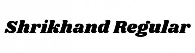
( Copyright (c) 2015 Jonny Pinhorn (jonpinhorn.typedesign@gmail.com) )
A bold, playful font with rounded characters and a friendly style.
![Shrikhand Regular font caratteri gratis]() Scaricare 22628 Downloads@WebFont
Scaricare 22628 Downloads@WebFont -
![Futurist Fixed-width font caratteri gratis]() Scaricare 22567 Downloads@WebFont
Scaricare 22567 Downloads@WebFont -
( Fonts by Divide By Zero! - fonts.tom7.com )
A playful, bold font with a 3D shadow effect and cartoonish style.
![Action Jackson font caratteri gratis]() Scaricare 22544 Downloads@WebFont
Scaricare 22544 Downloads@WebFont -
( Fonts by www.twopeasinabucket.com )
A playful, hand-drawn font with a stamp-like effect and irregular edges.
![2Peas Gift font caratteri gratis]() Scaricare 22535 Downloads@WebFont
Scaricare 22535 Downloads@WebFont -
![MLB Diamondbacks font caratteri gratis]() Scaricare 22526 Downloads@WebFont
Scaricare 22526 Downloads@WebFont -
![Serpentine-Light font caratteri gratis]() Scaricare 22474 Downloads@WebFont
Scaricare 22474 Downloads@WebFont -
( Fonts by Altsys Metamorphosis )
A decorative serif font with elegant swashes and intricate detailing.
![Harri font caratteri gratis]() Scaricare 22471 Downloads@WebFont
Scaricare 22471 Downloads@WebFont -
![AlternateGothicEF-NoTwo font caratteri gratis]() Scaricare 22450 Downloads@WebFont
Scaricare 22450 Downloads@WebFont -
( Fonts by Johan Holmdahl - www.free-typewriter-fonts.com )
A nostalgic, typewriter-inspired font with a vintage, mechanical feel.
![Another Typewriter font caratteri gratis]() Scaricare 22418 Downloads@WebFont
Scaricare 22418 Downloads@WebFont -
![Renaissance-Regular font caratteri gratis]() Scaricare 22387 Downloads@WebFont
Scaricare 22387 Downloads@WebFont -
( Copyright (c) 2010, Matt McInerney (matt@pixelspread.com) )
A modern, geometric sans-serif font with clean lines and uniform stroke width.
![Raleway font caratteri gratis]() Scaricare 22340 Downloads@WebFont
Scaricare 22340 Downloads@WebFont -
![MrsEavesRoman font caratteri gratis]() Scaricare 22320 Downloads
Scaricare 22320 Downloads -
( Copyright (c) 2010, NHN Corporation (http://www.nhncorp.com) )
A dynamic, brush-stroke style font with a casual, artistic feel.
![Nanum Brush Script font caratteri gratis]() Scaricare 22290 Downloads@WebFont
Scaricare 22290 Downloads@WebFont -
![m&ms font caratteri gratis]() Scaricare 22289 Downloads@WebFont
Scaricare 22289 Downloads@WebFont


Quali sono i font più popolari adesso?
Poppins, Roboto, Montserrat, Open Sans e Lato sono molto usati per le forme pulite e l'ampia applicabilità — dall'identità di marca alle landing page e ai poster.
Quali font si usano spesso nei loghi?
Le sans serif geometriche (es. Poppins, famiglie in stile Gotham) sono scelte comuni per un branding pulito e scalabile. Per un tocco personale restano valide script e stili manoscritti. Abbina un display deciso per i titoli a un corpo testo neutro per riconoscibilità ed equilibrio.
Ogni quanto si aggiorna la lista?
Con regolarità, in base ai download e all'attività reale. Torna spesso per scoprire in anticipo le nuove preferite.
💡 Consiglio: aggiungi ai preferiti — le tendenze cambiano in fretta e i font top di oggi possono ispirare il rebranding di domani.