Benvenuto nelle Font Più Popolari — dove popolarità e qualità si incontrano. Qui trovi i font più scaricati e usati dell'anno. Se cerchi scelte sicure per logo, web o social, inizia da qui.
Ogni font top si distingue per equilibrio, leggibilità e versatilità. Troverai sans serif moderne, script eleganti, serif vintage e display minimalisti.
-
( Fonts by nariswari_creative )
A bold, playful, hand-drawn font with a whimsical style.
 Scaricare 304 Downloads@WebFont
 -
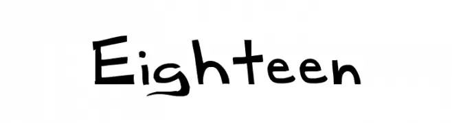
( Fonts by Kreative Korporation - www.kreativekorp.com )
A playful, handwritten font with a dynamic and energetic style.
![Eighteen font caratteri gratis]() Scaricare 304 Downloads@WebFont
Scaricare 304 Downloads@WebFont -
![KoukakuE font caratteri gratis]() Scaricare 304 Downloads@WebFont
Scaricare 304 Downloads@WebFont -
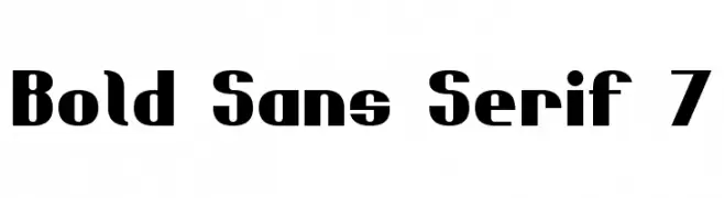
( Fonts by Style-7 - www.styleseven.com - Personal-use only. For commercial use please contact owner. )
A bold, modern sans-serif font with strong geometric shapes.
![Bold Sans Serif 7 font caratteri gratis]() Scaricare 304 Downloads@WebFont
Scaricare 304 Downloads@WebFont -
![Mestral font caratteri gratis]() Scaricare 304 Downloads@WebFont
Scaricare 304 Downloads@WebFont -
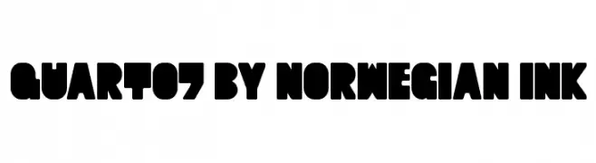
![Quart07 by Norwegian Ink font caratteri gratis]() Scaricare 304 Downloads@WebFont
Scaricare 304 Downloads@WebFont -
( Fonts by Vladimir Nikolic - www.creativefabrica.com/designer/vladimirnikolic/ - Personal-use only. For commercial use please contact owner. )
A bold, geometric font with striking negative space and sharp angles.
![Monte Carlo Regular font caratteri gratis]() Scaricare 304 Downloads@WebFont
Scaricare 304 Downloads@WebFont -
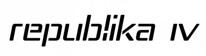
( Fonts by Apostrophic Lab )
A modern, slanted font with a futuristic and geometric design.
![Republika IV font caratteri gratis]() Scaricare 304 Downloads@WebFont
Scaricare 304 Downloads@WebFont -
![Apex Lake Regular font caratteri gratis]() Scaricare 304 Downloads@WebFont
Scaricare 304 Downloads@WebFont -
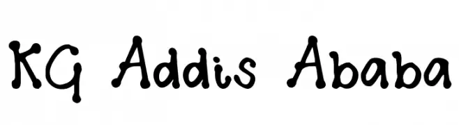
( Fonts by www.kimberlygeswein.com - Kimberly Geswein )
A playful, handwritten font with rounded, irregular characters.
![KG Addis Ababa font caratteri gratis]() Scaricare 304 Downloads@WebFont
Scaricare 304 Downloads@WebFont -
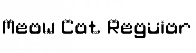
( Fonts by Yin Shu )
A playful font with cat ear designs on each character, offering a whimsical and modern aesthetic.
![Meow Cat Regular font caratteri gratis]() Scaricare 304 Downloads@WebFont
Scaricare 304 Downloads@WebFont -
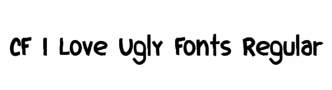
( Fonts by Steve Cloutier - www.cloutierfontes.ca )
A bold, hand-drawn font with a playful and textured appearance.
![CF I Love Ugly Fonts Regular font caratteri gratis]() Scaricare 304 Downloads@WebFont
Scaricare 304 Downloads@WebFont -
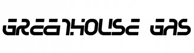
( Fonts by Jacob Fisher - www.pizzadude.dk )
A bold, futuristic font with geometric shapes and a dynamic style.
![Greenhouse gas font caratteri gratis]() Scaricare 304 Downloads@WebFont
Scaricare 304 Downloads@WebFont -
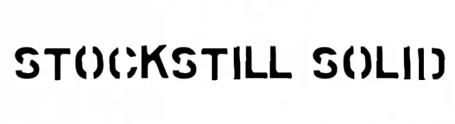
( Fonts by www.tepidmonkey.net )
A bold, stencil-style font with high contrast and geometric shapes.
![Stockstill Solid font caratteri gratis]() Scaricare 304 Downloads@WebFont
Scaricare 304 Downloads@WebFont -
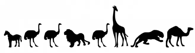
( Fonts by Daniel Zadorozny - www.iconian.com - Free for personal use )
Silhouetted animal shapes in a bold, uniform style.
![Zoologic font caratteri gratis]() Scaricare 304 Downloads@WebFont
Scaricare 304 Downloads@WebFont -
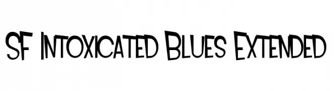
( Fonts by ShyFonts )
A bold, playful font with uneven strokes and a dynamic, hand-drawn style.
![SF Intoxicated Blues Extended font caratteri gratis]() Scaricare 304 Downloads@WebFont
Scaricare 304 Downloads@WebFont -
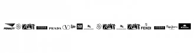
( truefonts.blogspot.com )
A compilation of logotype fonts used in well-known clothing and sportswear brand logos.
![clothing logos tfb font caratteri gratis]() Scaricare 304 Downloads@WebFont
Scaricare 304 Downloads@WebFont -
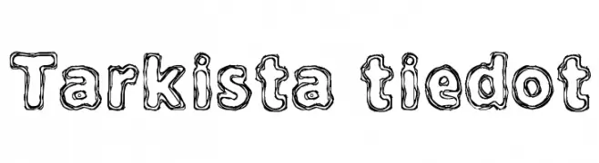
( Fonts by www.junkohanhero.com )
A playful, hand-drawn font with a doodle-like, double-lined style.
![Tarkista tiedot font caratteri gratis]() Scaricare 304 Downloads@WebFont
Scaricare 304 Downloads@WebFont -
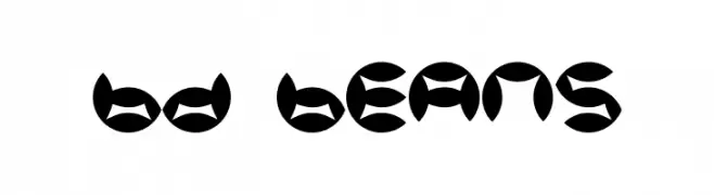
![BD Beans font caratteri gratis]() Scaricare 304 Downloads@WebFont
Scaricare 304 Downloads@WebFont -
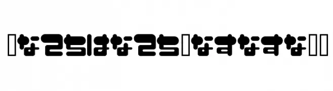
![FuwafuwaFururuHS font caratteri gratis]() Scaricare 304 Downloads@WebFont
Scaricare 304 Downloads@WebFont -
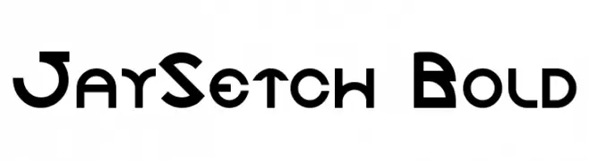
![JaySetch Bold font caratteri gratis]() Scaricare 304 Downloads@WebFont
Scaricare 304 Downloads@WebFont -
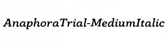
( Zetafonts - www.zetafonts.com )
A medium weight, italic serif font with elegant curves and subtle serifs.
![AnaphoraTrial-MediumItalic font caratteri gratis]() Scaricare 304 Downloads@WebFont
Scaricare 304 Downloads@WebFont -
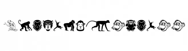
( Fonts by Woodcutter )
A whimsical collection of diverse monkey-themed illustrations in black and white.
![Monkey Business font caratteri gratis]() Scaricare 304 Downloads@WebFont
Scaricare 304 Downloads@WebFont -
( Fonts by Isaac K. Personal-use only. For commercial use please contact owner. )
A futuristic, geometric font with hollow, outlined characters.
![Android Hollow font caratteri gratis]() Scaricare 304 Downloads@WebFont
Scaricare 304 Downloads@WebFont -
( Fonts by Kotak Kuning Studio )
A bold, playful font with thick, rounded characters and a whimsical style.
![Hey Franky font caratteri gratis]() Scaricare 304 Downloads@WebFont
Scaricare 304 Downloads@WebFont -
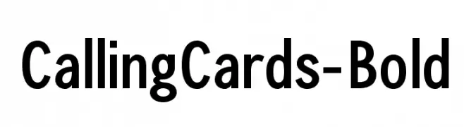
( Ana - www.anasfonts.com/ )
A bold, modern sans-serif font with clean lines and excellent readability.
![CallingCards-Bold font caratteri gratis]() Scaricare 304 Downloads@WebFont
Scaricare 304 Downloads@WebFont -
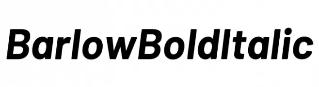
( Fonts by Tribby )
A bold, italicized font with a modern and clean design.
![Barlow Bold Italic font caratteri gratis]() Scaricare 304 Downloads@WebFont
Scaricare 304 Downloads@WebFont -
( Fonts by Zetafonts - Personal-use only. For commercial use please contact owner. )
A bold, italicized font with a modern and dynamic style.
![HeadingNow Trial 16 Bold Italic font caratteri gratis]() Scaricare 304 Downloads@WebFont
Scaricare 304 Downloads@WebFont -
( Fonts by Douglas Vitkauskas - www.vtksdesign.com. Personal-use only. For commercial use please contact owner. )
An ornate and decorative font with intricate swirls, perfect for artistic and vintage-themed projects.
![Vtks Wine Label Two font caratteri gratis]() Scaricare 304 Downloads@WebFont
Scaricare 304 Downloads@WebFont -
( Fonts by Denise Bentulan - douxiegirl.com. Personal-use only. For commercial use please contact owner. )
A playful, handwritten font with fluid, interconnected strokes.
![Wintermelon font caratteri gratis]() Scaricare 304 Downloads@WebFont
Scaricare 304 Downloads@WebFont -
( Fonts by antoniorodriguesjr.com )
A bold, modern sans-serif font with a clean, geometric style.
![Oslo II Bold font caratteri gratis]() Scaricare 304 Downloads@WebFont
Scaricare 304 Downloads@WebFont -
( گالری فانت فارسی پژوهش آريانا - only compatible with Farsi and Arabic )
A bold, geometric font with clean lines and modern style.
![Sadaf font caratteri gratis]() Scaricare 304 Downloads@WebFont
Scaricare 304 Downloads@WebFont -
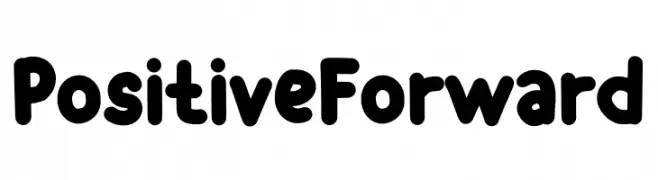
( Fonts by Muhammad Afif )
A bold, playful font with rounded edges and a friendly appearance.
![Positive Forward font caratteri gratis]() Scaricare 304 Downloads@WebFont
Scaricare 304 Downloads@WebFont -
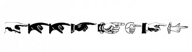
( Fonts by Manfred Klein. Free for private and charity use. Free for commercial with donation to organizations )
A decorative font composed entirely of pointing hand illustrations.
![AllHands font caratteri gratis]() Scaricare 304 Downloads@WebFont
Scaricare 304 Downloads@WebFont -
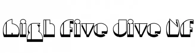
( Fonts by Nick Curtis - www.nicksfonts.com )
A bold, geometric font with a 3D shadow effect, ideal for impactful designs.
![High Five Jive NF font caratteri gratis]() Scaricare 304 Downloads@WebFont
Scaricare 304 Downloads@WebFont


Quali sono i font più popolari adesso?
Poppins, Roboto, Montserrat, Open Sans e Lato sono molto usati per le forme pulite e l'ampia applicabilità — dall'identità di marca alle landing page e ai poster.
Quali font si usano spesso nei loghi?
Le sans serif geometriche (es. Poppins, famiglie in stile Gotham) sono scelte comuni per un branding pulito e scalabile. Per un tocco personale restano valide script e stili manoscritti. Abbina un display deciso per i titoli a un corpo testo neutro per riconoscibilità ed equilibrio.
Ogni quanto si aggiorna la lista?
Con regolarità, in base ai download e all'attività reale. Torna spesso per scoprire in anticipo le nuove preferite.
💡 Consiglio: aggiungi ai preferiti — le tendenze cambiano in fretta e i font top di oggi possono ispirare il rebranding di domani.