Benvenuto nelle Font Più Popolari — dove popolarità e qualità si incontrano. Qui trovi i font più scaricati e usati dell'anno. Se cerchi scelte sicure per logo, web o social, inizia da qui.
Ogni font top si distingue per equilibrio, leggibilità e versatilità. Troverai sans serif moderne, script eleganti, serif vintage e display minimalisti.
-
( Fonts by wonoayu79 - Agung Harto - Personal-use only. For commercial use please contact owner. )
A playful, hand-drawn style font with bold, irregular characters.
 Scaricare 302 Downloads@WebFont
 -
( Fonts by Zdenek Gromnica - www.futuremillennium.com )
A bold, high-contrast serif font with angular serifs and a modern flair.
![InfraRed Black font caratteri gratis]() Scaricare 302 Downloads@WebFont
Scaricare 302 Downloads@WebFont -
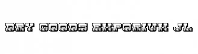
![Dry Goods Emporium JL font caratteri gratis]() Scaricare 302 Downloads@WebFont
Scaricare 302 Downloads@WebFont -
( Fonts by Paul Reid - tracertong.co.uk )
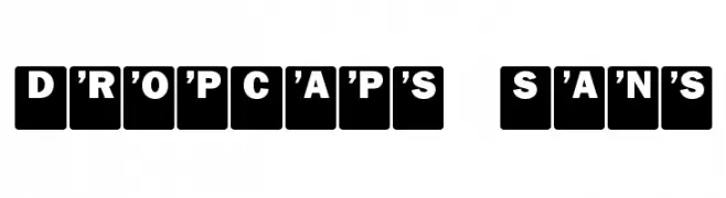
Bold, uppercase sans-serif letters in solid rectangular blocks.
![DropCaps Sans font caratteri gratis]() Scaricare 301 Downloads@WebFont
Scaricare 301 Downloads@WebFont -
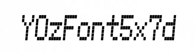
![YOzFont5x7d font caratteri gratis]() Scaricare 301 Downloads@WebFont
Scaricare 301 Downloads@WebFont -
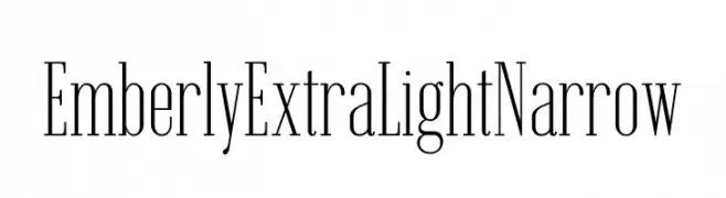
( Fonts by Rajesh Rajput - gumroad.com/rajputrajesh_448 - Personal-use only. For commercial use please contact owner. )
A sophisticated, extra-light, narrow font with high contrast and modern elegance.
![Emberly Extra Light Narrow font caratteri gratis]() Scaricare 301 Downloads@WebFont
Scaricare 301 Downloads@WebFont -
( Fonts by The Scriptorium - Dave Nalle )
A decorative font with swirling, vine-like extensions and high contrast, ideal for fantasy themes.
![Black Cow font caratteri gratis]() Scaricare 301 Downloads@WebFont
Scaricare 301 Downloads@WebFont -
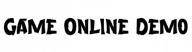
( Fonts by Noah Type )
A bold, dynamic font with a playful, hand-drawn style.
![Game Online Demo font caratteri gratis]() Scaricare 301 Downloads@WebFont
Scaricare 301 Downloads@WebFont -
( Free for a personal use. For a commercial use please visit www.kevinandamanda.com )
A playful, casual handwritten font with a lively and dynamic appearance.
![Pea Alisha font caratteri gratis]() Scaricare 301 Downloads@WebFont
Scaricare 301 Downloads@WebFont -
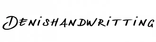
( Fonts by Denis Chapon )
A fluid and dynamic handwritten font with smooth curves and natural elegance.
![Denishandwritting font caratteri gratis]() Scaricare 301 Downloads@WebFont
Scaricare 301 Downloads@WebFont -
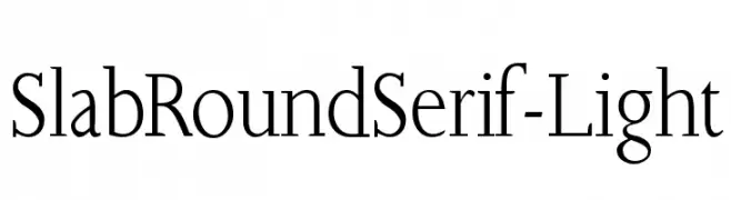
( Fonts by Manfred Klein. Free for private and charity use. Free for commercial with donation to organizations )
A light slab serif font with rounded edges, combining classic and modern elements.
![SlabRoundSerif-Light font caratteri gratis]() Scaricare 301 Downloads@WebFont
Scaricare 301 Downloads@WebFont -
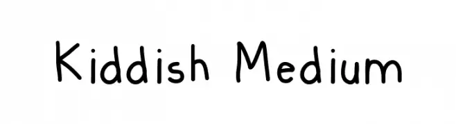
( Matt Bruinooge )
A playful, handwritten font with smooth, rounded strokes.
![Kiddish Medium font caratteri gratis]() Scaricare 301 Downloads@WebFont
Scaricare 301 Downloads@WebFont -
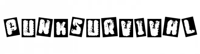
( Fonts by Woodcutter )
A gritty, distressed font with a punk rock aesthetic, featuring bold, jagged characters.
![Punk Survival font caratteri gratis]() Scaricare 301 Downloads@WebFont
Scaricare 301 Downloads@WebFont -
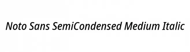
( Fonts by Google - Personal-use only. For commercial use please contact owner. )
A modern, semi-condensed, medium-weight italic typeface with a clean and professional appearance.
![Noto Sans SemiCondensed Medium Italic font caratteri gratis]() Scaricare 301 Downloads@WebFont
Scaricare 301 Downloads@WebFont -
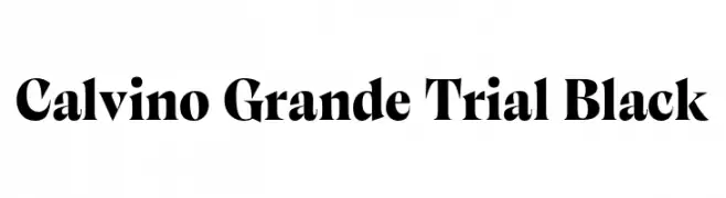
( Fonts by Zetafonts - Personal-use only. For commercial use please contact owner. )
A bold, high-contrast serif font with sharp serifs and a dramatic style.
![Calvino Grande Trial Black font caratteri gratis]() Scaricare 301 Downloads@WebFont
Scaricare 301 Downloads@WebFont -
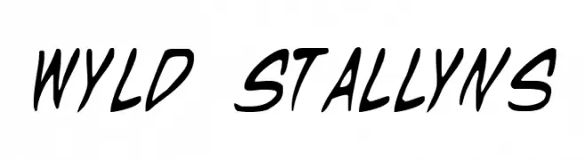
( Fonts by Daniel Zadorozny - www.iconian.com - Free for personal use )
A bold, italicized script font with a dynamic and energetic style.
![Wyld Stallyns font caratteri gratis]() Scaricare 301 Downloads@WebFont
Scaricare 301 Downloads@WebFont -
( Free for personal use - Fonts by Markus Schroppel. For commercial license please donate to http://www.die-gute-schrift.de/donation.html )
Bold geometric numerals paired with clear, functional media and utility icons.
![LL_Record font caratteri gratis]() Scaricare 301 Downloads@WebFont
Scaricare 301 Downloads@WebFont -
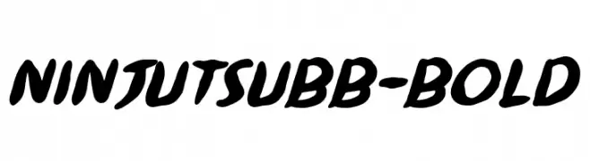
( Fonts by www.blambot.com )
A bold, dynamic font with flowing strokes and a playful slant.
![NinjutsuBB-Bold font caratteri gratis]() Scaricare 301 Downloads@WebFont
Scaricare 301 Downloads@WebFont -
( Fonts by Zetafonts - Personal-use only. For commercial use please contact owner. )
A bold, rounded typeface with smooth curves and uniform strokes.
![Antipasto Pro ExtraBold font caratteri gratis]() Scaricare 301 Downloads@WebFont
Scaricare 301 Downloads@WebFont -
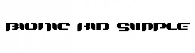
( Fonts by Jacob Fisher - www.pizzadude.dk )
A bold, geometric font with a futuristic, stencil-like design.
![Bionic Kid Simple font caratteri gratis]() Scaricare 301 Downloads@WebFont
Scaricare 301 Downloads@WebFont -
![Kosovo Target BC font caratteri gratis]() Scaricare 301 Downloads@WebFont
Scaricare 301 Downloads@WebFont -
( Fonts by Asep Zaenuri )
A playful, hand-drawn font with bold outlines and a cartoonish style.
![Monkey font caratteri gratis]() Scaricare 301 Downloads@WebFont
Scaricare 301 Downloads@WebFont -
( PutraCetol Studio - Putra Novembria Candra Kusuma - creativemarket.com/putracetol )
An elegant script font with flowing, interconnected letters and elaborate swashes.
![Rhonde Free font caratteri gratis]() Scaricare 301 Downloads@WebFont
Scaricare 301 Downloads@WebFont -
( Fonts by Leonard Posavec )
A bold, dynamic font with rounded edges and a playful, energetic style.
![Xeno's! font caratteri gratis]() Scaricare 301 Downloads@WebFont
Scaricare 301 Downloads@WebFont -
( Fonts by mlkwsn - www.mlkwsn.com - Personal-use only. For commercial use please contact owner. )
A bold, handwritten font with dynamic, flowing strokes.
![Empires font caratteri gratis]() Scaricare 301 Downloads@WebFont
Scaricare 301 Downloads@WebFont -
( Fonts by www.gliphmaker.com. Personal-use only. For commercial use please contact owner. )
A playful, hand-drawn font with bold, irregular strokes and a whimsical style.
![London font caratteri gratis]() Scaricare 301 Downloads@WebFont
Scaricare 301 Downloads@WebFont -
( Neogrey Creative - Ivan Filipov - www.neogrey.com )
A futuristic, geometric font with bold, rounded letterforms.
![Syntha Ultra font caratteri gratis]() Scaricare 301 Downloads@WebFont
Scaricare 301 Downloads@WebFont -
( Fonts by Peax Webdesign - www.peax-webdesign.com. Personal-use only. For commercial use please contact owner. )
Hand-drawn, sketchy font ideal for mockups and informal designs.
![UIMockup font caratteri gratis]() Scaricare 301 Downloads@WebFont
Scaricare 301 Downloads@WebFont -
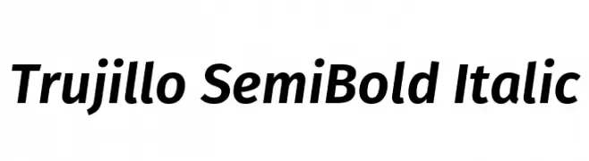
( Fonts by Fira Sans original fonts by bBox Type GmbH, Carrois Corporate GbR, & Edenspiekermann AG / Changes by Cristiano Sobral - Personal-use only. For commercial use please contact owner. )
A modern, semi-bold italic font with a sleek and dynamic style.
![Trujillo SemiBold Italic font caratteri gratis]() Scaricare 301 Downloads@WebFont
Scaricare 301 Downloads@WebFont -
( Fonts by Press Gang Studios - Andeh Pinkard - www.pressgang-studios.com )
A bold, handwritten font with a dynamic and energetic style.
![Dealspinner TBS Bold font caratteri gratis]() Scaricare 301 Downloads@WebFont
Scaricare 301 Downloads@WebFont -
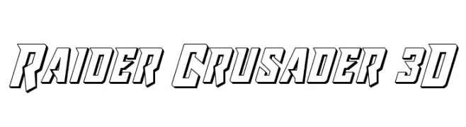
![Raider Crusader 3D font caratteri gratis]() Scaricare 301 Downloads@WebFont
Scaricare 301 Downloads@WebFont -
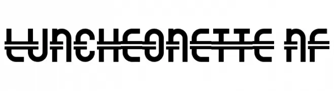
( Fonts by Nick Curtis - www.nicksfonts.com )
A bold, geometric sans-serif font with a unique horizontal line through each character.
![Luncheonette NF font caratteri gratis]() Scaricare 301 Downloads@WebFont
Scaricare 301 Downloads@WebFont -
Caratteri di antipixel. For commercial use please contact the owner.
![Presa ANTIPIXEL.COM.AR font caratteri gratis]() Scaricare 301 Downloads@WebFont
Scaricare 301 Downloads@WebFont -
( Fonts by Daniel Zadorozny - www.iconian.com )
A bold, angular italic font with a futuristic and dynamic style.
![Trans-America Italic font caratteri gratis]() Scaricare 301 Downloads@WebFont
Scaricare 301 Downloads@WebFont -
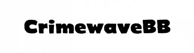
( Fonts by www.blambot.com )
A bold, rugged font with a distressed, grunge-like appearance.
![CrimewaveBB font caratteri gratis]() Scaricare 301 Downloads@WebFont
Scaricare 301 Downloads@WebFont


Quali sono i font più popolari adesso?
Poppins, Roboto, Montserrat, Open Sans e Lato sono molto usati per le forme pulite e l'ampia applicabilità — dall'identità di marca alle landing page e ai poster.
Quali font si usano spesso nei loghi?
Le sans serif geometriche (es. Poppins, famiglie in stile Gotham) sono scelte comuni per un branding pulito e scalabile. Per un tocco personale restano valide script e stili manoscritti. Abbina un display deciso per i titoli a un corpo testo neutro per riconoscibilità ed equilibrio.
Ogni quanto si aggiorna la lista?
Con regolarità, in base ai download e all'attività reale. Torna spesso per scoprire in anticipo le nuove preferite.
💡 Consiglio: aggiungi ai preferiti — le tendenze cambiano in fretta e i font top di oggi possono ispirare il rebranding di domani.