Benvenuto nelle Font Più Popolari — dove popolarità e qualità si incontrano. Qui trovi i font più scaricati e usati dell'anno. Se cerchi scelte sicure per logo, web o social, inizia da qui.
Ogni font top si distingue per equilibrio, leggibilità e versatilità. Troverai sans serif moderne, script eleganti, serif vintage e display minimalisti.
-
 Scaricare 285 Downloads@WebFont
 -
( Fonts by Mikko Sumulong )
A playful handwritten font with a casual and informal style.
![MixMiniCaps font caratteri gratis]() Scaricare 285 Downloads@WebFont
Scaricare 285 Downloads@WebFont -
( Fonts by Eko Bimantara - Personal-use only. For commercial use please contact owner. )
A bold, modern sans-serif font with clean lines and strong presence.
![CorpTrial-Bold font caratteri gratis]() Scaricare 285 Downloads@WebFont
Scaricare 285 Downloads@WebFont -
( Darrell Flood )
A playful, bold serif font with a whimsical and decorative style.
![Lovely Serifs font caratteri gratis]() Scaricare 285 Downloads@WebFont
Scaricare 285 Downloads@WebFont -
( Fonts by wep )
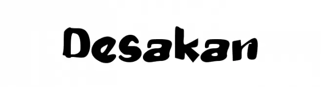
A bold, playful font with a hand-drawn, energetic style.
![Desakan font caratteri gratis]() Scaricare 285 Downloads@WebFont
Scaricare 285 Downloads@WebFont -
-
( Fonts by Steve Cloutier - www.cloutierfontes.ca )
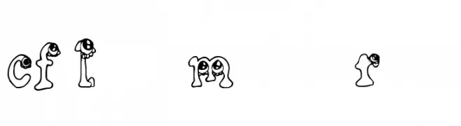
A playful font with monster-themed characters, perfect for whimsical designs.
![CF Little Monsters Regular font caratteri gratis]() Scaricare 285 Downloads@WebFont
Scaricare 285 Downloads@WebFont -
Caratteri di antipixel. For commercial use please contact the owner.
![Italo Medium Italic font caratteri gratis]() Scaricare 285 Downloads@WebFont
Scaricare 285 Downloads@WebFont -
( charmingcharlie.co.nr/ )
A thin, elegant font with a handwritten touch and consistent stroke width.
![DeterioratetheInternet font caratteri gratis]() Scaricare 285 Downloads@WebFont
Scaricare 285 Downloads@WebFont -
![Livingston Sanserif font caratteri gratis]() Scaricare 285 Downloads@WebFont
Scaricare 285 Downloads@WebFont -
( Fonts by a Jayvee Enaguas - harvettfox96.deviantart.com. Personal-use only. For commercial use please contact owner. )
A modern, geometric typeface with a clean and professional look.
![Sanitechtro Regular font caratteri gratis]() Scaricare 285 Downloads@WebFont
Scaricare 285 Downloads@WebFont -
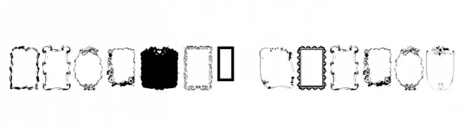
![Frames1 Normal font caratteri gratis]() Scaricare 285 Downloads@WebFont
Scaricare 285 Downloads@WebFont -
( Fonts by twinletter )
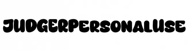
A bold, playful font with rounded edges and a bubbly appearance.
![JUDGER Personal Use font caratteri gratis]() Scaricare 285 Downloads@WebFont
Scaricare 285 Downloads@WebFont -
( Fonts by Dan P. Lyons - Personal-use only. For commercial use please contact owner. )
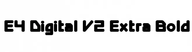
A bold, rounded font with a modern and futuristic style.
![E4 Digital V2 Extra Bold font caratteri gratis]() Scaricare 285 Downloads@WebFont
Scaricare 285 Downloads@WebFont -
![Reliant Trash font caratteri gratis]() Scaricare 285 Downloads@WebFont
Scaricare 285 Downloads@WebFont -
( ingoFonts - Ingo Zimmermann - www.ingofonts.com )
A classic serif font with elegant, Renaissance-inspired details.
![CharpentierRenaissanceDemiRe font caratteri gratis]() Scaricare 285 Downloads@WebFont
Scaricare 285 Downloads@WebFont -
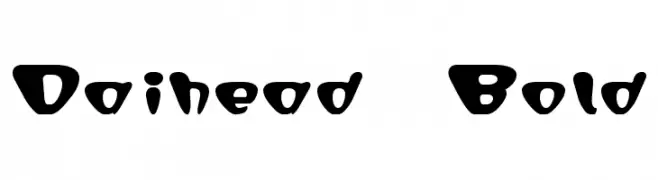
![Daihead Bold font caratteri gratis]() Scaricare 285 Downloads@WebFont
Scaricare 285 Downloads@WebFont -
( Fonts by zamjump - Ahmad Zamzami - Personal-use only. For commercial use please contact owner. )
A bold, angular font with a modern, geometric style.
![DEMARUS font caratteri gratis]() Scaricare 285 Downloads@WebFont
Scaricare 285 Downloads@WebFont -
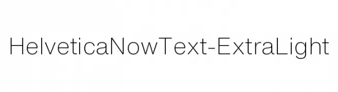
Caratteri di HammerBro101. For commercial use please contact the owner.
![HelveticaNowText-ExtraLight font caratteri gratis]() Scaricare 285 Downloads@WebFont
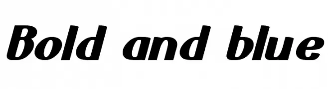
Scaricare 285 Downloads@WebFont -
![Bold and blue font caratteri gratis]() Scaricare 285 Downloads@WebFont
Scaricare 285 Downloads@WebFont -
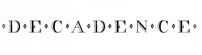
( Fonts by Emerald City Fontwerks )
An elegant and decorative font with diamond embellishments and unique numeral styling.
![decadence font caratteri gratis]() Scaricare 285 Downloads@WebFont
Scaricare 285 Downloads@WebFont -
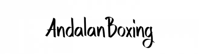
( Fonts by Studio Hello Good )
A bold, expressive font with dynamic strokes and a modern artistic style.
![Andalan Boxing font caratteri gratis]() Scaricare 285 Downloads@WebFont
Scaricare 285 Downloads@WebFont -
( Fonts by Mans Greback - www.mawns.com )
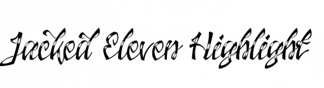
A bold, dynamic script font with high contrast and expressive strokes.
![Jacked Eleven Highlight font caratteri gratis]() Scaricare 285 Downloads@WebFont
Scaricare 285 Downloads@WebFont -
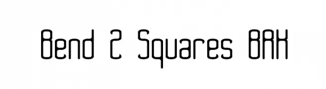
![Bend 2 Squares BRK font caratteri gratis]() Scaricare 285 Downloads@WebFont
Scaricare 285 Downloads@WebFont -
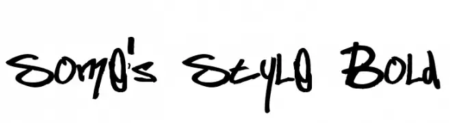
( Fonts by or from www.graffitifonts.net )
A bold, graffiti-inspired handwritten font with dynamic, expressive strokes.
![Some's Style Bold font caratteri gratis]() Scaricare 285 Downloads@WebFont
Scaricare 285 Downloads@WebFont -
( Fonts by Zefix - Personal-use only. For commercial use please contact owner. )
A bold, geometric font with sharp angles and high contrast.
![Garda font caratteri gratis]() Scaricare 285 Downloads@WebFont
Scaricare 285 Downloads@WebFont -
![Stinky font caratteri gratis]() Scaricare 285 Downloads@WebFont
Scaricare 285 Downloads@WebFont -
![caracol font caratteri gratis]() Scaricare 285 Downloads@WebFont
Scaricare 285 Downloads@WebFont -
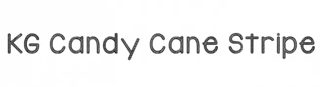
( Fonts by www.kimberlygeswein.com - Kimberly Geswein )
A playful, striped decorative font ideal for festive designs.
![KG Candy Cane Stripe font caratteri gratis]() Scaricare 285 Downloads@WebFont
Scaricare 285 Downloads@WebFont -
( Ryan Williamson )
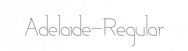
A sleek, modern font with thin, elegant lines and a geometric style.
![Adelaide-Regular font caratteri gratis]() Scaricare 285 Downloads@WebFont
Scaricare 285 Downloads@WebFont -
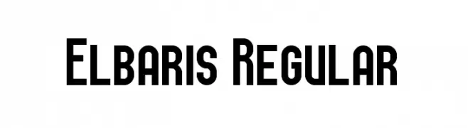
( Fonts by Peter Wiegel - www.peter-wiegel.de - Personal-use only. For commercial use please contact owner. )
A bold, geometric font with a modern and impactful design.
![Elbaris Regular font caratteri gratis]() Scaricare 285 Downloads@WebFont
Scaricare 285 Downloads@WebFont -
![Sinder Normal font caratteri gratis]() Scaricare 285 Downloads@WebFont
Scaricare 285 Downloads@WebFont -
![Drunken Calligrapher font caratteri gratis]() Scaricare 285 Downloads@WebFont
Scaricare 285 Downloads@WebFont -
( imagex - www.imagex-fonts.com )
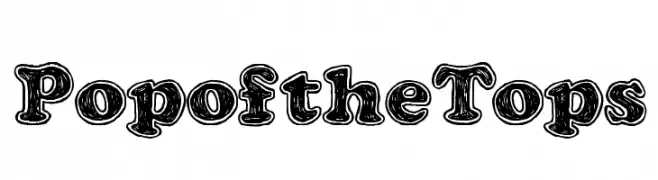
A bold, playful font with a three-dimensional, cartoonish style.
![Pop of the Tops font caratteri gratis]() Scaricare 285 Downloads@WebFont
Scaricare 285 Downloads@WebFont -
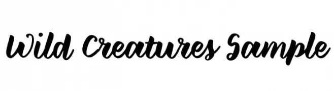
![Wild Creatures Sample font caratteri gratis]() Scaricare 285 Downloads@WebFont
Scaricare 285 Downloads@WebFont -
( Fonts by Cumberland Fontworks - Personal-use only. For commercial use please contact owner. )
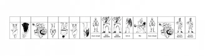
Comic-inspired, character-based decorative font with illustrated glyphs.
![SPARKS Free for All font caratteri gratis]() Scaricare 285 Downloads@WebFont
Scaricare 285 Downloads@WebFont


Quali sono i font più popolari adesso?
Poppins, Roboto, Montserrat, Open Sans e Lato sono molto usati per le forme pulite e l'ampia applicabilità — dall'identità di marca alle landing page e ai poster.
Quali font si usano spesso nei loghi?
Le sans serif geometriche (es. Poppins, famiglie in stile Gotham) sono scelte comuni per un branding pulito e scalabile. Per un tocco personale restano valide script e stili manoscritti. Abbina un display deciso per i titoli a un corpo testo neutro per riconoscibilità ed equilibrio.
Ogni quanto si aggiorna la lista?
Con regolarità, in base ai download e all'attività reale. Torna spesso per scoprire in anticipo le nuove preferite.
💡 Consiglio: aggiungi ai preferiti — le tendenze cambiano in fretta e i font top di oggi possono ispirare il rebranding di domani.