Benvenuto nelle Font Più Popolari — dove popolarità e qualità si incontrano. Qui trovi i font più scaricati e usati dell'anno. Se cerchi scelte sicure per logo, web o social, inizia da qui.
Ogni font top si distingue per equilibrio, leggibilità e versatilità. Troverai sans serif moderne, script eleganti, serif vintage e display minimalisti.
-
( Fonts by KindergartenWorks - Personal-use only. For commercial use please contact owner. )
A playful, hand-drawn font with rounded, informal characters.
 Scaricare 298 Downloads@WebFont
 -
![CROCHET PATTERN font caratteri gratis]() Scaricare 298 Downloads@WebFont
Scaricare 298 Downloads@WebFont -
( Fonts by Zetafonts - Personal-use only. For commercial use please contact owner. )
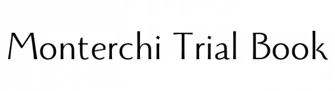
A classic serif font with elegant, thin strokes and a refined appearance.
![Monterchi Trial Book font caratteri gratis]() Scaricare 298 Downloads@WebFont
Scaricare 298 Downloads@WebFont -
( Fonts by a Neale Davidson - www.pixelsagas.com. Personal-use only. For commercial use please contact owner. )
A bold, geometric stencil-style font with a modern, industrial feel.
![Iori font caratteri gratis]() Scaricare 298 Downloads@WebFont
Scaricare 298 Downloads@WebFont -
![Wobble font caratteri gratis]() Scaricare 298 Downloads@WebFont
Scaricare 298 Downloads@WebFont -
![FLH-Font font caratteri gratis]() Scaricare 298 Downloads@WebFont
Scaricare 298 Downloads@WebFont -
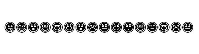
![EmoticonsOutline font caratteri gratis]() Scaricare 298 Downloads@WebFont
Scaricare 298 Downloads@WebFont -
( Syahputra - creativemarket.com/Bexxtype )
An elegant script font with flowing, cursive letters and high contrast.
![Fantastic-Italic font caratteri gratis]() Scaricare 298 Downloads@WebFont
Scaricare 298 Downloads@WebFont -
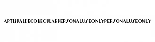
( Fonts by Mans Greback - Personal-use only. For commercial use please contact owner. )
A bold, geometric font inspired by the Art Deco era, perfect for striking visual designs.
![Artisual Deco Regular PERSONAL USE ONLY PERSONAL USE ONLY font caratteri gratis]() Scaricare 298 Downloads@WebFont
Scaricare 298 Downloads@WebFont -
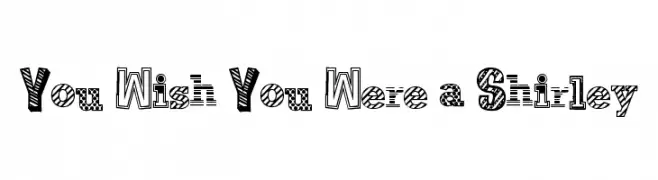
( Free for a personal use. For a commercial use please visit www.kevinandamanda.com )
A playful, textured display font with unique patterns in each letter.
![You Wish You Were a Shirley font caratteri gratis]() Scaricare 298 Downloads@WebFont
Scaricare 298 Downloads@WebFont -
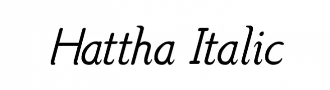
( Fonts by www.aimwell.org/Fonts/fonts.html )
An elegant italic font with smooth curves and a sophisticated style.
![Hattha Italic font caratteri gratis]() Scaricare 298 Downloads@WebFont
Scaricare 298 Downloads@WebFont -
![poo font caratteri gratis]() Scaricare 298 Downloads@WebFont
Scaricare 298 Downloads@WebFont -
( Fonts by Brian Zick - Personal-use only. For commercial use please contact owner. )
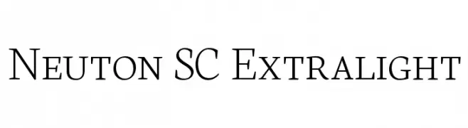
A refined serif typeface with thin strokes and a modern elegance.
![Neuton SC Extralight font caratteri gratis]() Scaricare 298 Downloads@WebFont
Scaricare 298 Downloads@WebFont -
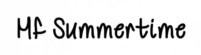
![Mf Summertime font caratteri gratis]() Scaricare 298 Downloads@WebFont
Scaricare 298 Downloads@WebFont -
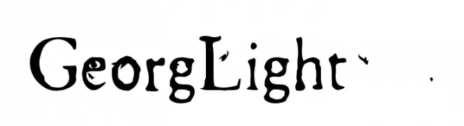
![GeorgLight font caratteri gratis]() Scaricare 298 Downloads@WebFont
Scaricare 298 Downloads@WebFont -
![NOCTURNAL-EXPERIENCE font caratteri gratis]() Scaricare 298 Downloads@WebFont
Scaricare 298 Downloads@WebFont -
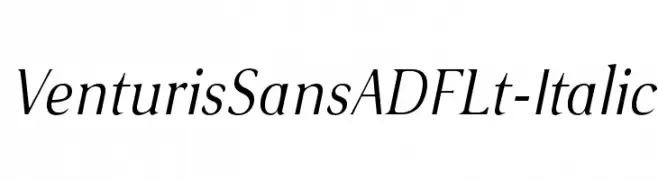
( Fonts by Arkandis Digital Foundry )
A refined italic font with smooth curves and moderate contrast.
![VenturisSansADFLt-Italic font caratteri gratis]() Scaricare 298 Downloads@WebFont
Scaricare 298 Downloads@WebFont -
( Fonts by www.aenigmafonts.com )
A decorative, textured font with a chaotic, artistic style.
![Spastic BRK font caratteri gratis]() Scaricare 298 Downloads@WebFont
Scaricare 298 Downloads@WebFont -
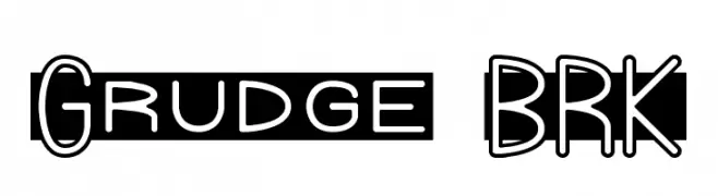
( Fonts by AEnigma - www.aenigmafonts.com )
A bold, playful font with outlined characters and a unique, eye-catching style.
![Grudge BRK font caratteri gratis]() Scaricare 298 Downloads@WebFont
Scaricare 298 Downloads@WebFont -
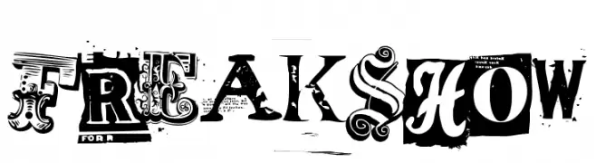
( Fonts by Sharkshock )
A bold, eclectic display typeface inspired by vintage circus posters.
![Freakshow font caratteri gratis]() Scaricare 298 Downloads@WebFont
Scaricare 298 Downloads@WebFont -
( Fonts by Daniel Zadorozny - www.iconian.com )
A bold, semi-italic font with sharp angles and a modern, dynamic style.
![Bummer Semi-Italic font caratteri gratis]() Scaricare 298 Downloads@WebFont
Scaricare 298 Downloads@WebFont -
![Klander font caratteri gratis]() Scaricare 298 Downloads@WebFont
Scaricare 298 Downloads@WebFont -
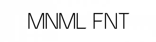
( Fonts by MuraKnockout Media + Design - muraknockout.com. Personal-use only. For commercial use please contact owner. )
A minimalist, geometric font with clean lines and a modern aesthetic.
![MNML FNT font caratteri gratis]() Scaricare 298 Downloads@WebFont
Scaricare 298 Downloads@WebFont -
![SF Eccentric Opus Bold Oblique font caratteri gratis]() Scaricare 298 Downloads@WebFont
Scaricare 298 Downloads@WebFont -
( Fonts by Ben Kohan )
A futuristic, geometric font with clean lines and angular shapes.
![Ides of Jade Regular font caratteri gratis]() Scaricare 298 Downloads@WebFont
Scaricare 298 Downloads@WebFont -
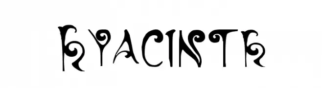
![Hyacinth font caratteri gratis]() Scaricare 298 Downloads@WebFont
Scaricare 298 Downloads@WebFont -
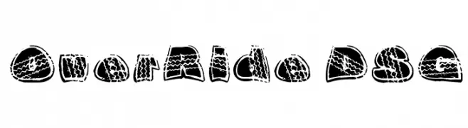
![OverRide DSG font caratteri gratis]() Scaricare 298 Downloads@WebFont
Scaricare 298 Downloads@WebFont -
( Fonts by Daniel Zadorozny - www.iconian.com )
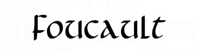
A bold, blackletter font with angular strokes and medieval flair.
![Foucault font caratteri gratis]() Scaricare 297 Downloads@WebFont
Scaricare 297 Downloads@WebFont -
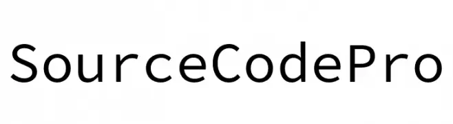
( Fonts by Adobe )
A clean, modern monospaced font ideal for coding.
![Source Code Pro font caratteri gratis]() Scaricare 297 Downloads@WebFont
Scaricare 297 Downloads@WebFont -
![Mastermind font caratteri gratis]() Scaricare 297 Downloads@WebFont
Scaricare 297 Downloads@WebFont -
( Fonts by Marc Beekhuis - www.beekhuis.ch )
A futuristic, geometric font with circular and semi-circular shapes.
![radion font caratteri gratis]() Scaricare 297 Downloads@WebFont
Scaricare 297 Downloads@WebFont -
( Fonts by Hanoded )
A playful, hand-drawn font with a whimsical and friendly style.
![Mayblossom DEMO Regular font caratteri gratis]() Scaricare 297 Downloads@WebFont
Scaricare 297 Downloads@WebFont -
( Fonts by Chris Simpkins )
A modern, oblique font with clean lines and a slightly condensed style.
![Hack Oblique font caratteri gratis]() Scaricare 297 Downloads@WebFont
Scaricare 297 Downloads@WebFont -
( Fonts by Docallisme HAS Feat Dutsky )
A bold, rounded, and playful font with a chunky appearance.
![TIGERYEN font caratteri gratis]() Scaricare 297 Downloads@WebFont
Scaricare 297 Downloads@WebFont -
![Denial2Regular font caratteri gratis]() Scaricare 297 Downloads@WebFont
Scaricare 297 Downloads@WebFont


Quali sono i font più popolari adesso?
Poppins, Roboto, Montserrat, Open Sans e Lato sono molto usati per le forme pulite e l'ampia applicabilità — dall'identità di marca alle landing page e ai poster.
Quali font si usano spesso nei loghi?
Le sans serif geometriche (es. Poppins, famiglie in stile Gotham) sono scelte comuni per un branding pulito e scalabile. Per un tocco personale restano valide script e stili manoscritti. Abbina un display deciso per i titoli a un corpo testo neutro per riconoscibilità ed equilibrio.
Ogni quanto si aggiorna la lista?
Con regolarità, in base ai download e all'attività reale. Torna spesso per scoprire in anticipo le nuove preferite.
💡 Consiglio: aggiungi ai preferiti — le tendenze cambiano in fretta e i font top di oggi possono ispirare il rebranding di domani.