Benvenuto nelle Font Più Popolari — dove popolarità e qualità si incontrano. Qui trovi i font più scaricati e usati dell'anno. Se cerchi scelte sicure per logo, web o social, inizia da qui.
Ogni font top si distingue per equilibrio, leggibilità e versatilità. Troverai sans serif moderne, script eleganti, serif vintage e display minimalisti.
-
( Fonts by www.gliphmaker.com. Personal-use only. For commercial use please contact owner. )
A bold, decorative font with a vintage, three-dimensional style.
 Scaricare 296 Downloads@WebFont
 -
( www.judzign.com/ )
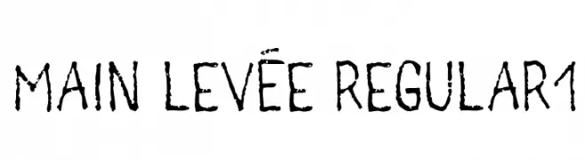
A rugged, hand-drawn font with a textured, organic appearance.
![main levée regular1 font caratteri gratis]() Scaricare 296 Downloads@WebFont
Scaricare 296 Downloads@WebFont -
( Fonts by www.movefont .com - Personal-use only. For commercial use please contact owner. )
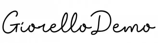
A flowing, cursive script font with a handwritten, elegant style.
![Giorello Demo font caratteri gratis]() Scaricare 296 Downloads@WebFont
Scaricare 296 Downloads@WebFont -
( Fonts by Graham Meade - GemFonts )
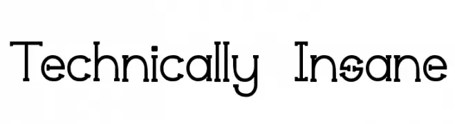
A modern geometric font with clean lines and circular forms.
![Technically Insane font caratteri gratis]() Scaricare 296 Downloads@WebFont
Scaricare 296 Downloads@WebFont -
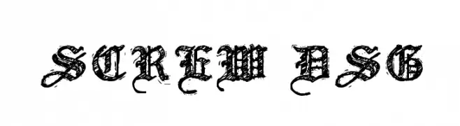
![Screw DSG font caratteri gratis]() Scaricare 296 Downloads@WebFont
Scaricare 296 Downloads@WebFont -
( Fonts by Toko Laris Djaja )
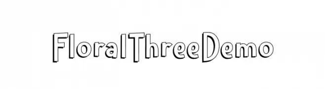
A playful, decorative font with a three-dimensional effect and bold outlines.
![Floral Three Demo font caratteri gratis]() Scaricare 296 Downloads@WebFont
Scaricare 296 Downloads@WebFont -
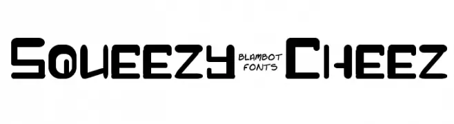
![Squeezy-Cheez font caratteri gratis]() Scaricare 296 Downloads@WebFont
Scaricare 296 Downloads@WebFont -
![LJ Studios MonitorIS MAYUS/Minus font caratteri gratis]() Scaricare 296 Downloads@WebFont
Scaricare 296 Downloads@WebFont -
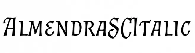
( Fonts by Ana Sanfelippo )
An elegant, italic serif font with a classic, calligraphic style.
![Almendra SC Italic font caratteri gratis]() Scaricare 296 Downloads@WebFont
Scaricare 296 Downloads@WebFont -
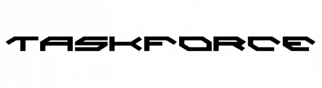
( Fonts by Daniel Zadorozny - www.iconian.com - Free for personal use )
A futuristic, angular font with sharp edges and geometric shapes.
![Taskforce font caratteri gratis]() Scaricare 296 Downloads@WebFont
Scaricare 296 Downloads@WebFont -
![FontCo Fences font caratteri gratis]() Scaricare 296 Downloads@WebFont
Scaricare 296 Downloads@WebFont -
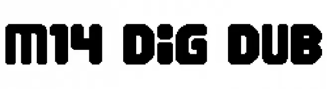
( Fonts by Miffies - mfs.jp.org - Personal-use only. For commercial use please contact owner. )
A bold, geometric font with a digital, pixelated style.
![M14_DIG DUB font caratteri gratis]() Scaricare 296 Downloads@WebFont
Scaricare 296 Downloads@WebFont -
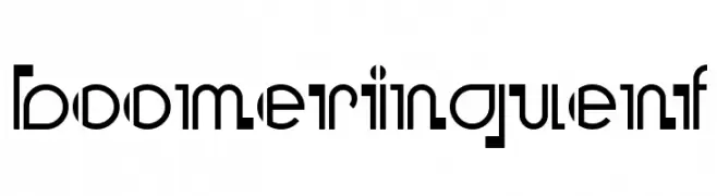
( Fonts by Nick Curtis - www.nicksfonts.com )
A bold, geometric font with sharp angles and smooth curves for a modern look.
![BooMeringueNF font caratteri gratis]() Scaricare 296 Downloads@WebFont
Scaricare 296 Downloads@WebFont -
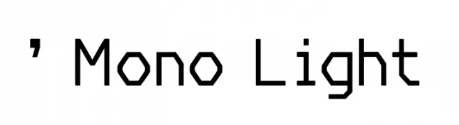
( Fonts by Rony Setya Siswadi )
A modern, monospaced font with consistent stroke weight and geometric design.
![' Mono Light font caratteri gratis]() Scaricare 296 Downloads@WebFont
Scaricare 296 Downloads@WebFont -
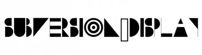
( www.danielmcshee.co.uk )
A bold, geometric display font with high contrast and abstract shapes.
![Subversion-Display font caratteri gratis]() Scaricare 296 Downloads@WebFont
Scaricare 296 Downloads@WebFont -
( Fonts by a Neale Davidson - www.pixelsagas.com. Personal-use only. For commercial use please contact owner. )
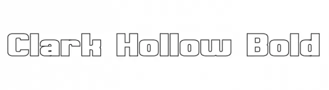
A bold, hollow, geometric font with a uniform and structured appearance.
![Clark Hollow Bold font caratteri gratis]() Scaricare 296 Downloads@WebFont
Scaricare 296 Downloads@WebFont -
( Fonts by Ikrar Bey Khubaib - Personal-use only. For commercial use please contact owner. )
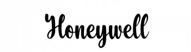
A bold and expressive script font with flowing letterforms.
![Honeywell font caratteri gratis]() Scaricare 296 Downloads@WebFont
Scaricare 296 Downloads@WebFont -
( fizzeticatypefoundry.tumblr.com )
A decorative font with floral and swirl embellishments.
![FTF Minthee Limo font caratteri gratis]() Scaricare 296 Downloads@WebFont
Scaricare 296 Downloads@WebFont -
( Fonts by Apostrophic Lab )
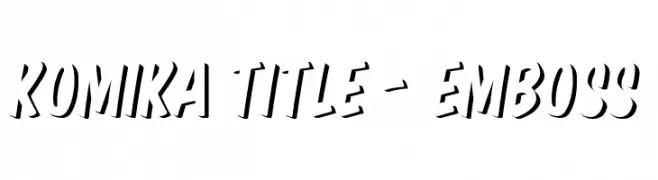
A bold, embossed font with a dynamic, three-dimensional effect.
![Komika Title - Emboss font caratteri gratis]() Scaricare 296 Downloads@WebFont
Scaricare 296 Downloads@WebFont -
( Fonts by or from www.graffitifonts.net )
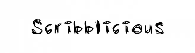
A chaotic, hand-drawn font with a scribbled, graffiti-like style.
![Scribblicious font caratteri gratis]() Scaricare 296 Downloads@WebFont
Scaricare 296 Downloads@WebFont -
( blue studio09 )
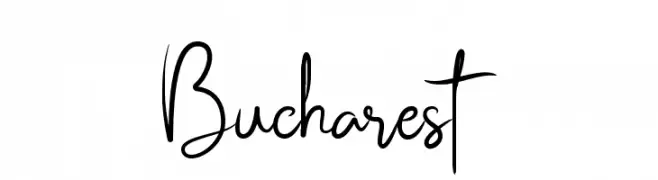
A flowing, elegant cursive font with graceful loops and smooth connections.
![Bucharest font caratteri gratis]() Scaricare 296 Downloads@WebFont
Scaricare 296 Downloads@WebFont -
( Fonts by Zarma Type Foundry )
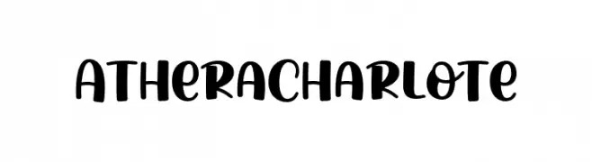
A bold, playful script font with smooth curves and thick strokes.
![AtheraCharlote font caratteri gratis]() Scaricare 296 Downloads@WebFont
Scaricare 296 Downloads@WebFont -
( Fonts by Docallisme HAS - Ryal - docallisme.blogspot.com - Personal-use only. For commercial use please contact owner. )
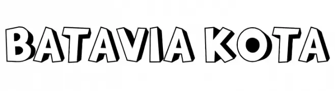
A bold, three-dimensional font with a playful, comic book style.
![BATAVIA KOTA font caratteri gratis]() Scaricare 296 Downloads@WebFont
Scaricare 296 Downloads@WebFont -
( Fonts by Scott Dieznyik - Kejak (formerly Cheops) )
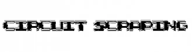
A glitch-inspired font with bold, distorted characters and a digital aesthetic.
![Circuit Scraping font caratteri gratis]() Scaricare 296 Downloads@WebFont
Scaricare 296 Downloads@WebFont -
( Darrell Flood )
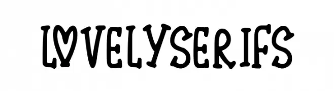
A playful, bold serif font with a whimsical and decorative style.
![Lovely Serifs font caratteri gratis]() Scaricare 296 Downloads@WebFont
Scaricare 296 Downloads@WebFont -
( Fonts by Daniel Zadorozny - www.iconian.com - Free for personal use )
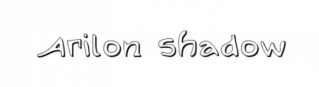
A playful, shadowed font with rounded edges and a whimsical style.
![Arilon Shadow font caratteri gratis]() Scaricare 296 Downloads@WebFont
Scaricare 296 Downloads@WebFont -
( Fonts by Font People - Personal-use only. For commercial use please contact owner. )
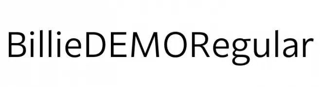
A clean, modern sans-serif font with balanced proportions and excellent readability.
![Billie DEMO Regular font caratteri gratis]() Scaricare 296 Downloads@WebFont
Scaricare 296 Downloads@WebFont -
( Fonts by Letterara )
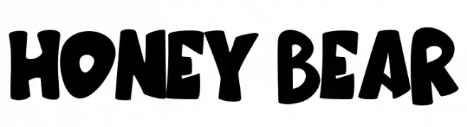
A bold, playful font with rounded, hand-drawn characters.
![Honey Bear font caratteri gratis]() Scaricare 296 Downloads@WebFont
Scaricare 296 Downloads@WebFont -
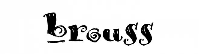
( Fonts by François Bruel )
A bold, hand-drawn font with an expressive and artistic style.
![Brouss font caratteri gratis]() Scaricare 296 Downloads@WebFont
Scaricare 296 Downloads@WebFont -
( Fonts by Woodcutter )
A bold, dotted font with a textured, pixelated appearance.
![Simple Myopia font caratteri gratis]() Scaricare 296 Downloads@WebFont
Scaricare 296 Downloads@WebFont -
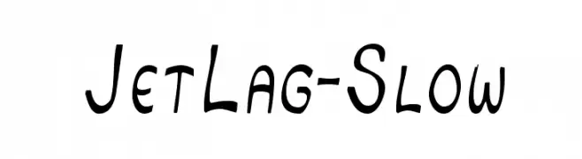
![JetLag-Slow font caratteri gratis]() Scaricare 296 Downloads@WebFont
Scaricare 296 Downloads@WebFont -
( Iconian Fonts - Daniel Zadorozny - www.iconian.com )
A bold, futuristic font with geometric shapes and sharp angles.
![Starduster font caratteri gratis]() Scaricare 296 Downloads@WebFont
Scaricare 296 Downloads@WebFont -
![Suwa font caratteri gratis]() Scaricare 296 Downloads@WebFont
Scaricare 296 Downloads@WebFont -
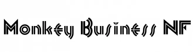
( Fonts by Nick Curtis - www.nicksfonts.com )
A bold, geometric font with Art Deco influences and high contrast.
![Monkey Business NF font caratteri gratis]() Scaricare 296 Downloads@WebFont
Scaricare 296 Downloads@WebFont -
( Fonts by Manfred Klein - manfred-klein.ina-mar.com )
An ornate, framed blackletter style font with intricate detailing.
![FramedFraxCaps font caratteri gratis]() Scaricare 296 Downloads@WebFont
Scaricare 296 Downloads@WebFont


Quali sono i font più popolari adesso?
Poppins, Roboto, Montserrat, Open Sans e Lato sono molto usati per le forme pulite e l'ampia applicabilità — dall'identità di marca alle landing page e ai poster.
Quali font si usano spesso nei loghi?
Le sans serif geometriche (es. Poppins, famiglie in stile Gotham) sono scelte comuni per un branding pulito e scalabile. Per un tocco personale restano valide script e stili manoscritti. Abbina un display deciso per i titoli a un corpo testo neutro per riconoscibilità ed equilibrio.
Ogni quanto si aggiorna la lista?
Con regolarità, in base ai download e all'attività reale. Torna spesso per scoprire in anticipo le nuove preferite.
💡 Consiglio: aggiungi ai preferiti — le tendenze cambiano in fretta e i font top di oggi possono ispirare il rebranding di domani.