Benvenuto nelle Font Più Popolari — dove popolarità e qualità si incontrano. Qui trovi i font più scaricati e usati dell'anno. Se cerchi scelte sicure per logo, web o social, inizia da qui.
Ogni font top si distingue per equilibrio, leggibilità e versatilità. Troverai sans serif moderne, script eleganti, serif vintage e display minimalisti.
-
 Scaricare 297 Downloads@WebFont
 -
( Fonts by Steve Cloutier - www.cloutierfontes.ca )
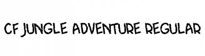
A bold, rugged font with a hand-drawn, adventurous style.
![CF Jungle Adventure Regular font caratteri gratis]() Scaricare 297 Downloads@WebFont
Scaricare 297 Downloads@WebFont -
( Fonts by Khurasan )
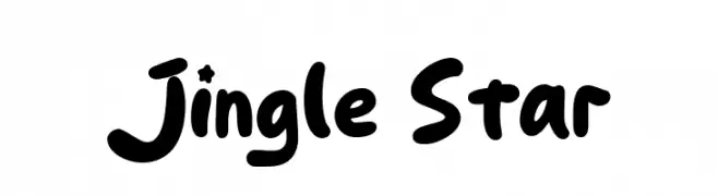
A playful, bold, and rounded font with a hand-drawn, whimsical style.
![Jingle Star font caratteri gratis]() Scaricare 297 Downloads@WebFont
Scaricare 297 Downloads@WebFont -
( Fonts by Des Gomez )
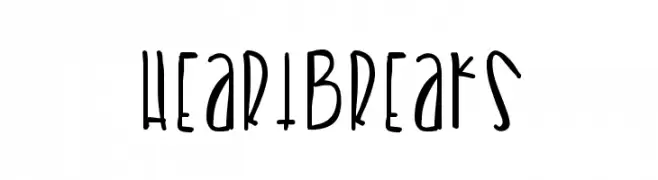
A playful, hand-drawn font with elongated, irregular strokes and a whimsical style.
![Heartbreaks font caratteri gratis]() Scaricare 297 Downloads@WebFont
Scaricare 297 Downloads@WebFont -
( Fonts by Laura Chen )
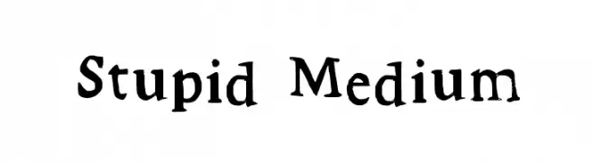
A playful, hand-drawn serif font with quirky, irregular strokes.
![Stupid Medium font caratteri gratis]() Scaricare 297 Downloads@WebFont
Scaricare 297 Downloads@WebFont -
( Fonts by Misti`s Fonts - mistifonts.com - Personal-use only. For commercial use please contact owner. )
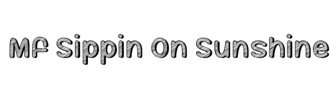
A bold, hand-drawn font with a textured, sketch-like pattern and rounded edges.
![Mf Sippin On Sunshine font caratteri gratis]() Scaricare 297 Downloads@WebFont
Scaricare 297 Downloads@WebFont -
( Free for a personal use. For a commercial use please visit www.kevinandamanda.com )
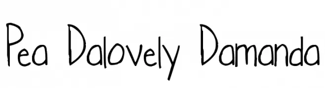
A playful, casual handwritten font with irregular strokes and a whimsical appearance.
![Pea Dalovely Damanda font caratteri gratis]() Scaricare 297 Downloads@WebFont
Scaricare 297 Downloads@WebFont -
( Konstantine Studio - konstantinestudio.com/ )
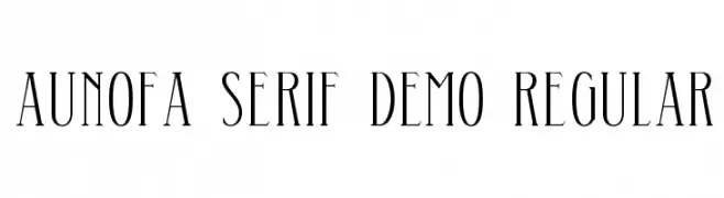
An elegant serif font with tall, slender letterforms and sharp serifs.
![Aunofa Serif DEMO Regular font caratteri gratis]() Scaricare 297 Downloads@WebFont
Scaricare 297 Downloads@WebFont -
( Fonts by www.studiotypo.com - Personal-use only. For commercial use please contact owner. )
A bold, distressed font with an eroded, vintage look.
![Bluefish ERODED DEMO font caratteri gratis]() Scaricare 297 Downloads@WebFont
Scaricare 297 Downloads@WebFont -
![Namaskar Regular font caratteri gratis]() Scaricare 297 Downloads@WebFont
Scaricare 297 Downloads@WebFont -
( Fonts by Hendrick Rolandez - www.moinzek.com - Personal-use only. For commercial use please contact owner. )
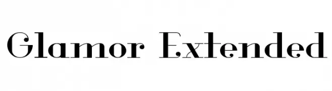
A high-contrast, elegant serif font with pronounced serifs and stylish numerals.
![Glamor Extended font caratteri gratis]() Scaricare 297 Downloads@WebFont
Scaricare 297 Downloads@WebFont -
( Fonts by Timur Type )
A lively and dynamic handwritten font with fluid strokes.
![Justica font caratteri gratis]() Scaricare 297 Downloads@WebFont
Scaricare 297 Downloads@WebFont -
( www.judzign.com/ )
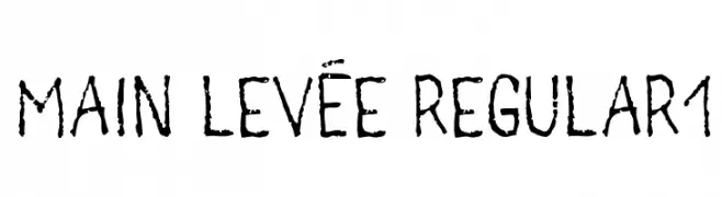
A rugged, hand-drawn font with a textured, organic appearance.
![main levée regular1 font caratteri gratis]() Scaricare 296 Downloads@WebFont
Scaricare 296 Downloads@WebFont -
( Fonts by Christiaan van Wyk - Personal-use only. For commercial use please contact owner. )
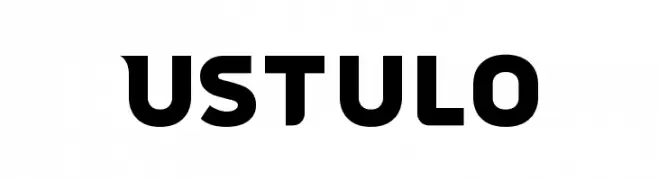
A bold, geometric font with strong, consistent letterforms.
![Ustulo font caratteri gratis]() Scaricare 296 Downloads@WebFont
Scaricare 296 Downloads@WebFont -
( Fonts by Jen Jones )
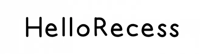
A playful, rounded font with smooth curves and a friendly appearance.
![HelloRecess font caratteri gratis]() Scaricare 296 Downloads@WebFont
Scaricare 296 Downloads@WebFont -
( Fonts by www.movefont .com - Personal-use only. For commercial use please contact owner. )
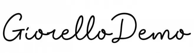
A flowing, cursive script font with a handwritten, elegant style.
![Giorello Demo font caratteri gratis]() Scaricare 296 Downloads@WebFont
Scaricare 296 Downloads@WebFont -
( Fonts by Graham Meade - GemFonts )
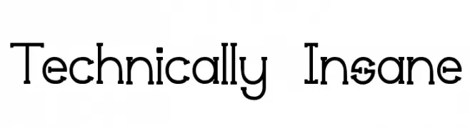
A modern geometric font with clean lines and circular forms.
![Technically Insane font caratteri gratis]() Scaricare 296 Downloads@WebFont
Scaricare 296 Downloads@WebFont -
( Fonts by Daniel Zadorozny - www.iconian.com )
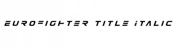
A sleek, italicized font with a futuristic and dynamic design.
![Eurofighter Title Italic font caratteri gratis]() Scaricare 296 Downloads@WebFont
Scaricare 296 Downloads@WebFont -
![Screw DSG font caratteri gratis]() Scaricare 296 Downloads@WebFont
Scaricare 296 Downloads@WebFont -
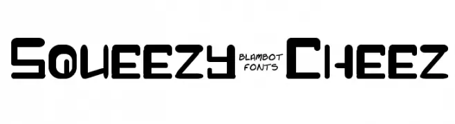
![Squeezy-Cheez font caratteri gratis]() Scaricare 296 Downloads@WebFont
Scaricare 296 Downloads@WebFont -
( Fonts by Daniel Zadorozny - www.iconian.com - Free for personal use )
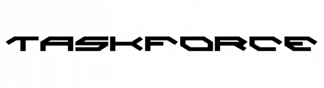
A futuristic, angular font with sharp edges and geometric shapes.
![Taskforce font caratteri gratis]() Scaricare 296 Downloads@WebFont
Scaricare 296 Downloads@WebFont -
![FontCo Fences font caratteri gratis]() Scaricare 296 Downloads@WebFont
Scaricare 296 Downloads@WebFont -
( Fonts by Rony Setya Siswadi )
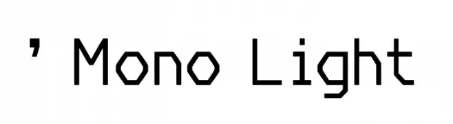
A modern, monospaced font with consistent stroke weight and geometric design.
![' Mono Light font caratteri gratis]() Scaricare 296 Downloads@WebFont
Scaricare 296 Downloads@WebFont -
( www.danielmcshee.co.uk )
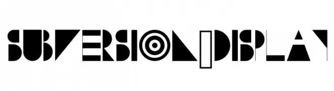
A bold, geometric display font with high contrast and abstract shapes.
![Subversion-Display font caratteri gratis]() Scaricare 296 Downloads@WebFont
Scaricare 296 Downloads@WebFont -
( These fonts are free to use in any private, recreational manner.For commercial go to www.flopdesign.com/fordesign/font.html )
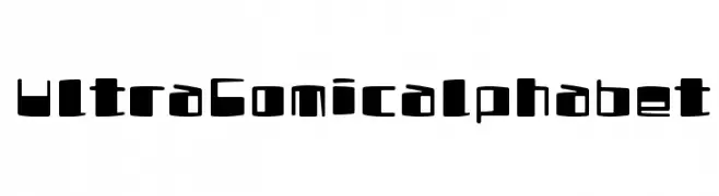
A playful, bold font with a cartoonish, hand-drawn style.
![UltraComicalphabet font caratteri gratis]() Scaricare 296 Downloads@WebFont
Scaricare 296 Downloads@WebFont -
( Fonts by Ikrar Bey Khubaib - Personal-use only. For commercial use please contact owner. )
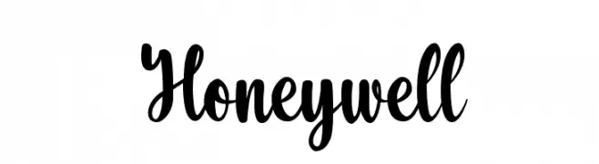
A bold and expressive script font with flowing letterforms.
![Honeywell font caratteri gratis]() Scaricare 296 Downloads@WebFont
Scaricare 296 Downloads@WebFont -
( fizzeticatypefoundry.tumblr.com )
A decorative font with floral and swirl embellishments.
![FTF Minthee Limo font caratteri gratis]() Scaricare 296 Downloads@WebFont
Scaricare 296 Downloads@WebFont -
( Fonts by Apostrophic Lab )
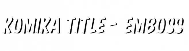
A bold, embossed font with a dynamic, three-dimensional effect.
![Komika Title - Emboss font caratteri gratis]() Scaricare 296 Downloads@WebFont
Scaricare 296 Downloads@WebFont -
( blue studio09 )
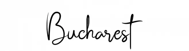
A flowing, elegant cursive font with graceful loops and smooth connections.
![Bucharest font caratteri gratis]() Scaricare 296 Downloads@WebFont
Scaricare 296 Downloads@WebFont -
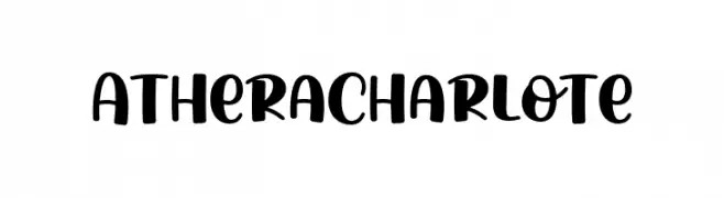
( Fonts by Zarma Type Foundry )
A bold, playful script font with smooth curves and thick strokes.
![AtheraCharlote font caratteri gratis]() Scaricare 296 Downloads@WebFont
Scaricare 296 Downloads@WebFont -
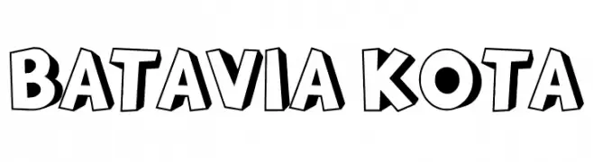
( Fonts by Docallisme HAS - Ryal - docallisme.blogspot.com - Personal-use only. For commercial use please contact owner. )
A bold, three-dimensional font with a playful, comic book style.
![BATAVIA KOTA font caratteri gratis]() Scaricare 296 Downloads@WebFont
Scaricare 296 Downloads@WebFont -
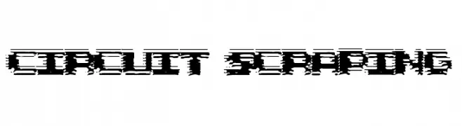
( Fonts by Scott Dieznyik - Kejak (formerly Cheops) )
A glitch-inspired font with bold, distorted characters and a digital aesthetic.
![Circuit Scraping font caratteri gratis]() Scaricare 296 Downloads@WebFont
Scaricare 296 Downloads@WebFont -
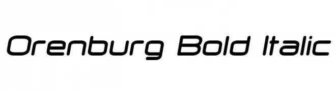
( Fonts by Vladimir Nikolic - https://www.creativefabrica.com/product/educated-deers/ref/144265/ - Personal-use only. For commercial use please contact owner. )
A sleek, modern bold italic font with rounded edges and smooth curves.
![Orenburg Bold Italic font caratteri gratis]() Scaricare 296 Downloads@WebFont
Scaricare 296 Downloads@WebFont -
( Darrell Flood )
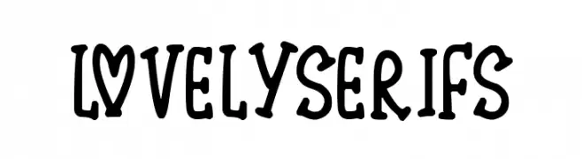
A playful, bold serif font with a whimsical and decorative style.
![Lovely Serifs font caratteri gratis]() Scaricare 296 Downloads@WebFont
Scaricare 296 Downloads@WebFont -
( Fonts by Daniel Zadorozny - www.iconian.com - Free for personal use )
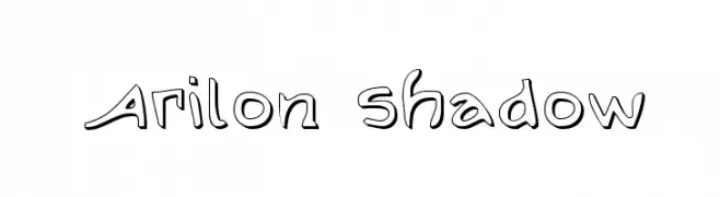
A playful, shadowed font with rounded edges and a whimsical style.
![Arilon Shadow font caratteri gratis]() Scaricare 296 Downloads@WebFont
Scaricare 296 Downloads@WebFont


Quali sono i font più popolari adesso?
Poppins, Roboto, Montserrat, Open Sans e Lato sono molto usati per le forme pulite e l'ampia applicabilità — dall'identità di marca alle landing page e ai poster.
Quali font si usano spesso nei loghi?
Le sans serif geometriche (es. Poppins, famiglie in stile Gotham) sono scelte comuni per un branding pulito e scalabile. Per un tocco personale restano valide script e stili manoscritti. Abbina un display deciso per i titoli a un corpo testo neutro per riconoscibilità ed equilibrio.
Ogni quanto si aggiorna la lista?
Con regolarità, in base ai download e all'attività reale. Torna spesso per scoprire in anticipo le nuove preferite.
💡 Consiglio: aggiungi ai preferiti — le tendenze cambiano in fretta e i font top di oggi possono ispirare il rebranding di domani.