Benvenuto nelle Font Più Popolari — dove popolarità e qualità si incontrano. Qui trovi i font più scaricati e usati dell'anno. Se cerchi scelte sicure per logo, web o social, inizia da qui.
Ogni font top si distingue per equilibrio, leggibilità e versatilità. Troverai sans serif moderne, script eleganti, serif vintage e display minimalisti.
-
( Fonts by www.kimberlygeswein.com - Kimberly Geswein )
A playful, casual handwritten font with smooth curves and consistent stroke width.
 Scaricare 295 Downloads@WebFont
 -
( Font by Jayvee D. Enaguas - grandchaos9000.deviantart.com )
A bold, cartoonish font with wacky, hand-drawn characters.
![Cartoonic Massive Wacky font caratteri gratis]() Scaricare 295 Downloads@WebFont
Scaricare 295 Downloads@WebFont -
( Fonts by FreshtypeINK )
Decorative script font with flowing cursive style.
![Blackids font caratteri gratis]() Scaricare 295 Downloads@WebFont
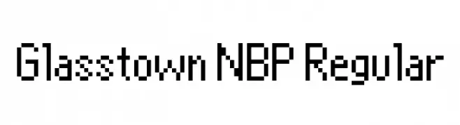
Scaricare 295 Downloads@WebFont -
![Glasstown NBP Regular font caratteri gratis]() Scaricare 295 Downloads@WebFont
Scaricare 295 Downloads@WebFont -
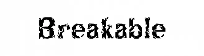
( www.facebook.com/Wonderful.Indonesia )
A jagged, shattered glass-style font with sharp, angular fragments.
![Breakable font caratteri gratis]() Scaricare 295 Downloads@WebFont
Scaricare 295 Downloads@WebFont -
![UltraLine font caratteri gratis]() Scaricare 295 Downloads
Scaricare 295 Downloads -
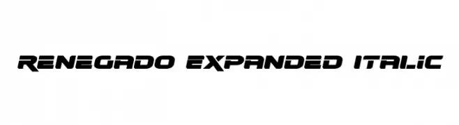
( Fonts by Daniel Zadorozny - www.iconian.com - Free for personal use )
A bold, expanded, and italicized font with a futuristic and dynamic style.
![Renegado Expanded Italic font caratteri gratis]() Scaricare 295 Downloads@WebFont
Scaricare 295 Downloads@WebFont -
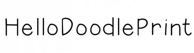
( Fonts by Jen Jones )
A playful, handwritten font with a casual and friendly style.
![HelloDoodlePrint font caratteri gratis]() Scaricare 295 Downloads@WebFont
Scaricare 295 Downloads@WebFont -
( Fonts by Alex Tomlinson - Skyhaven Fonts - shfonts.com )
A bold, hand-painted style font with expressive, uneven strokes.
![RubyGlow-Regular font caratteri gratis]() Scaricare 295 Downloads@WebFont
Scaricare 295 Downloads@WebFont -
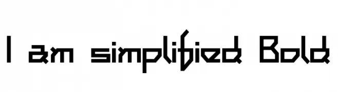
( Fonts by Levi Halmos )
A bold, geometric font with sharp angles and a futuristic style.
![I am simplified Bold font caratteri gratis]() Scaricare 295 Downloads@WebFont
Scaricare 295 Downloads@WebFont -
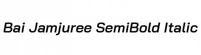
( Copyright 2018 Bai Jamjuree (https://github.com/cadsondemak/Bai-Jamjuree) )
A modern, semi-bold italic sans-serif font with smooth strokes and medium contrast.
![Bai Jamjuree SemiBold Italic font caratteri gratis]() Scaricare 295 Downloads@WebFont
Scaricare 295 Downloads@WebFont -
( Fonts by Yadhie Setiawan - typelinestudio.com - Personal-use only. For commercial use please contact owner. )
A charming and elegant script font with fluid, cursive strokes.
![wisteria font caratteri gratis]() Scaricare 295 Downloads@WebFont
Scaricare 295 Downloads@WebFont -
![Floral 2 font caratteri gratis]() Scaricare 295 Downloads@WebFont
Scaricare 295 Downloads@WebFont -
( Fonts by www.aenigmafonts.com )
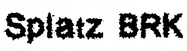
A bold, jagged font with an ink-splatter effect, perfect for creative projects.
![Splatz BRK font caratteri gratis]() Scaricare 295 Downloads@WebFont
Scaricare 295 Downloads@WebFont -
( Fonts by www.omniglot.com )
A decorative, geometric font inspired by fictional runes, ideal for fantasy themes.
![Hylian font caratteri gratis]() Scaricare 295 Downloads@WebFont
Scaricare 295 Downloads@WebFont -
( Fonts by Rantau Type - rantaustudio.com - Personal-use only. For commercial use please contact owner. )
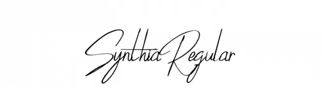
A fluid and elegant handwritten script with thin, consistent strokes.
![SynthiaRegular font caratteri gratis]() Scaricare 295 Downloads@WebFont
Scaricare 295 Downloads@WebFont -
( Fonts by a Des Gomez. Personal-use only. For commercial use please contact owner. )
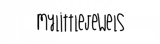
A playful, handwritten font with a casual and friendly style.
![MyLittleJewels font caratteri gratis]() Scaricare 295 Downloads@WebFont
Scaricare 295 Downloads@WebFont -
![MaiersNr8-Halbfett font caratteri gratis]() Scaricare 295 Downloads@WebFont
Scaricare 295 Downloads@WebFont -
( www.leodsen.com )
A bold, distressed font with a vintage, hand-crafted appearance.
![Fish font caratteri gratis]() Scaricare 295 Downloads@WebFont
Scaricare 295 Downloads@WebFont -
![Vintage Decorative Signs 8 font caratteri gratis]() Scaricare 295 Downloads@WebFont
Scaricare 295 Downloads@WebFont -
![HisHand font caratteri gratis]() Scaricare 295 Downloads@WebFont
Scaricare 295 Downloads@WebFont -
( Woodcutter - woodcutter Manero - www.woodcutter.es )
A bold, distressed font with a vintage, grunge aesthetic.
![Jodido&Noble font caratteri gratis]() Scaricare 295 Downloads@WebFont
Scaricare 295 Downloads@WebFont -
( Fonts by Daniel Zadorozny - www.iconian.com - Free for personal use )
A bold, geometric font with tall, narrow characters and sharp angles.
![Hawkmoon Regular font caratteri gratis]() Scaricare 295 Downloads@WebFont
Scaricare 295 Downloads@WebFont -
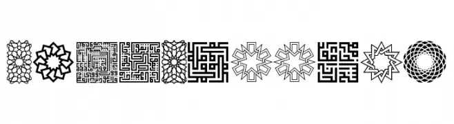
( Fonts by Peter Wiegel - www.peter-wiegel.de - Personal-use only. For commercial use please contact owner. )
Ornamental geometric font with Islamic art influences.
![KufiPattern font caratteri gratis]() Scaricare 295 Downloads@WebFont
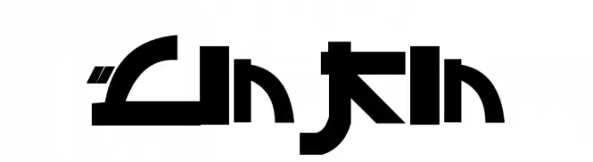
Scaricare 295 Downloads@WebFont -
![Linkin font caratteri gratis]() Scaricare 295 Downloads@WebFont
Scaricare 295 Downloads@WebFont -
![Rogeer Regular font caratteri gratis]() Scaricare 295 Downloads@WebFont
Scaricare 295 Downloads@WebFont -
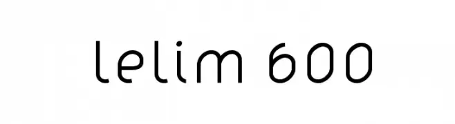
( Fonts by www.artill.de - Lukas Bischoff )
A modern, geometric sans-serif font with uniform stroke width and clean lines.
![lelim 600 font caratteri gratis]() Scaricare 295 Downloads@WebFont
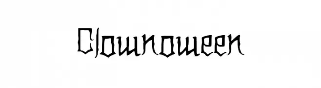
Scaricare 295 Downloads@WebFont -
![Clownoween font caratteri gratis]() Scaricare 295 Downloads@WebFont
Scaricare 295 Downloads@WebFont -
![hnoodle font caratteri gratis]() Scaricare 295 Downloads@WebFont
Scaricare 295 Downloads@WebFont -
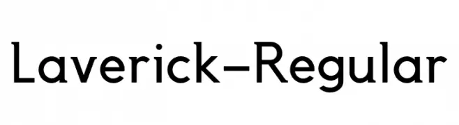
( Fonts by Daniel Pimley - Personal-use only. For commercial use please contact owner. )
A modern, geometric typeface with clean lines and a professional appearance.
![Laverick-Regular font caratteri gratis]() Scaricare 295 Downloads@WebFont
Scaricare 295 Downloads@WebFont -
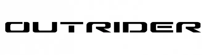
( Iconian Fonts - Daniel Zadorozny - www.iconian.com )
A futuristic, angular font with bold, geometric characters.
![Outrider font caratteri gratis]() Scaricare 295 Downloads@WebFont
Scaricare 295 Downloads@WebFont -
![UVN Vien Du font caratteri gratis]() Scaricare 295 Downloads@WebFont
Scaricare 295 Downloads@WebFont -
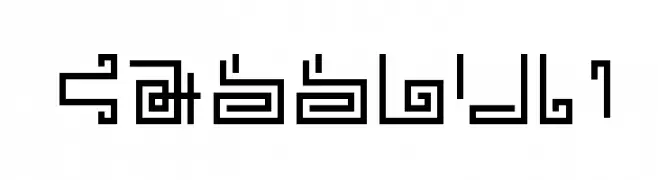
( Fonts by Manfred Klein. Free for private and charity use. Free for commercial with donation to organizations )
A geometric, runic-inspired font with sharp angles and historical flair.
![TheRomanRunesAlliance font caratteri gratis]() Scaricare 295 Downloads@WebFont
Scaricare 295 Downloads@WebFont -
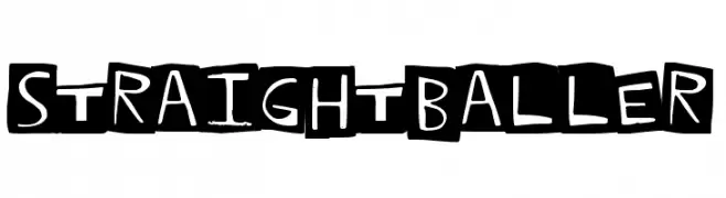
( Fonts by a Max Infeld - XEROGRAPHER FONTS - xerographer.blogspot.com . Personal-use only. For commercial use please contact owner. )
A bold, playful font with a hand-drawn aesthetic and high contrast.
![StraightBaller font caratteri gratis]() Scaricare 295 Downloads@WebFont
Scaricare 295 Downloads@WebFont -
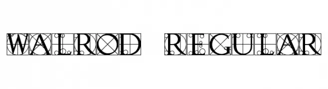
![Walrod Regular font caratteri gratis]() Scaricare 295 Downloads@WebFont
Scaricare 295 Downloads@WebFont


Quali sono i font più popolari adesso?
Poppins, Roboto, Montserrat, Open Sans e Lato sono molto usati per le forme pulite e l'ampia applicabilità — dall'identità di marca alle landing page e ai poster.
Quali font si usano spesso nei loghi?
Le sans serif geometriche (es. Poppins, famiglie in stile Gotham) sono scelte comuni per un branding pulito e scalabile. Per un tocco personale restano valide script e stili manoscritti. Abbina un display deciso per i titoli a un corpo testo neutro per riconoscibilità ed equilibrio.
Ogni quanto si aggiorna la lista?
Con regolarità, in base ai download e all'attività reale. Torna spesso per scoprire in anticipo le nuove preferite.
💡 Consiglio: aggiungi ai preferiti — le tendenze cambiano in fretta e i font top di oggi possono ispirare il rebranding di domani.