Benvenuto nelle Font Più Popolari — dove popolarità e qualità si incontrano. Qui trovi i font più scaricati e usati dell'anno. Se cerchi scelte sicure per logo, web o social, inizia da qui.
Ogni font top si distingue per equilibrio, leggibilità e versatilità. Troverai sans serif moderne, script eleganti, serif vintage e display minimalisti.
-
 Scaricare 288 Downloads@WebFont
 -
![gogozombie font caratteri gratis]() Scaricare 288 Downloads@WebFont
Scaricare 288 Downloads@WebFont -
( Fonts by Manfred Klein. Free for private and charity use. Free for commercial with donation to organizations )
A playful, hand-drawn style font with bold, irregular characters and a whimsical flair.
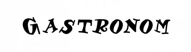
![Gastronom font caratteri gratis]() Scaricare 288 Downloads@WebFont
Scaricare 288 Downloads@WebFont -
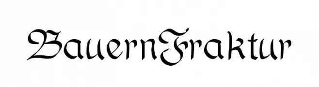
![BauernFraktur font caratteri gratis]() Scaricare 288 Downloads@WebFont
Scaricare 288 Downloads@WebFont -
![chupalo font caratteri gratis]() Scaricare 288 Downloads@WebFont
Scaricare 288 Downloads@WebFont -
( Fonts by Daniel Zadorozny - www.iconian.com - Free for personal use )
A bold, italic font with sharp, angular edges and a dynamic, modern style.
![National Express Exp Italic font caratteri gratis]() Scaricare 288 Downloads@WebFont
Scaricare 288 Downloads@WebFont -
( Fonts by Manfred Klein. Free for private and charity use. Free for commercial with donation to organizations )
A classic blackletter font with ornate, angular letterforms.
![JoeCaxton font caratteri gratis]() Scaricare 288 Downloads@WebFont
Scaricare 288 Downloads@WebFont -
( Fonts by Gilar Studio )
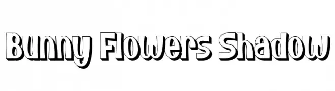
A playful, bold font with a shadow effect, ideal for creative projects.
![Bunny Flowers Shadow font caratteri gratis]() Scaricare 288 Downloads@WebFont
Scaricare 288 Downloads@WebFont -
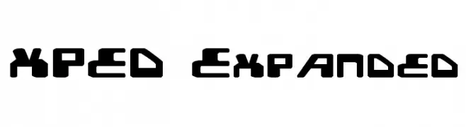
( Fonts by Daniel Zadorozny - www.iconian.com - Free for personal use )
A bold, futuristic font with geometric shapes and a strong, modern presence.
![XPED Expanded font caratteri gratis]() Scaricare 288 Downloads@WebFont
Scaricare 288 Downloads@WebFont -
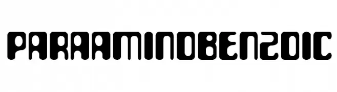
![ParaAminobenzoic font caratteri gratis]() Scaricare 288 Downloads@WebFont
Scaricare 288 Downloads@WebFont -
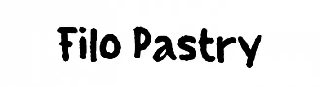
( Fonts by Wahyu Eka Prasetya - wepfont.com - Personal-use only. For commercial use please contact owner. )
A bold, playful handwritten font with thick, uneven strokes.
![Filo Pastry font caratteri gratis]() Scaricare 288 Downloads@WebFont
Scaricare 288 Downloads@WebFont -
![Ato font caratteri gratis]() Scaricare 287 Downloads@WebFont
Scaricare 287 Downloads@WebFont -
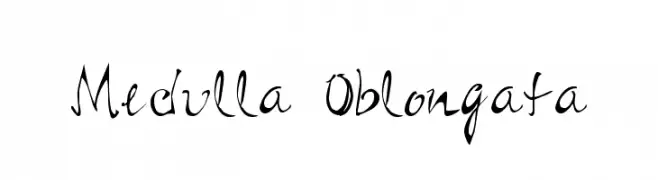
![Medulla Oblongata font caratteri gratis]() Scaricare 287 Downloads@WebFont
Scaricare 287 Downloads@WebFont -
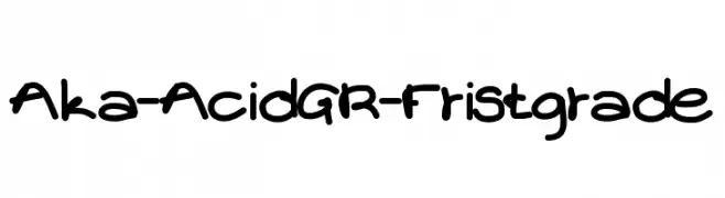
( Fonts by www.aka-acid.com )
A playful, handwritten font with bold, rounded strokes and a casual style.
![Aka-AcidGR-Fristgrade font caratteri gratis]() Scaricare 287 Downloads@WebFont
Scaricare 287 Downloads@WebFont -
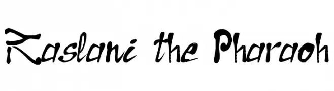
![Raslani the Pharaoh font caratteri gratis]() Scaricare 287 Downloads@WebFont
Scaricare 287 Downloads@WebFont -
![Karz 001 font caratteri gratis]() Scaricare 287 Downloads@WebFont
Scaricare 287 Downloads@WebFont -
( Måns Grebäck - www.mansgreback.com )
A bold, extra-expanded italic font with a modern and dynamic style.
![Specify PERSONAL Extraexpanded Bold Italic font caratteri gratis]() Scaricare 287 Downloads@WebFont
Scaricare 287 Downloads@WebFont -
( Fonts by Fajar Abdul Fattah - https://fontbundles.net/sibelumpagi-studio - Personal-use only. For commercial use please contact owner. )
A playful and elegant script font with smooth, flowing lines and a handwritten appearance.
![Arkina font caratteri gratis]() Scaricare 287 Downloads@WebFont
Scaricare 287 Downloads@WebFont -
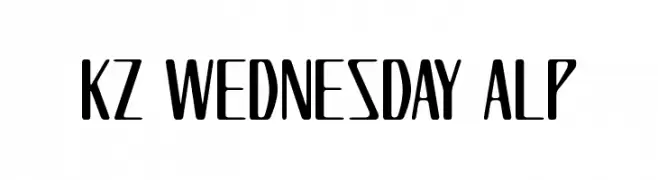
![KZ WEDNESDAY ALP font caratteri gratis]() Scaricare 287 Downloads@WebFont
Scaricare 287 Downloads@WebFont -
( Fonts by Ahmad Syarif Afandi - https://delapan.studio - Personal-use only. For commercial use please contact owner. )
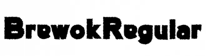
A bold, textured font with a playful and dynamic appearance.
![BrewokRegular font caratteri gratis]() Scaricare 287 Downloads@WebFont
Scaricare 287 Downloads@WebFont -
( Fonts by Moka Type Studio )
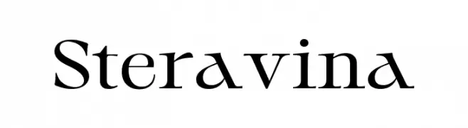
A classic serif font with elegant strokes and a modern twist.
![Steravina font caratteri gratis]() Scaricare 287 Downloads@WebFont
Scaricare 287 Downloads@WebFont -
( Fonts by Fajar Abdul Fattah - https://fontbundles.net/sibelumpagi-studio - Personal-use only. For commercial use please contact owner. )
An elegant script font with fluid, connected strokes and a sophisticated appearance.
![Gabryna font caratteri gratis]() Scaricare 287 Downloads@WebFont
Scaricare 287 Downloads@WebFont -
( Fonts by Vanessa Bays - bythebutterfly.com )
A playful, hollow, and rounded font with a casual vibe.
![The Urban Way Hollow font caratteri gratis]() Scaricare 287 Downloads@WebFont
Scaricare 287 Downloads@WebFont -
( truefonts.blogspot.com )
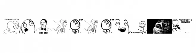
A meme-inspired decorative font using hand-drawn internet meme faces as glyphs.
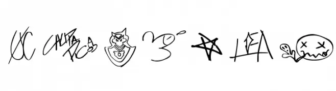
![THEmemefont font caratteri gratis]() Scaricare 287 Downloads@WebFont
Scaricare 287 Downloads@WebFont -
( Fonts by a Max Infeld - XEROGRAPHER FONTS - xerographer.blogspot.com . Personal-use only. For commercial use please contact owner. )
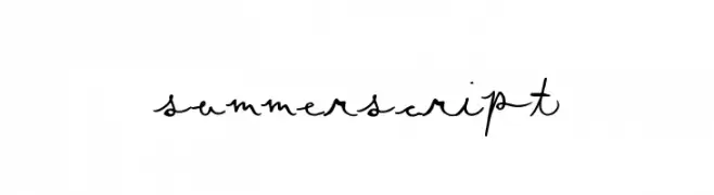
A playful, handwritten script font with fluid, connected letters and dynamic strokes.
![SummerScript font caratteri gratis]() Scaricare 287 Downloads@WebFont
Scaricare 287 Downloads@WebFont -
( Fonts by Iconian Fonts )
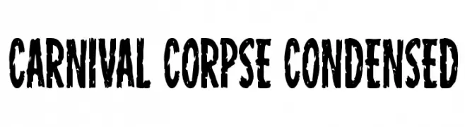
A bold, condensed, distressed font with a vintage, grunge aesthetic.
![Carnival Corpse Condensed font caratteri gratis]() Scaricare 287 Downloads@WebFont
Scaricare 287 Downloads@WebFont -
( Fonts by a Andrew Hart Dirt2.com - SickCapital. Personal-use only. For commercial use please contact owner. )
A decorative and artistic font with intricate patterns and dynamic flow.
![Giraffe & Co. font caratteri gratis]() Scaricare 287 Downloads@WebFont
Scaricare 287 Downloads@WebFont -
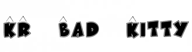
( Fonts by Kat`s Fun Fonts - Personal-use only. For commercial use please contact owner. )
A bold, cartoonish font with thick strokes and playful outlines.
![KR Bad Kitty font caratteri gratis]() Scaricare 287 Downloads@WebFont
Scaricare 287 Downloads@WebFont -
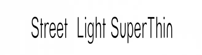
( Fonts by Apostrophic Lab )
A sleek, ultra-thin font with a minimalist and modern design.
![Street Light SuperThin font caratteri gratis]() Scaricare 287 Downloads@WebFont
Scaricare 287 Downloads@WebFont -
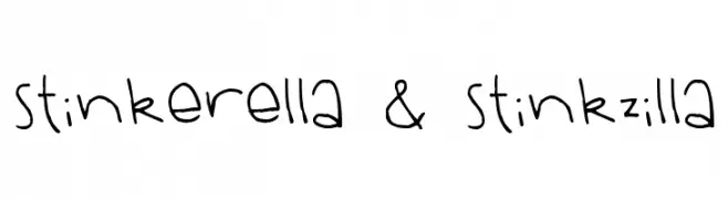
( Free for a personal use. For a commercial use please visit www.kevinandamanda.com )
A playful, handwritten font with quirky, irregular letterforms.
![Stinkerella & Stinkzilla font caratteri gratis]() Scaricare 287 Downloads@WebFont
Scaricare 287 Downloads@WebFont -
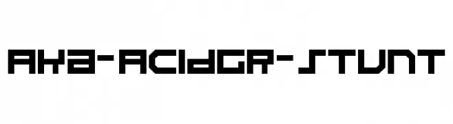
( Fonts by www.aka-acid.com )
A bold, geometric font with a futuristic, digital style.
![Aka-AcidGR-Stunt font caratteri gratis]() Scaricare 287 Downloads@WebFont
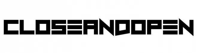
Scaricare 287 Downloads@WebFont -
![Close and Open font caratteri gratis]() Scaricare 287 Downloads@WebFont
Scaricare 287 Downloads@WebFont -
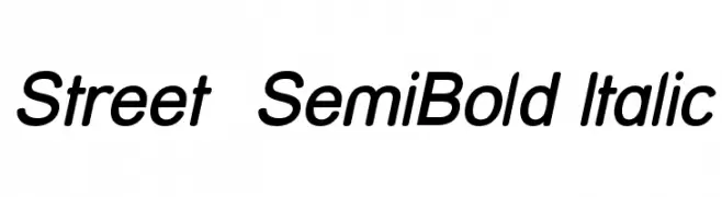
( Fonts by Apostrophic Lab )
A modern, semi-bold italic sans-serif font with clean lines and balanced spacing.
![Street SemiBold Italic font caratteri gratis]() Scaricare 287 Downloads@WebFont
Scaricare 287 Downloads@WebFont -
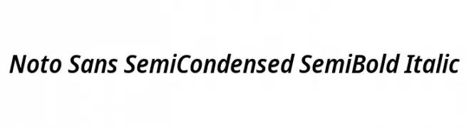
( Fonts by Google - Personal-use only. For commercial use please contact owner. )
A modern, semi-condensed sans-serif font with semi-bold weight and italic style.
![Noto Sans SemiCondensed SemiBold Italic font caratteri gratis]() Scaricare 287 Downloads@WebFont
Scaricare 287 Downloads@WebFont -
( Fonts by Wahyu Eka Prasetya - wepfont.com - Personal-use only. For commercial use please contact owner. )
A bold, playful font with rounded, cartoonish characters.
![Cocwit font caratteri gratis]() Scaricare 287 Downloads@WebFont
Scaricare 287 Downloads@WebFont


Quali sono i font più popolari adesso?
Poppins, Roboto, Montserrat, Open Sans e Lato sono molto usati per le forme pulite e l'ampia applicabilità — dall'identità di marca alle landing page e ai poster.
Quali font si usano spesso nei loghi?
Le sans serif geometriche (es. Poppins, famiglie in stile Gotham) sono scelte comuni per un branding pulito e scalabile. Per un tocco personale restano valide script e stili manoscritti. Abbina un display deciso per i titoli a un corpo testo neutro per riconoscibilità ed equilibrio.
Ogni quanto si aggiorna la lista?
Con regolarità, in base ai download e all'attività reale. Torna spesso per scoprire in anticipo le nuove preferite.
💡 Consiglio: aggiungi ai preferiti — le tendenze cambiano in fretta e i font top di oggi possono ispirare il rebranding di domani.