Benvenuto nelle Font Più Popolari — dove popolarità e qualità si incontrano. Qui trovi i font più scaricati e usati dell'anno. Se cerchi scelte sicure per logo, web o social, inizia da qui.
Ogni font top si distingue per equilibrio, leggibilità e versatilità. Troverai sans serif moderne, script eleganti, serif vintage e display minimalisti.
-
 Scaricare 286 Downloads@WebFont
 -
( Fonts by Nick Curtis - www.nicksfonts.com )
A bold, high-contrast font with Art Deco influences and geometric shapes.
![Studebaker font caratteri gratis]() Scaricare 286 Downloads
Scaricare 286 Downloads -
( Fonts by Rodrigo German - RASDESIGN )
A geometric, angular font with a futuristic and technical style.
![JOIA* font caratteri gratis]() Scaricare 286 Downloads@WebFont
Scaricare 286 Downloads@WebFont -
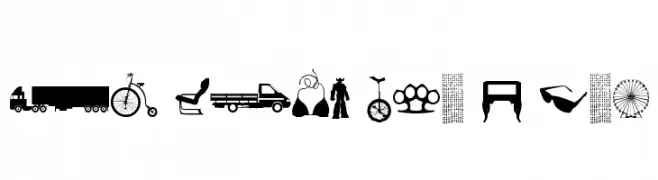
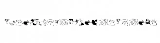
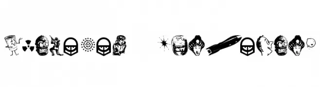
( Fonts by Christophe Feray - www.wcfonts.com )
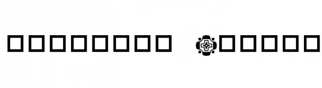
A pictogram-based decorative dingbat font featuring assorted object silhouettes.
![WC Sold Out E Bta font caratteri gratis]() Scaricare 286 Downloads@WebFont
Scaricare 286 Downloads@WebFont -
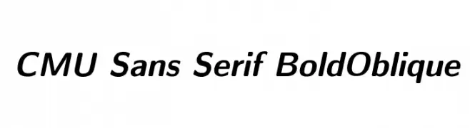
( Fonts by Donald E. Knuth - Personal-use only. For commercial use please contact owner. )
A bold, oblique sans-serif font with a modern and dynamic style.
![CMU Sans Serif BoldOblique font caratteri gratis]() Scaricare 286 Downloads@WebFont
Scaricare 286 Downloads@WebFont -
( Fonts by Wahyu Eka Prasetya - wepfont.com - Personal-use only. For commercial use please contact owner. )
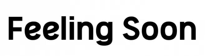
A bold, modern sans-serif font with clean lines and strong readability.
![Feeling Soon font caratteri gratis]() Scaricare 286 Downloads@WebFont
Scaricare 286 Downloads@WebFont -
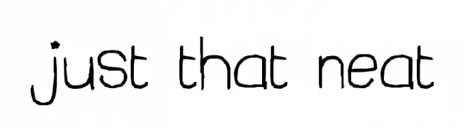
![just that neat font caratteri gratis]() Scaricare 286 Downloads@WebFont
Scaricare 286 Downloads@WebFont -
![auntbats Normal font caratteri gratis]() Scaricare 286 Downloads@WebFont
Scaricare 286 Downloads@WebFont -
( Fonts by Kevin Christopher - www.kcfonts.com. Personal-use only. For commercial use please contact owner. )
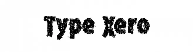
A bold, textured font with a distressed, grunge aesthetic.
![Type Xero font caratteri gratis]() Scaricare 286 Downloads@WebFont
Scaricare 286 Downloads@WebFont -
( Fonts by Daniel Zadorozny - www.iconian.com - Free for personal use )
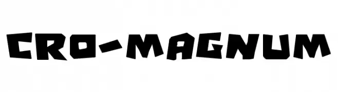
A bold, rugged font with angular, hand-chiseled characters.
![Cro-Magnum font caratteri gratis]() Scaricare 286 Downloads@WebFont
Scaricare 286 Downloads@WebFont -
( Fonts by a Max Infeld - XEROGRAPHER FONTS - xerographer.blogspot.com . Personal-use only. For commercial use please contact owner. )
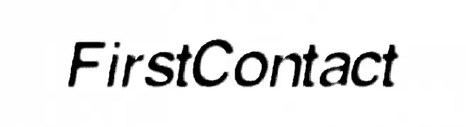
A modern, italicized font with a sleek and dynamic appearance.
![FirstContact font caratteri gratis]() Scaricare 286 Downloads@WebFont
Scaricare 286 Downloads@WebFont -
( Fonts by datto )
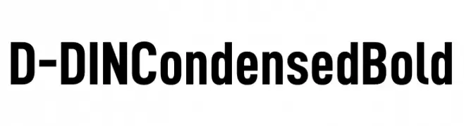
A bold, condensed font with a modern and geometric style.
![D-DIN Condensed Bold font caratteri gratis]() Scaricare 286 Downloads@WebFont
Scaricare 286 Downloads@WebFont -
( Fonts by Mans Greback - www.mawns.com )
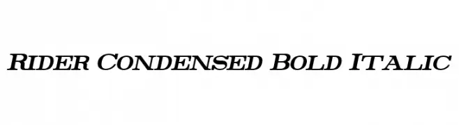
A bold, italicized, and condensed font with a modern and dynamic style.
![Rider Condensed Bold Italic font caratteri gratis]() Scaricare 286 Downloads@WebFont
Scaricare 286 Downloads@WebFont -
( Fonts by David Rakowski )
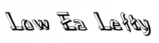
A bold, sketch-like font with a playful and dynamic style.
![Low Ea Lefty font caratteri gratis]() Scaricare 286 Downloads@WebFont
Scaricare 286 Downloads@WebFont -
![fightDurden Normal font caratteri gratis]() Scaricare 286 Downloads@WebFont
Scaricare 286 Downloads@WebFont -
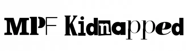
![MPF Kidnapped font caratteri gratis]() Scaricare 286 Downloads@WebFont
Scaricare 286 Downloads@WebFont -
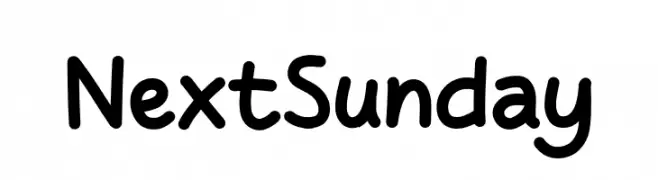
( Fonts by Khurasan )
A playful, rounded handwritten font with smooth curves and consistent stroke width.
![Next Sunday font caratteri gratis]() Scaricare 286 Downloads@WebFont
Scaricare 286 Downloads@WebFont -
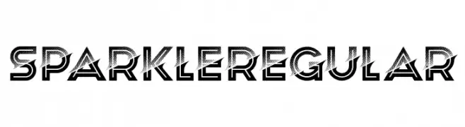
( Fonts by Vladimir Nikolic - www.creativefabrica.com/designer/vladimirnikolic/ - Personal-use only. For commercial use please contact owner. )
A bold, geometric font with a dotted interior pattern and sharp angles.
![Sparkle Regular font caratteri gratis]() Scaricare 286 Downloads@WebFont
Scaricare 286 Downloads@WebFont -
( Fonts by http://perso.calixo.net/~uzim/ )
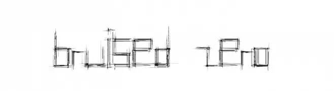
A sketch-like, distressed font with a modern, geometric structure.
![Bruised Zero font caratteri gratis]() Scaricare 286 Downloads@WebFont
Scaricare 286 Downloads@WebFont -
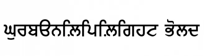
![GurbaniLipiLight Bold font caratteri gratis]() Scaricare 286 Downloads@WebFont
Scaricare 286 Downloads@WebFont -
( Fonts by Hanoded )
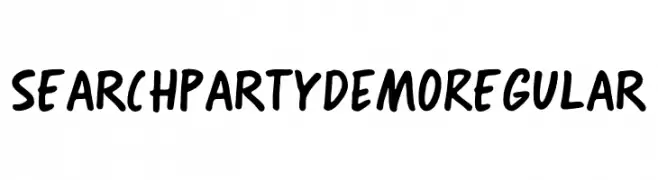
Playful handwritten font with a casual style.
![Search Party DEMO Regular font caratteri gratis]() Scaricare 286 Downloads@WebFont
Scaricare 286 Downloads@WebFont -
( Fonts by Daniel Zadorozny - www.iconian.com )
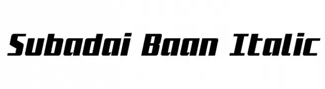
A bold, italic font with a dynamic and modern style.
![Subadai Baan Italic font caratteri gratis]() Scaricare 286 Downloads@WebFont
Scaricare 286 Downloads@WebFont -
( Fonts by Manfred Klein. Free for private and charity use. Free for commercial with donation to organizations )
An abstract, doodle-like font with unique, artistic characters.
![AbsoluteImprovisations font caratteri gratis]() Scaricare 286 Downloads@WebFont
Scaricare 286 Downloads@WebFont -
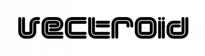
( Fonts by dustBUST - Andreas Nylin )
A futuristic, geometric font with bold, layered lines.
![Vectroid font caratteri gratis]() Scaricare 286 Downloads@WebFont
Scaricare 286 Downloads@WebFont -
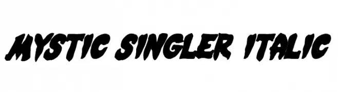
( Fonts by Daniel Zadorozny - www.iconian.com - Free for personal use )
A bold, dynamic font with thick strokes and an italic slant, ideal for expressive designs.
![Mystic Singler Italic font caratteri gratis]() Scaricare 286 Downloads@WebFont
Scaricare 286 Downloads@WebFont -
![BD Brockelmann font caratteri gratis]() Scaricare 286 Downloads@WebFont
Scaricare 286 Downloads@WebFont -
![Glamocon RetroBats font caratteri gratis]() Scaricare 286 Downloads@WebFont
Scaricare 286 Downloads@WebFont -
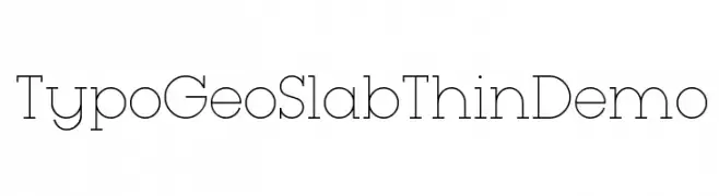
( Fonts by www.studiotypo.com - Personal-use only. For commercial use please contact owner. )
A geometric slab serif font with thin, elegant lines and a modern aesthetic.
![Typo GeoSlab Thin Demo font caratteri gratis]() Scaricare 286 Downloads@WebFont
Scaricare 286 Downloads@WebFont -
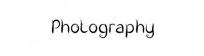
( Fonts by Wino S Kadir - weknow - www.revolge.com/shop/weknow/ - Personal-use only. For commercial use please contact owner. )
A whimsical and artistic font with flowing, curved lines.
![Photography font caratteri gratis]() Scaricare 286 Downloads@WebFont
Scaricare 286 Downloads@WebFont -
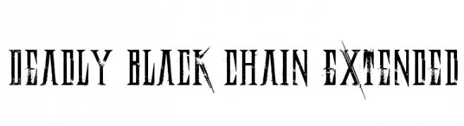
( Fonts by Andrew Hart - dirt2.com )
A bold, distressed gothic-style font with sharp, angular lines and a rugged texture.
![Deadly Black Chain Extended font caratteri gratis]() Scaricare 286 Downloads@WebFont
Scaricare 286 Downloads@WebFont -
( Fonts by Peter Wiegel - www.peter-wiegel.de )
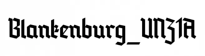
A bold, angular blackletter font with a Gothic, medieval aesthetic.
![Blankenburg_UNZ1A font caratteri gratis]() Scaricare 286 Downloads@WebFont
Scaricare 286 Downloads@WebFont -
( Fonts by RaisProject )
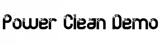
A bold, modern font with a unique distressed effect on each character.
![Power Clean Demo font caratteri gratis]() Scaricare 286 Downloads@WebFont
Scaricare 286 Downloads@WebFont -
( Fonts by NDISCOVER )
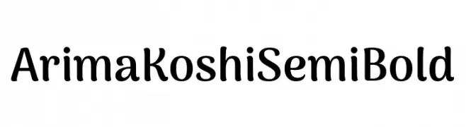
A playful, semi-bold font with rounded edges and a friendly design.
![Arima Koshi Semi Bold font caratteri gratis]() Scaricare 286 Downloads@WebFont
Scaricare 286 Downloads@WebFont -
( Fonts by Alex Tomlinson - Skyhaven Fonts - shfonts.com )
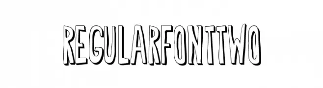
A bold, playful, hand-drawn font with a three-dimensional look.
![RegularfontTwo font caratteri gratis]() Scaricare 286 Downloads@WebFont
Scaricare 286 Downloads@WebFont -
( Fonts by Daniel Zadorozny - www.iconian.com - Free for personal use )
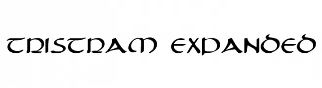
A decorative font with medieval-inspired, calligraphic strokes and elegant curves.
![Tristram Expanded font caratteri gratis]() Scaricare 286 Downloads@WebFont
Scaricare 286 Downloads@WebFont


Quali sono i font più popolari adesso?
Poppins, Roboto, Montserrat, Open Sans e Lato sono molto usati per le forme pulite e l'ampia applicabilità — dall'identità di marca alle landing page e ai poster.
Quali font si usano spesso nei loghi?
Le sans serif geometriche (es. Poppins, famiglie in stile Gotham) sono scelte comuni per un branding pulito e scalabile. Per un tocco personale restano valide script e stili manoscritti. Abbina un display deciso per i titoli a un corpo testo neutro per riconoscibilità ed equilibrio.
Ogni quanto si aggiorna la lista?
Con regolarità, in base ai download e all'attività reale. Torna spesso per scoprire in anticipo le nuove preferite.
💡 Consiglio: aggiungi ai preferiti — le tendenze cambiano in fretta e i font top di oggi possono ispirare il rebranding di domani.