Benvenuto nelle Font Più Popolari — dove popolarità e qualità si incontrano. Qui trovi i font più scaricati e usati dell'anno. Se cerchi scelte sicure per logo, web o social, inizia da qui.
Ogni font top si distingue per equilibrio, leggibilità e versatilità. Troverai sans serif moderne, script eleganti, serif vintage e display minimalisti.
-
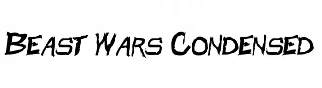
( Fonts by a Neale Davidson - www.pixelsagas.com. Personal-use only. For commercial use please contact owner. )
A bold, jagged font with a dynamic and aggressive style.
 Scaricare 285 Downloads@WebFont
 -
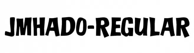
( Fonts by joorgemoron )
A bold, playful font with thick, uneven strokes and a quirky style.
![JMHADO-Regular font caratteri gratis]() Scaricare 285 Downloads@WebFont
Scaricare 285 Downloads@WebFont -
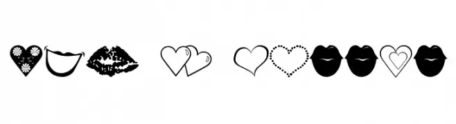
![luv n kisses font caratteri gratis]() Scaricare 285 Downloads@WebFont
Scaricare 285 Downloads@WebFont -
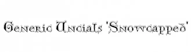
![Generic Uncials 'Snowcapped' font caratteri gratis]() Scaricare 285 Downloads@WebFont
Scaricare 285 Downloads@WebFont -
( Fonts by Khurasan )
A playful, bold font with rounded, thick strokes and a hand-drawn feel.
![Jreeng font caratteri gratis]() Scaricare 285 Downloads@WebFont
Scaricare 285 Downloads@WebFont -
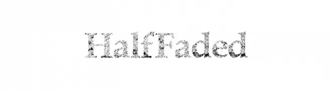
( Fonts by a Max Infeld - XEROGRAPHER FONTS - xerographer.blogspot.com . Personal-use only. For commercial use please contact owner. )
A serif font with a unique, dotted, half-faded texture.
![HalfFaded font caratteri gratis]() Scaricare 284 Downloads@WebFont
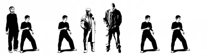
Scaricare 284 Downloads@WebFont -
![fenotype dings # people 0.5 font caratteri gratis]() Scaricare 284 Downloads@WebFont
Scaricare 284 Downloads@WebFont -
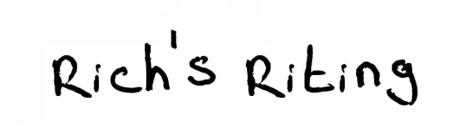
( Fonts by www.fontpanda.com. Personal-use only. For commercial use please contact owner. )
A casual, handwritten font with varied stroke thickness and a playful appearance.
![Rich's Riting font caratteri gratis]() Scaricare 284 Downloads@WebFont
Scaricare 284 Downloads@WebFont -
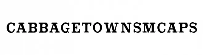
( Fonts by Bobistheowl - Personal-use only. For commercial use please contact owner. )
A bold serif font with a vintage yet modern appeal, perfect for impactful headlines.
![CabbagetownSmCaps font caratteri gratis]() Scaricare 284 Downloads@WebFont
Scaricare 284 Downloads@WebFont -
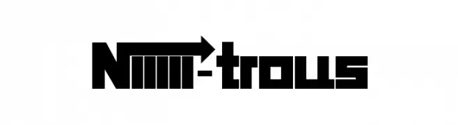
( Fonts by Koczman Balint - magiquefonts.gportal.hu )
A bold, geometric font with sharp edges and a modern style.
![Niiiii-trous font caratteri gratis]() Scaricare 284 Downloads@WebFont
Scaricare 284 Downloads@WebFont -
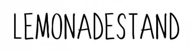
( Fonts by Sharkshock - Personal-use only. For commercial use please contact owner. )
A playful, hand-drawn font with tall, narrow letters and a whimsical style.
![Lemonade Stand font caratteri gratis]() Scaricare 284 Downloads@WebFont
Scaricare 284 Downloads@WebFont -
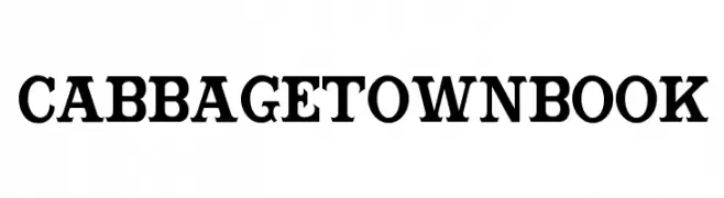
( Fonts by Bobistheowl - Personal-use only. For commercial use please contact owner. )
A bold, high-contrast serif font with strong, authoritative strokes.
![CabbagetownBook font caratteri gratis]() Scaricare 284 Downloads@WebFont
Scaricare 284 Downloads@WebFont -
( Fonts by MuraKnockout Media + Design - muraknockout.com. Personal-use only. For commercial use please contact owner. )
A sleek, modern font with thin, geometric lines and a minimalist design.
![Daiichi font caratteri gratis]() Scaricare 284 Downloads@WebFont
Scaricare 284 Downloads@WebFont -
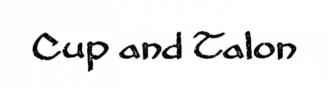
( Fonts by Cumberland Fontworks - http://www222.pair.com/sjohn/fonts.htm - S. John Ross )
A bold, textured, hand-drawn font with a rugged, organic style.
![Cup and Talon font caratteri gratis]() Scaricare 284 Downloads@WebFont
Scaricare 284 Downloads@WebFont -
( Fonts by Modestype Studio )
A playful, bold, and hand-drawn style font with rounded, irregular characters.
![Talkactive font caratteri gratis]() Scaricare 284 Downloads@WebFont
Scaricare 284 Downloads@WebFont -
( Typia Nesia - www.myfonts.com/foundry/Typia_Nesia/ )
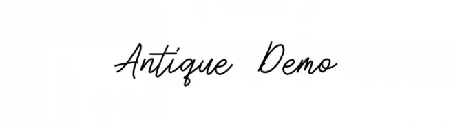
An elegant and flowing script font with smooth, cursive strokes.
![Antique Demo font caratteri gratis]() Scaricare 284 Downloads@WebFont
Scaricare 284 Downloads@WebFont -
( Fonts by dartcanada.tripod.com - Darren Rigby )
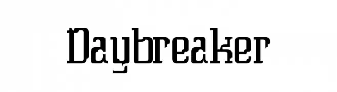
A bold, modern font with sharp edges and rounded corners for a striking look.
![Daybreaker font caratteri gratis]() Scaricare 284 Downloads@WebFont
Scaricare 284 Downloads@WebFont -
Caratteri di TGIFStudio. For commercial use please contact the owner.
( Thank you for downloading this font This font is free for PERSONAL USE ONLY! Commercial license for this font can be purchased at: http://bit.ly/2gWZKEk )
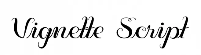
An elegant script font with flowing, cursive letterforms and decorative swashes.
![Vignette Script font caratteri gratis]() Scaricare 284 Downloads@WebFont
Scaricare 284 Downloads@WebFont -
( Please check www.otlab.ru before you use this font! )
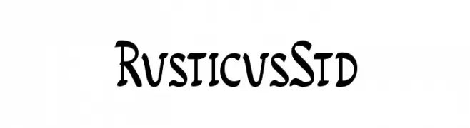
A rustic, handcrafted font with a vintage flair.
![RusticusStd font caratteri gratis]() Scaricare 284 Downloads@WebFont
Scaricare 284 Downloads@WebFont -
( Fonts by Daniel Zadorozny - www.iconian.com - Free for personal use )
A bold, geometric font with a military-inspired, stencil-like design.
![21 Gun Salute Regular font caratteri gratis]() Scaricare 284 Downloads@WebFont
Scaricare 284 Downloads@WebFont -
( Fonts by Yasir Ekinci )
An elegant, flowing script font with a hand-drawn appearance.
![VeronaLotte font caratteri gratis]() Scaricare 284 Downloads@WebFont
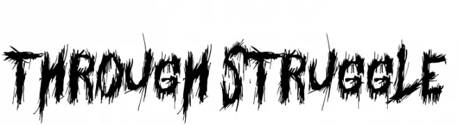
Scaricare 284 Downloads@WebFont -
![Through Struggle font caratteri gratis]() Scaricare 284 Downloads@WebFont
Scaricare 284 Downloads@WebFont -
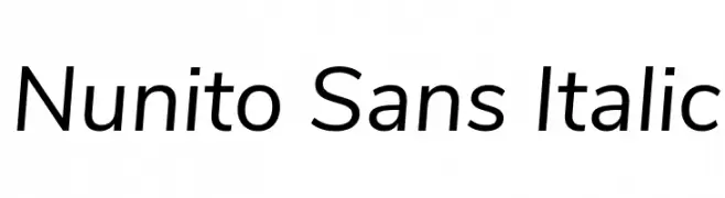
( Copyright 2016 The Nunito Project Authors (contact@sansoxygen.com) )
A modern, italic sans-serif font with a clean and approachable style.
![Nunito Sans Italic font caratteri gratis]() Scaricare 284 Downloads@WebFont
Scaricare 284 Downloads@WebFont -
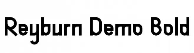
( Fonts by Edric Studio - Personal-use only. For commercial use please contact owner. )
A bold, geometric font with a modern and structured design.
![Reyburn Demo Bold font caratteri gratis]() Scaricare 284 Downloads@WebFont
Scaricare 284 Downloads@WebFont -
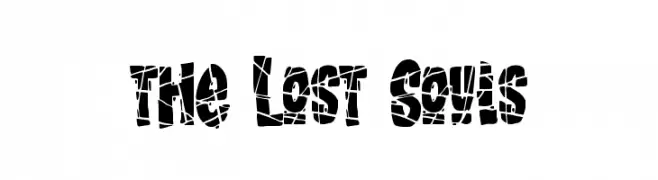
( Fonts by Gassstype )
A bold, fragmented font with a shattered, decorative style.
![the Lost Souls font caratteri gratis]() Scaricare 284 Downloads@WebFont
Scaricare 284 Downloads@WebFont -
( Fonts by SDFonts - Ritzy )
Primitive, pictograph-style font with hand-drawn, irregular shapes.
![Finnish Rock Paintings font caratteri gratis]() Scaricare 284 Downloads@WebFont
Scaricare 284 Downloads@WebFont -
( Fonts by Kat`s Fun Fonts - Personal-use only. For commercial use please contact owner. )
A decorative font with St. Patrick's Day-themed frames and festive designs.
![KR St Patricks Frames font caratteri gratis]() Scaricare 284 Downloads@WebFont
Scaricare 284 Downloads@WebFont -
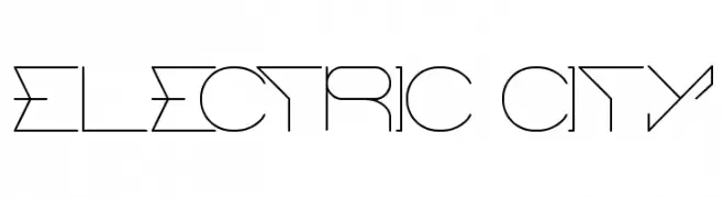
( Fonts by Wino S Kadir - weknow - www.revolge.com/shop/weknow/ - Personal-use only. For commercial use please contact owner. )
A decorative, geometric font with a futuristic, technological style.
![ELECTRIC CITY font caratteri gratis]() Scaricare 284 Downloads@WebFont
Scaricare 284 Downloads@WebFont -
( Linux Libertine - www.linuxlibertine.org )
A classic serif typeface with semi-bold weight and italic style, offering elegance and readability.
![Linux Libertine Semibold Italic font caratteri gratis]() Scaricare 284 Downloads@WebFont
Scaricare 284 Downloads@WebFont -
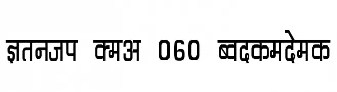
![Kruti Dev 060 Condensed font caratteri gratis]() Scaricare 284 Downloads@WebFont
Scaricare 284 Downloads@WebFont -
( Noto is a trademark of Google Inc. Noto fonts are open source. All Noto fonts are published under the SIL Open Font License, Version 1.1 )
A bold, modern sans-serif font with a clean and geometric design.
![Noto Sans Oriya Bold font caratteri gratis]() Scaricare 284 Downloads@WebFont
Scaricare 284 Downloads@WebFont -
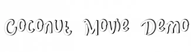
( Fonts by NihStudio )
A playful, hand-drawn font with bold, tilted letters and a shadow effect.
![Coconut Movie Demo font caratteri gratis]() Scaricare 284 Downloads@WebFont
Scaricare 284 Downloads@WebFont -
![Pixelicious font caratteri gratis]() Scaricare 284 Downloads@WebFont
Scaricare 284 Downloads@WebFont -
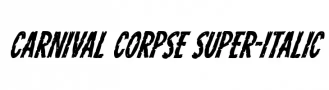
( Fonts by Iconian Fonts )
A bold, distressed, and heavily slanted font with a grunge aesthetic.
![Carnival Corpse Super-Italic font caratteri gratis]() Scaricare 284 Downloads@WebFont
Scaricare 284 Downloads@WebFont -
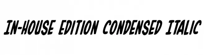
( Fonts by Daniel Zadorozny - www.iconian.com )
A bold, condensed, and italicized font with a dynamic style.
![In-House Edition Condensed Italic font caratteri gratis]() Scaricare 284 Downloads@WebFont
Scaricare 284 Downloads@WebFont


Quali sono i font più popolari adesso?
Poppins, Roboto, Montserrat, Open Sans e Lato sono molto usati per le forme pulite e l'ampia applicabilità — dall'identità di marca alle landing page e ai poster.
Quali font si usano spesso nei loghi?
Le sans serif geometriche (es. Poppins, famiglie in stile Gotham) sono scelte comuni per un branding pulito e scalabile. Per un tocco personale restano valide script e stili manoscritti. Abbina un display deciso per i titoli a un corpo testo neutro per riconoscibilità ed equilibrio.
Ogni quanto si aggiorna la lista?
Con regolarità, in base ai download e all'attività reale. Torna spesso per scoprire in anticipo le nuove preferite.
💡 Consiglio: aggiungi ai preferiti — le tendenze cambiano in fretta e i font top di oggi possono ispirare il rebranding di domani.