Benvenuto nelle Font Più Popolari — dove popolarità e qualità si incontrano. Qui trovi i font più scaricati e usati dell'anno. Se cerchi scelte sicure per logo, web o social, inizia da qui.
Ogni font top si distingue per equilibrio, leggibilità e versatilità. Troverai sans serif moderne, script eleganti, serif vintage e display minimalisti.
-
 Scaricare 279 Downloads@WebFont
 -
( Fonts by Apostrophic Lab )
A casual, handwritten-style font with rounded, playful characters.
![Street Freehand - Rev font caratteri gratis]() Scaricare 279 Downloads@WebFont
Scaricare 279 Downloads@WebFont -
( Fonts by Kat Vincent )
A bold, playful handwritten font with rounded, consistent strokes.
![Feel_Me font caratteri gratis]() Scaricare 279 Downloads@WebFont
Scaricare 279 Downloads@WebFont -
( Fonts by Tribby )
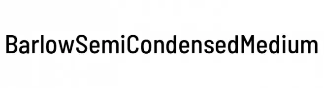
A modern, semi-condensed sans-serif font with uniform stroke width and balanced characters.
![Barlow Semi Condensed Medium font caratteri gratis]() Scaricare 279 Downloads@WebFont
Scaricare 279 Downloads@WebFont -
( Fonts by Letterday Studio )
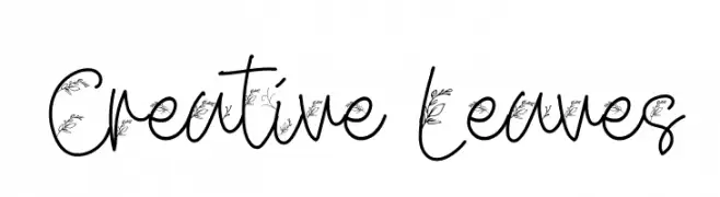
A whimsical handwritten font with leaf motifs integrated into each character.
![Creative Leaves font caratteri gratis]() Scaricare 279 Downloads@WebFont
Scaricare 279 Downloads@WebFont -
( Personal-use only. For commercial use please contact owner. )
A classic serif font with elegant curves and strong presence.
![Stanislav font caratteri gratis]() Scaricare 279 Downloads@WebFont
Scaricare 279 Downloads@WebFont -
( Fonts by Sang Seo - LALATO FONTS. Personal-use only. For commercial use please contact owner. )
A playful, casual handwritten font with smooth, rounded strokes.
![lazyfont font caratteri gratis]() Scaricare 279 Downloads@WebFont
Scaricare 279 Downloads@WebFont -
( Ariel Alvares )
A clean, modern sans-serif font with uniform stroke width and excellent readability.
![Polt Book font caratteri gratis]() Scaricare 279 Downloads@WebFont
Scaricare 279 Downloads@WebFont -
( Fonts by Typhoon Type - Suthi Srisopha - www.typhoontype.net - Personal-use only. For commercial use please contact owner. )
A bold, playful script font with a lively, handwritten style.
![Atomic Robusta - Personal Use font caratteri gratis]() Scaricare 279 Downloads@WebFont
Scaricare 279 Downloads@WebFont -
![CHOP!!!!! font caratteri gratis]() Scaricare 279 Downloads@WebFont
Scaricare 279 Downloads@WebFont -
( Fonts by CannotIntoSpaceFonts - KineticPlasma Fonts - Personal-use only. For commercial use please contact owner. )
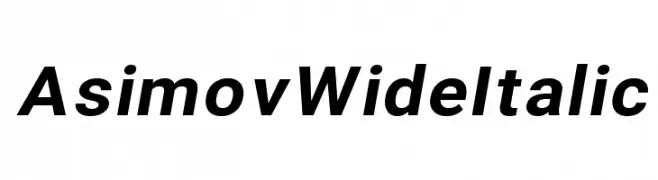
A modern, wide, and italicized font with bold characters and a sleek design.
![Asimov Wide Italic font caratteri gratis]() Scaricare 279 Downloads@WebFont
Scaricare 279 Downloads@WebFont -
( Fonts by Andrew McCluskey - nalgames.com. Personal-use only. For commercial use please contact owner. )
A bold, geometric font with a blocky, digital aesthetic.
![Don't Waste That Napkin font caratteri gratis]() Scaricare 279 Downloads@WebFont
Scaricare 279 Downloads@WebFont -
( Måns Grebäck - www.mansgreback.com )
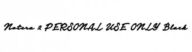
A bold, cursive font with a flowing, handwritten style.
![Notera 2 PERSONAL USE ONLY Black font caratteri gratis]() Scaricare 279 Downloads@WebFont
Scaricare 279 Downloads@WebFont -
Caratteri di fontdationstudio. For commercial use please contact the owner.
( Thank you for downloading this font This font is free for PERSONAL USE ONLY! Commercial license for this font can be purchased at: http://bit.ly/2wjqpgh )
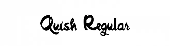
A bold, expressive handwritten font with a cursive style.
![Quish Regular font caratteri gratis]() Scaricare 279 Downloads@WebFont
Scaricare 279 Downloads@WebFont -
![The First font caratteri gratis]() Scaricare 279 Downloads@WebFont
Scaricare 279 Downloads@WebFont -
( Fonts by CannotIntoSpaceFonts - KineticPlasma Fonts - Personal-use only. For commercial use please contact owner. )
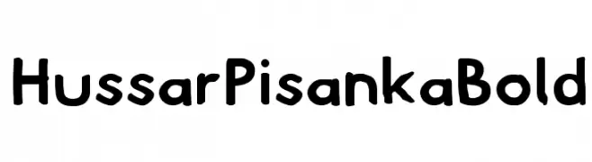
A bold, playful font with a hand-drawn, whimsical style.
![Hussar Pisanka Bold font caratteri gratis]() Scaricare 279 Downloads@WebFont
Scaricare 279 Downloads@WebFont -
![Asimov Edge Wide font caratteri gratis]() Scaricare 279 Downloads@WebFont
Scaricare 279 Downloads@WebFont -
( Fonts by Mans Greback - www.mawns.com )
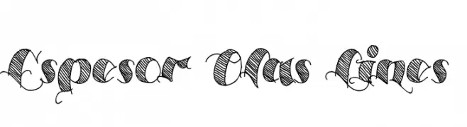
A dynamic script font with intricate hatching and elegant curves.
![Espesor Olas Lines font caratteri gratis]() Scaricare 279 Downloads@WebFont
Scaricare 279 Downloads@WebFont -
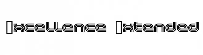
![Excellence Extended font caratteri gratis]() Scaricare 279 Downloads@WebFont
Scaricare 279 Downloads@WebFont -
( Fonts by Supersemar Letter )
A playful and whimsical font with exaggerated curves and a modern flair.
![Spicyholic font caratteri gratis]() Scaricare 279 Downloads@WebFont
Scaricare 279 Downloads@WebFont -
( Fonts by Maelle.K - Thomas Boucherie )
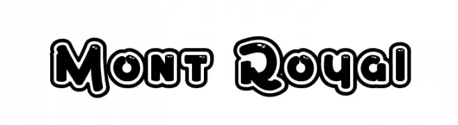
A bold, playful font with rounded edges and a double outline for a 3D effect.
![Mont Royal font caratteri gratis]() Scaricare 279 Downloads@WebFont
Scaricare 279 Downloads@WebFont -
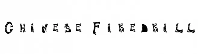
![Chinese Firedrill font caratteri gratis]() Scaricare 279 Downloads@WebFont
Scaricare 279 Downloads@WebFont -
( Fonts by Stefani Letter )
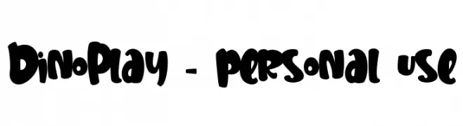
A bold, playful font with a hand-drawn, whimsical style.
![DinoPlay - personal use font caratteri gratis]() Scaricare 279 Downloads@WebFont
Scaricare 279 Downloads@WebFont -
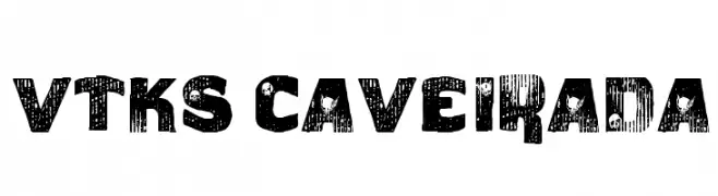
( Fonts by Douglas Vitkauskas - www.vtksdesign.com. Personal-use only. For commercial use please contact owner. )
A bold, distressed font with a textured, grunge aesthetic.
![vtks caveirada font caratteri gratis]() Scaricare 279 Downloads@WebFont
Scaricare 279 Downloads@WebFont -
![CropBats II AOE font caratteri gratis]() Scaricare 279 Downloads@WebFont
Scaricare 279 Downloads@WebFont -
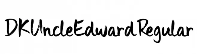
( Hanoded - David Kerkhoff - www.hanodedfonts.com )
A bold, expressive handwritten font with a brush-like style.
![DK Uncle Edward Regular font caratteri gratis]() Scaricare 279 Downloads@WebFont
Scaricare 279 Downloads@WebFont -
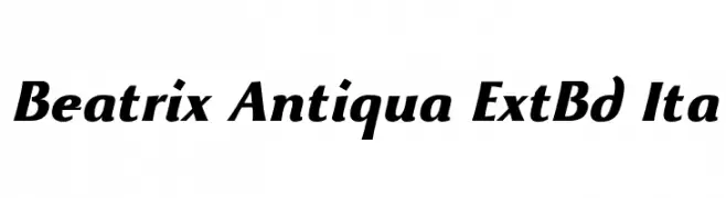
( Fonts by Zetafonts - Personal-use only. For commercial use please contact owner. )
A bold, italic font with high contrast and elegant style.
![Beatrix Antiqua ExtBd Ita font caratteri gratis]() Scaricare 279 Downloads@WebFont
Scaricare 279 Downloads@WebFont -
( Fonts by itypeface )
An elegant script font with flowing, cursive letterforms and a sophisticated appearance.
![Theage font caratteri gratis]() Scaricare 279 Downloads@WebFont
Scaricare 279 Downloads@WebFont -
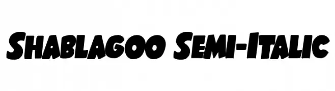
( Fonts by Iconian Fonts )
A bold, playful, and slightly italicized font with a cartoonish style.
![Shablagoo Semi-Italic font caratteri gratis]() Scaricare 279 Downloads@WebFont
Scaricare 279 Downloads@WebFont -
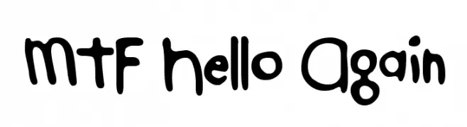
( Fonts by Miss Tiina at www.misstiina.com (please check the website before use) )
A playful, hand-drawn font with bold, rounded characters.
![MTF Hello Again font caratteri gratis]() Scaricare 279 Downloads@WebFont
Scaricare 279 Downloads@WebFont -
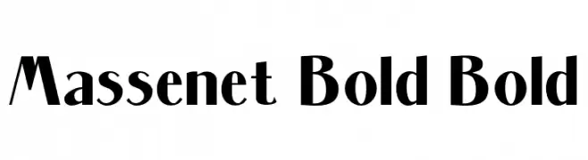
( Fonts by Chuck Mountain - Chuck`s Fonts - Personal-use only. For commercial use please contact owner. )
A bold, modern font with thick strokes and slightly condensed letterforms.
![Massenet Bold Bold font caratteri gratis]() Scaricare 279 Downloads@WebFont
Scaricare 279 Downloads@WebFont -
![SPEdessa font caratteri gratis]() Scaricare 279 Downloads@WebFont
Scaricare 279 Downloads@WebFont -
![criminal security font caratteri gratis]() Scaricare 279 Downloads@WebFont
Scaricare 279 Downloads@WebFont -
![Distant Galaxy AltOutline Italic font caratteri gratis]() Scaricare 279 Downloads@WebFont
Scaricare 279 Downloads@WebFont -
( twitter.com/ambushbug )
A playful, comic-style font with bold, rounded strokes and a hand-drawn appearance.
![Baltimore Comic font caratteri gratis]() Scaricare 279 Downloads@WebFont
Scaricare 279 Downloads@WebFont


Quali sono i font più popolari adesso?
Poppins, Roboto, Montserrat, Open Sans e Lato sono molto usati per le forme pulite e l'ampia applicabilità — dall'identità di marca alle landing page e ai poster.
Quali font si usano spesso nei loghi?
Le sans serif geometriche (es. Poppins, famiglie in stile Gotham) sono scelte comuni per un branding pulito e scalabile. Per un tocco personale restano valide script e stili manoscritti. Abbina un display deciso per i titoli a un corpo testo neutro per riconoscibilità ed equilibrio.
Ogni quanto si aggiorna la lista?
Con regolarità, in base ai download e all'attività reale. Torna spesso per scoprire in anticipo le nuove preferite.
💡 Consiglio: aggiungi ai preferiti — le tendenze cambiano in fretta e i font top di oggi possono ispirare il rebranding di domani.