Benvenuto nelle Font Più Popolari — dove popolarità e qualità si incontrano. Qui trovi i font più scaricati e usati dell'anno. Se cerchi scelte sicure per logo, web o social, inizia da qui.
Ogni font top si distingue per equilibrio, leggibilità e versatilità. Troverai sans serif moderne, script eleganti, serif vintage e display minimalisti.
-
( Fonts by Guy Man )
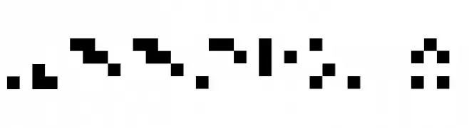
A pixelated, blocky font with a retro digital display style.
 Scaricare 274 Downloads@WebFont
 -
( Fonts by Daniel Zadorozny - www.iconian.com - Free for personal use )
A bold, condensed font with a rugged, Western-inspired style.
![Texas Ranger Condensed font caratteri gratis]() Scaricare 274 Downloads@WebFont
Scaricare 274 Downloads@WebFont -
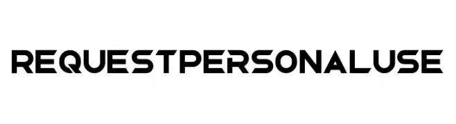
( Fonts by Din Studio - Donis Miftahudin - Personal-use only. For commercial use please contact owner. )
A bold, geometric font with a futuristic and angular design.
![Request Personal Use font caratteri gratis]() Scaricare 274 Downloads@WebFont
Scaricare 274 Downloads@WebFont -
![Liquid Hollow font caratteri gratis]() Scaricare 274 Downloads@WebFont
Scaricare 274 Downloads@WebFont -
( Fonts by Dan P. Lyons - Personal-use only. For commercial use please contact owner. )
A bold, modern sans-serif font with clean lines and uniform stroke width.
![Blue Crown font caratteri gratis]() Scaricare 274 Downloads@WebFont
Scaricare 274 Downloads@WebFont -
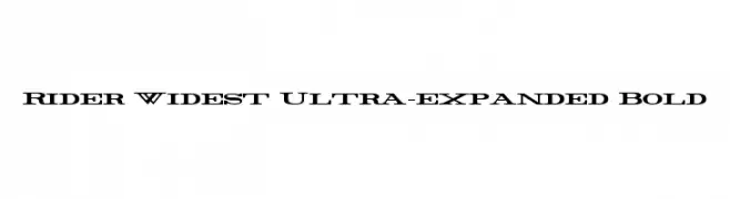
( Fonts by Mans Greback - www.mawns.com )
A bold, ultra-expanded serif font with wide letterforms and high contrast.
![Rider Widest Ultra-expanded Bold font caratteri gratis]() Scaricare 274 Downloads@WebFont
Scaricare 274 Downloads@WebFont -
( Fonts by Stefie Justprince )
A bold, playful handwritten font with rounded edges and thick strokes.
![Sunkist Squash font caratteri gratis]() Scaricare 274 Downloads@WebFont
Scaricare 274 Downloads@WebFont -
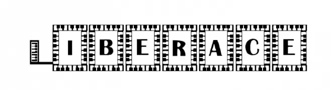
![Liberace font caratteri gratis]() Scaricare 274 Downloads@WebFont
Scaricare 274 Downloads@WebFont -
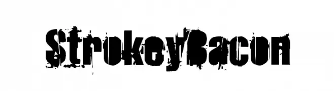
![StrokeyBacon font caratteri gratis]() Scaricare 274 Downloads@WebFont
Scaricare 274 Downloads@WebFont -
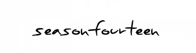
( Fonts by a Max Infeld - XEROGRAPHER FONTS - xerographer.blogspot.com . Personal-use only. For commercial use please contact owner. )
A casual, handwritten font with a playful and informal style.
![SeasonFourteen font caratteri gratis]() Scaricare 274 Downloads@WebFont
Scaricare 274 Downloads@WebFont -
![Bit Blocks TTF BRK font caratteri gratis]() Scaricare 274 Downloads@WebFont
Scaricare 274 Downloads@WebFont -
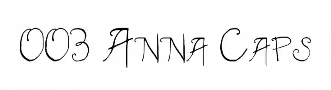
( Jane Bond )
A whimsical, hand-drawn font with playful loops and swirls.
![003 Anna Caps font caratteri gratis]() Scaricare 274 Downloads@WebFont
Scaricare 274 Downloads@WebFont -
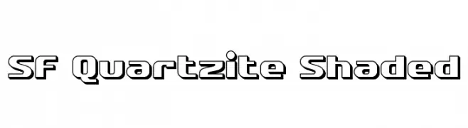
( Fonts by ShyFonts )
A bold, geometric font with a shaded, three-dimensional effect.
![SF Quartzite Shaded font caratteri gratis]() Scaricare 274 Downloads@WebFont
Scaricare 274 Downloads@WebFont -
![Pixel Sleigh Regular font caratteri gratis]() Scaricare 274 Downloads@WebFont
Scaricare 274 Downloads@WebFont -
( Fonts by Aqeela Studio - Muhammad Nasir - Personal-use only. For commercial use please contact owner. )
An elegant script font with intricate loops and swirls, perfect for sophisticated designs.
![Rostina-Regular font caratteri gratis]() Scaricare 274 Downloads@WebFont
Scaricare 274 Downloads@WebFont -
![Klaudia Bold font caratteri gratis]() Scaricare 274 Downloads@WebFont
Scaricare 274 Downloads@WebFont -
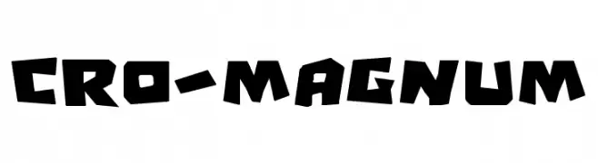
( Fonts by Daniel Zadorozny - www.iconian.com - Free for personal use )
A bold, rugged font with angular, hand-chiseled characters.
![Cro-Magnum font caratteri gratis]() Scaricare 274 Downloads@WebFont
Scaricare 274 Downloads@WebFont -
( Fonts by imagex )
A bold, decorative font with intricate paisley patterns, ideal for standout headlines.
![Paysley Sports font caratteri gratis]() Scaricare 274 Downloads@WebFont
Scaricare 274 Downloads@WebFont -
( Fonts by www.peter-wiegel.de. Personal-use only. For commercial use please contact owner. )
A bold, geometric font with a distinctive striped pattern, perfect for impactful designs.
![Barnroof font caratteri gratis]() Scaricare 274 Downloads@WebFont
Scaricare 274 Downloads@WebFont -
( Fonts by Wei Huang - Personal-use only. For commercial use please contact owner. )
A bold, italicized sans-serif font with strong, dynamic strokes.
![Work Sans Black Italic font caratteri gratis]() Scaricare 274 Downloads@WebFont
Scaricare 274 Downloads@WebFont -
( Free - www.greatmade.de/ )
A tall, narrow font with elongated characters and a modern, artistic style.
![Sancho font caratteri gratis]() Scaricare 274 Downloads@WebFont
Scaricare 274 Downloads@WebFont -
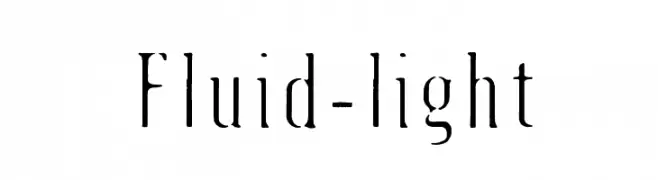
![Fluid-light font caratteri gratis]() Scaricare 274 Downloads@WebFont
Scaricare 274 Downloads@WebFont -
![Critters1DC SemiBold font caratteri gratis]() Scaricare 274 Downloads@WebFont
Scaricare 274 Downloads@WebFont -
![Ruth Fancy font caratteri gratis]() Scaricare 274 Downloads
Scaricare 274 Downloads -
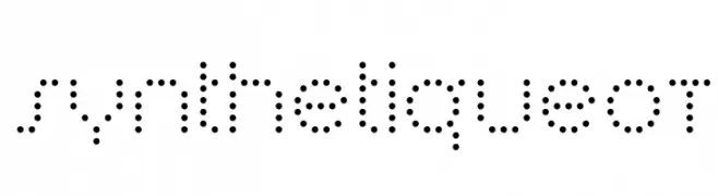
( Fonts by Blue Vinyl - Jess Latham - www.bvfonts.com )
A modern, dotted font with a digital and futuristic style.
![SynthetiqueOT font caratteri gratis]() Scaricare 274 Downloads@WebFont
Scaricare 274 Downloads@WebFont -
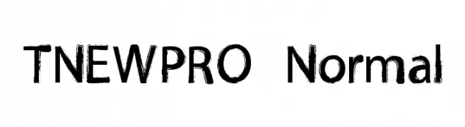
![TNEWPRO Normal font caratteri gratis]() Scaricare 274 Downloads@WebFont
Scaricare 274 Downloads@WebFont -
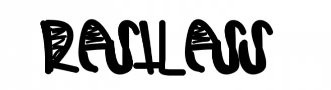
( Fonts by Des Gomez )
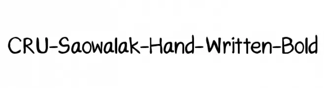
A bold, expressive handwritten font with a playful and dynamic style.
![Restless font caratteri gratis]() Scaricare 274 Downloads@WebFont
Scaricare 274 Downloads@WebFont -
![CRU-Saowalak-Hand-Written-Bold font caratteri gratis]() Scaricare 274 Downloads@WebFont
Scaricare 274 Downloads@WebFont -
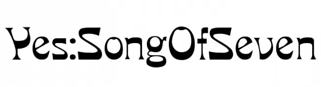
( Fonts by www.varian.net )
A bold, decorative font with a modern and vintage blend, featuring angular strokes and elegant curves.
![Yes:SongOfSeven font caratteri gratis]() Scaricare 274 Downloads@WebFont
Scaricare 274 Downloads@WebFont -
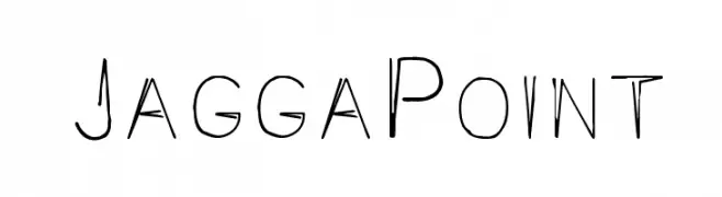
( Fonts by Graham Meade - GemFonts )
A playful, hand-drawn font with irregular strokes and artistic flair.
![JaggaPoint font caratteri gratis]() Scaricare 274 Downloads@WebFont
Scaricare 274 Downloads@WebFont -
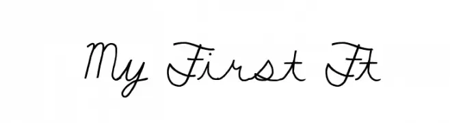
( Fonts by Kirk Shelton - www.kirkshelton.com )
A playful, casual script font with flowing, cursive letterforms.
![My First Ft font caratteri gratis]() Scaricare 274 Downloads@WebFont
Scaricare 274 Downloads@WebFont -
( Fonts by Maulana Creative )
Elegant handwritten script font.
![Mattswans font caratteri gratis]() Scaricare 274 Downloads@WebFont
Scaricare 274 Downloads@WebFont -
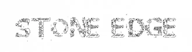
![Stone Edge font caratteri gratis]() Scaricare 274 Downloads@WebFont
Scaricare 274 Downloads@WebFont -
( Paul Lloyd Fonts )
A bold, modern font with clean lines and uniform strokes.
![NewStyle Bold font caratteri gratis]() Scaricare 274 Downloads@WebFont
Scaricare 274 Downloads@WebFont -
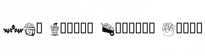
![LCR Autumn Harvest Dings font caratteri gratis]() Scaricare 274 Downloads@WebFont
Scaricare 274 Downloads@WebFont


Quali sono i font più popolari adesso?
Poppins, Roboto, Montserrat, Open Sans e Lato sono molto usati per le forme pulite e l'ampia applicabilità — dall'identità di marca alle landing page e ai poster.
Quali font si usano spesso nei loghi?
Le sans serif geometriche (es. Poppins, famiglie in stile Gotham) sono scelte comuni per un branding pulito e scalabile. Per un tocco personale restano valide script e stili manoscritti. Abbina un display deciso per i titoli a un corpo testo neutro per riconoscibilità ed equilibrio.
Ogni quanto si aggiorna la lista?
Con regolarità, in base ai download e all'attività reale. Torna spesso per scoprire in anticipo le nuove preferite.
💡 Consiglio: aggiungi ai preferiti — le tendenze cambiano in fretta e i font top di oggi possono ispirare il rebranding di domani.