Benvenuto nelle Font Più Popolari — dove popolarità e qualità si incontrano. Qui trovi i font più scaricati e usati dell'anno. Se cerchi scelte sicure per logo, web o social, inizia da qui.
Ogni font top si distingue per equilibrio, leggibilità e versatilità. Troverai sans serif moderne, script eleganti, serif vintage e display minimalisti.
-
( Fonts by Castcraft Software - OPTI Fonts Archive - opti.netii.net - Personal-use only. For commercial use please contact owner. )
A bold, classic serif font with strong strokes and a traditional aesthetic.
 Scaricare 3631 Downloads@WebFont
 -
![Edgar da cool font caratteri gratis]() Scaricare 3630 Downloads@WebFont
Scaricare 3630 Downloads@WebFont -
![Trueno ExtraBold Italic font caratteri gratis]() Scaricare 3629 Downloads@WebFont
Scaricare 3629 Downloads@WebFont -
( Fonts by Castcraft Software - OPTI Fonts Archive - opti.netii.net - Personal-use only. For commercial use please contact owner. )
A bold, outlined font with a modern and impactful style.
![OPTIVanDyke-Outline font caratteri gratis]() Scaricare 3628 Downloads@WebFont
Scaricare 3628 Downloads@WebFont -
( Fonts by Alvaro Thomaz - alvarothomaz.com )
A modern sans-serif font with rounded edges and uniform stroke width.
![Aovel Sans Rounded font caratteri gratis]() Scaricare 3628 Downloads@WebFont
Scaricare 3628 Downloads@WebFont -
( www.fontfabulous.weebly.com )
A playful, handwritten font with an informal and whimsical style.
![MaryKate font caratteri gratis]() Scaricare 3626 Downloads@WebFont
Scaricare 3626 Downloads@WebFont -
( Fonts by ShyFonts )
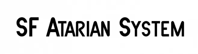
A bold, geometric font with a modern, structured design.
![SF Atarian System font caratteri gratis]() Scaricare 3625 Downloads@WebFont
Scaricare 3625 Downloads@WebFont -
![Blue Highway Condensed font caratteri gratis]() Scaricare 3625 Downloads@WebFont
Scaricare 3625 Downloads@WebFont -
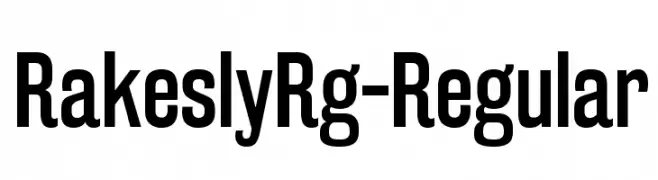
![RakeslyRg-Regular font caratteri gratis]() Scaricare 3624 Downloads@WebFont
Scaricare 3624 Downloads@WebFont -
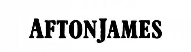
( Fonts by Cumberland Fontworks )
A bold, vintage-style serif font with high contrast and a classic woodblock print feel.
![AftonJames font caratteri gratis]() Scaricare 3624 Downloads@WebFont
Scaricare 3624 Downloads@WebFont -
( Fonts by www.gust.org.pl )
A modern, clean sans-serif font with a slightly condensed style.
![LMSansDemiCond10-Regular font caratteri gratis]() Scaricare 3624 Downloads@WebFont
Scaricare 3624 Downloads@WebFont -
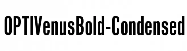
( Fonts by Castcraft Software - OPTI Fonts Archive - opti.netii.net - Personal-use only. For commercial use please contact owner. )
Bold, condensed typeface with a modern and impactful design.
![OPTIVenusBold-Condensed font caratteri gratis]() Scaricare 3623 Downloads@WebFont
Scaricare 3623 Downloads@WebFont -
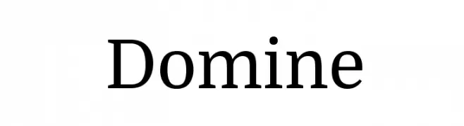
( Copyright (c) 2012, Pablo Impallari (www.impallari.com|impallari@gmail.com) )
A modern serif typeface with elegant, readable characters and balanced proportions.
![Domine font caratteri gratis]() Scaricare 3623 Downloads@WebFont
Scaricare 3623 Downloads@WebFont -
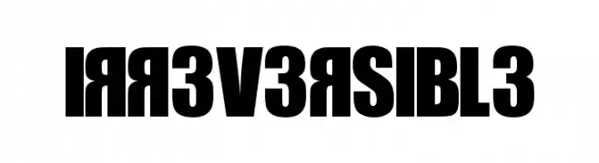
![IRR3V3RSIBL3 font caratteri gratis]() Scaricare 3623 Downloads@WebFont
Scaricare 3623 Downloads@WebFont -
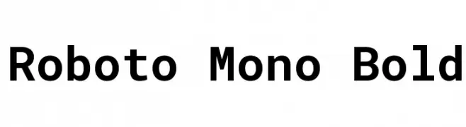
![Roboto Mono Bold font caratteri gratis]() Scaricare 3622 Downloads@WebFont
Scaricare 3622 Downloads@WebFont -
![Arise font caratteri gratis]() Scaricare 3622 Downloads@WebFont
Scaricare 3622 Downloads@WebFont -
( Fonts by www.vicfieger.com )
A bold, industrial font with a distinctive shadow effect for a three-dimensional look.
![Motorway font caratteri gratis]() Scaricare 3622 Downloads@WebFont
Scaricare 3622 Downloads@WebFont -
( Fonts by Agathe M.Joyce - www.foundmyfont.com - Personal-use only. For commercial use please contact owner. )
An elegant script font with intricate, flowing lines and decorative flourishes.
![Alexandra Orleans font caratteri gratis]() Scaricare 3621 Downloads@WebFont
Scaricare 3621 Downloads@WebFont -
![Stylin' BRK font caratteri gratis]() Scaricare 3621 Downloads@WebFont
Scaricare 3621 Downloads@WebFont -
( Fonts by Tursun Sultan - Personal-use only. For commercial use please contact owner. )
A traditional blackletter font with ornate, angular letterforms and high contrast.
![UKIJ Kufi Tar font caratteri gratis]() Scaricare 3619 Downloads@WebFont
Scaricare 3619 Downloads@WebFont -
( Fonts by Katsia Jazwinska )
A bold, expressive handwritten font with brush-like strokes.
![Mayton font caratteri gratis]() Scaricare 3619 Downloads@WebFont
Scaricare 3619 Downloads@WebFont -
( THESE ARE SHAREWARE FONTS ! NOT FREEWARE ! PLEASE VISIT www.fuelfonts.com )
A bold, geometric font with thick strokes and a strong, cohesive design.
![Makimango font caratteri gratis]() Scaricare 3619 Downloads@WebFont
Scaricare 3619 Downloads@WebFont -
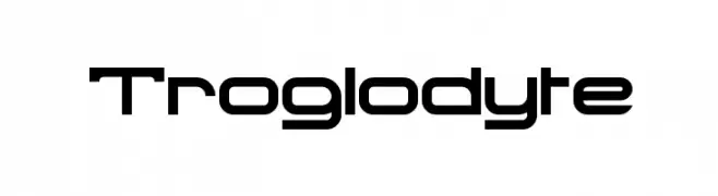
( Fonts by Apostrophic Lab )
A futuristic, geometric font with clean lines and squared edges.
![Troglodyte font caratteri gratis]() Scaricare 3619 Downloads@WebFont
Scaricare 3619 Downloads@WebFont -
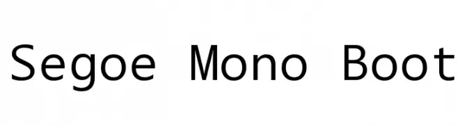
![Segoe Mono Boot font caratteri gratis]() Scaricare 3618 Downloads@WebFont
Scaricare 3618 Downloads@WebFont -
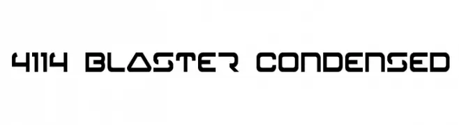
( Fonts by Daniel Zadorozny - www.iconian.com )
A futuristic, geometric font with bold, angular letterforms and a condensed width.
![4114 Blaster Condensed font caratteri gratis]() Scaricare 3617 Downloads@WebFont
Scaricare 3617 Downloads@WebFont -
![Malvie font caratteri gratis]() Scaricare 3616 Downloads@WebFont
Scaricare 3616 Downloads@WebFont -
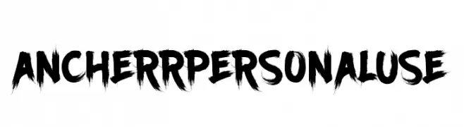
( Fonts by Tama Putra )
A bold, brushstroke-style font with a dynamic and expressive appearance.
![Ancherr Personal Use font caratteri gratis]() Scaricare 3615 Downloads@WebFont
Scaricare 3615 Downloads@WebFont -
![Pravda font caratteri gratis]() Scaricare 3615 Downloads
Scaricare 3615 Downloads -
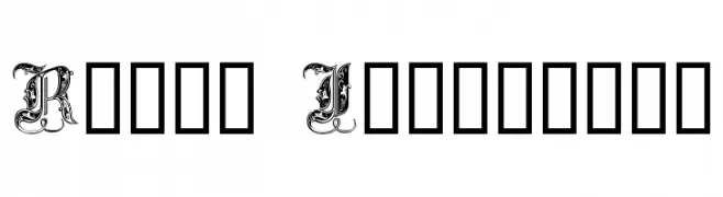
( Fonts by Dieter Steffmann )
An ornate and decorative font with intricate flourishes, ideal for regal and elegant designs.
![Royal Initialen font caratteri gratis]() Scaricare 3615 Downloads@WebFont
Scaricare 3615 Downloads@WebFont -
( Fonts by CannotIntoSpaceFonts - KineticPlasma Fonts - Personal-use only. For commercial use please contact owner. )
A bold, modern font with thick strokes and strong presence.
![Warownia Ultra font caratteri gratis]() Scaricare 3614 Downloads@WebFont
Scaricare 3614 Downloads@WebFont -
( Fonts by Diogene - Claude Pelletier )
A classic serif font with pronounced serifs and balanced proportions.
![Bienetresocial font caratteri gratis]() Scaricare 3614 Downloads@WebFont
Scaricare 3614 Downloads@WebFont -
![Wet Paint font caratteri gratis]() Scaricare 3614 Downloads@WebFont
Scaricare 3614 Downloads@WebFont -
( Fonts by Nick Slater - www.nicholasslater.com )
A bold, industrial-style font with thick strokes and angular serifs.
![Woodshop font caratteri gratis]() Scaricare 3613 Downloads@WebFont
Scaricare 3613 Downloads@WebFont -
( Fonts by Press Gang Studios - Andeh Pinkard - www.pressgang-studios.com )
A bold, dynamic font with sharp, jagged edges and an energetic style.
![Fighting Spirit TBS font caratteri gratis]() Scaricare 3612 Downloads@WebFont
Scaricare 3612 Downloads@WebFont -
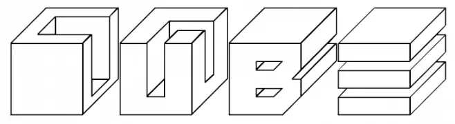
( Fonts by Emil Bertell - www.fenotype.com )
A bold, 3D cube-style font with a modern, geometric design.
![Cube font caratteri gratis]() Scaricare 3611 Downloads@WebFont
Scaricare 3611 Downloads@WebFont


Quali sono i font più popolari adesso?
Poppins, Roboto, Montserrat, Open Sans e Lato sono molto usati per le forme pulite e l'ampia applicabilità — dall'identità di marca alle landing page e ai poster.
Quali font si usano spesso nei loghi?
Le sans serif geometriche (es. Poppins, famiglie in stile Gotham) sono scelte comuni per un branding pulito e scalabile. Per un tocco personale restano valide script e stili manoscritti. Abbina un display deciso per i titoli a un corpo testo neutro per riconoscibilità ed equilibrio.
Ogni quanto si aggiorna la lista?
Con regolarità, in base ai download e all'attività reale. Torna spesso per scoprire in anticipo le nuove preferite.
💡 Consiglio: aggiungi ai preferiti — le tendenze cambiano in fretta e i font top di oggi possono ispirare il rebranding di domani.