Benvenuto nelle Font Più Popolari — dove popolarità e qualità si incontrano. Qui trovi i font più scaricati e usati dell'anno. Se cerchi scelte sicure per logo, web o social, inizia da qui.
Ogni font top si distingue per equilibrio, leggibilità e versatilità. Troverai sans serif moderne, script eleganti, serif vintage e display minimalisti.
-
( Fonts by Mans Greback - www.mansgreback.com - Personal-use only. For commercial use please contact owner. )
A playful, bold font with rounded edges and a hand-drawn feel.
 Scaricare 259 Downloads@WebFont
 -
( Fonts by Maulana Creative )
Elegant handwritten script font.
![Mattswans font caratteri gratis]() Scaricare 259 Downloads@WebFont
Scaricare 259 Downloads@WebFont -
( Free for non-commercial use. www.johnmartz.com )
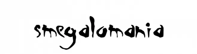
An expressive, hand-drawn font with dynamic strokes and artistic flair.
![Smegalomania font caratteri gratis]() Scaricare 259 Downloads@WebFont
Scaricare 259 Downloads@WebFont -
( Fonts by Graham Meade - GemFonts )
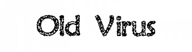
A bold, textured font with an organic, virus-like pattern.
![Old Virus font caratteri gratis]() Scaricare 259 Downloads@WebFont
Scaricare 259 Downloads@WebFont -
( Fonts by Mans Greback - www.mawns.com )
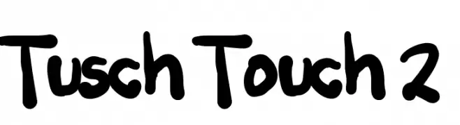
A bold, hand-drawn font with a playful and energetic style.
![Tusch Touch 2 font caratteri gratis]() Scaricare 259 Downloads@WebFont
Scaricare 259 Downloads@WebFont -
-
( Fonts by Syaf Rizal - www.creativefabrica.com/ref/53/ - Personal-use only. For commercial use please contact owner. )
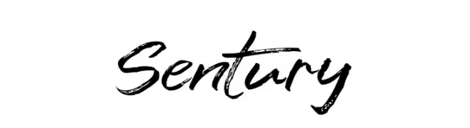
A dynamic, brush-style font with an expressive, handwritten look.
![Sentury font caratteri gratis]() Scaricare 259 Downloads@WebFont
Scaricare 259 Downloads@WebFont -
( Fonts by www.gliphmaker.com. Personal-use only. For commercial use please contact owner. )
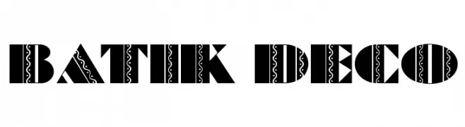
A bold, decorative font with intricate batik-inspired patterns.
![Batik Deco font caratteri gratis]() Scaricare 259 Downloads@WebFont
Scaricare 259 Downloads@WebFont -
( Fonts by Balpirick Studio )
A playful, hand-drawn font with a friendly and whimsical style.
![kidsfun font caratteri gratis]() Scaricare 259 Downloads@WebFont
Scaricare 259 Downloads@WebFont -
( Fonts by Andrew Hart - dirt2.com )
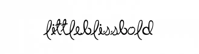
A playful, cursive font with flowing loops and decorative swirls.
![LittleBlissBold font caratteri gratis]() Scaricare 259 Downloads@WebFont
Scaricare 259 Downloads@WebFont -
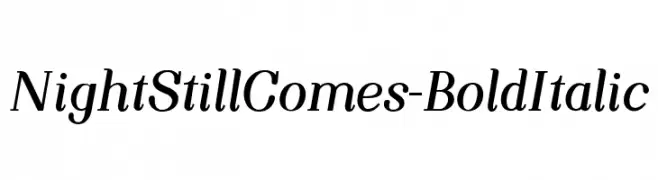
![NightStillComes-BoldItalic font caratteri gratis]() Scaricare 259 Downloads@WebFont
Scaricare 259 Downloads@WebFont -
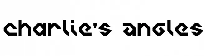
![Charlie's Angles font caratteri gratis]() Scaricare 259 Downloads@WebFont
Scaricare 259 Downloads@WebFont -
( Fonts by Southype )
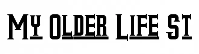
A bold, vintage slab serif font with high contrast and block-like serifs.
![My Older Life St font caratteri gratis]() Scaricare 259 Downloads@WebFont
Scaricare 259 Downloads@WebFont -
![DRAKO HEART font caratteri gratis]() Scaricare 259 Downloads@WebFont
Scaricare 259 Downloads@WebFont -
( Fonts by Apostrophic Lab )
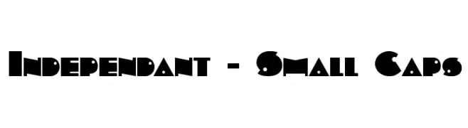
A bold, geometric font with angular shapes and circular elements, offering a modern and assertive style.
![Independant - Small Caps font caratteri gratis]() Scaricare 259 Downloads@WebFont
Scaricare 259 Downloads@WebFont -
( Fonts by Rick Mueller )
A playful, hand-drawn style font with bold, rounded characters.
![CasualMarkerMF font caratteri gratis]() Scaricare 259 Downloads@WebFont
Scaricare 259 Downloads@WebFont -
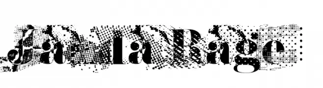
![Janda Rage font caratteri gratis]() Scaricare 259 Downloads@WebFont
Scaricare 259 Downloads@WebFont -
( Fonts by Dreadful Productions - http://usersites.horrorfind.com/home/horror/dreadful/ )
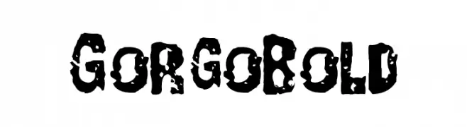
A bold, distressed font with a rugged, textured appearance.
![GorgoBold font caratteri gratis]() Scaricare 259 Downloads@WebFont
Scaricare 259 Downloads@WebFont -
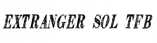
( truefonts.blogspot.com )
A bold, distressed font with a vintage, hand-drawn appearance.
![Extranger sol tfb font caratteri gratis]() Scaricare 259 Downloads@WebFont
Scaricare 259 Downloads@WebFont -
( Fonts by Imagi Factory )
Casual handwritten font.
![Woles font caratteri gratis]() Scaricare 259 Downloads@WebFont
Scaricare 259 Downloads@WebFont -
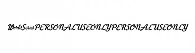
( Fonts by Mans Greback - Personal-use only. For commercial use please contact owner. )
A bold, cursive font with elegant, sweeping curves and a cohesive style.
![World Series PERSONAL USE ONLY PERSONAL USE ONLY font caratteri gratis]() Scaricare 259 Downloads@WebFont
Scaricare 259 Downloads@WebFont -
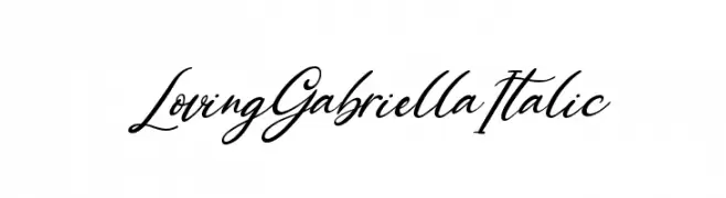
( Fonts by Kong Font - https://fontkong.com/ - Personal-use only. For commercial use please contact owner. )
A graceful, flowing script font with an elegant italic style.
![Loving Gabriella Italic font caratteri gratis]() Scaricare 259 Downloads@WebFont
Scaricare 259 Downloads@WebFont -
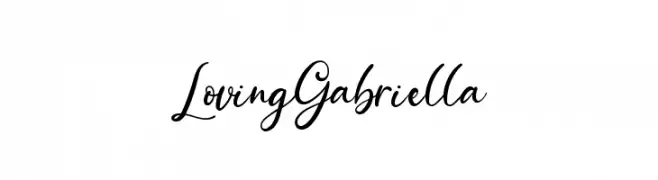
( Fonts by Kong Font - https://fontkong.com/ - Personal-use only. For commercial use please contact owner. )
A graceful script font with elegant, flowing cursive strokes.
![Loving Gabriella font caratteri gratis]() Scaricare 259 Downloads@WebFont
Scaricare 259 Downloads@WebFont -
( Fonts by a Max Infeld - XEROGRAPHER FONTS - xerographer.blogspot.com . Personal-use only. For commercial use please contact owner. )
An expressive, cursive font with fluid, interconnected strokes and a calligraphic style.
![FiftyHours font caratteri gratis]() Scaricare 259 Downloads@WebFont
Scaricare 259 Downloads@WebFont -
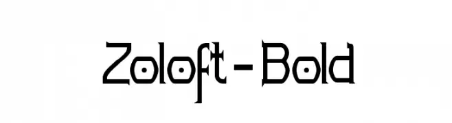
( Fonts by Apostrophic Lab )
A bold, geometric font with angular edges and a futuristic style.
![Zoloft-Bold font caratteri gratis]() Scaricare 259 Downloads@WebFont
Scaricare 259 Downloads@WebFont -
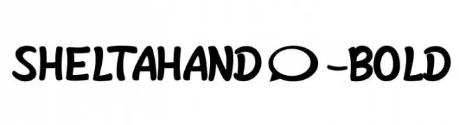
( Phitradesign - Philip Trautmann - www.phitradesign-fonts.com )
A bold, playful handwritten font with rounded edges and thick strokes.
![SheltaHand*-Bold font caratteri gratis]() Scaricare 259 Downloads@WebFont
Scaricare 259 Downloads@WebFont -
( Fonts by www.fontalicious.com )
A playful collection of sports-themed icons in a cartoonish style.
![Sporto font caratteri gratis]() Scaricare 259 Downloads@WebFont
Scaricare 259 Downloads@WebFont -
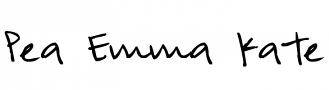
( Free for a personal use. For a commercial use please visit www.kevinandamanda.com )
A playful, casual handwritten font with dynamic strokes.
![Pea Emma Kate font caratteri gratis]() Scaricare 259 Downloads@WebFont
Scaricare 259 Downloads@WebFont -
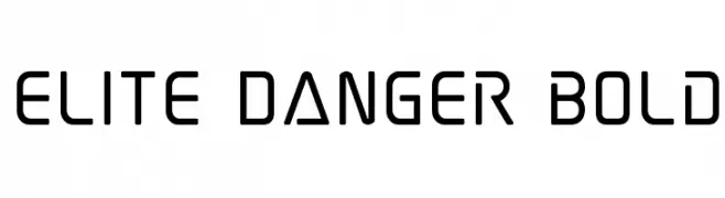
( Fonts by Iconian Fonts )
A futuristic, geometric font with clean lines and a bold presence.
![Elite Danger Bold font caratteri gratis]() Scaricare 259 Downloads@WebFont
Scaricare 259 Downloads@WebFont -
( Fonts by wepfont - Wahyu Eka Prasetya - Personal-use only. For commercial use please contact owner. )
A bold, brush-style font with textured, dynamic strokes.
![Arang font caratteri gratis]() Scaricare 259 Downloads@WebFont
Scaricare 259 Downloads@WebFont -
![Boonta font caratteri gratis]() Scaricare 259 Downloads@WebFont
Scaricare 259 Downloads@WebFont -
( Fonts by www.studiotypo.com - Personal-use only. For commercial use please contact owner. )
A modern, rounded, light italic font with a clean and approachable style.
![Typo Grotesk Rounded Light Italic font caratteri gratis]() Scaricare 259 Downloads@WebFont
Scaricare 259 Downloads@WebFont -
Caratteri di twinletter. For commercial use please contact the owner.
( This font is free for PERSONAL USE only. My fonts for free use allowed only in personal project , non-profit and charity use. But any donation are very appreciated. PayPal account for donation : https://paypal.me/abahrozi Download Commercial License If )
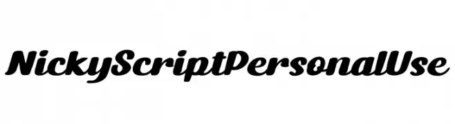
A bold, flowing script font with elegant curves and a modern classic style.
![Nicky Script Personal Use font caratteri gratis]() Scaricare 259 Downloads@WebFont
Scaricare 259 Downloads@WebFont -
( Fonts by vladimirnikolic - Personal-use only. For commercial use please contact owner. )
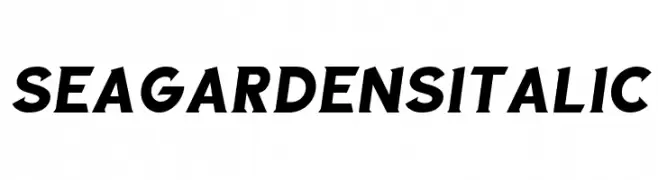
A bold, italicized font with a modern and dynamic style.
![Sea Gardens Italic font caratteri gratis]() Scaricare 259 Downloads@WebFont
Scaricare 259 Downloads@WebFont -
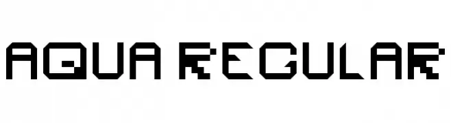
![Aqua Regular font caratteri gratis]() Scaricare 259 Downloads@WebFont
Scaricare 259 Downloads@WebFont -
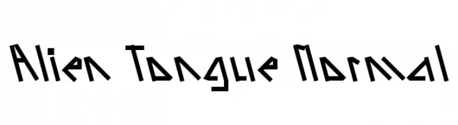
![Alien Tongue Normal font caratteri gratis]() Scaricare 259 Downloads
Scaricare 259 Downloads


Quali sono i font più popolari adesso?
Poppins, Roboto, Montserrat, Open Sans e Lato sono molto usati per le forme pulite e l'ampia applicabilità — dall'identità di marca alle landing page e ai poster.
Quali font si usano spesso nei loghi?
Le sans serif geometriche (es. Poppins, famiglie in stile Gotham) sono scelte comuni per un branding pulito e scalabile. Per un tocco personale restano valide script e stili manoscritti. Abbina un display deciso per i titoli a un corpo testo neutro per riconoscibilità ed equilibrio.
Ogni quanto si aggiorna la lista?
Con regolarità, in base ai download e all'attività reale. Torna spesso per scoprire in anticipo le nuove preferite.
💡 Consiglio: aggiungi ai preferiti — le tendenze cambiano in fretta e i font top di oggi possono ispirare il rebranding di domani.