Benvenuto nelle Font Più Popolari — dove popolarità e qualità si incontrano. Qui trovi i font più scaricati e usati dell'anno. Se cerchi scelte sicure per logo, web o social, inizia da qui.
Ogni font top si distingue per equilibrio, leggibilità e versatilità. Troverai sans serif moderne, script eleganti, serif vintage e display minimalisti.
-
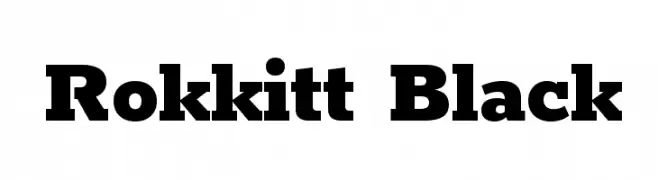
( Copyright 2016 The Rokkit Project Authors (contact@sansoxygen.com) )
A bold, slab serif font with strong, thick strokes and a modern aesthetic.
 Scaricare 3582 Downloads@WebFont
 -
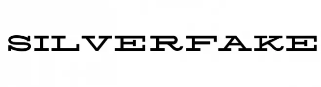
( Fonts by www.Fontfabric.com )
A bold, modern serif font with strong, angular serifs and cohesive design.
![Silverfake font caratteri gratis]() Scaricare 3582 Downloads@WebFont
Scaricare 3582 Downloads@WebFont -
( Fonts by Manfred Klein. Free for private and charity use. Free for commercial with donation to organizations )
A bold, decorative font with artistic flair and dynamic letterforms.
![Cuban font caratteri gratis]() Scaricare 3581 Downloads@WebFont
Scaricare 3581 Downloads@WebFont -
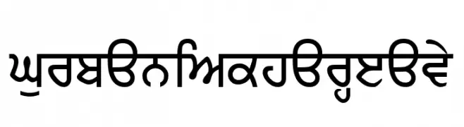
( Fonts by jobanbal )
A bold, heavy font with modern flair and traditional elements, perfect for impactful designs.
![GurbaniAkharHeavy font caratteri gratis]() Scaricare 3581 Downloads@WebFont
Scaricare 3581 Downloads@WebFont -
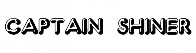
( Fonts by Spork Thug Typography - Josh Wilhelm - www.lifewithouttaffy.com/taffy/blog )
A bold, 3D-effect font with a playful and dynamic style.
![Captain Shiner font caratteri gratis]() Scaricare 3581 Downloads@WebFont
Scaricare 3581 Downloads@WebFont -
( Fonts by Namara Creative Studio - Personal-use only. For commercial use please contact owner. )
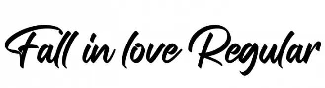
A bold, expressive script font with fluid strokes and dynamic curves.
![Fall in love Regular font caratteri gratis]() Scaricare 3577 Downloads@WebFont
Scaricare 3577 Downloads@WebFont -
( Fonts by Chris Simpson - Personal-use only. For commercial use please contact owner. )
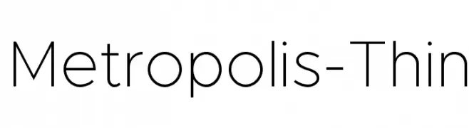
A sleek, modern font with clean lines and uniform stroke width.
![Metropolis-Thin font caratteri gratis]() Scaricare 3577 Downloads@WebFont
Scaricare 3577 Downloads@WebFont -
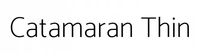
( Copyright 2014 The Catamaran Authors (pria.ravichandran@gmail.com) )
A modern, thin sans-serif font with a clean and elegant design.
![Catamaran Thin font caratteri gratis]() Scaricare 3577 Downloads@WebFont
Scaricare 3577 Downloads@WebFont -
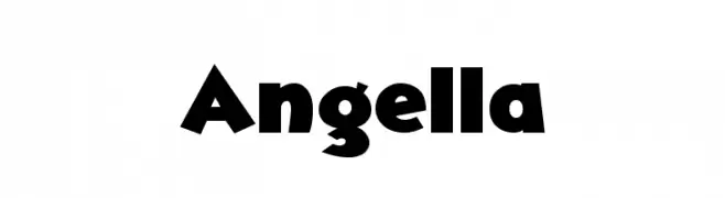
( Free for personal use - www.studiotypo.com )
A bold, playful font with thick, rounded characters.
![Angella font caratteri gratis]() Scaricare 3577 Downloads@WebFont
Scaricare 3577 Downloads@WebFont -
( Fonts by www.peter-wiegel.de. Personal-use only. For commercial use please contact owner. )
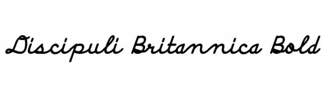
A bold, cursive font with a playful and energetic style.
![Discipuli Britannica Bold font caratteri gratis]() Scaricare 3577 Downloads@WebFont
Scaricare 3577 Downloads@WebFont -
( Fonts by ShyFonts )
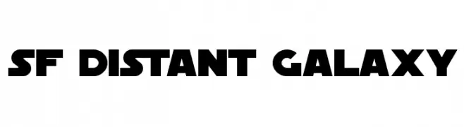
A bold, futuristic font with geometric shapes and a sci-fi aesthetic.
![SF Distant Galaxy font caratteri gratis]() Scaricare 3577 Downloads@WebFont
Scaricare 3577 Downloads@WebFont -
( Fonts by Manfred Klein. Free for private and charity use. Free for commercial with donation to organizations )
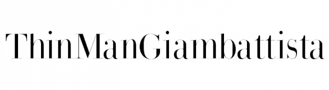
A high-contrast serif typeface with elegant, refined strokes.
![ThinManGiambattista font caratteri gratis]() Scaricare 3576 Downloads@WebFont
Scaricare 3576 Downloads@WebFont -
( Fonts by Ryoichi Tsunekawa - www.dharmatype.com )
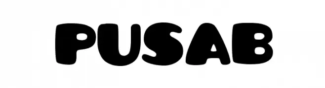
A bold, playful font with rounded, bubble-like characters.
![Pusab font caratteri gratis]() Scaricare 3576 Downloads@WebFont
Scaricare 3576 Downloads@WebFont -
( Fonts by Zetafonts - Personal-use only. For commercial use please contact owner. )
A bold, heavy font with high contrast and tight spacing, perfect for impactful headlines.
![Heading Now Trial 38 Heavy font caratteri gratis]() Scaricare 3575 Downloads@WebFont
Scaricare 3575 Downloads@WebFont -
( Fonts by HENRIavecunK. Personal-use only. For commercial use please contact owner. )
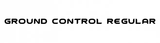
A futuristic, geometric font with rounded edges and consistent weight.
![Ground Control Regular font caratteri gratis]() Scaricare 3575 Downloads@WebFont
Scaricare 3575 Downloads@WebFont -
( Fonts by Original fonts by Vernon Adams / Changes by Cristiano Sobral - Personal-use only. For commercial use please contact owner. )
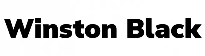
A bold, modern font with strong, uniform characters.
![Winston Black font caratteri gratis]() Scaricare 3574 Downloads@WebFont
Scaricare 3574 Downloads@WebFont -
![Accordion font caratteri gratis]() Scaricare 3574 Downloads@WebFont
Scaricare 3574 Downloads@WebFont -
( Copyright (c) 2011, Pablo Impallari (www.impallari.com|impallari@gmail.com) )
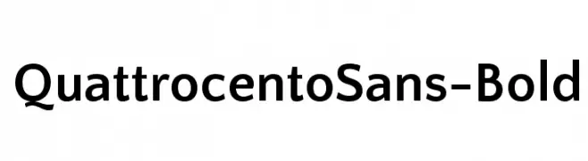
A bold, modern sans-serif font with clean lines and balanced proportions.
![QuattrocentoSans-Bold font caratteri gratis]() Scaricare 3573 Downloads@WebFont
Scaricare 3573 Downloads@WebFont -
![Foo font caratteri gratis]() Scaricare 3573 Downloads@WebFont
Scaricare 3573 Downloads@WebFont -
( Copyright (c) 2015 Dan Reynolds. )
A bold, modern sans-serif font with clean lines and strong readability.
![Biryani Bold font caratteri gratis]() Scaricare 3572 Downloads@WebFont
Scaricare 3572 Downloads@WebFont -
Caratteri di filsonkiol. For commercial use please contact the owner.
![Web Serveroff font caratteri gratis]() Scaricare 3572 Downloads@WebFont
Scaricare 3572 Downloads@WebFont -
![Blade Runner Movie Font 2 font caratteri gratis]() Scaricare 3572 Downloads@WebFont
Scaricare 3572 Downloads@WebFont -
( Fonts by Matthew Welch - www.squaregear.net/fonts/ )
A bold, geometric font with a modern and impactful design.
![Libby Heavy:Version 1.00 font caratteri gratis]() Scaricare 3571 Downloads@WebFont
Scaricare 3571 Downloads@WebFont -
![Tenby Five font caratteri gratis]() Scaricare 3571 Downloads@WebFont
Scaricare 3571 Downloads@WebFont -
![RR Beaver font caratteri gratis]() Scaricare 3569 Downloads@WebFont
Scaricare 3569 Downloads@WebFont -
( Fonts by Michelle Pha )
A playful, handwritten font with bold, rounded strokes and a whimsical touch.
![Shelby font caratteri gratis]() Scaricare 3569 Downloads@WebFont
Scaricare 3569 Downloads@WebFont -
( Fonts by Daniel Zadorozny - www.iconian.com - Free for personal use )
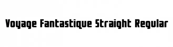
A bold, geometric font with a modern and assertive style.
![Voyage Fantastique Straight Regular font caratteri gratis]() Scaricare 3568 Downloads@WebFont
Scaricare 3568 Downloads@WebFont -
( Copyright (c) 2010, Haley Fiege (haley@kingdomofawesome.com) )
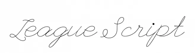
An elegant, flowing script font with classic cursive styling.
![League Script font caratteri gratis]() Scaricare 3568 Downloads@WebFont
Scaricare 3568 Downloads@WebFont -
![Gentium Plus font caratteri gratis]() Scaricare 3568 Downloads@WebFont
Scaricare 3568 Downloads@WebFont -
( Fonts by Matthew Welch - www.squaregear.net/fonts/ )
A bold, modern sans-serif font with clean lines and strong presence.
![Hit the Road Regular font caratteri gratis]() Scaricare 3568 Downloads@WebFont
Scaricare 3568 Downloads@WebFont -
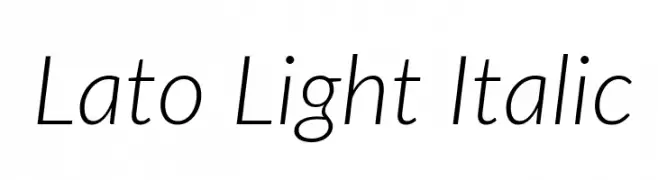
( Copyright (c) 2010-2014 by tyPoland Lukasz Dziedzic (team@latofonts.com) with Reserved Font Name "Lato" )
A sleek, modern, light italic font with smooth curves and balanced spacing.
![Lato Light Italic font caratteri gratis]() Scaricare 3566 Downloads@WebFont
Scaricare 3566 Downloads@WebFont -
![NHL Edge Minnesota Home font caratteri gratis]() Scaricare 3566 Downloads@WebFont
Scaricare 3566 Downloads@WebFont -
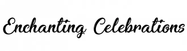
( Fonts by Agathe M.Joyce - www.foundmyfont.com - Personal-use only. For commercial use please contact owner. )
A lively, elegant script font with flowing, interconnected letters.
![Enchanting Celebrations font caratteri gratis]() Scaricare 3565 Downloads@WebFont
Scaricare 3565 Downloads@WebFont -
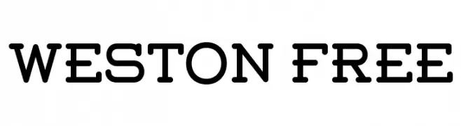
( Fonts by www.Fontfabric.com )
A modern, bold font with rounded edges and geometric structure.
![Weston-Free font caratteri gratis]() Scaricare 3565 Downloads@WebFont
Scaricare 3565 Downloads@WebFont -
![Bambi Bold font caratteri gratis]() Scaricare 3565 Downloads
Scaricare 3565 Downloads


Quali sono i font più popolari adesso?
Poppins, Roboto, Montserrat, Open Sans e Lato sono molto usati per le forme pulite e l'ampia applicabilità — dall'identità di marca alle landing page e ai poster.
Quali font si usano spesso nei loghi?
Le sans serif geometriche (es. Poppins, famiglie in stile Gotham) sono scelte comuni per un branding pulito e scalabile. Per un tocco personale restano valide script e stili manoscritti. Abbina un display deciso per i titoli a un corpo testo neutro per riconoscibilità ed equilibrio.
Ogni quanto si aggiorna la lista?
Con regolarità, in base ai download e all'attività reale. Torna spesso per scoprire in anticipo le nuove preferite.
💡 Consiglio: aggiungi ai preferiti — le tendenze cambiano in fretta e i font top di oggi possono ispirare il rebranding di domani.