Benvenuto nelle Font Più Popolari — dove popolarità e qualità si incontrano. Qui trovi i font più scaricati e usati dell'anno. Se cerchi scelte sicure per logo, web o social, inizia da qui.
Ogni font top si distingue per equilibrio, leggibilità e versatilità. Troverai sans serif moderne, script eleganti, serif vintage e display minimalisti.
-
( Fonts by www.blambot.com )
A bold, playful font with rounded, bulbous characters and a whimsical style.
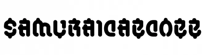 Scaricare 266 Downloads@WebFont
 -
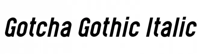
( Levi Szekeres - www.loremipsum.ro )
A bold, italic, and dynamic font with a modern, assertive style.
![Gotcha Gothic Italic font caratteri gratis]() Scaricare 266 Downloads@WebFont
Scaricare 266 Downloads@WebFont -
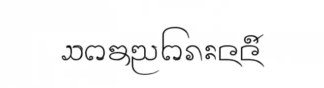
( Fonts by www.omniglot.com )
An ornate and decorative font with flowing, cursive elements and varied stroke thickness.
![Cr-Paitoon font caratteri gratis]() Scaricare 266 Downloads@WebFont
Scaricare 266 Downloads@WebFont -
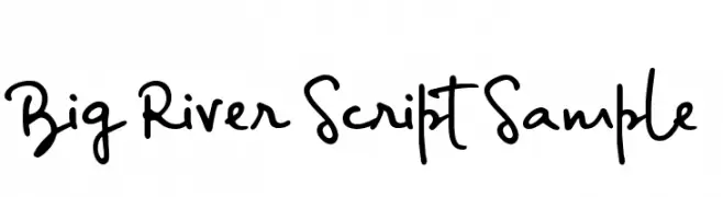
( Ana - www.anasfonts.com/ )
A lively, cursive script font with interconnected characters and dynamic strokes.
![Big River Script Sample font caratteri gratis]() Scaricare 266 Downloads@WebFont
Scaricare 266 Downloads@WebFont -
( Fonts by Zetafonts - Personal-use only. For commercial use please contact owner. )
A bold, condensed, modern font with tight spacing and clean lines.
![Heading Now Trial 06 Bold font caratteri gratis]() Scaricare 266 Downloads@WebFont
Scaricare 266 Downloads@WebFont -
( Fonts by www.studiotypo.com - Personal-use only. For commercial use please contact owner. )
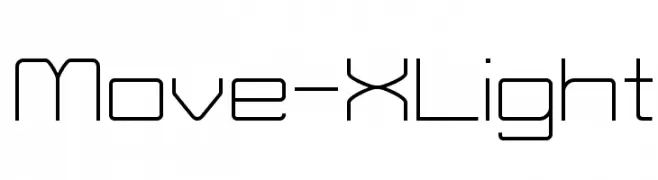
A geometric, modern font with clean lines and a minimalist aesthetic.
![Move-X Light font caratteri gratis]() Scaricare 266 Downloads@WebFont
Scaricare 266 Downloads@WebFont -
( Free for personal use - www.pressgang-studios.com )
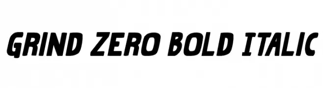
A bold, italicized font with a modern and dynamic style.
![Grind Zero Bold Italic font caratteri gratis]() Scaricare 266 Downloads@WebFont
Scaricare 266 Downloads@WebFont -
( Fonts by Miss Tiina at www.misstiina.com (please check the website before use) )
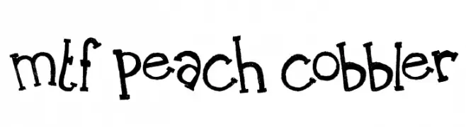
A playful, hand-drawn font with a whimsical and friendly style.
![MTF Peach Cobbler font caratteri gratis]() Scaricare 266 Downloads@WebFont
Scaricare 266 Downloads@WebFont -
![Brigadoom Wide BRK font caratteri gratis]() Scaricare 266 Downloads@WebFont
Scaricare 266 Downloads@WebFont -
( Fonts by Apostrophic Lab )
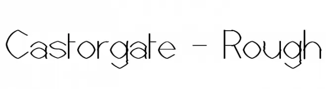
A rough, hand-drawn font with tall, slender characters and uneven strokes.
![Castorgate - Rough font caratteri gratis]() Scaricare 266 Downloads@WebFont
Scaricare 266 Downloads@WebFont -
( Fonts by sronstudio - Yusron Billah - Personal-use only. For commercial use please contact owner. )
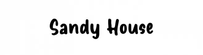
A playful, handwritten font with rounded edges and a casual style.
![Sandy House font caratteri gratis]() Scaricare 266 Downloads@WebFont
Scaricare 266 Downloads@WebFont -
( Fonts by zulkhairilettering - Zulkhairi M Saleh - Personal-use only. For commercial use please contact owner. )
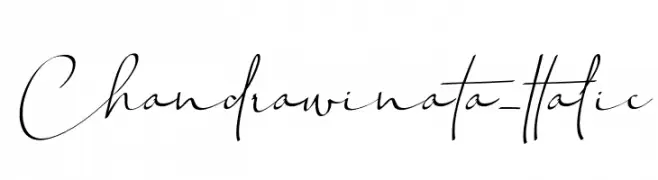
A graceful and flowing script font with elegant, fluid strokes.
![Chandrawinata-Italic font caratteri gratis]() Scaricare 266 Downloads@WebFont
Scaricare 266 Downloads@WebFont -
![I'm A Font Designer font caratteri gratis]() Scaricare 266 Downloads@WebFont
Scaricare 266 Downloads@WebFont -
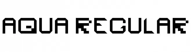
![Aqua Regular font caratteri gratis]() Scaricare 266 Downloads@WebFont
Scaricare 266 Downloads@WebFont -
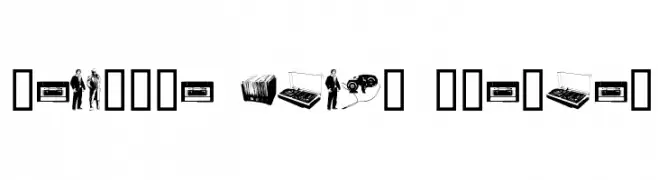
( Fonts by www.fenotype.com )
Retro-themed dingbat set with music gear and vintage figures.
![Fenotype dings preview font caratteri gratis]() Scaricare 266 Downloads@WebFont
Scaricare 266 Downloads@WebFont -
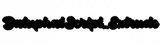
( Fonts by Debut Studio - Ari Fadli - Personal-use only. For commercial use please contact owner. )
A bold, playful script font with a 3D extruded effect and whimsical style.
![BatuphatScript-Extrude font caratteri gratis]() Scaricare 266 Downloads@WebFont
Scaricare 266 Downloads@WebFont -
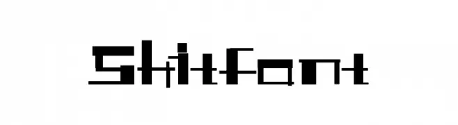
![Shitfont font caratteri gratis]() Scaricare 266 Downloads@WebFont
Scaricare 266 Downloads@WebFont -
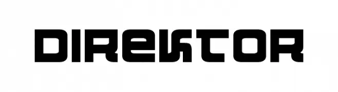
( Fonts by Daniel Zadorozny - www.iconian.com - Free for personal use )
A bold, geometric font with a modern, futuristic style.
![Direktor font caratteri gratis]() Scaricare 266 Downloads@WebFont
Scaricare 266 Downloads@WebFont -
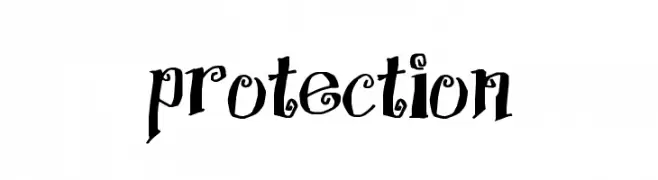
( Fonts by Jacob Fisher - www.pizzadude.dk )
A whimsical, handwritten font with decorative curls and swirls.
![Protection font caratteri gratis]() Scaricare 266 Downloads@WebFont
Scaricare 266 Downloads@WebFont -
![AnmolOutlined font caratteri gratis]() Scaricare 266 Downloads@WebFont
Scaricare 266 Downloads@WebFont -
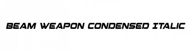
( Fonts by Iconian Fonts )
A futuristic, condensed italic font with bold, angular lines.
![Beam Weapon Condensed Italic font caratteri gratis]() Scaricare 266 Downloads@WebFont
Scaricare 266 Downloads@WebFont -
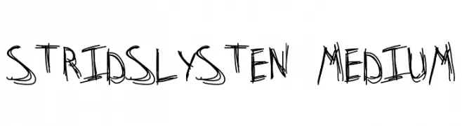
![Stridslysten Medium font caratteri gratis]() Scaricare 266 Downloads@WebFont
Scaricare 266 Downloads@WebFont -
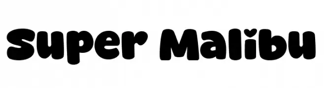
( Fonts by fsuarez913 )
A playful, bold font with rounded, bubble-like characters.
![Super Malibu font caratteri gratis]() Scaricare 266 Downloads@WebFont
Scaricare 266 Downloads@WebFont -
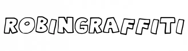
( Free )
A bold, graffiti-inspired font with playful, rounded characters.
![RobinGraffiti font caratteri gratis]() Scaricare 266 Downloads@WebFont
Scaricare 266 Downloads@WebFont -
( Iordanis Passas - http:/ip-art.info )
A bold, textured slab serif font with a vintage, distressed style.
![Sanek font caratteri gratis]() Scaricare 266 Downloads@WebFont
Scaricare 266 Downloads@WebFont -
![DanceMixR font caratteri gratis]() Scaricare 266 Downloads@WebFont
Scaricare 266 Downloads@WebFont -
( Fonts by Noah Type )
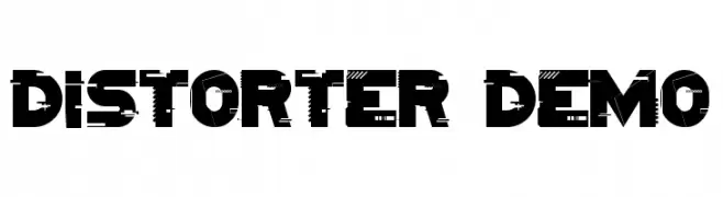
A bold, geometric font with a distressed, glitch-like effect for modern designs.
![Distorter Demo font caratteri gratis]() Scaricare 266 Downloads@WebFont
Scaricare 266 Downloads@WebFont -
![UNIVERSAL SANS PERSONAL USE Regular font caratteri gratis]() Scaricare 266 Downloads@WebFont
Scaricare 266 Downloads@WebFont -
![Giovedi font caratteri gratis]() Scaricare 266 Downloads@WebFont
Scaricare 266 Downloads@WebFont -
( Fonts by FONTS BY LYAJKA - Personal-use only. For commercial use please contact owner. )
A bold, geometric font with a futuristic and industrial design.
![Mob 200 (RUS BY LYAJKA) font caratteri gratis]() Scaricare 266 Downloads@WebFont
Scaricare 266 Downloads@WebFont -
( Fonts by Chequered Ink - chequered.ink - Personal-use only. For commercial use please contact owner. )
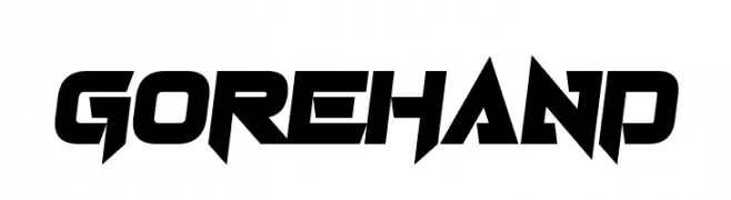
A bold, angular font with a futuristic and dynamic style.
![Gorehand font caratteri gratis]() Scaricare 266 Downloads@WebFont
Scaricare 266 Downloads@WebFont -
( Fonts by niyos - Nur Huda - Personal-use only. For commercial use please contact owner. )
A lively, expressive script font with a handwritten feel.
![adela font caratteri gratis]() Scaricare 266 Downloads@WebFont
Scaricare 266 Downloads@WebFont -
( Fonts by Daniel Zadorozny - www.iconian.com - Personal-use only. For commercial use please contact owner. )
A bold, semi-italic font with a modern, angular design.
![Pilot Command Semi-Italic font caratteri gratis]() Scaricare 266 Downloads@WebFont
Scaricare 266 Downloads@WebFont -
( Fonts by Bill Roach. Personal-use only. For commercial use please contact owner. )
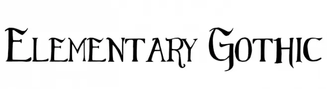
A bold Gothic font with sharp, angular lines and intricate serifs.
![Elementary Gothic font caratteri gratis]() Scaricare 266 Downloads@WebFont
Scaricare 266 Downloads@WebFont -
( Fonts by Khurasan )
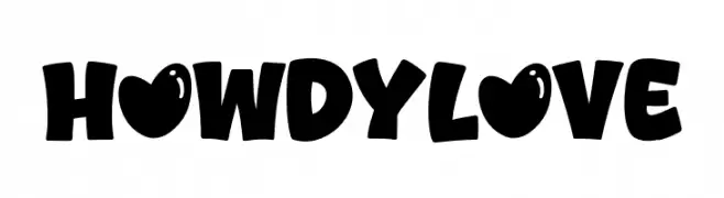
A bold, playful font with a cartoonish style and unique heart-shaped details.
![Howdy Love font caratteri gratis]() Scaricare 266 Downloads@WebFont
Scaricare 266 Downloads@WebFont


Quali sono i font più popolari adesso?
Poppins, Roboto, Montserrat, Open Sans e Lato sono molto usati per le forme pulite e l'ampia applicabilità — dall'identità di marca alle landing page e ai poster.
Quali font si usano spesso nei loghi?
Le sans serif geometriche (es. Poppins, famiglie in stile Gotham) sono scelte comuni per un branding pulito e scalabile. Per un tocco personale restano valide script e stili manoscritti. Abbina un display deciso per i titoli a un corpo testo neutro per riconoscibilità ed equilibrio.
Ogni quanto si aggiorna la lista?
Con regolarità, in base ai download e all'attività reale. Torna spesso per scoprire in anticipo le nuove preferite.
💡 Consiglio: aggiungi ai preferiti — le tendenze cambiano in fretta e i font top di oggi possono ispirare il rebranding di domani.