Benvenuto nelle Font Più Popolari — dove popolarità e qualità si incontrano. Qui trovi i font più scaricati e usati dell'anno. Se cerchi scelte sicure per logo, web o social, inizia da qui.
Ogni font top si distingue per equilibrio, leggibilità e versatilità. Troverai sans serif moderne, script eleganti, serif vintage e display minimalisti.
-
( Konstantine Studio - www.behance.net/konstantinestudio )
A modern vintage font with tall, narrow letterforms and decorative serifs.
 Scaricare 265 Downloads@WebFont
 -
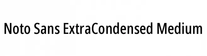
( Fonts by Google )
A modern, extra condensed sans-serif font with medium weight and high legibility.
![Noto Sans ExtraCondensed Medium font caratteri gratis]() Scaricare 265 Downloads@WebFont
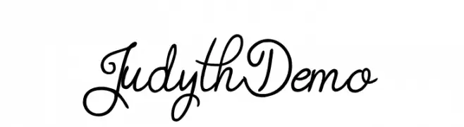
Scaricare 265 Downloads@WebFont -
![Judyth Demo font caratteri gratis]() Scaricare 265 Downloads@WebFont
Scaricare 265 Downloads@WebFont -
![Mers font caratteri gratis]() Scaricare 265 Downloads@WebFont
Scaricare 265 Downloads@WebFont -
( Fonts by Arkandis Digital Foundry )
A decorative symbol font featuring diverse arrow icons.
![Arrows ADF font caratteri gratis]() Scaricare 265 Downloads@WebFont
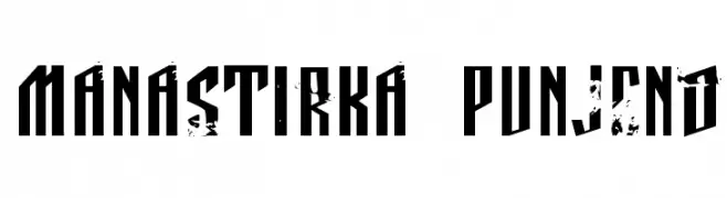
Scaricare 265 Downloads@WebFont -
![Manastirka punjeno font caratteri gratis]() Scaricare 265 Downloads@WebFont
Scaricare 265 Downloads@WebFont -
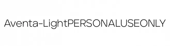
( Fonts by Ellen Luff - Personal-use only. For commercial use please contact owner. )
A modern, geometric sans-serif font with clean lines and uniform stroke width.
![Aventa-LightPERSONALUSEONLY font caratteri gratis]() Scaricare 265 Downloads@WebFont
Scaricare 265 Downloads@WebFont -
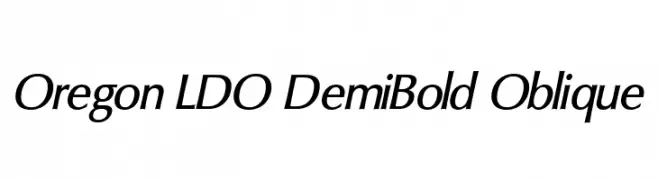
( Fonts by Luke Owens - Personal-use only. For commercial use please contact owner. )
A dynamic, oblique font with elegant curves and sharp edges.
![Oregon LDO DemiBold Oblique font caratteri gratis]() Scaricare 265 Downloads@WebFont
Scaricare 265 Downloads@WebFont -
( Fonts by Des Gomez )
A playful, handwritten font with tall, narrow letters and a whimsical style.
![PrettyGirl font caratteri gratis]() Scaricare 265 Downloads@WebFont
Scaricare 265 Downloads@WebFont -
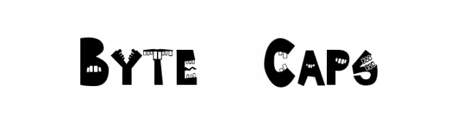
![Byte Caps font caratteri gratis]() Scaricare 265 Downloads@WebFont
Scaricare 265 Downloads@WebFont -
( Fonts by Rodrigo German - RASDESIGN )
A bold, rounded font with a playful and modern style.
![RÖLÓ! font caratteri gratis]() Scaricare 265 Downloads@WebFont
Scaricare 265 Downloads@WebFont -
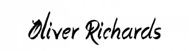
( Fonts by Jonathan S. Harris - www.tattoowoo.com. Personal-use only. For commercial use please contact owner. )
A bold, expressive brush script with dynamic strokes and a textured, handcrafted appearance.
![Oliver Richards font caratteri gratis]() Scaricare 265 Downloads@WebFont
Scaricare 265 Downloads@WebFont -
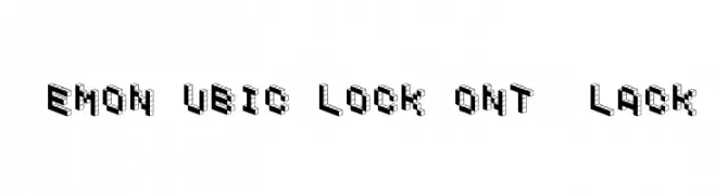
![DemonCubicBlockFont Black font caratteri gratis]() Scaricare 265 Downloads@WebFont
Scaricare 265 Downloads@WebFont -
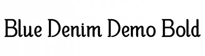
( Fonts by Edric Studio - Personal-use only. For commercial use please contact owner. )
A bold, modern font with subtle serifs and a touch of elegance.
![Blue Denim Demo Bold font caratteri gratis]() Scaricare 265 Downloads@WebFont
Scaricare 265 Downloads@WebFont -
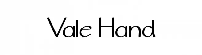
( Fonts by Valeria Betancourt )
A playful handwritten font with smooth curves and a casual style.
![Vale Hand font caratteri gratis]() Scaricare 265 Downloads@WebFont
Scaricare 265 Downloads@WebFont -
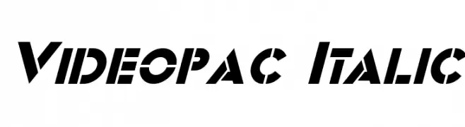
( Fonts by a Neale Davidson - www.pixelsagas.com. Personal-use only. For commercial use please contact owner. )
A bold, italicized font with a futuristic, geometric design.
![Videopac Italic font caratteri gratis]() Scaricare 265 Downloads@WebFont
Scaricare 265 Downloads@WebFont -
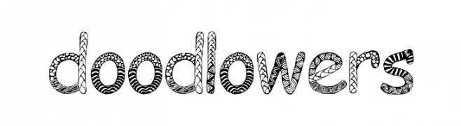
( Fonts by EvasUniqueFonts )
A whimsical, doodle-patterned decorative font perfect for playful designs.
![Doodlowers font caratteri gratis]() Scaricare 265 Downloads@WebFont
Scaricare 265 Downloads@WebFont -
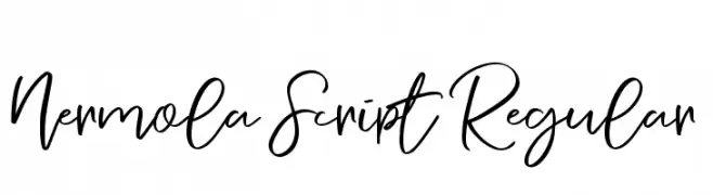
( Alit Design - Alit Suarnegara - www.alitdesign.net )
A lively and fluid script font with interconnected cursive strokes.
![Nermola Script Regular font caratteri gratis]() Scaricare 265 Downloads@WebFont
Scaricare 265 Downloads@WebFont -
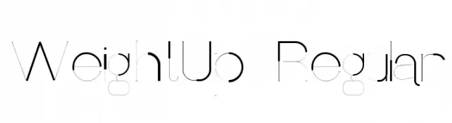
Caratteri di Raashi95. For commercial use please contact the owner.
![WeightUp-Regular font caratteri gratis]() Scaricare 265 Downloads@WebFont
Scaricare 265 Downloads@WebFont -
( Fonts by Dav studio - Dimas Aji Virgiawan - Personal-use only. For commercial use please contact owner. )
A modern, elegant script font with flowing curves and decorative swashes.
![Suneater font caratteri gratis]() Scaricare 265 Downloads@WebFont
Scaricare 265 Downloads@WebFont -
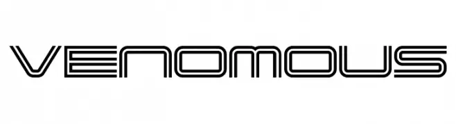
( Fonts by Rich Gast - www.greywolfwebworks.com Commerciali Caratteri )
A futuristic, geometric font with a double-line structure and modern appeal.
![Venomous font caratteri gratis]() Scaricare 265 Downloads
Scaricare 265 Downloads -
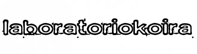
( Fonts by www.junkohanhero.com )
A bold, distressed font with outlined characters and a grungy texture.
![Laboratoriokoira font caratteri gratis]() Scaricare 265 Downloads@WebFont
Scaricare 265 Downloads@WebFont -
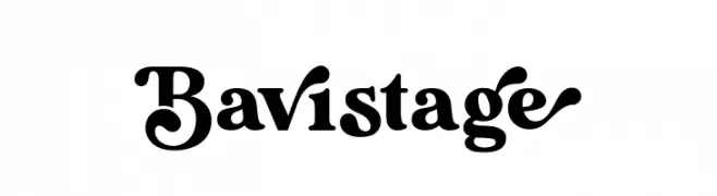
( Fonts by Aluyeah Studio - Personal-use only. For commercial use please contact owner. )
A bold, decorative font with unique flourishes and strong visual impact.
![Bavistage font caratteri gratis]() Scaricare 265 Downloads@WebFont
Scaricare 265 Downloads@WebFont -
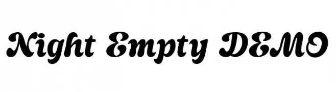
( Fonts by Dharmas Studio )
A bold, flowing script font with elegant, rounded characters.
![Night Empty DEMO font caratteri gratis]() Scaricare 265 Downloads@WebFont
Scaricare 265 Downloads@WebFont -
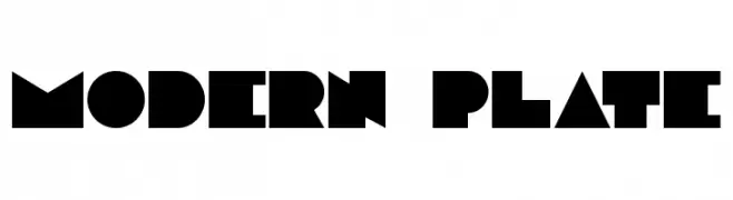
( Fonts by Benoit Champy - www.vnbc.fr - Personal-use only. For commercial use please contact owner. )
A bold, geometric font with sharp angles and a modern aesthetic.
![Modern plate font caratteri gratis]() Scaricare 265 Downloads@WebFont
Scaricare 265 Downloads@WebFont -
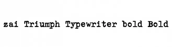
( Fonts by Tomasz Skowronski - Personal-use only. For commercial use please contact owner. )
A bold, textured typewriter-style font with a vintage, distressed look.
![zai Triumph Typewriter bold Bold font caratteri gratis]() Scaricare 265 Downloads@WebFont
Scaricare 265 Downloads@WebFont -
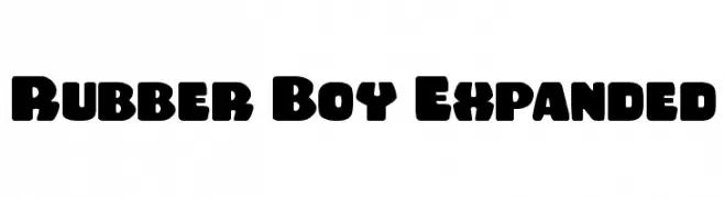
( Fonts by Daniel Zadorozny - www.iconian.com )
A bold, playful font with rounded characters and a retro-modern style.
![Rubber Boy Expanded font caratteri gratis]() Scaricare 265 Downloads@WebFont
Scaricare 265 Downloads@WebFont -
![RomulanHawk font caratteri gratis]() Scaricare 265 Downloads@WebFont
Scaricare 265 Downloads@WebFont -
( Cristina Palapa )
A modern, slanted font with bold, angular characters and a dynamic style.
![Fly font caratteri gratis]() Scaricare 265 Downloads@WebFont
Scaricare 265 Downloads@WebFont -
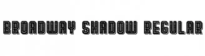
( Vladimir Nikolic - www.coroflot.com/vladimirnikolic )
A bold, dotted font with a shadow effect, ideal for vintage or theatrical designs.
![Broadway Shadow Regular font caratteri gratis]() Scaricare 265 Downloads@WebFont
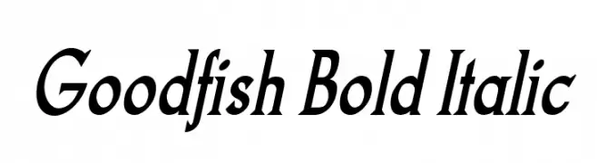
Scaricare 265 Downloads@WebFont -
![Goodfish Bold Italic font caratteri gratis]() Scaricare 265 Downloads@WebFont
Scaricare 265 Downloads@WebFont -
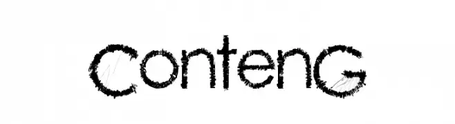
( Fonts by a cenz qobbal - www.facebook.com/cenzqobbalfonts. Personal-use only. For commercial use please contact owner. )
A rugged, textured font with a hand-drawn, edgy style.
![ContenG font caratteri gratis]() Scaricare 265 Downloads@WebFont
Scaricare 265 Downloads@WebFont -
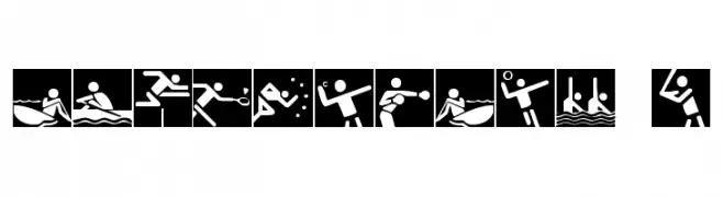
( Fonts by Daniel Zadorozny - www.iconian.com - Free for personal use )
A geometric pictogram icon set for Olympic sports and symbols.
![Olympicons 2 font caratteri gratis]() Scaricare 265 Downloads@WebFont
Scaricare 265 Downloads@WebFont -
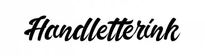
( Debut Studio - Ari Fadli - creativemarket.com/debutstudio )
A bold, cursive font with fluid, interconnected strokes.
![Handletterink font caratteri gratis]() Scaricare 265 Downloads@WebFont
Scaricare 265 Downloads@WebFont -
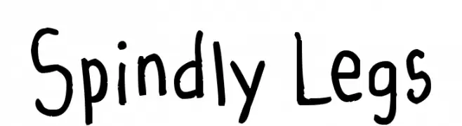
( Stork - Vextorart Stork - www.vextorart.blogspot.com )
A playful, hand-drawn font with irregular strokes and a whimsical style.
![Spindly Legs font caratteri gratis]() Scaricare 265 Downloads@WebFont
Scaricare 265 Downloads@WebFont


Quali sono i font più popolari adesso?
Poppins, Roboto, Montserrat, Open Sans e Lato sono molto usati per le forme pulite e l'ampia applicabilità — dall'identità di marca alle landing page e ai poster.
Quali font si usano spesso nei loghi?
Le sans serif geometriche (es. Poppins, famiglie in stile Gotham) sono scelte comuni per un branding pulito e scalabile. Per un tocco personale restano valide script e stili manoscritti. Abbina un display deciso per i titoli a un corpo testo neutro per riconoscibilità ed equilibrio.
Ogni quanto si aggiorna la lista?
Con regolarità, in base ai download e all'attività reale. Torna spesso per scoprire in anticipo le nuove preferite.
💡 Consiglio: aggiungi ai preferiti — le tendenze cambiano in fretta e i font top di oggi possono ispirare il rebranding di domani.