Benvenuto nelle Font Più Popolari — dove popolarità e qualità si incontrano. Qui trovi i font più scaricati e usati dell'anno. Se cerchi scelte sicure per logo, web o social, inizia da qui.
Ogni font top si distingue per equilibrio, leggibilità e versatilità. Troverai sans serif moderne, script eleganti, serif vintage e display minimalisti.
-
 Scaricare 3548 Downloads@WebFont
 -
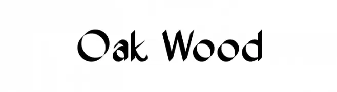
![Oak Wood font caratteri gratis]() Scaricare 3548 Downloads@WebFont
Scaricare 3548 Downloads@WebFont -
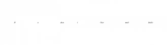
![Bodoni-Normal-Italic font caratteri gratis]() Scaricare 3547 Downloads
Scaricare 3547 Downloads -
![Rufa font caratteri gratis]() Scaricare 3547 Downloads@WebFont
Scaricare 3547 Downloads@WebFont -
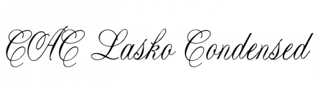
![CAC Lasko Condensed font caratteri gratis]() Scaricare 3546 Downloads@WebFont
Scaricare 3546 Downloads@WebFont -
( Fonts by TypeType - Personal-use only. For commercial use please contact owner. )
A bold, modern sans-serif typeface with uniform strokes and strong visual impact.
![TT Norms Black font caratteri gratis]() Scaricare 3545 Downloads@WebFont
Scaricare 3545 Downloads@WebFont -
( Copyright 2015 The El Messiri Project Authors. )
A modern, elegant font with smooth curves and sharp edges, suitable for versatile applications.
![El Messiri Regular font caratteri gratis]() Scaricare 3545 Downloads@WebFont
Scaricare 3545 Downloads@WebFont -
Caratteri di Kemal. For commercial use please contact the owner.
![ModifiedbyKEMAL font caratteri gratis]() Scaricare 3545 Downloads@WebFont
Scaricare 3545 Downloads@WebFont -
( Fonts by Apostrophic Lab )
A bold, playful font with rounded edges and a bubbly appearance.
![Distro Bold font caratteri gratis]() Scaricare 3545 Downloads@WebFont
Scaricare 3545 Downloads@WebFont -
( Typia Nesia - www.myfonts.com/foundry/Typia_Nesia/ )
A bold, expressive script font with a hand-drawn, dynamic style.
![The Historia Demo font caratteri gratis]() Scaricare 3544 Downloads@WebFont
Scaricare 3544 Downloads@WebFont -
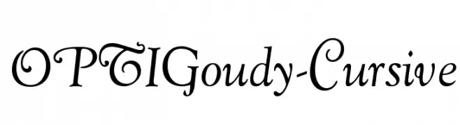
( Fonts by Castcraft Software - opti.netii.net - check the website before use )
A classic cursive font with elegant, flowing lines and sophisticated style.
![OPTIGoudy-Cursive font caratteri gratis]() Scaricare 3544 Downloads@WebFont
Scaricare 3544 Downloads@WebFont -
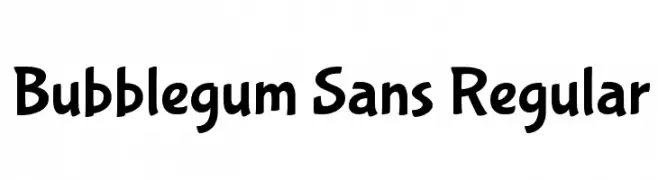
( Copyright (c) 2011 Angel Koziupa (sudtipos@sudtipos.com) )
A playful, bubbly typeface with a hand-drawn, whimsical style.
![Bubblegum Sans Regular font caratteri gratis]() Scaricare 3544 Downloads@WebFont
Scaricare 3544 Downloads@WebFont -
![Kuriero Esperanto Dika font caratteri gratis]() Scaricare 3543 Downloads
Scaricare 3543 Downloads -
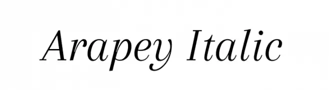
( Copyright (c) 2011, Eduardo Tunni (http://www.tipo.net.ar) )
An elegant serif font with a classic italic style and smooth, flowing curves.
![Arapey Italic font caratteri gratis]() Scaricare 3542 Downloads@WebFont
Scaricare 3542 Downloads@WebFont -
![Udgam font caratteri gratis]() Scaricare 3542 Downloads@WebFont
Scaricare 3542 Downloads@WebFont -
![TeXGyreTermes-Regular font caratteri gratis]() Scaricare 3541 Downloads@WebFont
Scaricare 3541 Downloads@WebFont -
![RFX Splatz font caratteri gratis]() Scaricare 3540 Downloads@WebFont
Scaricare 3540 Downloads@WebFont -
( Fonts by Manfred Klein - manfred-klein.ina-mar.com )
A bold, rounded font with a friendly and approachable style.
![FolksBlack font caratteri gratis]() Scaricare 3540 Downloads@WebFont
Scaricare 3540 Downloads@WebFont -
( Fonts by Rodrigo German - RASDESIGN )
The image features hand-drawn illustrations, not a standard font.
![chile font caratteri gratis]() Scaricare 3539 Downloads@WebFont
Scaricare 3539 Downloads@WebFont -
( Fonts by a Neale Davidson - www.pixelsagas.com. Personal-use only. For commercial use please contact owner. )
A modern, geometric font with rounded edges and a tech-inspired design.
![Downlink font caratteri gratis]() Scaricare 3537 Downloads@WebFont
Scaricare 3537 Downloads@WebFont -
![M+ 1p thin font caratteri gratis]() Scaricare 3537 Downloads@WebFont
Scaricare 3537 Downloads@WebFont -
( Fonts by Mario Arturo - marioarturo.com. Personal-use only. For commercial use please contact owner. Contact the owner for a donation. )
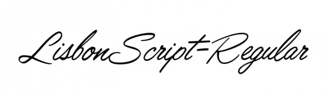
A flowing, cursive script font with elegant, handwritten calligraphy style.
![LisbonScript-Regular font caratteri gratis]() Scaricare 3536 Downloads@WebFont
Scaricare 3536 Downloads@WebFont -
![101! Chinese Zodiac font caratteri gratis]() Scaricare 3536 Downloads@WebFont
Scaricare 3536 Downloads@WebFont -
![WilhelmKlingsporGotisch font caratteri gratis]() Scaricare 3536 Downloads@WebFont
Scaricare 3536 Downloads@WebFont -
( Fonts by Dan P. Lyons - Personal-use only. For commercial use please contact owner. )
A playful, bold font with rounded, bubbly characters.
![ToySans font caratteri gratis]() Scaricare 3535 Downloads@WebFont
Scaricare 3535 Downloads@WebFont -
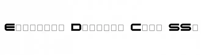
![Eyechart Display Caps SSi font caratteri gratis]() Scaricare 3535 Downloads
Scaricare 3535 Downloads -
![CochinArchaic font caratteri gratis]() Scaricare 3535 Downloads@WebFont
Scaricare 3535 Downloads@WebFont -
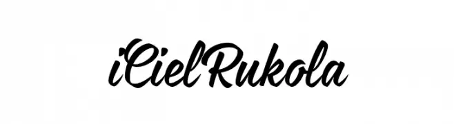
![iCielRukola font caratteri gratis]() Scaricare 3534 Downloads@WebFont
Scaricare 3534 Downloads@WebFont -
![Kelvinized Normal font caratteri gratis]() Scaricare 3533 Downloads@WebFont
Scaricare 3533 Downloads@WebFont -
( Copyright (c) 2012, Eduardo Tunni (http://www.tipo.net.ar), with Reserved Font Name 'Strait' )
A modern, geometric sans-serif font with consistent stroke width and clear readability.
![Strait font caratteri gratis]() Scaricare 3532 Downloads@WebFont
Scaricare 3532 Downloads@WebFont -
![An Unfortunate Event font caratteri gratis]() Scaricare 3532 Downloads@WebFont
Scaricare 3532 Downloads@WebFont -
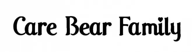
![Care Bear Family font caratteri gratis]() Scaricare 3532 Downloads@WebFont
Scaricare 3532 Downloads@WebFont -
( Fonts by www.blambot.com )
A playful, rounded font with a hand-drawn feel and consistent stroke thickness.
![DigitalStrip 2.0 BB font caratteri gratis]() Scaricare 3531 Downloads@WebFont
Scaricare 3531 Downloads@WebFont -
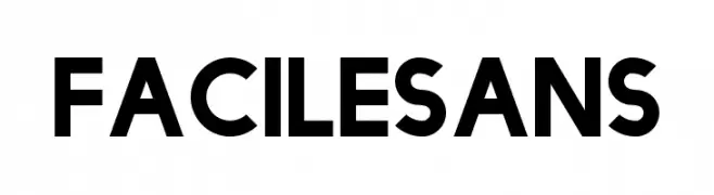
![FacileSans font caratteri gratis]() Scaricare 3530 Downloads@WebFont
Scaricare 3530 Downloads@WebFont -
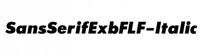
( Fonts by Casady & Greene )
Bold, italicized sans-serif font with high contrast and modern style.
![SansSerifExbFLF-Italic font caratteri gratis]() Scaricare 3530 Downloads@WebFont
Scaricare 3530 Downloads@WebFont


Quali sono i font più popolari adesso?
Poppins, Roboto, Montserrat, Open Sans e Lato sono molto usati per le forme pulite e l'ampia applicabilità — dall'identità di marca alle landing page e ai poster.
Quali font si usano spesso nei loghi?
Le sans serif geometriche (es. Poppins, famiglie in stile Gotham) sono scelte comuni per un branding pulito e scalabile. Per un tocco personale restano valide script e stili manoscritti. Abbina un display deciso per i titoli a un corpo testo neutro per riconoscibilità ed equilibrio.
Ogni quanto si aggiorna la lista?
Con regolarità, in base ai download e all'attività reale. Torna spesso per scoprire in anticipo le nuove preferite.
💡 Consiglio: aggiungi ai preferiti — le tendenze cambiano in fretta e i font top di oggi possono ispirare il rebranding di domani.