Benvenuto nelle Font Più Popolari — dove popolarità e qualità si incontrano. Qui trovi i font più scaricati e usati dell'anno. Se cerchi scelte sicure per logo, web o social, inizia da qui.
Ogni font top si distingue per equilibrio, leggibilità e versatilità. Troverai sans serif moderne, script eleganti, serif vintage e display minimalisti.
-
( Fonts by Divide By Zero! - fonts.tom7.com )
A playful set of hand-drawn doodles and illustrations with a quirky, cartoonish style.
 Scaricare 262 Downloads@WebFont
 -
( Fonts by Pinisiart )
A bold, playful font with rounded, bubbly characters perfect for fun and whimsical designs.
![Second-Grade font caratteri gratis]() Scaricare 262 Downloads@WebFont
Scaricare 262 Downloads@WebFont -
( Fonts by Apostrophic Lab )
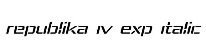
A modern, italicized font with expanded, geometric shapes and clean lines.
![Republika IV Exp Italic font caratteri gratis]() Scaricare 262 Downloads@WebFont
Scaricare 262 Downloads@WebFont -
( Fonts by www.omniglot.com )
A flowing, connected script font with elegant loops and smooth curves.
![Newcursive font caratteri gratis]() Scaricare 262 Downloads@WebFont
Scaricare 262 Downloads@WebFont -
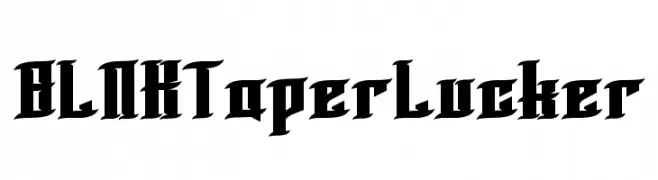
![BLNKTaperLucker font caratteri gratis]() Scaricare 262 Downloads@WebFont
Scaricare 262 Downloads@WebFont -
( DJB Fonts - Darcy Baldwin - darcybaldwin.com )
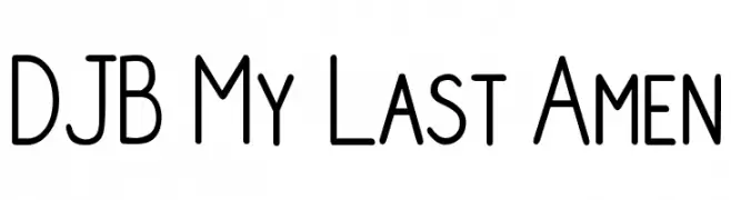
A clean, modern font with rounded edges and uniform stroke width.
![DJB My Last Amen font caratteri gratis]() Scaricare 262 Downloads@WebFont
Scaricare 262 Downloads@WebFont -
( Fonts by Levi Halmos )
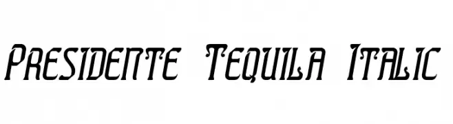
A bold, italic font with a modern, dynamic style and sharp angles.
![Presidente Tequila Italic font caratteri gratis]() Scaricare 262 Downloads@WebFont
Scaricare 262 Downloads@WebFont -
( Fonts by weknow - Wino S Kadir )
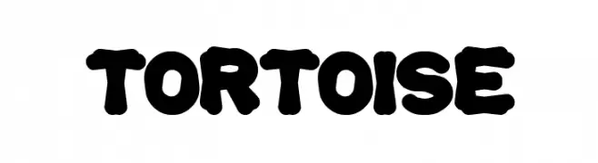
A bold, rounded font with a playful, retro vibe.
![tortoise font caratteri gratis]() Scaricare 262 Downloads@WebFont
Scaricare 262 Downloads@WebFont -
![KR Spring Me font caratteri gratis]() Scaricare 262 Downloads@WebFont
Scaricare 262 Downloads@WebFont -
( Fonts by Fontfabric - Svetoslav Simov - Personal-use only. For commercial use please contact owner. )
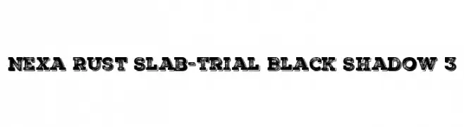
A bold, distressed slab serif font with a vintage, industrial style.
![Nexa Rust Slab-Trial Black Shadow 3 font caratteri gratis]() Scaricare 262 Downloads@WebFont
Scaricare 262 Downloads@WebFont -
( Fonts by Andreas Lindholm - Personal-use only. For commercial use please contact owner. )
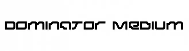
A futuristic, geometric font with bold, angular characters.
![Dominator Medium font caratteri gratis]() Scaricare 262 Downloads@WebFont
Scaricare 262 Downloads@WebFont -
( Fonts by Typhoon Type - Suthi Srisopha - www.typhoontype.net - Personal-use only. For commercial use please contact owner. )
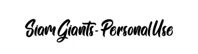
A bold, dynamic script font with fluid, connected characters and elegant curves.
![Siam Giants - Personal Use font caratteri gratis]() Scaricare 262 Downloads@WebFont
Scaricare 262 Downloads@WebFont -
![Timeface font caratteri gratis]() Scaricare 262 Downloads@WebFont
Scaricare 262 Downloads@WebFont -
( Fonts by Alex Squack - http://twitter.com/NoGoodToMe )
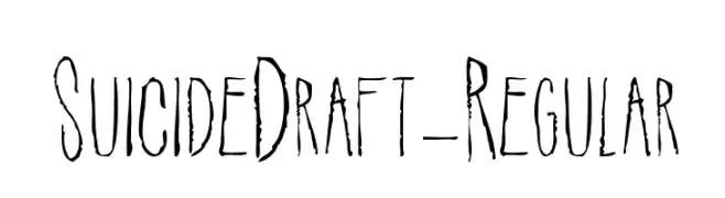
A distressed, hand-drawn font with a grungy, artistic style.
![SuicideDraft-Regular font caratteri gratis]() Scaricare 262 Downloads@WebFont
Scaricare 262 Downloads@WebFont -
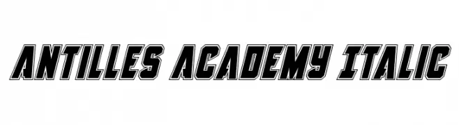
![Antilles Academy Italic font caratteri gratis]() Scaricare 262 Downloads@WebFont
Scaricare 262 Downloads@WebFont -
( Fonts by Allouse Studio - Personal-use only. For commercial use please contact owner. )
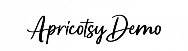
A lively handwritten font with fluid, connected strokes and a playful, informal style.
![Apricotsy Demo font caratteri gratis]() Scaricare 262 Downloads@WebFont
Scaricare 262 Downloads@WebFont -
( Anchor Fonts - Eric Mueller - www.anchorfonts.com )
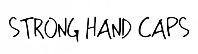
A bold, handwritten font with a playful and casual style.
![Strong Hand Caps font caratteri gratis]() Scaricare 262 Downloads@WebFont
Scaricare 262 Downloads@WebFont -
( Fonts by Attype Studio )
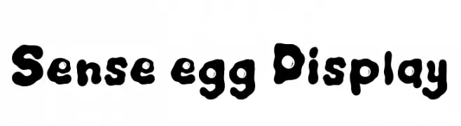
A playful, bubbly font with rounded, thick characters.
![Sense egg Display font caratteri gratis]() Scaricare 262 Downloads@WebFont
Scaricare 262 Downloads@WebFont -
( Fonts by Peter Wiegel - www.peter-wiegel.de - Personal-use only. For commercial use please contact owner. )
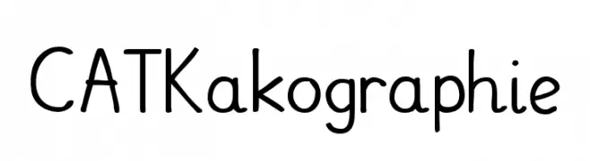
A playful handwritten font with rounded edges and a casual style.
![CATKakographie font caratteri gratis]() Scaricare 262 Downloads@WebFont
Scaricare 262 Downloads@WebFont -
( Fonts by Manfred Klein. Free for private and charity use. Free for commercial with donation to organizations )
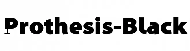
A bold, modern font with geometric elements and strong presence.
![Prothesis-Black font caratteri gratis]() Scaricare 262 Downloads@WebFont
Scaricare 262 Downloads@WebFont -
![PIX_lite font caratteri gratis]() Scaricare 262 Downloads@WebFont
Scaricare 262 Downloads@WebFont -
( Fonts by Goma Shin - Shintarou Nakayama www.geocities.jp/gomarice_font/ )
A bold, rounded font with a playful and friendly style.
![Coffee and Curry Shop__G font caratteri gratis]() Scaricare 262 Downloads@WebFont
Scaricare 262 Downloads@WebFont -
( Extram Studios - Lewis Bauer )
A playful, hand-drawn font with bold, irregular strokes.
![6 Script font caratteri gratis]() Scaricare 262 Downloads@WebFont
Scaricare 262 Downloads@WebFont -
![Lubeck font caratteri gratis]() Scaricare 262 Downloads@WebFont
Scaricare 262 Downloads@WebFont -
( Fonts by Daniel Gauthier )
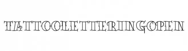
An artistic and ornate font inspired by traditional tattoo lettering, featuring intricate lines and curves.
![TattooLetteringOpen font caratteri gratis]() Scaricare 262 Downloads@WebFont
Scaricare 262 Downloads@WebFont -
( Fonts by Daniel Zadorozny - www.iconian.com - Free for personal use )
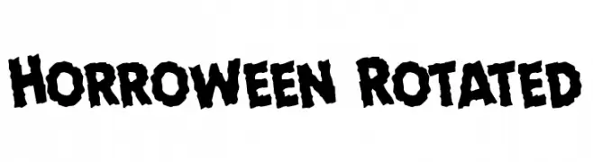
A bold, jagged font with a horror-inspired, textured design.
![Horroween Rotated font caratteri gratis]() Scaricare 262 Downloads@WebFont
Scaricare 262 Downloads@WebFont -
( Fonts by Fikryal studio - Fikry Alif - Personal-use only. For commercial use please contact owner. )
A dynamic handwritten font with fluid strokes and expressive character.
![Soul Signature font caratteri gratis]() Scaricare 262 Downloads@WebFont
Scaricare 262 Downloads@WebFont -
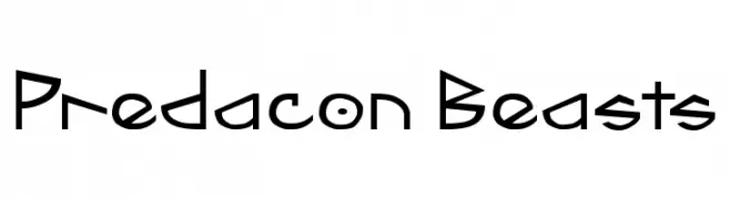
![Predacon Beasts font caratteri gratis]() Scaricare 262 Downloads@WebFont
Scaricare 262 Downloads@WebFont -
![Sansitype Script font caratteri gratis]() Scaricare 262 Downloads@WebFont
Scaricare 262 Downloads@WebFont -
( Free for a personal use. For a commercial use please visit www.kevinandamanda.com )
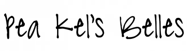
A playful, casual handwritten font with a lively and spontaneous appearance.
![Pea Kel's Belles font caratteri gratis]() Scaricare 262 Downloads@WebFont
Scaricare 262 Downloads@WebFont -
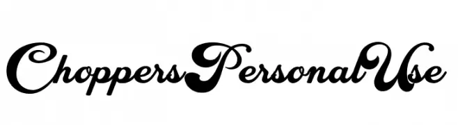
( Fonts by Billy Argel Fonts - www.billyargel.com - Personal-use only. For commercial use please contact owner. )
A bold, flowing script font with elegant swashes and high contrast.
![Choppers Personal Use font caratteri gratis]() Scaricare 262 Downloads@WebFont
Scaricare 262 Downloads@WebFont -
( Fonts by Alvaro Thomaz - alvarothomaz.com )
A bold, geometric font with a modern and minimalist aesthetic.
![Duase-LightDisplay font caratteri gratis]() Scaricare 262 Downloads@WebFont
Scaricare 262 Downloads@WebFont -
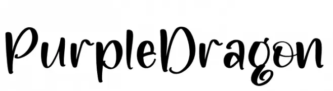
( Fonts by Integritype Studio )
A bold, playful handwritten font with smooth curves and dynamic strokes.
![Purple Dragon font caratteri gratis]() Scaricare 262 Downloads@WebFont
Scaricare 262 Downloads@WebFont -
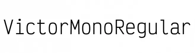
( Fonts by Rune Bjørnerås )
A modern, monospaced font with a clean and geometric design, perfect for coding.
![Victor Mono Regular font caratteri gratis]() Scaricare 262 Downloads@WebFont
Scaricare 262 Downloads@WebFont -
( Fonts by Graham Meade - GemFonts )
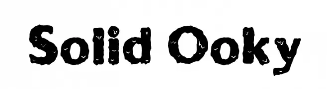
A bold, textured font with a playful, handcrafted style.
![Solid Ooky font caratteri gratis]() Scaricare 262 Downloads@WebFont
Scaricare 262 Downloads@WebFont


Quali sono i font più popolari adesso?
Poppins, Roboto, Montserrat, Open Sans e Lato sono molto usati per le forme pulite e l'ampia applicabilità — dall'identità di marca alle landing page e ai poster.
Quali font si usano spesso nei loghi?
Le sans serif geometriche (es. Poppins, famiglie in stile Gotham) sono scelte comuni per un branding pulito e scalabile. Per un tocco personale restano valide script e stili manoscritti. Abbina un display deciso per i titoli a un corpo testo neutro per riconoscibilità ed equilibrio.
Ogni quanto si aggiorna la lista?
Con regolarità, in base ai download e all'attività reale. Torna spesso per scoprire in anticipo le nuove preferite.
💡 Consiglio: aggiungi ai preferiti — le tendenze cambiano in fretta e i font top di oggi possono ispirare il rebranding di domani.