Benvenuto nelle Font Più Popolari — dove popolarità e qualità si incontrano. Qui trovi i font più scaricati e usati dell'anno. Se cerchi scelte sicure per logo, web o social, inizia da qui.
Ogni font top si distingue per equilibrio, leggibilità e versatilità. Troverai sans serif moderne, script eleganti, serif vintage e display minimalisti.
-
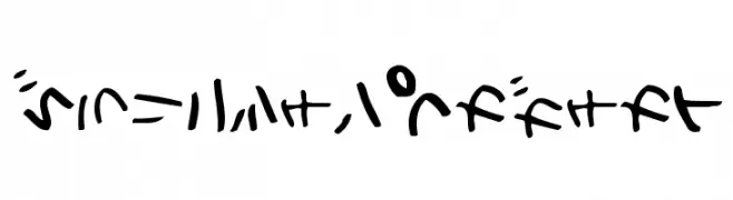
( Fonts by Maniackers Design - www.mksd.jp OFF SITE )
A decorative and abstract script with bold, flowing symbols.
 Scaricare 0 Downloads
 -
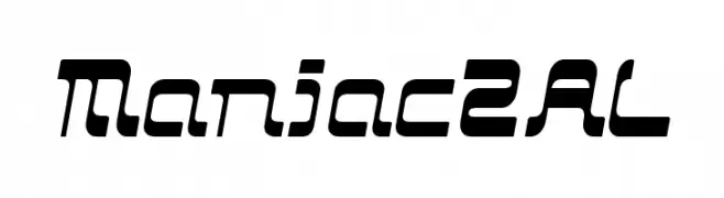
( Fonts by Maniackers Design - www.mksd.jp OFF SITE )
A bold, futuristic font with a dynamic, slanted design.
![Maniac2AL font caratteri gratis]() Scaricare 0 Downloads
Scaricare 0 Downloads -
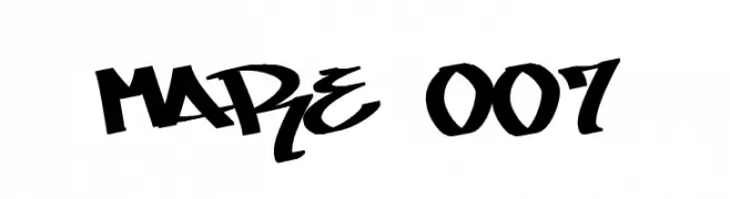
( CrazeCo.com.au OFF SITE )
A bold, graffiti-inspired font with dynamic, angular strokes.
![MARE 007 font caratteri gratis]() Scaricare 0 Downloads
Scaricare 0 Downloads -
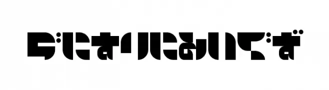
( Fonts by Maniackers Design - www.mksd.jp OFF SITE )
A bold, geometric font with a modern and futuristic style.
![AirlineHR font caratteri gratis]() Scaricare 0 Downloads
Scaricare 0 Downloads -
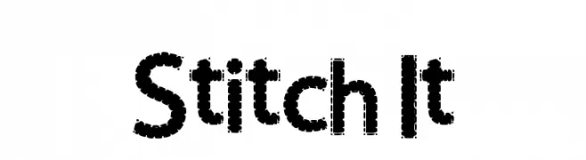
( Fonts by Nicki Throndsen - www.throndsendesigns.com OFF SITE )
A playful, stitched-style font with a textured, handcrafted look.
![Stitch It font caratteri gratis]() Scaricare 0 Downloads
Scaricare 0 Downloads -
-
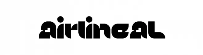
( Fonts by Maniackers Design - www.mksd.jp OFF SITE )
A bold, geometric font with a futuristic and modern style.
![AirlineAL font caratteri gratis]() Scaricare 0 Downloads
Scaricare 0 Downloads -
( Fonts by Maniackers Design - www.mksd.jp OFF SITE )
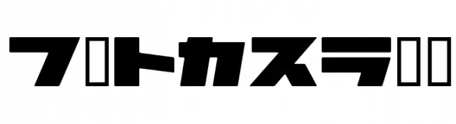
A bold, futuristic font with geometric and dynamic styling.
![AirlineKT font caratteri gratis]() Scaricare 0 Downloads
Scaricare 0 Downloads -
( Fonts by Maniackers Design - www.mksd.jp OFF SITE )
A bold, decorative font with playful, whimsical elements and a modern twist.
![YonimofushiginaHR font caratteri gratis]() Scaricare 0 Downloads
Scaricare 0 Downloads -
( Fonts by Maniackers Design - www.mksd.jp OFF SITE )
Bold, geometric font with a modern, futuristic style.
![2AstroKT font caratteri gratis]() Scaricare 0 Downloads
Scaricare 0 Downloads -
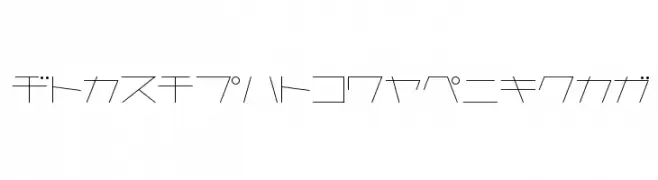
( Fonts by Maniackers Design - www.mksd.jp OFF SITE )
A minimalist, geometric font with thin lines and sharp angles, ideal for modern designs.
![AstraKfsb07LightT font caratteri gratis]() Scaricare 0 Downloads
Scaricare 0 Downloads
Quali sono i font più popolari adesso?
Poppins, Roboto, Montserrat, Open Sans e Lato sono molto usati per le forme pulite e l'ampia applicabilità — dall'identità di marca alle landing page e ai poster.
Quali font si usano spesso nei loghi?
Le sans serif geometriche (es. Poppins, famiglie in stile Gotham) sono scelte comuni per un branding pulito e scalabile. Per un tocco personale restano valide script e stili manoscritti. Abbina un display deciso per i titoli a un corpo testo neutro per riconoscibilità ed equilibrio.
Ogni quanto si aggiorna la lista?
Con regolarità, in base ai download e all'attività reale. Torna spesso per scoprire in anticipo le nuove preferite.
💡 Consiglio: aggiungi ai preferiti — le tendenze cambiano in fretta e i font top di oggi possono ispirare il rebranding di domani.