Benvenuto nelle Font Più Popolari — dove popolarità e qualità si incontrano. Qui trovi i font più scaricati e usati dell'anno. Se cerchi scelte sicure per logo, web o social, inizia da qui.
Ogni font top si distingue per equilibrio, leggibilità e versatilità. Troverai sans serif moderne, script eleganti, serif vintage e display minimalisti.
-
 Scaricare 0 Downloads
 -
( Fonts by Maniackers Design - www.mksd.jp OFF SITE )
A casual, handwritten font with a playful and informal style.
![OmiyageHR font caratteri gratis]() Scaricare 0 Downloads
Scaricare 0 Downloads -
( Fonts by Jack Harvatt - HARVATT.HOUSE/STORE - Personal-use only. For commercial use please contact owner. OFF SITE )
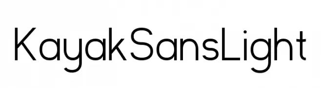
A modern, light sans-serif font with clean lines and balanced proportions.
![Kayak Sans Light font caratteri gratis]() Scaricare 0 Downloads
Scaricare 0 Downloads -
( Fonts by Maniackers Design - www.mksd.jp OFF SITE )
A futuristic and abstract font with bold, geometric shapes and rounded edges.
![DorisorangeKT font caratteri gratis]() Scaricare 0 Downloads
Scaricare 0 Downloads -
( Font by www.houseind.com OFF SITE )
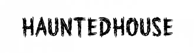
A spooky, jagged font with a haunted, eerie appearance.
![HauntedHouse font caratteri gratis]() Scaricare 0 Downloads
Scaricare 0 Downloads -
-
( Fonts by Jack Harvatt - HARVATT.HOUSE/STORE - Personal-use only. For commercial use please contact owner. OFF SITE )
A modern, light, and italic sans-serif font with clean lines and a sleek design.
![Kayak Sans Light Italic font caratteri gratis]() Scaricare 0 Downloads
Scaricare 0 Downloads -
( Fonts by Maniackers Design - www.mksd.jp OFF SITE )
A bold, geometric font with a futuristic, digital aesthetic.
![PerformarAL font caratteri gratis]() Scaricare 0 Downloads
Scaricare 0 Downloads -
( Fonts by Maniackers Design - www.mksd.jp OFF SITE )
A bold, playful font with organic, fluid shapes and high contrast.
![Parade20AL font caratteri gratis]() Scaricare 0 Downloads
Scaricare 0 Downloads -
( Fonts by Maniackers Design - www.mksd.jp OFF SITE )
A bold, rounded font with a playful and modern aesthetic.
![MerumoKt font caratteri gratis]() Scaricare 0 Downloads
Scaricare 0 Downloads -
![Wedding Text BT font caratteri gratis]() Scaricare 0 Downloads
Scaricare 0 Downloads

Quali sono i font più popolari adesso?
Poppins, Roboto, Montserrat, Open Sans e Lato sono molto usati per le forme pulite e l'ampia applicabilità — dall'identità di marca alle landing page e ai poster.
Quali font si usano spesso nei loghi?
Le sans serif geometriche (es. Poppins, famiglie in stile Gotham) sono scelte comuni per un branding pulito e scalabile. Per un tocco personale restano valide script e stili manoscritti. Abbina un display deciso per i titoli a un corpo testo neutro per riconoscibilità ed equilibrio.
Ogni quanto si aggiorna la lista?
Con regolarità, in base ai download e all'attività reale. Torna spesso per scoprire in anticipo le nuove preferite.
💡 Consiglio: aggiungi ai preferiti — le tendenze cambiano in fretta e i font top di oggi possono ispirare il rebranding di domani.