Benvenuto nelle Font Più Popolari — dove popolarità e qualità si incontrano. Qui trovi i font più scaricati e usati dell'anno. Se cerchi scelte sicure per logo, web o social, inizia da qui.
Ogni font top si distingue per equilibrio, leggibilità e versatilità. Troverai sans serif moderne, script eleganti, serif vintage e display minimalisti.
-
( Fonts by Casady & Greene )
Bold, italicized sans-serif font with high contrast and modern style.
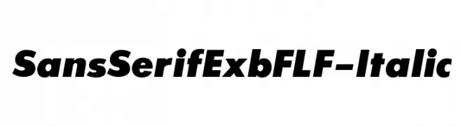 Scaricare 3528 Downloads@WebFont
 -
( Fonts by Kitaleigh Boutique )
A charming cursive font with smooth, flowing lines and whimsical special characters.
![KLCupid font caratteri gratis]() Scaricare 3527 Downloads@WebFont
Scaricare 3527 Downloads@WebFont -
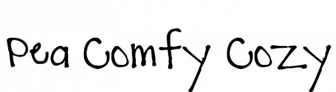
( Free for a personal use. For a commercial use please visit www.kevinandamanda.com )
A playful, hand-drawn font with irregular, whimsical strokes.
![Pea Comfy Cozy font caratteri gratis]() Scaricare 3527 Downloads@WebFont
Scaricare 3527 Downloads@WebFont -
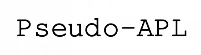
![Pseudo-APL font caratteri gratis]() Scaricare 3527 Downloads@WebFont
Scaricare 3527 Downloads@WebFont -
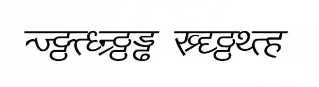
![DV_Divyae Italic font caratteri gratis]() Scaricare 3526 Downloads@WebFont
Scaricare 3526 Downloads@WebFont -
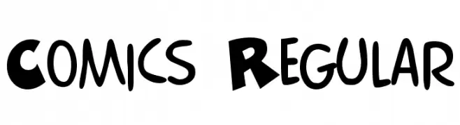
![Comics Regular font caratteri gratis]() Scaricare 3525 Downloads@WebFont
Scaricare 3525 Downloads@WebFont -
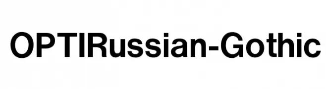
( Fonts by Castcraft Software - OPTI Fonts Archive - opti.netii.net - Personal-use only. For commercial use please contact owner. )
A bold, modern sans-serif font with clean lines and geometric structure.
![OPTIRussian-Gothic font caratteri gratis]() Scaricare 3524 Downloads@WebFont
Scaricare 3524 Downloads@WebFont -
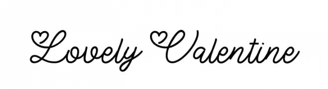
( Fonts by Thirtypath - Personal-use only. For commercial use please contact owner. )
A whimsical font with heart motifs in uppercase and elegant cursive lowercase.
![Lovely Valentine font caratteri gratis]() Scaricare 3522 Downloads@WebFont
Scaricare 3522 Downloads@WebFont -
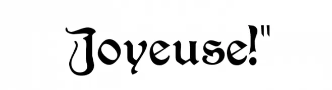
![Joyeuse!]() Scaricare 3522 Downloads@WebFont
Scaricare 3522 Downloads@WebFont -
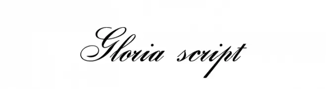
( Fonts by www.gliphmaker.com. Personal-use only. For commercial use please contact owner. )
An elegant script font with flowing, ornate letterforms and intricate swashes.
![Gloria script font caratteri gratis]() Scaricare 3521 Downloads@WebFont
Scaricare 3521 Downloads@WebFont -
( Fonts by www.Fontfabric.com )
A bold, rounded, and playful font with a modern, chunky style.
![VAL font caratteri gratis]() Scaricare 3521 Downloads@WebFont
Scaricare 3521 Downloads@WebFont -
( Fonts by Daniel Zadorozny - www.iconian.com )
A bold, futuristic font with sharp angles and a dynamic slant.
![Paladins Expanded font caratteri gratis]() Scaricare 3520 Downloads@WebFont
Scaricare 3520 Downloads@WebFont -
![Yana font caratteri gratis]() Scaricare 3520 Downloads@WebFont
Scaricare 3520 Downloads@WebFont -
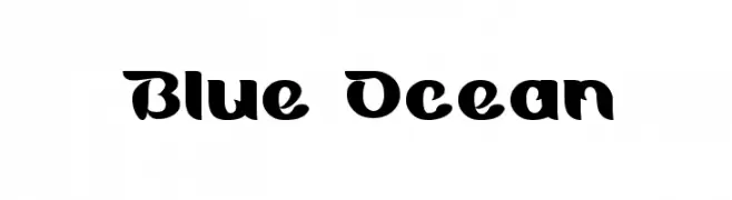
![Blue Ocean font caratteri gratis]() Scaricare 3520 Downloads@WebFont
Scaricare 3520 Downloads@WebFont -
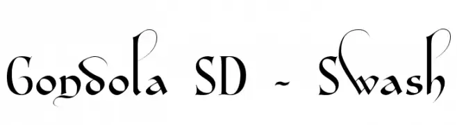
( Fonts by Steve Deffeyes - www.deffeyes.com )
An elegant serif font with swash elements and flowing curves.
![Gondola SD - Swash font caratteri gratis]() Scaricare 3520 Downloads@WebFont
Scaricare 3520 Downloads@WebFont -
![Amalgam Shadow font caratteri gratis]() Scaricare 3520 Downloads@WebFont
Scaricare 3520 Downloads@WebFont -
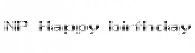
![NP Happy birthday font caratteri gratis]() Scaricare 3519 Downloads@WebFont
Scaricare 3519 Downloads@WebFont -
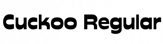
![Cuckoo Regular font caratteri gratis]() Scaricare 3519 Downloads@WebFont
Scaricare 3519 Downloads@WebFont -
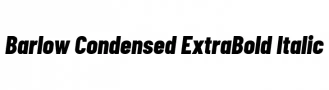
( Copyright 2017 The Barlow Project Authors (https://github.com/jpt/barlow) )
A bold, condensed, and italic typeface perfect for striking headlines.
![Barlow Condensed ExtraBold Italic font caratteri gratis]() Scaricare 3518 Downloads@WebFont
Scaricare 3518 Downloads@WebFont -
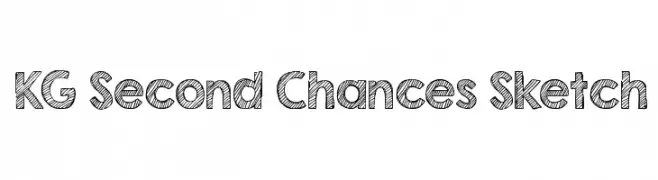
( Fonts by www.kimberlygeswein.com - Kimberly Geswein )
A playful, sketch-style font with bold, hand-drawn characters.
![KG Second Chances Sketch font caratteri gratis]() Scaricare 3518 Downloads@WebFont
Scaricare 3518 Downloads@WebFont -
( Fonts by Castcraft Software - opti.netii.net - check the website before use )
A dynamic and elegant script font with flowing, cursive letterforms.
![OPTICoyonetBold font caratteri gratis]() Scaricare 3518 Downloads@WebFont
Scaricare 3518 Downloads@WebFont -
( Fonts by billyargel.blogspot.com - Billy Argel )
A bold, cartoonish font with rounded, balloon-like letters.
![BOMB FONT font caratteri gratis]() Scaricare 3518 Downloads@WebFont
Scaricare 3518 Downloads@WebFont -
( Fonts by Apostrophic Lab )
A playful, handwritten font with smooth, rounded edges and a dynamic slant.
![Komika Slick font caratteri gratis]() Scaricare 3518 Downloads@WebFont
Scaricare 3518 Downloads@WebFont -
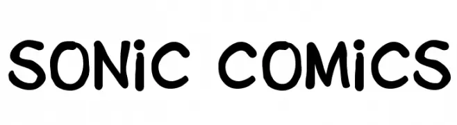
( Fonts by Daniel Werneck )
A playful, bold font with a hand-drawn, energetic style.
![Sonic Comics font caratteri gratis]() Scaricare 3518 Downloads@WebFont
Scaricare 3518 Downloads@WebFont -
( Fonts by Sora Sagano - www.dotcolon.net )
A classic serif font with high contrast and elegant, narrow letters.
![Ferrum font caratteri gratis]() Scaricare 3517 Downloads@WebFont
Scaricare 3517 Downloads@WebFont -
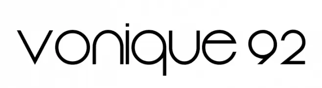
( Fonts by Sharkshock Productions----www.sharkshock.com. Personal-use only. For commercial use please contact owner. )
A sleek, geometric font with a modern and futuristic style.
![Vonique 92 font caratteri gratis]() Scaricare 3516 Downloads@WebFont
Scaricare 3516 Downloads@WebFont -
( Fonts by Daniel Zadorozny - www.iconian.com - Free for personal use )
A futuristic, geometric font with bold, angular letterforms.
![Dodger Title font caratteri gratis]() Scaricare 3516 Downloads@WebFont
Scaricare 3516 Downloads@WebFont -
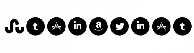
( Fonts by www.Fontfabric.com )
A bold, modern set of social media and brand icons in circular shapes.
![Socialico font caratteri gratis]() Scaricare 3516 Downloads@WebFont
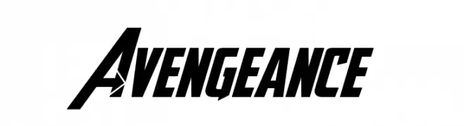
Scaricare 3516 Downloads@WebFont -
![Avengeance font caratteri gratis]() Scaricare 3515 Downloads@WebFont
Scaricare 3515 Downloads@WebFont -
( Fonts by Paul Reid - tracertong.co.uk )
A bold, geometric font with high contrast and minimal spacing.
![Unrealised font caratteri gratis]() Scaricare 3514 Downloads@WebFont
Scaricare 3514 Downloads@WebFont -
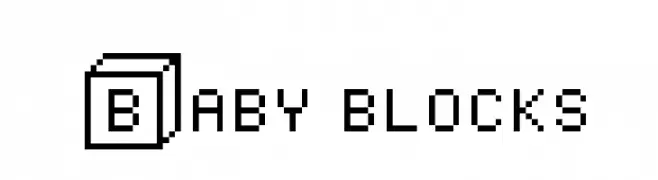
( Fonts by Colorful Typhoon - http://orange.s56.xrea.com/blog/ )
A playful, blocky font with a pixelated, retro style.
![Baby blocks font caratteri gratis]() Scaricare 3514 Downloads@WebFont
Scaricare 3514 Downloads@WebFont -
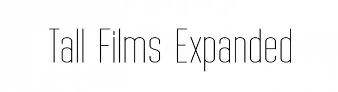
( Fonts by Graham Meade - GemFonts )
A tall, slender, and modern typeface with a geometric and minimalist design.
![Tall Films Expanded font caratteri gratis]() Scaricare 3513 Downloads@WebFont
Scaricare 3513 Downloads@WebFont -
![Bulgarian Kursiv font caratteri gratis]() Scaricare 3512 Downloads@WebFont
Scaricare 3512 Downloads@WebFont -
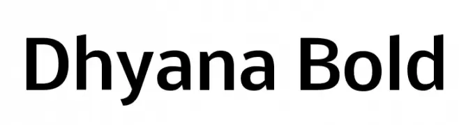
( Copyright (c) 2010-12, Vernon Adams (vern@newtypography.co.uk) )
A bold, modern sans-serif font with clean lines and uniform strokes.
![Dhyana Bold font caratteri gratis]() Scaricare 3510 Downloads@WebFont
Scaricare 3510 Downloads@WebFont -
![Inception font caratteri gratis]() Scaricare 3510 Downloads@WebFont
Scaricare 3510 Downloads@WebFont


Quali sono i font più popolari adesso?
Poppins, Roboto, Montserrat, Open Sans e Lato sono molto usati per le forme pulite e l'ampia applicabilità — dall'identità di marca alle landing page e ai poster.
Quali font si usano spesso nei loghi?
Le sans serif geometriche (es. Poppins, famiglie in stile Gotham) sono scelte comuni per un branding pulito e scalabile. Per un tocco personale restano valide script e stili manoscritti. Abbina un display deciso per i titoli a un corpo testo neutro per riconoscibilità ed equilibrio.
Ogni quanto si aggiorna la lista?
Con regolarità, in base ai download e all'attività reale. Torna spesso per scoprire in anticipo le nuove preferite.
💡 Consiglio: aggiungi ai preferiti — le tendenze cambiano in fretta e i font top di oggi possono ispirare il rebranding di domani.