Benvenuto nelle Font Più Popolari — dove popolarità e qualità si incontrano. Qui trovi i font più scaricati e usati dell'anno. Se cerchi scelte sicure per logo, web o social, inizia da qui.
Ogni font top si distingue per equilibrio, leggibilità e versatilità. Troverai sans serif moderne, script eleganti, serif vintage e display minimalisti.
-
( Fonts by Alex Tomlinson - Skyhaven Fonts - shfonts.com )
A playful, handwritten font with a casual and informal style.
 Scaricare 256 Downloads@WebFont
 -
![Xeranthemum font caratteri gratis]() Scaricare 256 Downloads@WebFont
Scaricare 256 Downloads@WebFont -
![kuma Font font caratteri gratis]() Scaricare 256 Downloads@WebFont
Scaricare 256 Downloads@WebFont -
![SF-Cecilys font caratteri gratis]() Scaricare 256 Downloads@WebFont
Scaricare 256 Downloads@WebFont -
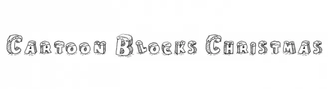
( Fonts by a Galdino Otten - galdinootten.com . Personal-use only. For commercial use please contact owner. )
A playful, 3D cartoon block font with a Christmas theme and snow-capped letters.
![Cartoon Blocks Christmas font caratteri gratis]() Scaricare 256 Downloads@WebFont
Scaricare 256 Downloads@WebFont -
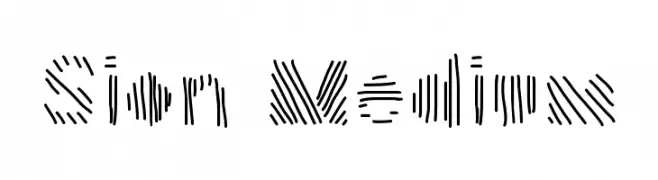
Caratteri di helveticbrands. For commercial use please contact the owner.
![Sion Medium font caratteri gratis]() Scaricare 256 Downloads@WebFont
Scaricare 256 Downloads@WebFont -
( Fonts by Google )
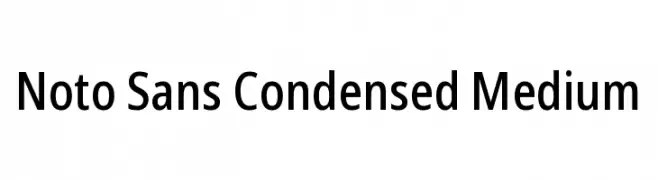
A modern, condensed sans-serif font with a clean and professional look.
![Noto Sans Condensed Medium font caratteri gratis]() Scaricare 256 Downloads@WebFont
Scaricare 256 Downloads@WebFont -
( Fonts by Graham Meade - GemFonts )
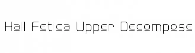
A modern, geometric font with clean lines and rounded corners.
![Hall Fetica Upper Decompose font caratteri gratis]() Scaricare 256 Downloads@WebFont
Scaricare 256 Downloads@WebFont -
![mclovin font caratteri gratis]() Scaricare 256 Downloads@WebFont
Scaricare 256 Downloads@WebFont -
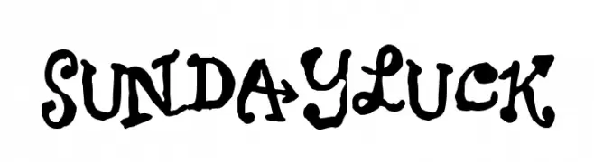
![Sundayluck font caratteri gratis]() Scaricare 256 Downloads@WebFont
Scaricare 256 Downloads@WebFont -
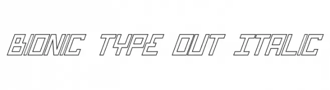
( Fonts by Daniel Zadorozny - www.iconian.com - Free for personal use )
A futuristic, angular, and outlined font with an italic slant.
![Bionic Type Out Italic font caratteri gratis]() Scaricare 256 Downloads
Scaricare 256 Downloads -
( Fonts by Origin Type )
Playful handwritten font with rounded edges.
![The Series font caratteri gratis]() Scaricare 256 Downloads@WebFont
Scaricare 256 Downloads@WebFont -
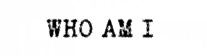
![WHO AM I font caratteri gratis]() Scaricare 256 Downloads@WebFont
Scaricare 256 Downloads@WebFont -
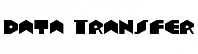
( Fonts by Levi Halmos )
A bold, geometric font with a futuristic and modern design.
![Data Transfer font caratteri gratis]() Scaricare 256 Downloads@WebFont
Scaricare 256 Downloads@WebFont -
( Fonts by billyargel.blogspot.com - Billy Argel )
A bold, distressed font with a rugged, vintage texture.
![SOAPSTORE font caratteri gratis]() Scaricare 256 Downloads@WebFont
Scaricare 256 Downloads@WebFont -
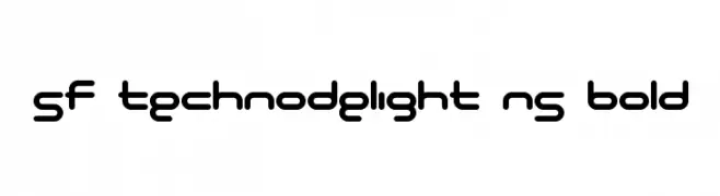
( Fonts by ShyFonts )
A bold, futuristic font with rounded edges and consistent stroke width.
![SF Technodelight NS Bold font caratteri gratis]() Scaricare 256 Downloads@WebFont
Scaricare 256 Downloads@WebFont -
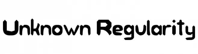
![Unknown Regularity font caratteri gratis]() Scaricare 256 Downloads@WebFont
Scaricare 256 Downloads@WebFont -
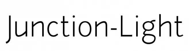
( Fonts by The League of Moveable Type - Personal-use only. For commercial use please contact owner. )
A modern, light sans-serif font with clean lines and balanced proportions.
![Junction-Light font caratteri gratis]() Scaricare 256 Downloads@WebFont
Scaricare 256 Downloads@WebFont -
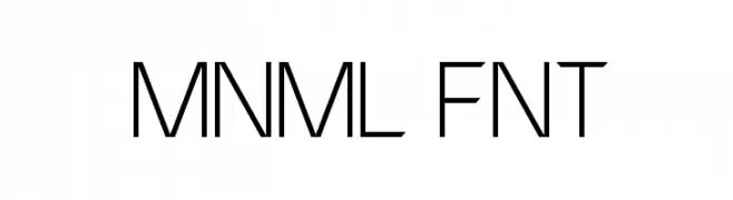
( Fonts by Michael Muranaka - muraknockout.com - Personal-use only. For commercial use please contact owner. )
A minimalist, geometric font with a modern and futuristic style.
![MNML FNT font caratteri gratis]() Scaricare 256 Downloads@WebFont
Scaricare 256 Downloads@WebFont -
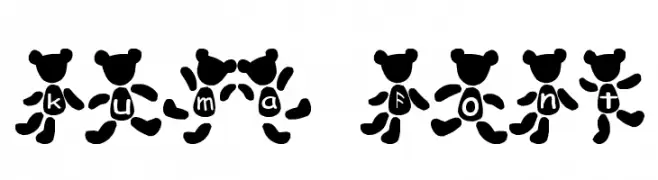
( Fonts by Adult Ramblings - Anastacia E. Zittel - Personal-use only. For commercial use please contact owner. )
Holiday-themed bear illustrations as font glyphs.
![AEZholidaybears font caratteri gratis]() Scaricare 256 Downloads@WebFont
Scaricare 256 Downloads@WebFont -
![F1rca font caratteri gratis]() Scaricare 256 Downloads@WebFont
Scaricare 256 Downloads@WebFont -
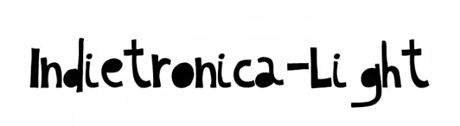
( Pisto Casero - Gilberto Moya Perona - www.pistocasero.com )
A playful, hand-drawn font with bold, irregular letterforms.
![Indietronica-Light font caratteri gratis]() Scaricare 256 Downloads@WebFont
Scaricare 256 Downloads@WebFont -
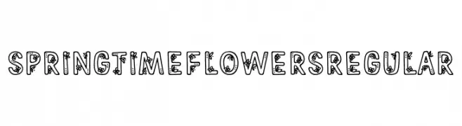
( Fonts by Brittney Murphy Design )
A playful, floral-themed decorative font with whimsical elements.
![Springtime Flowers Regular font caratteri gratis]() Scaricare 256 Downloads@WebFont
Scaricare 256 Downloads@WebFont -
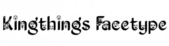
( Font by kingthingsfonts.co.uk )
A whimsical and artistic font with playful, illustrative characters.
![Kingthings Facetype font caratteri gratis]() Scaricare 256 Downloads@WebFont
Scaricare 256 Downloads@WebFont -
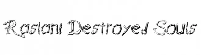
![Raslani Destroyed Souls font caratteri gratis]() Scaricare 256 Downloads@WebFont
Scaricare 256 Downloads@WebFont -
( Fonts by www.selawetype.com - Personal-use only. FOR DONATION https://www.paypal.me/selawe . For commercial use please contact owner. )
A sophisticated script font with elegant, flowing cursive strokes.
![BlueSign font caratteri gratis]() Scaricare 256 Downloads@WebFont
Scaricare 256 Downloads@WebFont -
( Fonts by Galdino Otten Fonts - www.galdinootten.com - Personal-use only. For commercial use please contact owner. )
A tall, slender, and modern font with a minimalist aesthetic.
![Thin Design font caratteri gratis]() Scaricare 256 Downloads@WebFont
Scaricare 256 Downloads@WebFont -
![Michigan Condensed Italic font caratteri gratis]() Scaricare 256 Downloads@WebFont
Scaricare 256 Downloads@WebFont -
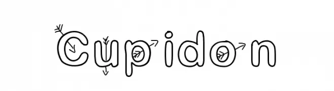
![Cupidon font caratteri gratis]() Scaricare 256 Downloads@WebFont
Scaricare 256 Downloads@WebFont -
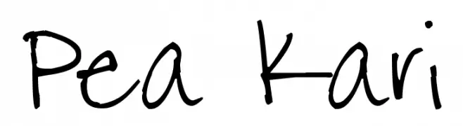
( Free for a personal use. For a commercial use please visit www.kevinandamanda.com )
A playful, casual handwritten font with irregular strokes and a lively feel.
![Pea Kari font caratteri gratis]() Scaricare 256 Downloads@WebFont
Scaricare 256 Downloads@WebFont -
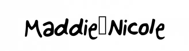
![Maddie_Nicole font caratteri gratis]() Scaricare 256 Downloads@WebFont
Scaricare 256 Downloads@WebFont -
( Fonts by Michael Sharanda )
A modern, geometric sans-serif typeface with balanced strokes and clear legibility.
![Manrope SemiBold font caratteri gratis]() Scaricare 256 Downloads@WebFont
Scaricare 256 Downloads@WebFont -
( Andrea Bartsch - www.fraubartsch.de )
A whimsical, character-based decorative font with abstract cartoon figures.
![B Kings font caratteri gratis]() Scaricare 256 Downloads@WebFont
Scaricare 256 Downloads@WebFont -
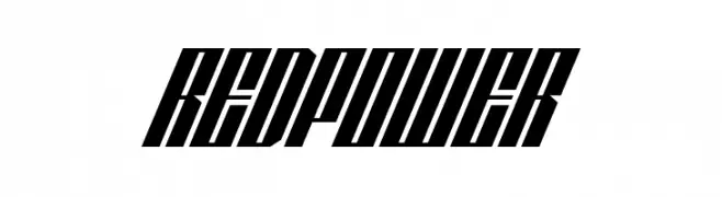
( Denis Sherbak - yavlenie.com )
A bold, slanted font with high contrast and a modern, dynamic style.
![REDPOWER font caratteri gratis]() Scaricare 256 Downloads@WebFont
Scaricare 256 Downloads@WebFont -
( Fonts by Daniel Zadorozny - www.iconian.com )
A bold, futuristic font with geometric and angular design.
![Skyhawk font caratteri gratis]() Scaricare 256 Downloads@WebFont
Scaricare 256 Downloads@WebFont


Quali sono i font più popolari adesso?
Poppins, Roboto, Montserrat, Open Sans e Lato sono molto usati per le forme pulite e l'ampia applicabilità — dall'identità di marca alle landing page e ai poster.
Quali font si usano spesso nei loghi?
Le sans serif geometriche (es. Poppins, famiglie in stile Gotham) sono scelte comuni per un branding pulito e scalabile. Per un tocco personale restano valide script e stili manoscritti. Abbina un display deciso per i titoli a un corpo testo neutro per riconoscibilità ed equilibrio.
Ogni quanto si aggiorna la lista?
Con regolarità, in base ai download e all'attività reale. Torna spesso per scoprire in anticipo le nuove preferite.
💡 Consiglio: aggiungi ai preferiti — le tendenze cambiano in fretta e i font top di oggi possono ispirare il rebranding di domani.