Benvenuto nelle Font Più Popolari — dove popolarità e qualità si incontrano. Qui trovi i font più scaricati e usati dell'anno. Se cerchi scelte sicure per logo, web o social, inizia da qui.
Ogni font top si distingue per equilibrio, leggibilità e versatilità. Troverai sans serif moderne, script eleganti, serif vintage e display minimalisti.
-
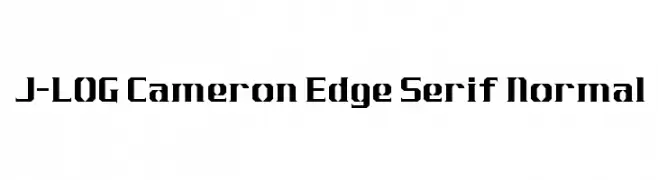
Caratteri di jlog3000. For commercial use please contact the owner.
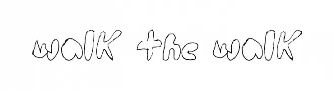
( Fonts by John Ocasio. Free for personal use only )
A bold, geometric font with sharp, angular edges for a modern look.
 Scaricare 242 Downloads@WebFont
 -
![walk the walk font caratteri gratis]() Scaricare 242 Downloads@WebFont
Scaricare 242 Downloads@WebFont -
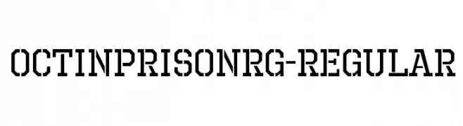
( Typodermic Fonts - Ray Larabie - www.typodermicfonts.com/ )
A bold, industrial font with a geometric, stencil-like design.
![OctinPrisonRg-Regular font caratteri gratis]() Scaricare 242 Downloads@WebFont
Scaricare 242 Downloads@WebFont -
![Tecnojap font caratteri gratis]() Scaricare 242 Downloads@WebFont
Scaricare 242 Downloads@WebFont -
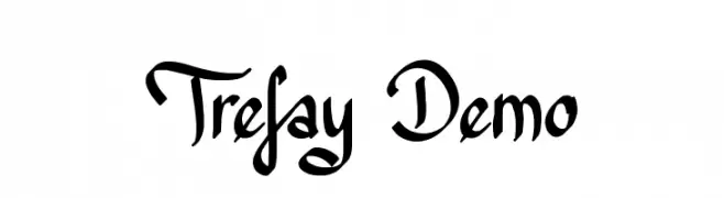
![Trefay Demo font caratteri gratis]() Scaricare 242 Downloads@WebFont
Scaricare 242 Downloads@WebFont -
-
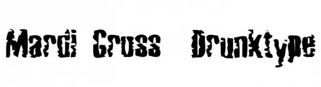
![Mardi Gross Drunktype font caratteri gratis]() Scaricare 242 Downloads@WebFont
Scaricare 242 Downloads@WebFont -
( Fonts by Docallisme HAS )
A playful, hand-drawn style font with bold, energetic strokes.
![DILOVE font caratteri gratis]() Scaricare 242 Downloads@WebFont
Scaricare 242 Downloads@WebFont -
( Fonts by Manfred Klein. Free for private and charity use. Free for commercial with donation to organizations )
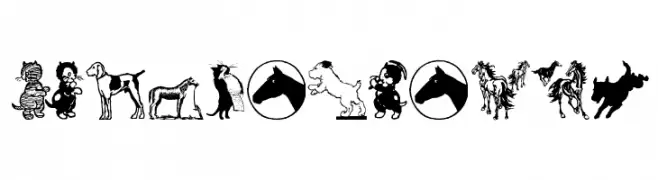
Cartoon animal dingbat font with cats, dogs, horses, and eyes.
![CatDogHorse font caratteri gratis]() Scaricare 242 Downloads@WebFont
Scaricare 242 Downloads@WebFont -
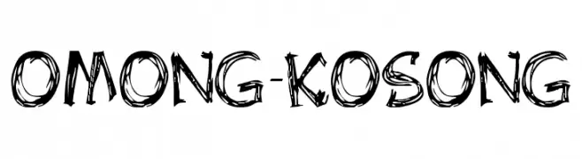
![OMONG-KOSONG font caratteri gratis]() Scaricare 242 Downloads@WebFont
Scaricare 242 Downloads@WebFont -
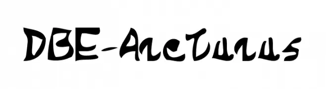
Caratteri di davalignllc. For commercial use please contact the owner.
![DBE-Arcturus font caratteri gratis]() Scaricare 241 Downloads@WebFont
Scaricare 241 Downloads@WebFont -
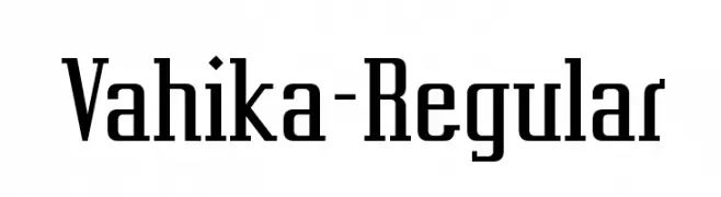
( Fonts by www.typodermicfonts.com - Ray Larabie )
A bold, modern serif font with sharp edges and a structured design.
![Vahika-Regular font caratteri gratis]() Scaricare 241 Downloads@WebFont
Scaricare 241 Downloads@WebFont -
( Haris Prawoto - graphicriver.net/user/selawe/portfolio )
A stylish cursive font with flowing, interconnected letterforms.
![Harris font caratteri gratis]() Scaricare 241 Downloads@WebFont
Scaricare 241 Downloads@WebFont -
( Fonts by MadeType - Personal-use only. For commercial use please contact owner. )
A bold, rounded outline font with a playful and modern style.
![MADETommySoftOutline-Black font caratteri gratis]() Scaricare 241 Downloads@WebFont
Scaricare 241 Downloads@WebFont -
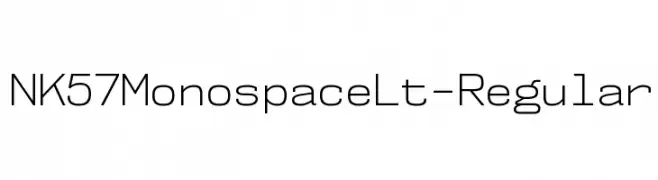
( Fonts by Typodermic Fonts )
A modern, monospaced typeface with a geometric and minimalist design.
![NK57MonospaceLt-Regular font caratteri gratis]() Scaricare 241 Downloads@WebFont
Scaricare 241 Downloads@WebFont -
![antara - aksara sunda font caratteri gratis]() Scaricare 241 Downloads@WebFont
Scaricare 241 Downloads@WebFont -
( Fonts by Iconian Fonts - Daniel Zadorozny )
A bold, condensed, and italic font with a futuristic and angular design.
![Free Agent Bold CondItal font caratteri gratis]() Scaricare 241 Downloads@WebFont
Scaricare 241 Downloads@WebFont -
( Fonts by Axel Lymphos )
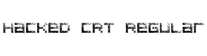
A pixelated, retro-style font inspired by vintage digital displays.
![Hacked CRT Regular font caratteri gratis]() Scaricare 241 Downloads@WebFont
Scaricare 241 Downloads@WebFont -
( Fonts by Daniel Zadorozny - www.iconian.com - Free for personal use )
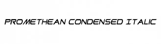
A sleek, modern, condensed italic font with dynamic angles.
![Promethean Condensed Italic font caratteri gratis]() Scaricare 241 Downloads@WebFont
Scaricare 241 Downloads@WebFont -
( Fonts by Daniel Zadorozny - www.iconian.com - Free for personal use )
A futuristic, condensed italic font with sharp angles and a sleek design.
![Free Agent Condensed Italic font caratteri gratis]() Scaricare 241 Downloads@WebFont
Scaricare 241 Downloads@WebFont -
( Fonts by Andrew McCluskey - nalgames.com. Personal-use only. For commercial use please contact owner. )
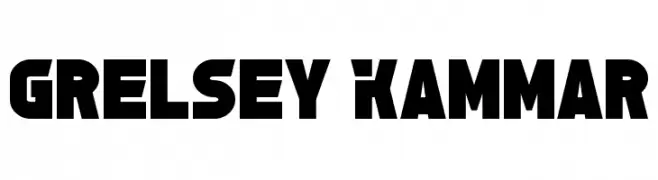
A bold, geometric font with a modern, industrial style.
![Grelsey Kammar font caratteri gratis]() Scaricare 241 Downloads@WebFont
Scaricare 241 Downloads@WebFont -
( Fonts by Andrew McCluskey - nalgames.com. Personal-use only. For commercial use please contact owner. )
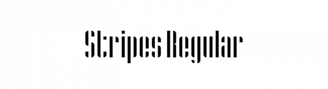
A bold, modern font with a distinctive vertical striped pattern.
![Stripes Regular font caratteri gratis]() Scaricare 241 Downloads@WebFont
Scaricare 241 Downloads@WebFont -
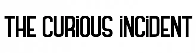
( Fonts by Maelle.K - Thomas Boucherie - Personal-use only. For commercial use please contact owner. )
A bold, geometric sans-serif font with a modern, structured design.
![THE CURIOUS INCIDENT font caratteri gratis]() Scaricare 241 Downloads@WebFont
Scaricare 241 Downloads@WebFont -
![Brush Wedco font caratteri gratis]() Scaricare 241 Downloads@WebFont
Scaricare 241 Downloads@WebFont -
![DIN Rundschrift Eng Kontur font caratteri gratis]() Scaricare 241 Downloads@WebFont
Scaricare 241 Downloads@WebFont -
![Laughin Like A Seagull font caratteri gratis]() Scaricare 241 Downloads@WebFont
Scaricare 241 Downloads@WebFont -
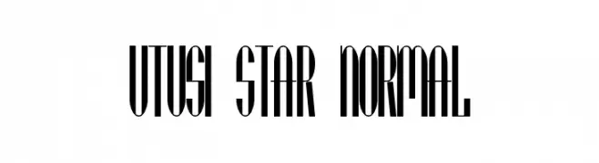
( Fonts by www.peter-wiegel.de. Personal-use only. For commercial use please contact owner. )
A tall, narrow, and modern font with high contrast and tight spacing.
![Utusi Star Normal font caratteri gratis]() Scaricare 241 Downloads@WebFont
Scaricare 241 Downloads@WebFont -
![Formas germetricas 1 font caratteri gratis]() Scaricare 241 Downloads@WebFont
Scaricare 241 Downloads@WebFont -
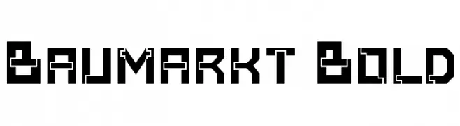
![Baumarkt Bold font caratteri gratis]() Scaricare 241 Downloads@WebFont
Scaricare 241 Downloads@WebFont -
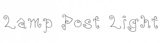
![Lamp Post Light font caratteri gratis]() Scaricare 241 Downloads@WebFont
Scaricare 241 Downloads@WebFont -
( Fonts by Kong Font )
A playful, bold font with rounded, bubbly characters and a whimsical style.
![Jellyo font caratteri gratis]() Scaricare 241 Downloads@WebFont
Scaricare 241 Downloads@WebFont -
Caratteri di NicholasJudy456. For commercial use please contact the owner.
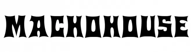
( Here's More of the House Fonts )
A bold, angular font with sharp points and thick strokes, perfect for impactful designs.
![Machohouse font caratteri gratis]() Scaricare 241 Downloads@WebFont
Scaricare 241 Downloads@WebFont -
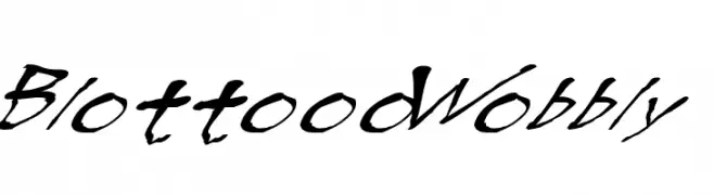
![BlottoooWobbly font caratteri gratis]() Scaricare 241 Downloads@WebFont
Scaricare 241 Downloads@WebFont -
( Fonts by Manfred Klein. Free for private and charity use. Free for commercial with donation to organizations )
A traditional Blackletter font with ornate, angular letterforms and a gothic aesthetic.
![CuxhavenFraktur font caratteri gratis]() Scaricare 241 Downloads@WebFont
Scaricare 241 Downloads@WebFont -
![ODINS SPEAR font caratteri gratis]() Scaricare 241 Downloads@WebFont
Scaricare 241 Downloads@WebFont -
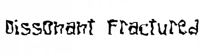
![Dissonant Fractured font caratteri gratis]() Scaricare 241 Downloads@WebFont
Scaricare 241 Downloads@WebFont


Quali sono i font più popolari adesso?
Poppins, Roboto, Montserrat, Open Sans e Lato sono molto usati per le forme pulite e l'ampia applicabilità — dall'identità di marca alle landing page e ai poster.
Quali font si usano spesso nei loghi?
Le sans serif geometriche (es. Poppins, famiglie in stile Gotham) sono scelte comuni per un branding pulito e scalabile. Per un tocco personale restano valide script e stili manoscritti. Abbina un display deciso per i titoli a un corpo testo neutro per riconoscibilità ed equilibrio.
Ogni quanto si aggiorna la lista?
Con regolarità, in base ai download e all'attività reale. Torna spesso per scoprire in anticipo le nuove preferite.
💡 Consiglio: aggiungi ai preferiti — le tendenze cambiano in fretta e i font top di oggi possono ispirare il rebranding di domani.