Benvenuto nelle Font Più Popolari — dove popolarità e qualità si incontrano. Qui trovi i font più scaricati e usati dell'anno. Se cerchi scelte sicure per logo, web o social, inizia da qui.
Ogni font top si distingue per equilibrio, leggibilità e versatilità. Troverai sans serif moderne, script eleganti, serif vintage e display minimalisti.
-
 Scaricare 249 Downloads@WebFont
 -
![Octagen Roman Italic font caratteri gratis]() Scaricare 249 Downloads@WebFont
Scaricare 249 Downloads@WebFont -
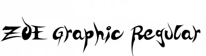
( Fonts by zoe fonts - www.comiczeichnerin.de - free for non-commercial and commercial purposes. )
A bold, edgy font with sharp, angular lines and dramatic curves.
![ZOE Graphic Regular font caratteri gratis]() Scaricare 249 Downloads@WebFont
Scaricare 249 Downloads@WebFont -
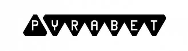
![Pyrabet font caratteri gratis]() Scaricare 249 Downloads
Scaricare 249 Downloads -
( Fonts by Style-7 - www.styleseven.com - Personal-use only. For commercial use please contact owner. )
A pixelated serif font with a retro digital style.
![Serif Pixel-7 font caratteri gratis]() Scaricare 249 Downloads@WebFont
Scaricare 249 Downloads@WebFont -
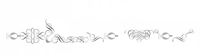
( Fonts by www.gliphmaker.com. Personal-use only. For commercial use please contact owner. )
Elaborate decorative flourishes and borders with a classic, vintage feel.
![Classic Decor font caratteri gratis]() Scaricare 249 Downloads@WebFont
Scaricare 249 Downloads@WebFont -
( Fonts by Renn Crump - http://moorstation.org/typoasis/designers/renncrump/ )
A playful, hand-drawn font with bold, rounded characters and a whimsical style.
![LeGolf font caratteri gratis]() Scaricare 249 Downloads@WebFont
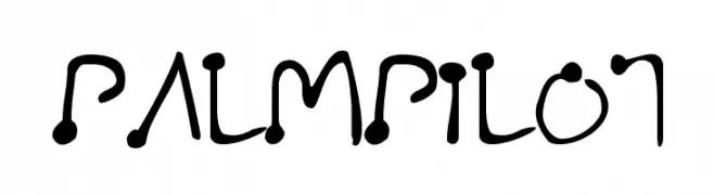
Scaricare 249 Downloads@WebFont -
![PalmPilot font caratteri gratis]() Scaricare 249 Downloads@WebFont
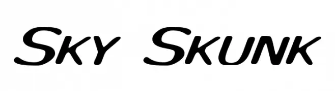
Scaricare 249 Downloads@WebFont -
![Sky Skunk font caratteri gratis]() Scaricare 249 Downloads@WebFont
Scaricare 249 Downloads@WebFont -
![SoozieQs font caratteri gratis]() Scaricare 249 Downloads@WebFont
Scaricare 249 Downloads@WebFont -
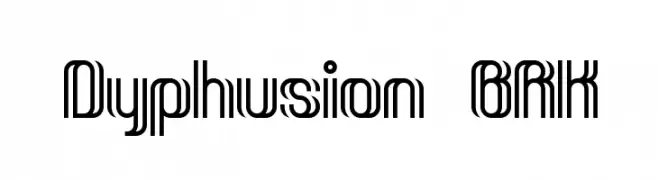
( Fonts by www.aenigmafonts.com )
A futuristic, geometric font with bold, parallel lines and rounded edges.
![Dyphusion BRK font caratteri gratis]() Scaricare 249 Downloads@WebFont
Scaricare 249 Downloads@WebFont -
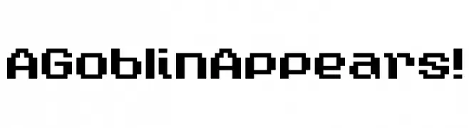
( Chequered Ink - chequered.ink/ )
A bold, pixelated font with a retro, digital aesthetic.
![A Goblin Appears! font caratteri gratis]() Scaricare 249 Downloads@WebFont
Scaricare 249 Downloads@WebFont -
( Måns Grebäck - www.mansgreback.com )
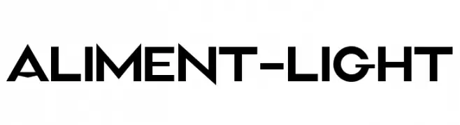
A modern, geometric font with bold, clean lines and a futuristic aesthetic.
![Aliment-Light font caratteri gratis]() Scaricare 249 Downloads@WebFont
Scaricare 249 Downloads@WebFont -
( Fonts by Original fonts by Christian Thalmann (Catharsis Fonts), Modifications by Cristiano Sobral - Personal-use only. For commercial use please contact owner. )
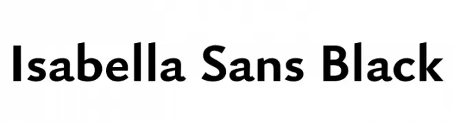
A bold, modern sans-serif font with clean lines and strong presence.
![Isabella Sans Black font caratteri gratis]() Scaricare 249 Downloads@WebFont
Scaricare 249 Downloads@WebFont -
( Fonts by Hatf Type )
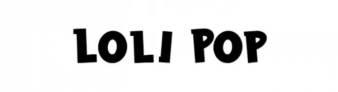
A bold, playful font with rounded, hand-drawn characters.
![Loli Pop font caratteri gratis]() Scaricare 249 Downloads@WebFont
Scaricare 249 Downloads@WebFont -
( Fonts by StringLabs - stringlabscreative.com - Personal-use only. For commercial use please contact owner. )
A bold, expressive handwritten font with fluid, interconnected strokes.
![I am Cool font caratteri gratis]() Scaricare 249 Downloads@WebFont
Scaricare 249 Downloads@WebFont -
( Beraka Design - José Beraka Lobos - about.me/beraka )
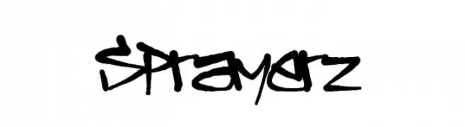
A bold, graffiti-inspired font with dynamic and expressive strokes.
![Sprayerz font caratteri gratis]() Scaricare 249 Downloads@WebFont
Scaricare 249 Downloads@WebFont -
( Fonts by Apostrophic Lab )
A modern, sleek script font with elongated, dynamic characters.
![Rx-ZeroOne font caratteri gratis]() Scaricare 249 Downloads@WebFont
Scaricare 249 Downloads@WebFont -
( Iconian Fonts - Daniel Zadorozny - www.iconian.com )
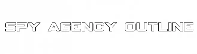
A bold, geometric outline font with a futuristic and technical style.
![Spy Agency Outline font caratteri gratis]() Scaricare 249 Downloads@WebFont
Scaricare 249 Downloads@WebFont -
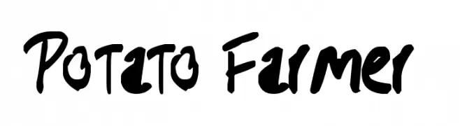
![Potato Farmer font caratteri gratis]() Scaricare 249 Downloads@WebFont
Scaricare 249 Downloads@WebFont -
Caratteri di ArashiGames. For commercial use please contact the owner.
( A personally designed font that uses chunky lettering to create a fun and cool style that calls back to the wild and irreverent 90s style. )
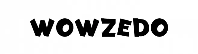
A playful, bold font with irregular, dynamic letterforms.
![Wowzedo font caratteri gratis]() Scaricare 249 Downloads@WebFont
Scaricare 249 Downloads@WebFont -
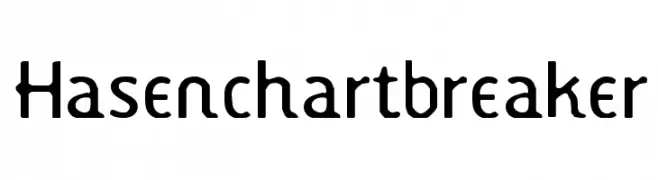
![Hasenchartbreaker font caratteri gratis]() Scaricare 249 Downloads@WebFont
Scaricare 249 Downloads@WebFont -
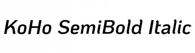
( Copyright 2018 The KoHo Project Authors (https://github.com/cadsondemak/Koho) )
A modern, semi-bold italic font with medium contrast and a sleek design.
![KoHo SemiBold Italic font caratteri gratis]() Scaricare 249 Downloads@WebFont
Scaricare 249 Downloads@WebFont -
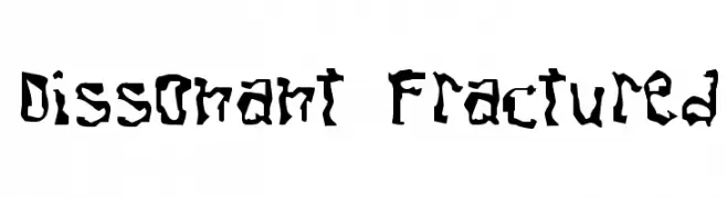
![Dissonant Fractured font caratteri gratis]() Scaricare 249 Downloads@WebFont
Scaricare 249 Downloads@WebFont -
Caratteri di NicholasJudy456. For commercial use please contact the owner.
( Here's More of the House Fonts )
A bold, distressed font with a grunge, hand-painted style.
![Condemdhouse font caratteri gratis]() Scaricare 249 Downloads@WebFont
Scaricare 249 Downloads@WebFont -
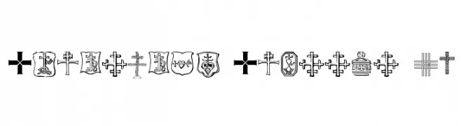
( Fonts by uatype.faithweb.com - UnAuthorized Type )
A symbol font with diverse Christian cross designs and religious motifs.
![Christian Crosses IV font caratteri gratis]() Scaricare 249 Downloads@WebFont
Scaricare 249 Downloads@WebFont -
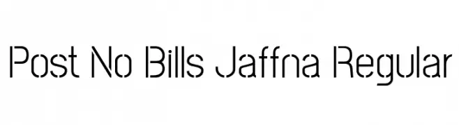
( Copyright (c) 2013-2015 Post No Bills Project Authors (https://github.com/mooniak/post-no-bills-font). )
A modern, geometric sans-serif font with clean lines and consistent stroke width.
![Post No Bills Jaffna Regular font caratteri gratis]() Scaricare 249 Downloads@WebFont
Scaricare 249 Downloads@WebFont -
Caratteri di inGeniousGuru. For commercial use please contact the owner.
( Rubik font )
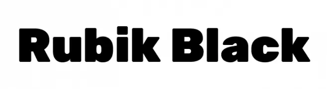
A bold, modern font with rounded edges and uniform weight.
![Rubik Black font caratteri gratis]() Scaricare 249 Downloads@WebFont
Scaricare 249 Downloads@WebFont -
( Fonts by bob istheowl http://luc.devroye.org/bobistheowl.html )
A whimsical, cartoon-style display font with playful curves.
![GrimNatwickBetty font caratteri gratis]() Scaricare 249 Downloads@WebFont
Scaricare 249 Downloads@WebFont -
( Fonts by Charlie Samways - www.csamways.com - Personal-use only. For commercial use please contact owner. )
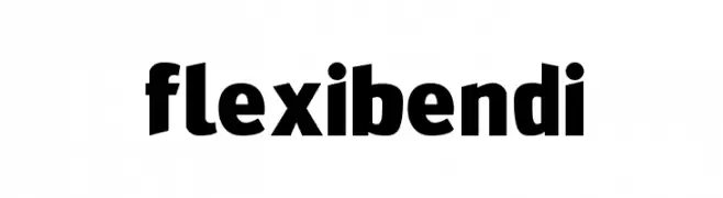
A bold, playful font with rounded, slightly condensed characters and a modern style.
![FlexiBendi font caratteri gratis]() Scaricare 249 Downloads@WebFont
Scaricare 249 Downloads@WebFont -
![GoGo Hack Italic font caratteri gratis]() Scaricare 249 Downloads@WebFont
Scaricare 249 Downloads@WebFont -
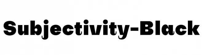
( Fonts by Alex Slobzheninov - Personal-use only. For commercial use please contact owner. )
A bold and impactful font with thick, uniform strokes.
![Subjectivity-Black font caratteri gratis]() Scaricare 249 Downloads@WebFont
Scaricare 249 Downloads@WebFont -
( Fonts by a Max Infeld - XEROGRAPHER FONTS - xerographer.blogspot.com . Personal-use only. For commercial use please contact owner. )
A playful, icy-themed font with bold, rounded letters adorned with icicle drips.
![FrostyHoliday font caratteri gratis]() Scaricare 249 Downloads@WebFont
Scaricare 249 Downloads@WebFont -
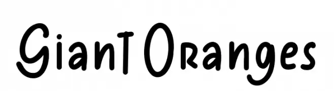
( Fonts by Masa Aska Sanurumi )
A playful, handwritten font with a casual and friendly appearance.
![Giant Oranges font caratteri gratis]() Scaricare 249 Downloads@WebFont
Scaricare 249 Downloads@WebFont -
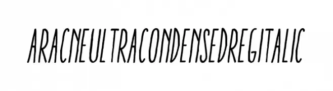
( Antipixel - Julia Martínez Diana - www.antipixel.com.ar/ )
A dynamic, ultra-condensed italic font with a modern and elegant style.
![AracneUltraCondensedRegItalic font caratteri gratis]() Scaricare 249 Downloads@WebFont
Scaricare 249 Downloads@WebFont


Quali sono i font più popolari adesso?
Poppins, Roboto, Montserrat, Open Sans e Lato sono molto usati per le forme pulite e l'ampia applicabilità — dall'identità di marca alle landing page e ai poster.
Quali font si usano spesso nei loghi?
Le sans serif geometriche (es. Poppins, famiglie in stile Gotham) sono scelte comuni per un branding pulito e scalabile. Per un tocco personale restano valide script e stili manoscritti. Abbina un display deciso per i titoli a un corpo testo neutro per riconoscibilità ed equilibrio.
Ogni quanto si aggiorna la lista?
Con regolarità, in base ai download e all'attività reale. Torna spesso per scoprire in anticipo le nuove preferite.
💡 Consiglio: aggiungi ai preferiti — le tendenze cambiano in fretta e i font top di oggi possono ispirare il rebranding di domani.