Benvenuto nelle Font Più Popolari — dove popolarità e qualità si incontrano. Qui trovi i font più scaricati e usati dell'anno. Se cerchi scelte sicure per logo, web o social, inizia da qui.
Ogni font top si distingue per equilibrio, leggibilità e versatilità. Troverai sans serif moderne, script eleganti, serif vintage e display minimalisti.
-
( Fonts by www.graphicartsunit.com - Personal-use only. For commercial use please contact owner. )
A bold, geometric font with a futuristic and modern style.
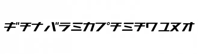 Scaricare 236 Downloads@WebFont
 -
( Fonts by weknow - Wino S Kadir )
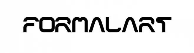
A futuristic, geometric font with bold, angular shapes and consistent line thickness.
![formalart font caratteri gratis]() Scaricare 236 Downloads@WebFont
Scaricare 236 Downloads@WebFont -
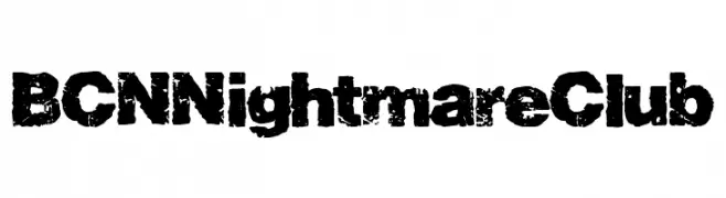
( Fonts by Woodcutter Manero - http://www.woodcutter.es - Personal-use only. For commercial use please contact owner. )
A bold, distressed font with a grunge, textured appearance.
![BCN Nightmare Club font caratteri gratis]() Scaricare 236 Downloads@WebFont
Scaricare 236 Downloads@WebFont -
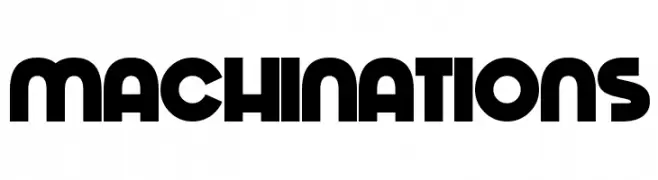
![Machinations font caratteri gratis]() Scaricare 236 Downloads@WebFont
Scaricare 236 Downloads@WebFont -
( Maellekeita )
A bold, brushstroke-style font with dynamic and textured characters.
![LA KAME A LEON font caratteri gratis]() Scaricare 236 Downloads@WebFont
Scaricare 236 Downloads@WebFont -
-
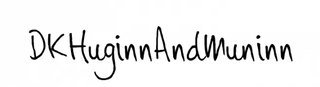
( Fonts by David Kerkhoff - www.hanodedphotography.com )
A playful, casual handwritten font with irregular strokes and a lively appearance.
![DKHuginnAndMuninn font caratteri gratis]() Scaricare 236 Downloads@WebFont
Scaricare 236 Downloads@WebFont -
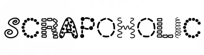
( Fonts by Vanessa Bays - bythebutterfly.com )
A playful and decorative font with unique patterns and textures in each character.
![ScrapOHolic font caratteri gratis]() Scaricare 236 Downloads@WebFont
Scaricare 236 Downloads@WebFont -
![King Of The World font caratteri gratis]() Scaricare 236 Downloads@WebFont
Scaricare 236 Downloads@WebFont -
![Prickly Pear font caratteri gratis]() Scaricare 236 Downloads@WebFont
Scaricare 236 Downloads@WebFont -
( Donationware - www.junkohanhero.com )
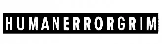
A bold, distressed stencil-style font with a vintage, industrial feel.
![Human Error Grim font caratteri gratis]() Scaricare 236 Downloads@WebFont
Scaricare 236 Downloads@WebFont -
( Fonts by Daniel Zadorozny - www.iconian.com - Free for personal use )
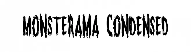
A bold, jagged, and distressed font ideal for horror-themed designs.
![Monsterama Condensed font caratteri gratis]() Scaricare 236 Downloads@WebFont
Scaricare 236 Downloads@WebFont -
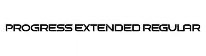
( Fonts by Vladimir Nikolic - www.creativefabrica.com/designer/vladimirnikolic/ - Personal-use only. For commercial use please contact owner. )
A modern, geometric font with bold, extended characters and a futuristic style.
![Progress Extended Regular font caratteri gratis]() Scaricare 236 Downloads@WebFont
Scaricare 236 Downloads@WebFont -
( Megan Toy - etsy.com/shop/in2itiveARTWORK )
A playful, hand-drawn font with a youthful, informal style.
![Fourth Grader Font font caratteri gratis]() Scaricare 236 Downloads@WebFont
Scaricare 236 Downloads@WebFont -
![Cyberia Bold Italic font caratteri gratis]() Scaricare 236 Downloads@WebFont
Scaricare 236 Downloads@WebFont -
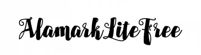
![AlamarkLiteFree font caratteri gratis]() Scaricare 236 Downloads@WebFont
Scaricare 236 Downloads@WebFont -
( Fonts by www.blambot.com )
A bold, dynamic font with a hand-drawn, energetic style.
![Dragonbones BB Bold font caratteri gratis]() Scaricare 236 Downloads@WebFont
Scaricare 236 Downloads@WebFont -
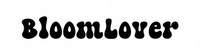
( Fonts by ReyreyBlue )
A bold, playful font with rounded, bulbous shapes and a retro vibe.
![Bloom Lover font caratteri gratis]() Scaricare 236 Downloads@WebFont
Scaricare 236 Downloads@WebFont -
( Fonts by Blue Vinyl - Jess Latham - www.bvfonts.com )
A decorative symbol font featuring stars, hearts, and arrows with a playful style.
![Charms BV font caratteri gratis]() Scaricare 236 Downloads@WebFont
Scaricare 236 Downloads@WebFont -
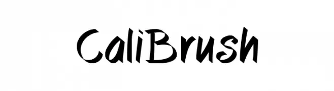
( Fonts by www.studiotypo.com - Personal-use only. For commercial use please contact owner. )
A dynamic brush-style font with bold, angular strokes and a handwritten feel.
![CaliBrush font caratteri gratis]() Scaricare 236 Downloads@WebFont
Scaricare 236 Downloads@WebFont -
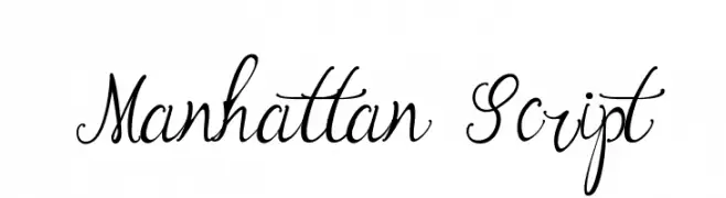
( Fonts by arttotell )
An elegant and flowing script font with intricate loops and swashes.
![Manhattan Script font caratteri gratis]() Scaricare 236 Downloads@WebFont
Scaricare 236 Downloads@WebFont -
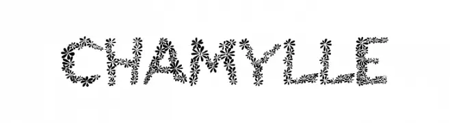
( Fonts by EvasUniqueFonts )
A decorative font with characters made of floral patterns.
![Chamylle font caratteri gratis]() Scaricare 236 Downloads@WebFont
Scaricare 236 Downloads@WebFont -
![CD-Icons font caratteri gratis]() Scaricare 236 Downloads@WebFont
Scaricare 236 Downloads@WebFont -
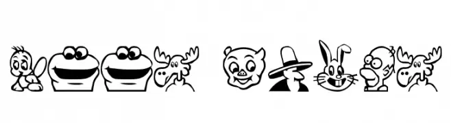
( Fonts by Rick Montgomery )
Cartoon character dingbat font with bold, outlined faces.
![Toon Plain font caratteri gratis]() Scaricare 236 Downloads@WebFont
Scaricare 236 Downloads@WebFont -
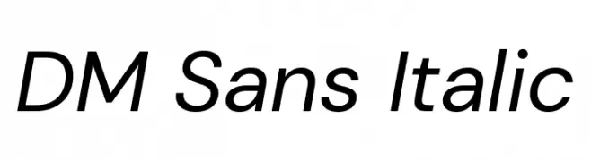
( Copyright 2014-2017 Indian Type Foundry (info@indiantypefoundry.com). )
A modern, italic sans-serif font with clean lines and balanced proportions.
![DM Sans Italic font caratteri gratis]() Scaricare 236 Downloads@WebFont
Scaricare 236 Downloads@WebFont -
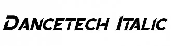
![Dancetech Italic font caratteri gratis]() Scaricare 236 Downloads@WebFont
Scaricare 236 Downloads@WebFont -
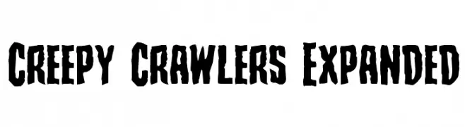
( Fonts by Iconian Fonts )
A bold, jagged font with an eerie, hand-carved appearance.
![Creepy Crawlers Expanded font caratteri gratis]() Scaricare 236 Downloads@WebFont
Scaricare 236 Downloads@WebFont -
![Dippex font caratteri gratis]() Scaricare 236 Downloads@WebFont
Scaricare 236 Downloads@WebFont -
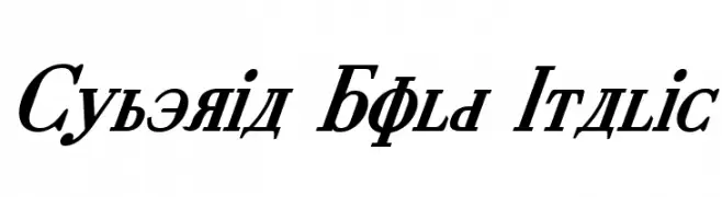
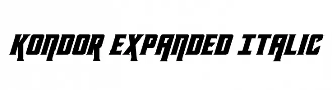
( Fonts by Daniel Zadorozny - www.iconian.com - Free for personal use )
A bold, expanded, and italicized font with a modern, edgy style.
![Kondor Expanded Italic font caratteri gratis]() Scaricare 236 Downloads@WebFont
Scaricare 236 Downloads@WebFont -
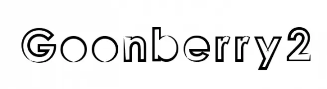
![Goonberry2 font caratteri gratis]() Scaricare 236 Downloads@WebFont
Scaricare 236 Downloads@WebFont -
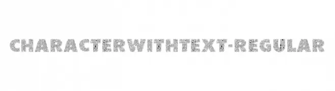
( Fonts by 177Studio )
A bold, decorative font with characters made from intricate text patterns.
![CharacterwithText-Regular font caratteri gratis]() Scaricare 236 Downloads@WebFont
Scaricare 236 Downloads@WebFont -
( Fonts by Figuree Studio )
A decorative font with a carved, elegant style and playful curves.
![Fontastique Carved font caratteri gratis]() Scaricare 236 Downloads@WebFont
Scaricare 236 Downloads@WebFont -
( Fonts by Qwatchy Wikwik )
A playful, bold font with rounded edges and a bubbly appearance.
![Glitteries font caratteri gratis]() Scaricare 236 Downloads@WebFont
Scaricare 236 Downloads@WebFont -
( Fonts by Karin McCombes. Personal-use only. For commercial use please contact owner. )
A tall, narrow font with a whimsical and modern style.
![LewisBlues font caratteri gratis]() Scaricare 236 Downloads@WebFont
Scaricare 236 Downloads@WebFont -
( Fonts by Yann Gall )
A modern, minimalist font with geometric shapes and a sleek appearance.
![Boisu Fill font caratteri gratis]() Scaricare 236 Downloads@WebFont
Scaricare 236 Downloads@WebFont -
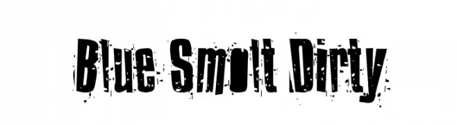
( Fonts by Benoit DESPREZ - Personal-use only. For commercial use please contact owner. )
A bold, distressed font with a grunge, urban aesthetic.
![Blue Smolt Dirty font caratteri gratis]() Scaricare 236 Downloads
Scaricare 236 Downloads


Quali sono i font più popolari adesso?
Poppins, Roboto, Montserrat, Open Sans e Lato sono molto usati per le forme pulite e l'ampia applicabilità — dall'identità di marca alle landing page e ai poster.
Quali font si usano spesso nei loghi?
Le sans serif geometriche (es. Poppins, famiglie in stile Gotham) sono scelte comuni per un branding pulito e scalabile. Per un tocco personale restano valide script e stili manoscritti. Abbina un display deciso per i titoli a un corpo testo neutro per riconoscibilità ed equilibrio.
Ogni quanto si aggiorna la lista?
Con regolarità, in base ai download e all'attività reale. Torna spesso per scoprire in anticipo le nuove preferite.
💡 Consiglio: aggiungi ai preferiti — le tendenze cambiano in fretta e i font top di oggi possono ispirare il rebranding di domani.