Benvenuto nelle Font Più Popolari — dove popolarità e qualità si incontrano. Qui trovi i font più scaricati e usati dell'anno. Se cerchi scelte sicure per logo, web o social, inizia da qui.
Ogni font top si distingue per equilibrio, leggibilità e versatilità. Troverai sans serif moderne, script eleganti, serif vintage e display minimalisti.
-
( Fonts by a Situjuh Nazara - c7n1.wordpress.com. Personal-use only. For commercial use please contact owner. )
A playful, rounded font with smooth curves and a friendly appearance.
 Scaricare 244 Downloads@WebFont
 -
( Fonts by Woodcutter Manero - www.woodcutter.es - Personal-use only. For commercial use please contact owner. )
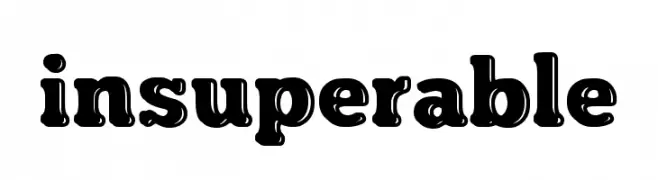
A bold, decorative font with a playful, retro style and unique cutouts.
![insuperable font caratteri gratis]() Scaricare 244 Downloads@WebFont
Scaricare 244 Downloads@WebFont -
( Fonts by ShyFonts )
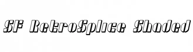
A retro-styled font with a shaded, three-dimensional effect and bold, slanted characters.
![SF RetroSplice Shaded font caratteri gratis]() Scaricare 244 Downloads@WebFont
Scaricare 244 Downloads@WebFont -
( Måns Grebäck - www.mansgreback.com )
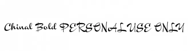
A bold, flowing script font with modern elegance.
![Chinal Bold PERSONAL USE ONLY font caratteri gratis]() Scaricare 244 Downloads@WebFont
Scaricare 244 Downloads@WebFont -
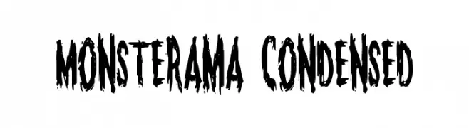
( Fonts by Daniel Zadorozny - www.iconian.com - Free for personal use )
A bold, jagged, and distressed font ideal for horror-themed designs.
![Monsterama Condensed font caratteri gratis]() Scaricare 244 Downloads@WebFont
Scaricare 244 Downloads@WebFont -
( Fonts by D; Jov )
A playful, handwritten font with thin, irregular strokes.
![Seneca font caratteri gratis]() Scaricare 244 Downloads@WebFont
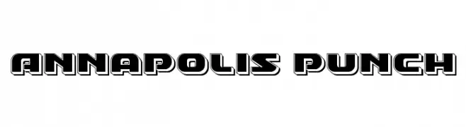
Scaricare 244 Downloads@WebFont -
![Annapolis Punch font caratteri gratis]() Scaricare 244 Downloads@WebFont
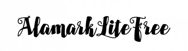
Scaricare 244 Downloads@WebFont -
![AlamarkLiteFree font caratteri gratis]() Scaricare 244 Downloads@WebFont
Scaricare 244 Downloads@WebFont -
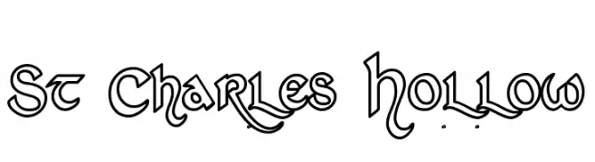
( Fonts by Omega Font Labs )
A decorative, hollow font with intricate curves and sharp angles.
![St Charles Hollow font caratteri gratis]() Scaricare 244 Downloads@WebFont
Scaricare 244 Downloads@WebFont -
![Bigntall font caratteri gratis]() Scaricare 244 Downloads@WebFont
Scaricare 244 Downloads@WebFont -
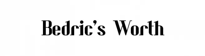
![Bedric's Worth font caratteri gratis]() Scaricare 244 Downloads@WebFont
Scaricare 244 Downloads@WebFont -
( Fonts by Toko Laris Djaja - Dicky Syafaat - Personal-use only. For commercial use please contact owner. )
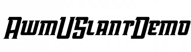
A bold, slanted font with sharp angles and a dynamic presence.
![AwmU Slant Demo font caratteri gratis]() Scaricare 244 Downloads@WebFont
Scaricare 244 Downloads@WebFont -
( Fonts by Daniel Zadorozny - www.iconian.com )
A bold, geometric font with an expanded width and futuristic style.
![Stuntman Expanded font caratteri gratis]() Scaricare 244 Downloads@WebFont
Scaricare 244 Downloads@WebFont -
( Fonts by Kreative Korporation - www.kreativekorp.com )
A casual, handwritten font with smooth, flowing lines and a relaxed style.
![Los Altos font caratteri gratis]() Scaricare 244 Downloads@WebFont
Scaricare 244 Downloads@WebFont -
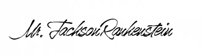
![Mr.JacksonRankenstein font caratteri gratis]() Scaricare 244 Downloads@WebFont
Scaricare 244 Downloads@WebFont -
( ingoFonts - Ingo Zimmermann - www.ingofonts.com )
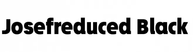
A bold, modern font with thick, uniform strokes and high legibility.
![Josefreduced-Black font caratteri gratis]() Scaricare 244 Downloads@WebFont
Scaricare 244 Downloads@WebFont -
( Fonts by www.vicfieger.com )
A distressed, grunge-style font with rough, uneven edges and a bold presence.
![Ex Kata Damaged font caratteri gratis]() Scaricare 244 Downloads@WebFont
Scaricare 244 Downloads@WebFont -
![Bite font caratteri gratis]() Scaricare 244 Downloads@WebFont
Scaricare 244 Downloads@WebFont -
( Fonts by Steve Art )
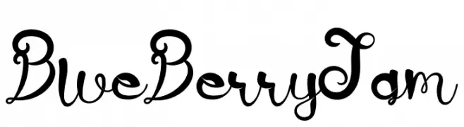
A whimsical, handwritten font with curly and looping strokes.
![BlueBerry Jam font caratteri gratis]() Scaricare 244 Downloads@WebFont
Scaricare 244 Downloads@WebFont -
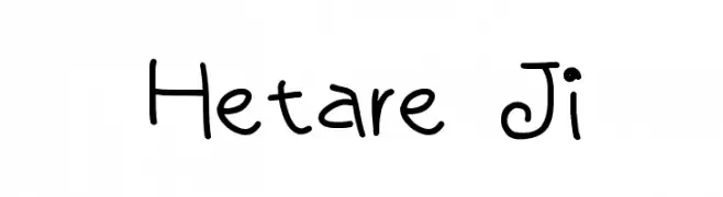
( Fonts by Baka - Kyakirun - bakafonts.kyakirun.com )
A playful, handwritten font with a casual and friendly style.
![Hetare Ji font caratteri gratis]() Scaricare 244 Downloads@WebFont
Scaricare 244 Downloads@WebFont -
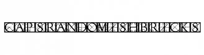
( Fonts by Manfred Klein. Free for private and charity use. Free for commercial with donation to organizations )
An ornate, geometric font with intricate patterns and uppercase letters.
![CapsRandomishBricks font caratteri gratis]() Scaricare 244 Downloads@WebFont
Scaricare 244 Downloads@WebFont -
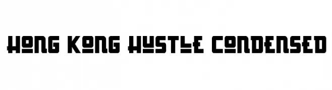
( Fonts by Daniel Zadorozny - www.iconian.com - Free for personal use )
A bold, geometric, and condensed font with a modern, futuristic style.
![Hong Kong Hustle Condensed font caratteri gratis]() Scaricare 244 Downloads@WebFont
Scaricare 244 Downloads@WebFont -
( Fonts by Al Ghul )
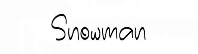
A playful handwritten font with smooth, rounded strokes and a whimsical style.
![Snowman font caratteri gratis]() Scaricare 244 Downloads@WebFont
Scaricare 244 Downloads@WebFont -
( Fonts by Balpirick Studio )
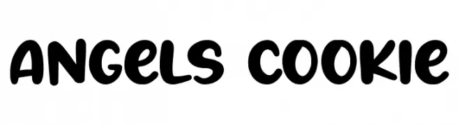
A playful, bold font with rounded, bubbly characters ideal for informal designs.
![Angels Cookie font caratteri gratis]() Scaricare 244 Downloads@WebFont
Scaricare 244 Downloads@WebFont -
( Fonts by Jamie Place [FontBlast Design] - Personal-use only. For commercial use please contact owner. )
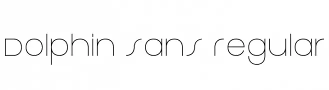
A sleek, modern font with geometric lines and a minimalist aesthetic.
![Dolphin Sans Regular font caratteri gratis]() Scaricare 244 Downloads@WebFont
Scaricare 244 Downloads@WebFont -
( Fonts by ShyFonts )
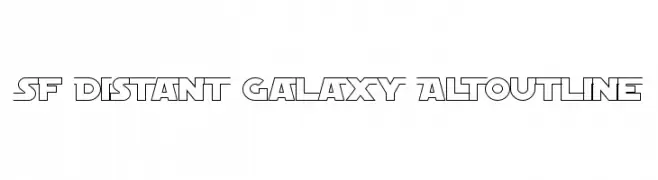
A bold, futuristic outline font with a geometric and angular design.
![SF Distant Galaxy AltOutline font caratteri gratis]() Scaricare 244 Downloads@WebFont
Scaricare 244 Downloads@WebFont -
( Craft Supply Co. - creativemarket.com/craftsupplyco )
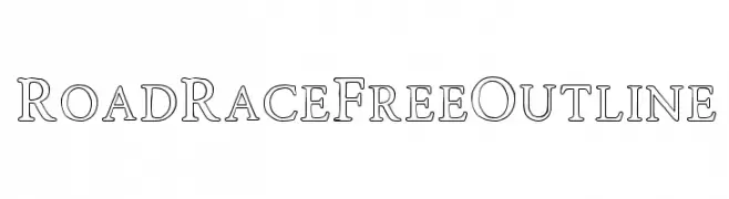
A bold, outlined serif font with a modern and elegant style.
![RoadRaceFree-Outline font caratteri gratis]() Scaricare 244 Downloads@WebFont
Scaricare 244 Downloads@WebFont -
( Fonts by Daniel Zadorozny - www.iconian.com - Free for personal use )
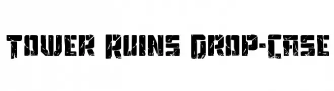
A bold, distressed font with a rugged, weathered appearance.
![Tower Ruins Drop-Case font caratteri gratis]() Scaricare 244 Downloads@WebFont
Scaricare 244 Downloads@WebFont -
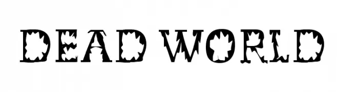
![Dead World font caratteri gratis]() Scaricare 244 Downloads@WebFont
Scaricare 244 Downloads@WebFont -
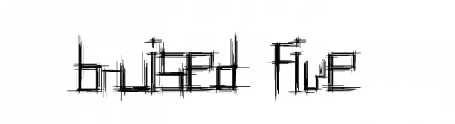
( Fonts by http://perso.calixo.net/~uzim/ )
A distressed, sketch-like font with a chaotic and edgy appearance.
![Bruised Five font caratteri gratis]() Scaricare 244 Downloads@WebFont
Scaricare 244 Downloads@WebFont -
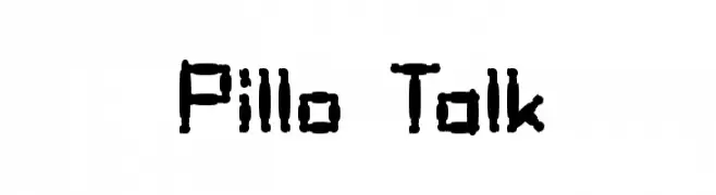
( Fonts by Graham Meade - GemFonts )
A playful, bold font with a rounded, pillow-like design.
![Pillo Talk font caratteri gratis]() Scaricare 244 Downloads@WebFont
Scaricare 244 Downloads@WebFont -
( www.behance.net/SRCDesigns )
A playful, handwritten font with a casual and friendly style.
![Fruit Sale font caratteri gratis]() Scaricare 244 Downloads@WebFont
Scaricare 244 Downloads@WebFont -
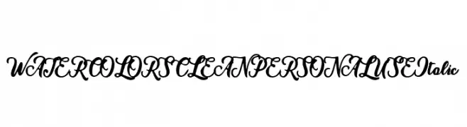
( Fonts by Billy Argel - Personal-use only. For commercial use please contact owner. )
An elegant, flowing script font with a bold, italic style.
![WATERCOLORS CLEAN PERSONAL USE Italic font caratteri gratis]() Scaricare 244 Downloads@WebFont
Scaricare 244 Downloads@WebFont -
( Fonts by Fikry Alif - Fikryal studio - https://www.creativefabrica.com/designer/mfikryalif/ref/222304/ - Personal-use only. For commercial use please contact owner. )
A lively, expressive handwritten font with dynamic strokes and a modern artistic flair.
![olive font caratteri gratis]() Scaricare 244 Downloads@WebFont
Scaricare 244 Downloads@WebFont -
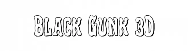
( Fonts by Iconian Fonts )
A bold, playful font with a 3D melting effect and thick outlines.
![Black Gunk 3D font caratteri gratis]() Scaricare 244 Downloads@WebFont
Scaricare 244 Downloads@WebFont


Quali sono i font più popolari adesso?
Poppins, Roboto, Montserrat, Open Sans e Lato sono molto usati per le forme pulite e l'ampia applicabilità — dall'identità di marca alle landing page e ai poster.
Quali font si usano spesso nei loghi?
Le sans serif geometriche (es. Poppins, famiglie in stile Gotham) sono scelte comuni per un branding pulito e scalabile. Per un tocco personale restano valide script e stili manoscritti. Abbina un display deciso per i titoli a un corpo testo neutro per riconoscibilità ed equilibrio.
Ogni quanto si aggiorna la lista?
Con regolarità, in base ai download e all'attività reale. Torna spesso per scoprire in anticipo le nuove preferite.
💡 Consiglio: aggiungi ai preferiti — le tendenze cambiano in fretta e i font top di oggi possono ispirare il rebranding di domani.