Benvenuto nelle Font Più Popolari — dove popolarità e qualità si incontrano. Qui trovi i font più scaricati e usati dell'anno. Se cerchi scelte sicure per logo, web o social, inizia da qui.
Ogni font top si distingue per equilibrio, leggibilità e versatilità. Troverai sans serif moderne, script eleganti, serif vintage e display minimalisti.
-
( Fonts by www.gliphmaker.com. Personal-use only. For commercial use please contact owner. )
A classic italic typeface with elegant curves and delicate serifs.
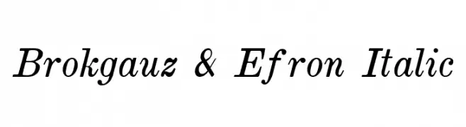 Scaricare 244 Downloads@WebFont
 -
( Fonts by a Neale Davidson - www.pixelsagas.com. Personal-use only. For commercial use please contact owner. )
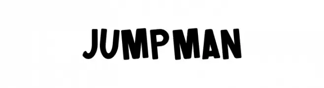
A bold, playful font with a retro-modern appeal and unique star symbols.
![Jumpman font caratteri gratis]() Scaricare 244 Downloads@WebFont
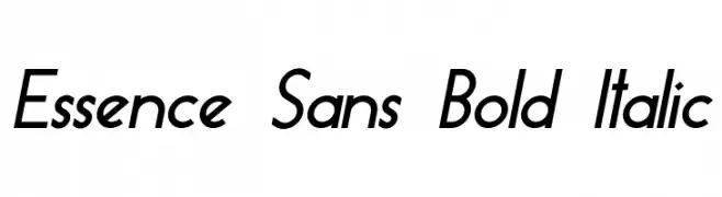
Scaricare 244 Downloads@WebFont -
![Essence Sans Bold Italic font caratteri gratis]() Scaricare 244 Downloads@WebFont
Scaricare 244 Downloads@WebFont -
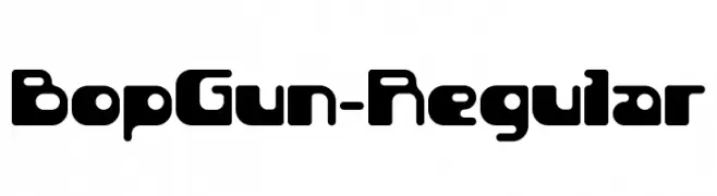
( Fonts by 9031.com )
A bold, rounded font with a futuristic and playful design.
![BopGun-Regular font caratteri gratis]() Scaricare 244 Downloads@WebFont
Scaricare 244 Downloads@WebFont -
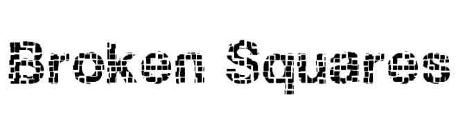
![Broken Squares font caratteri gratis]() Scaricare 244 Downloads@WebFont
Scaricare 244 Downloads@WebFont -
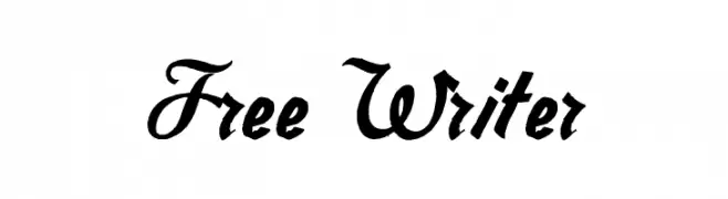
![Free Writer font caratteri gratis]() Scaricare 244 Downloads@WebFont
Scaricare 244 Downloads@WebFont -
( Fonts by Daniel Zadorozny - www.iconian.com - Free for personal use )
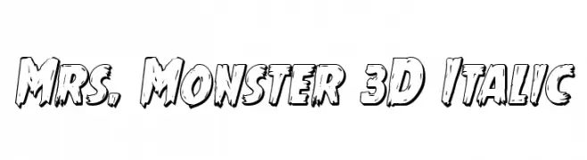
A bold, 3D italic font with a playful, comic book style.
![Mrs. Monster 3D Italic font caratteri gratis]() Scaricare 244 Downloads@WebFont
Scaricare 244 Downloads@WebFont -
( Fonts by Apostrophic Lab )
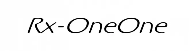
A smooth, flowing script font with elegant curves and a handwritten style.
![Rx-OneOne font caratteri gratis]() Scaricare 244 Downloads@WebFont
Scaricare 244 Downloads@WebFont -
( Fonts by Balpirick Studio - Personal-use only. For commercial use please contact owner. )
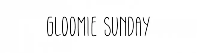
A playful, hand-drawn font with tall, narrow letters and a whimsical style.
![Gloomie Sunday font caratteri gratis]() Scaricare 244 Downloads@WebFont
Scaricare 244 Downloads@WebFont -
( Fonts by Maelle.K - Thomas Boucherie )
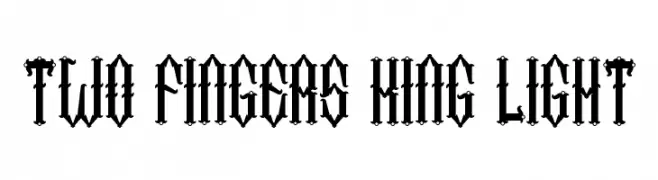
A bold, gothic-style blackletter font with intricate details.
![Two Fingers King Light font caratteri gratis]() Scaricare 244 Downloads@WebFont
Scaricare 244 Downloads@WebFont -
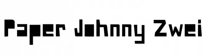
![Paper Johnny Zwei font caratteri gratis]() Scaricare 244 Downloads@WebFont
Scaricare 244 Downloads@WebFont -
Caratteri di HammerBro101. For commercial use please contact the owner.
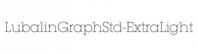
![LubalinGraphStd-ExtraLight font caratteri gratis]() Scaricare 243 Downloads@WebFont
Scaricare 243 Downloads@WebFont -
( Fonts by Daniel Zadorozny - www.iconian.com - Free for personal use )
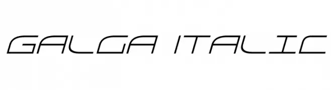
A sleek, futuristic italic font with geometric lines and a modern aesthetic.
![Galga Italic font caratteri gratis]() Scaricare 243 Downloads@WebFont
Scaricare 243 Downloads@WebFont -
( Fonts by ShyFonts )
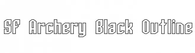
A bold, geometric outline font with sharp angles and a modern aesthetic.
![SF Archery Black Outline font caratteri gratis]() Scaricare 243 Downloads@WebFont
Scaricare 243 Downloads@WebFont -
( Fonts by www.chequered.ink - Chequered Ink - Personal-use only. For commercial use please contact owner. )
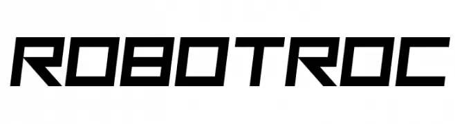
A futuristic, angular font with a bold and dynamic style.
![Robot Roc font caratteri gratis]() Scaricare 243 Downloads@WebFont
Scaricare 243 Downloads@WebFont -
( Fonts by Zach Dunton )
A playful, bold handwritten font with an organic feel.
![BreNoelle font caratteri gratis]() Scaricare 243 Downloads@WebFont
Scaricare 243 Downloads@WebFont -
![ChineseWhisper font caratteri gratis]() Scaricare 243 Downloads@WebFont
Scaricare 243 Downloads@WebFont -
( Fonts by Jen Jones )
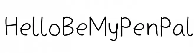
A playful, casual handwritten font with rounded, consistent strokes.
![HelloBeMyPenPal font caratteri gratis]() Scaricare 243 Downloads@WebFont
Scaricare 243 Downloads@WebFont -
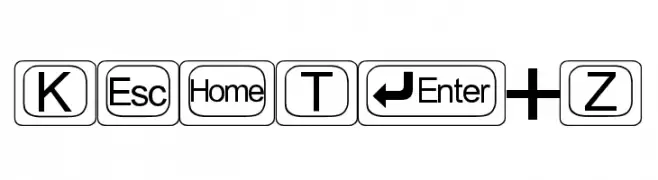
![KeyTopZ font caratteri gratis]() Scaricare 243 Downloads@WebFont
Scaricare 243 Downloads@WebFont -
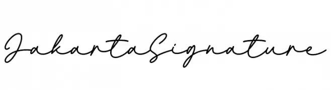
( Fonts by AVType - Personal-use only. For commercial use please contact owner. )
Elegant script font with fluid, connected strokes.
![Jakarta Signature font caratteri gratis]() Scaricare 243 Downloads@WebFont
Scaricare 243 Downloads@WebFont -
( Fonts by Ikrar Bey Khubaib )
A bold, energetic script font with a hand-drawn, dynamic style.
![Takipedey font caratteri gratis]() Scaricare 243 Downloads@WebFont
Scaricare 243 Downloads@WebFont -
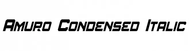
( Fonts by a Neale Davidson - www.pixelsagas.com. Personal-use only. For commercial use please contact owner. )
A bold, condensed, and italic font with a modern and dynamic style.
![Amuro Condensed Italic font caratteri gratis]() Scaricare 243 Downloads@WebFont
Scaricare 243 Downloads@WebFont -
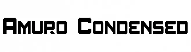
( Fonts by a Neale Davidson - www.pixelsagas.com. Personal-use only. For commercial use please contact owner. )
A bold, geometric, and modern font with a condensed width and strong visual impact.
![Amuro Condensed font caratteri gratis]() Scaricare 243 Downloads@WebFont
Scaricare 243 Downloads@WebFont -
( Font by Jonathan Harris - www.tattoowoo.com )
A playful and whimsical font with rounded edges and dynamic strokes.
![GeT wEt font caratteri gratis]() Scaricare 243 Downloads@WebFont
Scaricare 243 Downloads@WebFont -
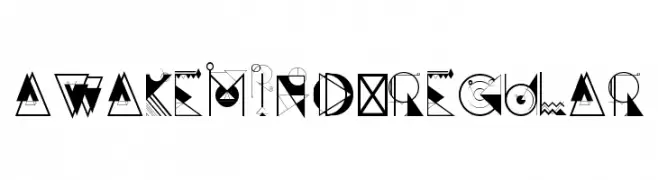
( fonts.pistocasero.com )
A decorative, geometric font with abstract and artistic elements.
![AWAKEMIND-Regular font caratteri gratis]() Scaricare 243 Downloads@WebFont
Scaricare 243 Downloads@WebFont -
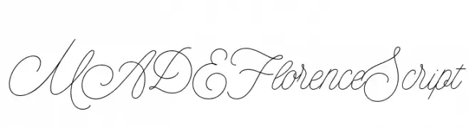
( Fonts by MadeType - Personal-use only. For commercial use please contact owner. )
An elegant, flowing script font with high contrast and ornate details.
![MADEFlorenceScript font caratteri gratis]() Scaricare 243 Downloads@WebFont
Scaricare 243 Downloads@WebFont -
![Flob Out a Bork font caratteri gratis]() Scaricare 243 Downloads@WebFont
Scaricare 243 Downloads@WebFont -
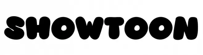
( Fonts by Khurasan™ )
A bold, playful font with rounded, bubbly characters perfect for fun designs.
![Showtoon font caratteri gratis]() Scaricare 243 Downloads@WebFont
Scaricare 243 Downloads@WebFont -
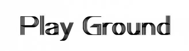
( Fonts by weknow - Wino S Kadir )
A modern, dynamic font with parallel line patterns creating a sense of movement.
![Play Ground font caratteri gratis]() Scaricare 243 Downloads@WebFont
Scaricare 243 Downloads@WebFont -
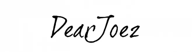
( JOEBOB graphics - Joe vanderHam - www.joebob.nl )
A handwritten, casual font with dynamic strokes and a personal touch.
![DearJoe2 font caratteri gratis]() Scaricare 243 Downloads@WebFont
Scaricare 243 Downloads@WebFont -
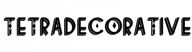
( Fonts by www.Fontfabric.com )
A bold, decorative font with a distressed texture and geometric elements.
![tetradecorative font caratteri gratis]() Scaricare 243 Downloads@WebFont
Scaricare 243 Downloads@WebFont -
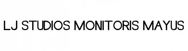
![LJ Studios MonitorIS MAYUS font caratteri gratis]() Scaricare 243 Downloads@WebFont
Scaricare 243 Downloads@WebFont -
![Eichante font caratteri gratis]() Scaricare 243 Downloads@WebFont
Scaricare 243 Downloads@WebFont -
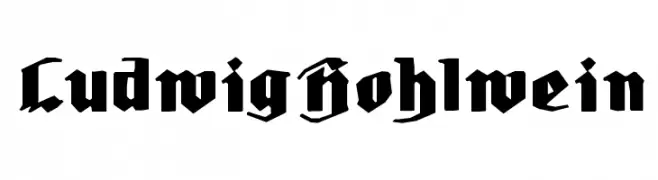
( Fonts by Manfred Klein. Free for private and charity use. Free for commercial with donation to organizations )
A bold blackletter font with sharp, angular lines and a gothic style.
![LudwigHohlwein font caratteri gratis]() Scaricare 243 Downloads@WebFont
Scaricare 243 Downloads@WebFont -
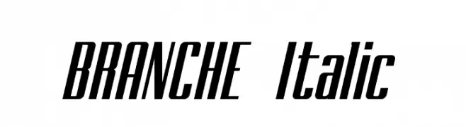
( Typo Bureau Studio - TypoBureau Studio )
A sleek, italicized font with narrow, elongated characters and tight spacing.
![BRANCHE Italic font caratteri gratis]() Scaricare 243 Downloads@WebFont
Scaricare 243 Downloads@WebFont


Quali sono i font più popolari adesso?
Poppins, Roboto, Montserrat, Open Sans e Lato sono molto usati per le forme pulite e l'ampia applicabilità — dall'identità di marca alle landing page e ai poster.
Quali font si usano spesso nei loghi?
Le sans serif geometriche (es. Poppins, famiglie in stile Gotham) sono scelte comuni per un branding pulito e scalabile. Per un tocco personale restano valide script e stili manoscritti. Abbina un display deciso per i titoli a un corpo testo neutro per riconoscibilità ed equilibrio.
Ogni quanto si aggiorna la lista?
Con regolarità, in base ai download e all'attività reale. Torna spesso per scoprire in anticipo le nuove preferite.
💡 Consiglio: aggiungi ai preferiti — le tendenze cambiano in fretta e i font top di oggi possono ispirare il rebranding di domani.