Benvenuto nelle Font Più Popolari — dove popolarità e qualità si incontrano. Qui trovi i font più scaricati e usati dell'anno. Se cerchi scelte sicure per logo, web o social, inizia da qui.
Ogni font top si distingue per equilibrio, leggibilità e versatilità. Troverai sans serif moderne, script eleganti, serif vintage e display minimalisti.
-
( Fonts by Darrell Flood )
A bold, italicized decorative font with a festive, dotted design.
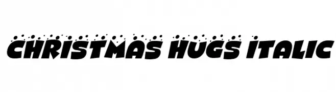 Scaricare 231 Downloads@WebFont
 -
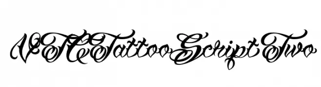
( Fonts by Vigilante Typeface Corporation Larry Yerkes. Personal-use only. For commercial use please contact owner. )
An ornate script font with intricate loops and flourishes, reminiscent of traditional calligraphy.
![VTCTattooScriptTwo font caratteri gratis]() Scaricare 231 Downloads@WebFont
Scaricare 231 Downloads@WebFont -
( Fonts by Daniel Zadorozny - www.iconian.com - Free for personal use )
A sleek, futuristic italic font with smooth, continuous lines.
![Planet N Italic font caratteri gratis]() Scaricare 231 Downloads@WebFont
Scaricare 231 Downloads@WebFont -
( Fonts by BBA Key - Personal-use only. For commercial use please contact owner. )
A bold, cursive font with smooth, flowing lines and a dynamic appearance.
![chocolate font caratteri gratis]() Scaricare 231 Downloads@WebFont
Scaricare 231 Downloads@WebFont -
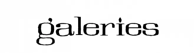
( Fonts by Mario Arturo - marioarturo.com. Personal-use only. For commercial use please contact owner. Contact the owner for a donation. )
A bold, artistic font with a modern vintage aesthetic and sharp serifs.
![Galeries font caratteri gratis]() Scaricare 231 Downloads@WebFont
Scaricare 231 Downloads@WebFont -
-
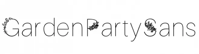
![GardenPartySans font caratteri gratis]() Scaricare 231 Downloads@WebFont
Scaricare 231 Downloads@WebFont -
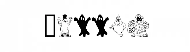
( Fonts by www.houseoflime.com )
Cartoonish Halloween-themed decorative font with ghost illustrations.
![Spooky font caratteri gratis]() Scaricare 231 Downloads@WebFont
Scaricare 231 Downloads@WebFont -
( Fonts by Matthew Napolitano / Full Time Artists - Personal-use only. For commercial use please contact owner. )
A playful, rounded font with smooth, flowing lines and consistent stroke width.
![PreCursive OFL font caratteri gratis]() Scaricare 231 Downloads@WebFont
Scaricare 231 Downloads@WebFont -
( Fonts by Andrew McCluskey - nalgames.com. Personal-use only. For commercial use please contact owner. )
A pixelated, grid-like font with a retro digital aesthetic.
![Aardvark Cwm Type Regular font caratteri gratis]() Scaricare 231 Downloads@WebFont
Scaricare 231 Downloads@WebFont -
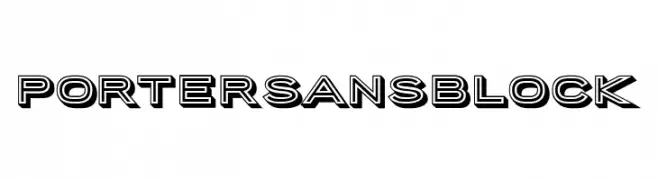
( Fonts by Tyler Finck )
A bold, three-dimensional block font ideal for impactful headlines.
![PorterSansBlock font caratteri gratis]() Scaricare 231 Downloads@WebFont
Scaricare 231 Downloads@WebFont -
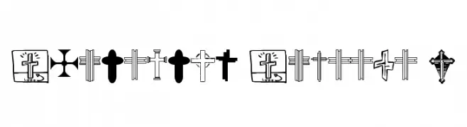
( Fonts by uatype.faithweb.com - UnAuthorized Type )
A symbol font with diverse Christian cross designs.
![Christian Crosses V font caratteri gratis]() Scaricare 231 Downloads@WebFont
Scaricare 231 Downloads@WebFont -
( Fonts by Daniel Zadorozny - www.iconian.com )
A bold, dynamic font with thick strokes and a modern, artistic flair.
![Nuevo Passion Expanded font caratteri gratis]() Scaricare 231 Downloads@WebFont
Scaricare 231 Downloads@WebFont -
( Fonts by Miffies - mfs.jp.org - Personal-use only. For commercial use please contact owner. )
A pixelated, retro-style font with a digital, blocky appearance.
![M02_STRIDER font caratteri gratis]() Scaricare 231 Downloads@WebFont
Scaricare 231 Downloads@WebFont -
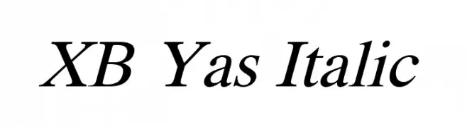
( Fonts by Behnam - Personal-use only. For commercial use please contact owner. )
An elegant serif italic typeface with smooth, flowing lines and a classic style.
![XB Yas Italic font caratteri gratis]() Scaricare 231 Downloads@WebFont
Scaricare 231 Downloads@WebFont -
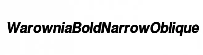
( Fonts by CannotIntoSpaceFonts - KineticPlasma Fonts - Personal-use only. For commercial use please contact owner. )
Bold, narrow, and oblique font with a modern, dynamic style.
![Warownia Bold Narrow Oblique font caratteri gratis]() Scaricare 231 Downloads@WebFont
Scaricare 231 Downloads@WebFont -
![Dividers & Misc font caratteri gratis]() Scaricare 231 Downloads@WebFont
Scaricare 231 Downloads@WebFont -
( Fonts by David Kerkhoff - www.hanodedphotography.com )
A hand-drawn, narrow font with an informal, artistic style.
![DKSucoDeLaranja font caratteri gratis]() Scaricare 231 Downloads@WebFont
Scaricare 231 Downloads@WebFont -
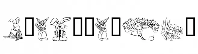
( Fonts by Kat`s Fun Fonts - Personal-use only. For commercial use please contact owner. )
A decorative Easter-themed font with playful illustrations in each character.
![KR Easter No 2 font caratteri gratis]() Scaricare 231 Downloads@WebFont
Scaricare 231 Downloads@WebFont -
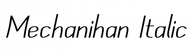
( Fonts by Apostrophic Lab )
A modern, italicized font with sleek, elongated characters and minimal contrast.
![Mechanihan Italic font caratteri gratis]() Scaricare 231 Downloads@WebFont
Scaricare 231 Downloads@WebFont -
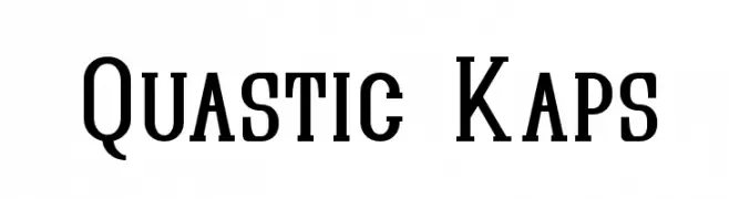
( Fonts by Apostrophic Lab )
A bold, structured serif font with a modern twist, ideal for impactful designs.
![Quastic Kaps font caratteri gratis]() Scaricare 231 Downloads@WebFont
Scaricare 231 Downloads@WebFont -
![Ifao N Copte font caratteri gratis]() Scaricare 231 Downloads@WebFont
Scaricare 231 Downloads@WebFont -
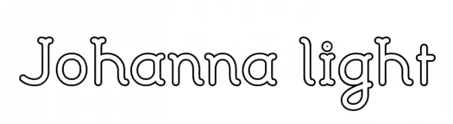
( Fonts by Benoit Sjoholm - www.benoitsjoholm.com - All my fonts are for sale )
A playful, modern outline font with geometric and consistent strokes.
![Johanna light font caratteri gratis]() Scaricare 231 Downloads@WebFont
Scaricare 231 Downloads@WebFont -
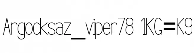
( Vlad Viperov )
A modern, sleek font with elongated, narrow characters and a minimalist aesthetic.
![Argocksaz_viper78 1KG=K9 font caratteri gratis]() Scaricare 231 Downloads@WebFont
Scaricare 231 Downloads@WebFont -
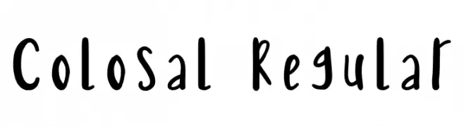
![Colosal Regular font caratteri gratis]() Scaricare 231 Downloads@WebFont
Scaricare 231 Downloads@WebFont -
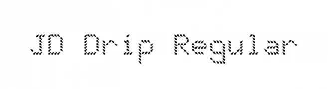
![JD Drip Regular font caratteri gratis]() Scaricare 231 Downloads@WebFont
Scaricare 231 Downloads@WebFont -
( Fonts by Impallari Type )
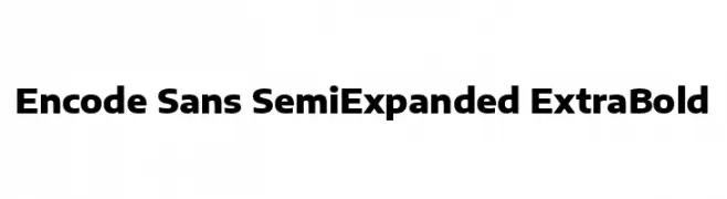
A bold, semi-expanded sans-serif typeface with a modern and versatile style.
![Encode Sans SemiExpanded ExtraBold font caratteri gratis]() Scaricare 231 Downloads@WebFont
Scaricare 231 Downloads@WebFont -
![MiddleSchoolSucks font caratteri gratis]() Scaricare 231 Downloads@WebFont
Scaricare 231 Downloads@WebFont -
![Kremlin Imperial font caratteri gratis]() Scaricare 231 Downloads@WebFont
Scaricare 231 Downloads@WebFont -
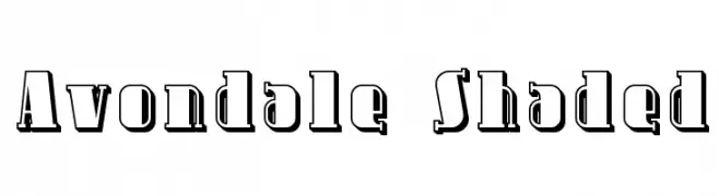
( Fonts by Apostrophic Lab )
A bold, decorative font with a vintage shaded effect.
![Avondale Shaded font caratteri gratis]() Scaricare 231 Downloads@WebFont
Scaricare 231 Downloads@WebFont -
![Fatty font caratteri gratis]() Scaricare 231 Downloads@WebFont
Scaricare 231 Downloads@WebFont -
( Fonts by Md Shohail Bhuian - Personal-use only. For commercial use please contact owner. )
A playful, narrow font with rounded characters and even spacing.
![Good Mood font caratteri gratis]() Scaricare 231 Downloads@WebFont
Scaricare 231 Downloads@WebFont -
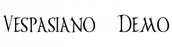
( Fonts by The Scriptorium - Dave Nalle )
A classic, calligraphic font with elegant serifs and medium contrast.
![Vespasiano Demo font caratteri gratis]() Scaricare 231 Downloads@WebFont
Scaricare 231 Downloads@WebFont -
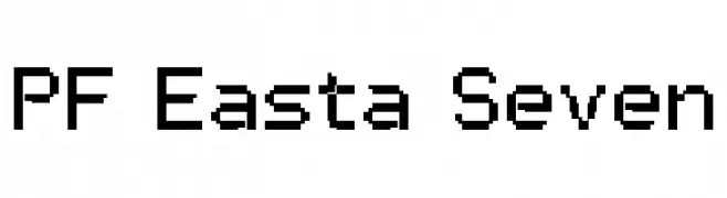
( Fonts by yusukekamiyamane.com )
A pixelated, retro-style font inspired by early digital displays.
![PF Easta Seven font caratteri gratis]() Scaricare 231 Downloads@WebFont
Scaricare 231 Downloads@WebFont -
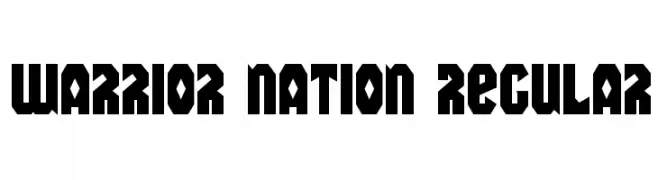
( Fonts by Daniel Zadorozny - www.iconian.com - Free for personal use )
A bold, angular font with a strong geometric influence, ideal for impactful designs.
![Warrior Nation Regular font caratteri gratis]() Scaricare 231 Downloads@WebFont
Scaricare 231 Downloads@WebFont -
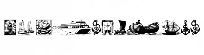
( Fonts by Manfred Klein - manfred-klein.ina-mar.com )
A decorative dingbat font with nautical and pirate-themed illustrations.
![ShipsNBoats font caratteri gratis]() Scaricare 231 Downloads@WebFont
Scaricare 231 Downloads@WebFont


Quali sono i font più popolari adesso?
Poppins, Roboto, Montserrat, Open Sans e Lato sono molto usati per le forme pulite e l'ampia applicabilità — dall'identità di marca alle landing page e ai poster.
Quali font si usano spesso nei loghi?
Le sans serif geometriche (es. Poppins, famiglie in stile Gotham) sono scelte comuni per un branding pulito e scalabile. Per un tocco personale restano valide script e stili manoscritti. Abbina un display deciso per i titoli a un corpo testo neutro per riconoscibilità ed equilibrio.
Ogni quanto si aggiorna la lista?
Con regolarità, in base ai download e all'attività reale. Torna spesso per scoprire in anticipo le nuove preferite.
💡 Consiglio: aggiungi ai preferiti — le tendenze cambiano in fretta e i font top di oggi possono ispirare il rebranding di domani.