Benvenuto nelle Font Più Popolari — dove popolarità e qualità si incontrano. Qui trovi i font più scaricati e usati dell'anno. Se cerchi scelte sicure per logo, web o social, inizia da qui.
Ogni font top si distingue per equilibrio, leggibilità e versatilità. Troverai sans serif moderne, script eleganti, serif vintage e display minimalisti.
-
( Fonts by Daniel Zadorozny - www.iconian.com - Free for personal use )
A bold, italic, futuristic font with outlined characters and sharp angles.
 Scaricare 241 Downloads@WebFont
 -
( Fonts by weknow - Wino S Kadir )
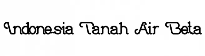
A playful, interconnected font with bold strokes and a modern, artistic style.
![Indonesia Tanah Air Beta font caratteri gratis]() Scaricare 241 Downloads@WebFont
Scaricare 241 Downloads@WebFont -
( Fonts by vladimirnikolic - Personal-use only. For commercial use please contact owner. )
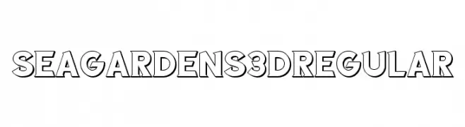
A bold, 3D font with strong outlines and a modern, dynamic style.
![Sea Gardens 3D Regular font caratteri gratis]() Scaricare 241 Downloads@WebFont
Scaricare 241 Downloads@WebFont -
( Fonts by Knackpack Studio - www.knackpack.studio - Personal-use only. For commercial use please contact owner. )
A bold, brush-style script font with dynamic, expressive strokes.
![Bottomless Script font caratteri gratis]() Scaricare 241 Downloads@WebFont
Scaricare 241 Downloads@WebFont -
![Ochent Silibrina font caratteri gratis]() Scaricare 241 Downloads@WebFont
Scaricare 241 Downloads@WebFont -
( Fonts by omoriley )
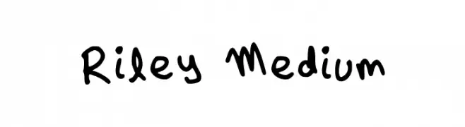
A playful, handwritten font with a casual and friendly style.
![Riley Medium font caratteri gratis]() Scaricare 241 Downloads@WebFont
Scaricare 241 Downloads@WebFont -
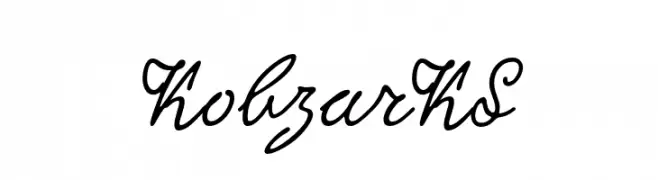
( Fonts by Dmitry Rastvortsev, Henadij Zarechnjuk and Lukyan Turetsky - Personal-use only. Free font based on the handwriting of Taras Shnvchenko, the Ukrainian poet, artist and philosopher. )
A flowing, cursive script font with elegant, connected letters.
![KobzarKS font caratteri gratis]() Scaricare 241 Downloads@WebFont
Scaricare 241 Downloads@WebFont -
( Shareware - new.myfonts.com/foundry/Intellecta_Design/?refby=paulow )
An elegant, cursive script font with flowing, connected strokes.
![ClosetoYou font caratteri gratis]() Scaricare 241 Downloads@WebFont
Scaricare 241 Downloads@WebFont -
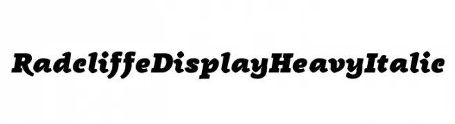
( Zetafonts - www.zetafonts.com )
A bold, italic serif font with a dynamic and commanding presence.
![Radcliffe Display Heavy Italic font caratteri gratis]() Scaricare 241 Downloads@WebFont
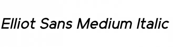
Scaricare 241 Downloads@WebFont -
![Elliot Sans Medium Italic font caratteri gratis]() Scaricare 241 Downloads@WebFont
Scaricare 241 Downloads@WebFont -
( Fonts by Fizzetica DepokAsiana TypeFoundry - fizzeticatypefoundry.tumblr.com )
A mix of bold, modern, and decorative logotype fonts for branding.
![FTF Cellul@r of Indonesiana Island font caratteri gratis]() Scaricare 241 Downloads@WebFont
Scaricare 241 Downloads@WebFont -
( Fonts by imagex )
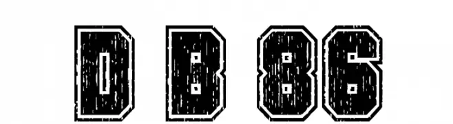
A bold, distressed font with a rugged, vintage appearance.
![Dirty Bowl 86 font caratteri gratis]() Scaricare 241 Downloads@WebFont
Scaricare 241 Downloads@WebFont -
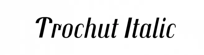
( Copyright (c) 2011, Andreu Balius (http://www.typerepublic.com) )
A modern italic font with smooth strokes and moderate contrast, exuding elegance and fluidity.
![Trochut Italic font caratteri gratis]() Scaricare 241 Downloads@WebFont
Scaricare 241 Downloads@WebFont -
![Monsterz Regular font caratteri gratis]() Scaricare 241 Downloads@WebFont
Scaricare 241 Downloads@WebFont -
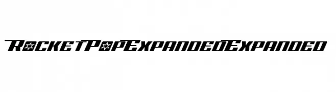
( Iconian Fonts - Daniel Zadorozny - www.iconian.com )
A bold, angular font with a futuristic and dynamic style.
![Rocket Pop Expanded Expanded font caratteri gratis]() Scaricare 241 Downloads@WebFont
Scaricare 241 Downloads@WebFont -
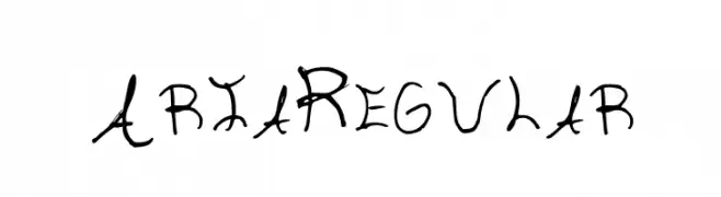
( ADavis )
A whimsical, handwritten font with playful, irregular strokes.
![Aria Regular font caratteri gratis]() Scaricare 241 Downloads@WebFont
Scaricare 241 Downloads@WebFont -
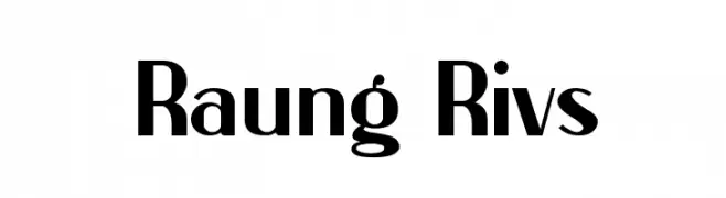
( Sudar Moko )
A bold, high-contrast font with a modern and impactful style.
![Raung Rivs font caratteri gratis]() Scaricare 241 Downloads@WebFont
Scaricare 241 Downloads@WebFont -
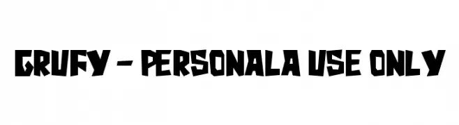
( Fonts by Stefani Letter )
A bold, graffiti-inspired font with sharp angles and an urban aesthetic.
![Grufy - Personala use only font caratteri gratis]() Scaricare 241 Downloads@WebFont
Scaricare 241 Downloads@WebFont -
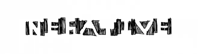
( Fonts by a Max Infeld - XEROGRAPHER FONTS - xerographer.blogspot.com . Personal-use only. For commercial use please contact owner. )
A bold, decorative font with geometric shapes and intricate, hand-drawn patterns.
![negative font caratteri gratis]() Scaricare 241 Downloads@WebFont
Scaricare 241 Downloads@WebFont -
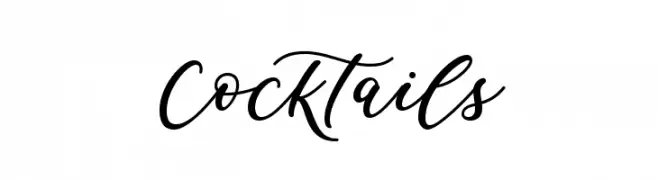
( Fonts by Graphix Line Studio )
A lively and elegant script font with fluid, connected strokes.
![Cocktails font caratteri gratis]() Scaricare 241 Downloads@WebFont
Scaricare 241 Downloads@WebFont -
( Fonts by Scratchones )
Playful handwritten font with rounded edges.
![Little Turtle font caratteri gratis]() Scaricare 241 Downloads@WebFont
Scaricare 241 Downloads@WebFont -
( Fonts by Graham Meade - GemFonts )
A futuristic, geometric font with circular cutouts and bold lines.
![Kharnorric font caratteri gratis]() Scaricare 241 Downloads@WebFont
Scaricare 241 Downloads@WebFont -
( Fonts by Savana Price )
A playful, handwritten font with rounded, consistent letterforms.
![To The Point Regular font caratteri gratis]() Scaricare 241 Downloads@WebFont
Scaricare 241 Downloads@WebFont -
( Fonts by Galdino Otten Fonts - www.galdinootten.com - Personal-use only. For commercial use please contact owner. )
A bold, italicized font with a distressed, vintage Western style.
![Go 2 Old Western Italic font caratteri gratis]() Scaricare 241 Downloads@WebFont
Scaricare 241 Downloads@WebFont -
( Free for a personal use. For a commercial use please visit www.kevinandamanda.com )
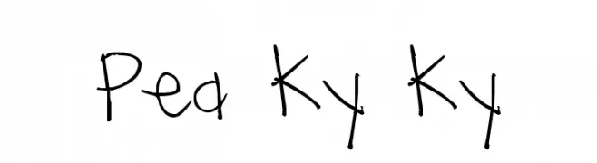
A playful, casual handwritten font with irregular strokes and a friendly appearance.
![Pea Ky Ky font caratteri gratis]() Scaricare 241 Downloads@WebFont
Scaricare 241 Downloads@WebFont -
( Fonts by PiPi Creative )
A playful and elegant script font with flowing, connected letterforms.
![Love Butter font caratteri gratis]() Scaricare 241 Downloads@WebFont
Scaricare 241 Downloads@WebFont -
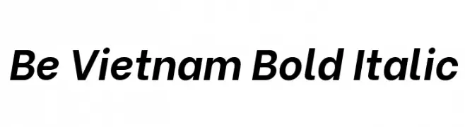
( Copyright 2019 The Bevietnam Project Authors (https://github.com/bettergui/beVietnam) )
A modern, bold, and italic sans-serif font with consistent stroke thickness.
![Be Vietnam Bold Italic font caratteri gratis]() Scaricare 241 Downloads@WebFont
Scaricare 241 Downloads@WebFont -
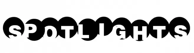
( Fonts by a Max Infeld - XEROGRAPHER FONTS - xerographer.blogspot.com . Personal-use only. For commercial use please contact owner. )
A bold, geometric font with a unique spotlight effect created by circular shapes.
![SpotLights font caratteri gratis]() Scaricare 241 Downloads@WebFont
Scaricare 241 Downloads@WebFont -
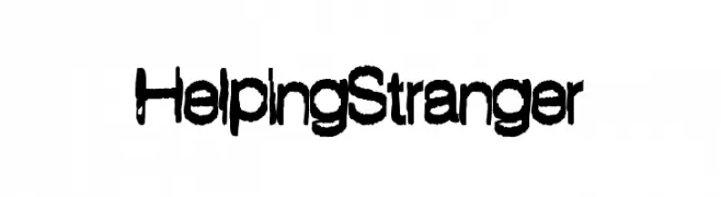
( Fonts by a Max Infeld - XEROGRAPHER FONTS - xerographer.blogspot.com . Personal-use only. For commercial use please contact owner. )
A bold, hand-drawn font with a playful, artistic style.
![HelpingStranger font caratteri gratis]() Scaricare 241 Downloads@WebFont
Scaricare 241 Downloads@WebFont -
( Fonts by Steve Gardner - www.explogos.com. Personal-use only. For commercial use please contact owner. )
A modern, geometric font with clean lines and uniform stroke width.
![Formation Serif Regular font caratteri gratis]() Scaricare 241 Downloads@WebFont
Scaricare 241 Downloads@WebFont -
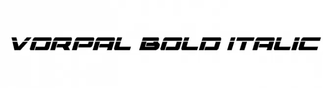
( Fonts by Daniel Zadorozny - www.iconian.com - Free for personal use )
A bold, italicized font with a futuristic and dynamic style.
![Vorpal Bold Italic font caratteri gratis]() Scaricare 241 Downloads@WebFont
Scaricare 241 Downloads@WebFont -
![Melbylon font caratteri gratis]() Scaricare 241 Downloads@WebFont
Scaricare 241 Downloads@WebFont -
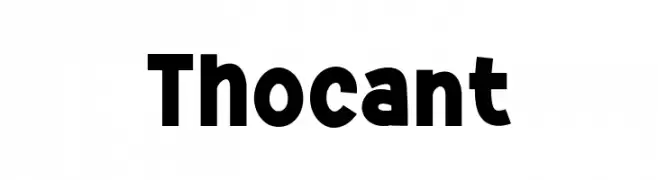
( Fonts by Khurasan™ )
Bold, playful font with rounded edges.
![Thocant font caratteri gratis]() Scaricare 241 Downloads@WebFont
Scaricare 241 Downloads@WebFont -
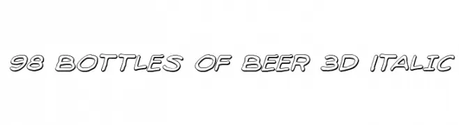
( Fonts by Iconian Fonts )
A bold, 3D italic font with outlined characters and a playful, dynamic style.
![98 Bottles of Beer 3D Italic font caratteri gratis]() Scaricare 241 Downloads@WebFont
Scaricare 241 Downloads@WebFont -
( Fonts by Daniel Gauthier )
Bold, three-dimensional font with a modern and playful style.
![GautsMotelLowerLeft font caratteri gratis]() Scaricare 241 Downloads@WebFont
Scaricare 241 Downloads@WebFont


Quali sono i font più popolari adesso?
Poppins, Roboto, Montserrat, Open Sans e Lato sono molto usati per le forme pulite e l'ampia applicabilità — dall'identità di marca alle landing page e ai poster.
Quali font si usano spesso nei loghi?
Le sans serif geometriche (es. Poppins, famiglie in stile Gotham) sono scelte comuni per un branding pulito e scalabile. Per un tocco personale restano valide script e stili manoscritti. Abbina un display deciso per i titoli a un corpo testo neutro per riconoscibilità ed equilibrio.
Ogni quanto si aggiorna la lista?
Con regolarità, in base ai download e all'attività reale. Torna spesso per scoprire in anticipo le nuove preferite.
💡 Consiglio: aggiungi ai preferiti — le tendenze cambiano in fretta e i font top di oggi possono ispirare il rebranding di domani.