Benvenuto nelle Font Più Popolari — dove popolarità e qualità si incontrano. Qui trovi i font più scaricati e usati dell'anno. Se cerchi scelte sicure per logo, web o social, inizia da qui.
Ogni font top si distingue per equilibrio, leggibilità e versatilità. Troverai sans serif moderne, script eleganti, serif vintage e display minimalisti.
-
 Scaricare 240 Downloads@WebFont
 -
( Fonts by dcoxy )
A bold, dripping font ideal for horror and Halloween themes.
![Joly Death font caratteri gratis]() Scaricare 240 Downloads@WebFont
Scaricare 240 Downloads@WebFont -
( Fonts by Figs - Personal-use only. For commercial use please contact owner. )
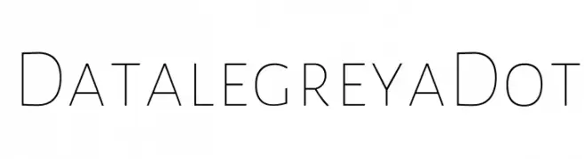
A modern, geometric font with a clean and minimalist design.
![Datalegreya Dot font caratteri gratis]() Scaricare 240 Downloads@WebFont
Scaricare 240 Downloads@WebFont -
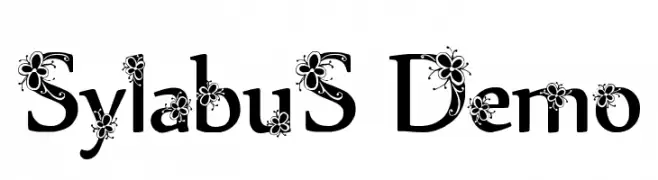
![Sylabus Demo font caratteri gratis]() Scaricare 240 Downloads@WebFont
Scaricare 240 Downloads@WebFont -
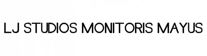
![LJ Studios MonitorIS MAYUS font caratteri gratis]() Scaricare 240 Downloads@WebFont
Scaricare 240 Downloads@WebFont -
( Ajith Rajan - ajithrajan.tk )
A bold, artistic font with layered strokes and a dynamic, textured appearance.
![Aesthetica font caratteri gratis]() Scaricare 240 Downloads@WebFont
Scaricare 240 Downloads@WebFont -
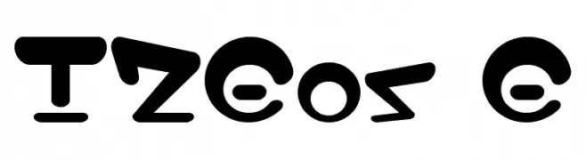
![I2Eos E font caratteri gratis]() Scaricare 240 Downloads@WebFont
Scaricare 240 Downloads@WebFont -
( Fonts by or from www.graffitifonts.net )
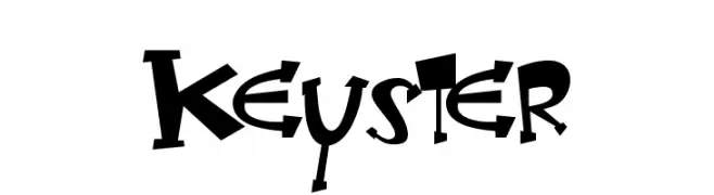
A playful, hand-drawn font with bold, uneven strokes and dynamic characters.
![Keyster font caratteri gratis]() Scaricare 240 Downloads@WebFont
Scaricare 240 Downloads@WebFont -
( Fonts by Julia Fang )
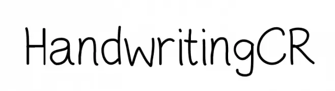
A playful, casual handwritten font with smooth, flowing lines.
![HandwritingCR font caratteri gratis]() Scaricare 240 Downloads@WebFont
Scaricare 240 Downloads@WebFont -
( Fonts by www.lobbby24.com - Personal-use only. For commercial use please contact owner. )
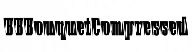
A bold, angular, and decorative font with a compressed, jagged style.
![BBBouquet Compressed font caratteri gratis]() Scaricare 240 Downloads@WebFont
Scaricare 240 Downloads@WebFont -
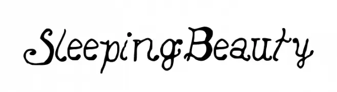
![SleepingBeauty font caratteri gratis]() Scaricare 240 Downloads@WebFont
Scaricare 240 Downloads@WebFont -
( Fonts by dcoxy | Greg Medina )
A bold, distressed font with a rugged, grunge-like texture.
![Shotgunµ font caratteri gratis]() Scaricare 240 Downloads@WebFont
Scaricare 240 Downloads@WebFont -
( Fonts by Des Gomez )
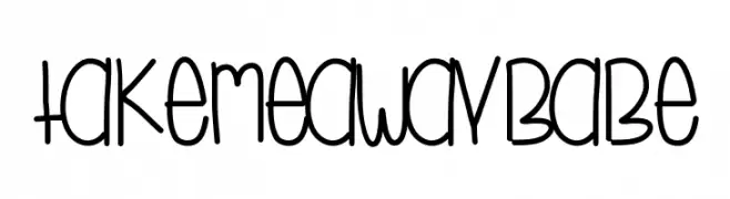
A playful, hand-drawn font with tall, narrow letters and a whimsical style.
![TakeMeAwayBabe font caratteri gratis]() Scaricare 240 Downloads@WebFont
Scaricare 240 Downloads@WebFont -
( Fonts by Woodcutter )
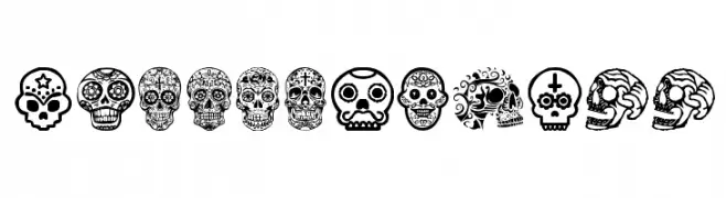
Ornate skull-themed decorative display font inspired by Mexican folk art.
![Mexican Skull font caratteri gratis]() Scaricare 240 Downloads@WebFont
Scaricare 240 Downloads@WebFont -
( Fonts by Slava Krivonosov - Personal-use only. For commercial use please contact owner. )
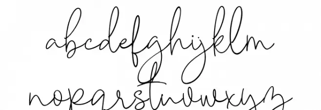
A playful and modern script font with elegant, flowing lines.
![Hitchhiker font caratteri gratis]() Scaricare 240 Downloads@WebFont
Scaricare 240 Downloads@WebFont -
( Fonts by HENRIavecunK )
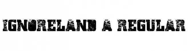
A bold, distressed font with a vintage, industrial feel.
![Ignoreland A Regular font caratteri gratis]() Scaricare 240 Downloads@WebFont
Scaricare 240 Downloads@WebFont -
![Cabin_in_the_Woods font caratteri gratis]() Scaricare 240 Downloads@WebFont
Scaricare 240 Downloads@WebFont -
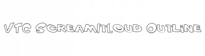
![VTC ScreamItLoud Outline font caratteri gratis]() Scaricare 240 Downloads@WebFont
Scaricare 240 Downloads@WebFont -
( Fonts by Vigilante Typeface Corporation Larry Yerkes. Personal-use only. For commercial use please contact owner. )
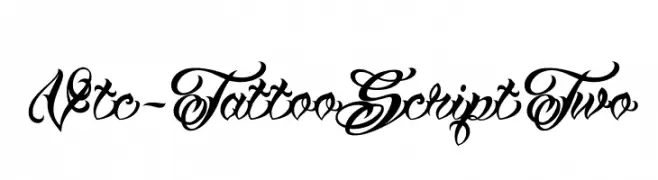
An ornate, tattoo-inspired script font with decorative flourishes.
![Vtc-TattooScriptTwo font caratteri gratis]() Scaricare 240 Downloads@WebFont
Scaricare 240 Downloads@WebFont -
( Donationware - www.junkohanhero.com )
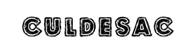
A bold, hand-drawn font with textured, uneven outlines.
![Culdesac font caratteri gratis]() Scaricare 240 Downloads@WebFont
Scaricare 240 Downloads@WebFont -
( Fonts by Geronimo Fonts - Personal-use only. For commercial use please contact owner. )
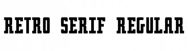
A bold, retro-inspired serif font with strong vertical lines and minimal curves.
![Retro serif Regular font caratteri gratis]() Scaricare 240 Downloads@WebFont
Scaricare 240 Downloads@WebFont -
( Fonts by Matthew Napolitano / Full Time Artists - Personal-use only. For commercial use please contact owner. )
A playful, rounded font with smooth, flowing lines and consistent stroke width.
![PreCursive OFL font caratteri gratis]() Scaricare 240 Downloads@WebFont
Scaricare 240 Downloads@WebFont -
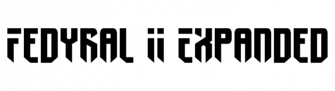
![Fedyral II Expanded font caratteri gratis]() Scaricare 240 Downloads@WebFont
Scaricare 240 Downloads@WebFont -
( Fonts by Andika )
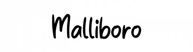
A playful, casual handwritten font with smooth, rounded strokes.
![Malliboro font caratteri gratis]() Scaricare 240 Downloads@WebFont
Scaricare 240 Downloads@WebFont -
( Fonts by Daniel Zadorozny - www.iconian.com )
A bold, dynamic font with thick strokes and a modern, artistic flair.
![Nuevo Passion Expanded font caratteri gratis]() Scaricare 240 Downloads@WebFont
Scaricare 240 Downloads@WebFont -
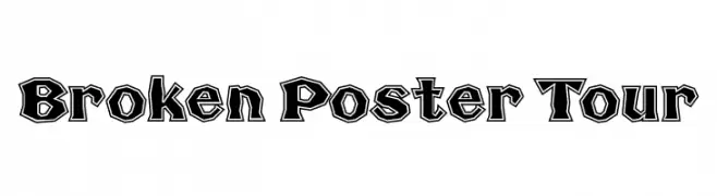
![Broken Poster Tour font caratteri gratis]() Scaricare 240 Downloads@WebFont
Scaricare 240 Downloads@WebFont -
( Fonts by Mocha Frappuccino - Personal-use only. For commercial use please contact owner. )
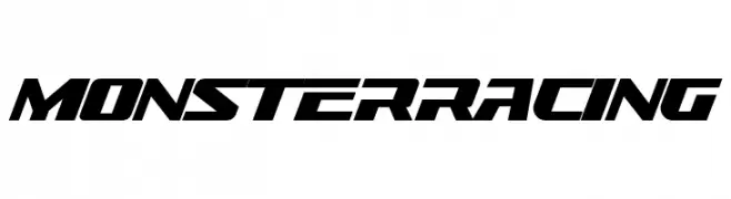
Bold, italicized racing-inspired display font.
![Monster Racing font caratteri gratis]() Scaricare 240 Downloads@WebFont
Scaricare 240 Downloads@WebFont -
![Dividers & Misc font caratteri gratis]() Scaricare 240 Downloads@WebFont
Scaricare 240 Downloads@WebFont -
( Fonts by Alex Slobzheninov - Personal-use only. For commercial use please contact owner. )
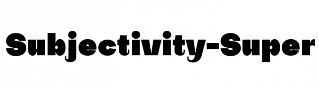
A bold, geometric font with strong visual impact and high contrast.
![Subjectivity-Super font caratteri gratis]() Scaricare 240 Downloads@WebFont
Scaricare 240 Downloads@WebFont -
( Fonts by a Max Infeld - XEROGRAPHER FONTS - xerographer.blogspot.com . Personal-use only. For commercial use please contact owner. )
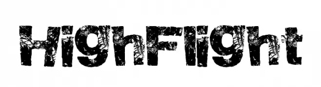
A bold, distressed font with a rugged, textured appearance.
![HighFlight font caratteri gratis]() Scaricare 240 Downloads@WebFont
Scaricare 240 Downloads@WebFont -
( Fonts by FreshtypeINK )
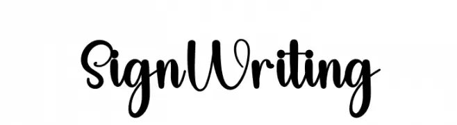
A playful, handwritten script font with bold, expressive characters.
![Sign Writing font caratteri gratis]() Scaricare 240 Downloads@WebFont
Scaricare 240 Downloads@WebFont -
( Fonts by www.fenotype.com )
A bold, geometric font with a futuristic and modern aesthetic.
![HKI metropol font caratteri gratis]() Scaricare 240 Downloads@WebFont
Scaricare 240 Downloads@WebFont -
( Darrell Flood - hawtpixel.com )
A bold, smooth script font with flowing curves and strong strokes.
![Strong Smooth Script font caratteri gratis]() Scaricare 240 Downloads@WebFont
Scaricare 240 Downloads@WebFont -
![VTCBadHangover Regular font caratteri gratis]() Scaricare 240 Downloads@WebFont
Scaricare 240 Downloads@WebFont -
( Graphix Line Studio )
A bold, hand-drawn font with a dynamic and artistic style.
![HOLIDAYROUGH LICENSE font caratteri gratis]() Scaricare 240 Downloads@WebFont
Scaricare 240 Downloads@WebFont


Quali sono i font più popolari adesso?
Poppins, Roboto, Montserrat, Open Sans e Lato sono molto usati per le forme pulite e l'ampia applicabilità — dall'identità di marca alle landing page e ai poster.
Quali font si usano spesso nei loghi?
Le sans serif geometriche (es. Poppins, famiglie in stile Gotham) sono scelte comuni per un branding pulito e scalabile. Per un tocco personale restano valide script e stili manoscritti. Abbina un display deciso per i titoli a un corpo testo neutro per riconoscibilità ed equilibrio.
Ogni quanto si aggiorna la lista?
Con regolarità, in base ai download e all'attività reale. Torna spesso per scoprire in anticipo le nuove preferite.
💡 Consiglio: aggiungi ai preferiti — le tendenze cambiano in fretta e i font top di oggi possono ispirare il rebranding di domani.