Benvenuto nelle Font Più Popolari — dove popolarità e qualità si incontrano. Qui trovi i font più scaricati e usati dell'anno. Se cerchi scelte sicure per logo, web o social, inizia da qui.
Ogni font top si distingue per equilibrio, leggibilità e versatilità. Troverai sans serif moderne, script eleganti, serif vintage e display minimalisti.
-
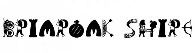
( Fonts by Daniel Zadorozny - www.iconian.com - Free for personal use )
A decorative font with silhouettes of weapons and action figures.
 Scaricare 236 Downloads@WebFont
 -
( Fonts by uatype.faithweb.com - UnAuthorized Type )
A decorative font with medieval and fantasy-inspired elements.
![Briaroak Shire font caratteri gratis]() Scaricare 236 Downloads@WebFont
Scaricare 236 Downloads@WebFont -
![SuperLovelyI font caratteri gratis]() Scaricare 236 Downloads@WebFont
Scaricare 236 Downloads@WebFont -
( Fonts by DM Letter31 )
A bold, playful font with a hand-drawn, dynamic style.
![Sour Crunch font caratteri gratis]() Scaricare 236 Downloads@WebFont
Scaricare 236 Downloads@WebFont -
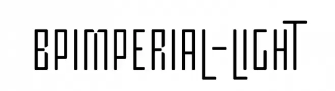
( Fonts by backpacker.gr )
A modern, geometric font with a clean, structured design.
![BPimperial-Light font caratteri gratis]() Scaricare 236 Downloads@WebFont
Scaricare 236 Downloads@WebFont -
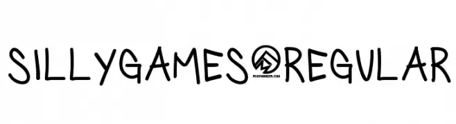
![SillyGames-Regular font caratteri gratis]() Scaricare 236 Downloads@WebFont
Scaricare 236 Downloads@WebFont -
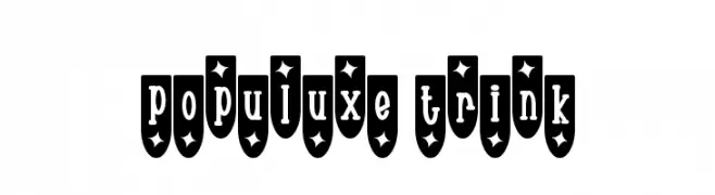
![Populuxe Trink font caratteri gratis]() Scaricare 236 Downloads@WebFont
Scaricare 236 Downloads@WebFont -
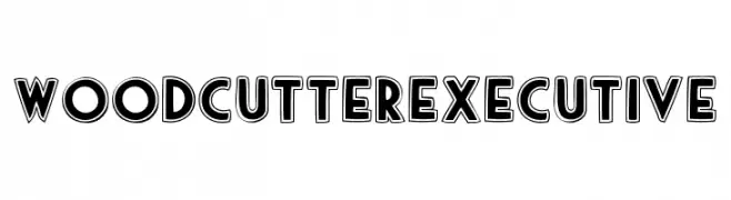
( Fonts by www.woodcutter.es - woodcutter Manero - Personal-use only. For commercial use please contact owner. )
A bold, geometric font with outlined characters for a three-dimensional effect.
![woodcutter executive font caratteri gratis]() Scaricare 236 Downloads@WebFont
Scaricare 236 Downloads@WebFont -
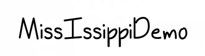
![MissIssippiDemo font caratteri gratis]() Scaricare 236 Downloads@WebFont
Scaricare 236 Downloads@WebFont -
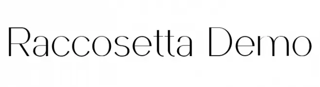
( Fonts by Patria Ari Typestudio - Patria Ari - Personal-use only. For commercial use please contact owner. )
A sleek, modern font with clean lines and slight stroke contrast.
![Raccosetta Demo font caratteri gratis]() Scaricare 236 Downloads@WebFont
Scaricare 236 Downloads@WebFont -
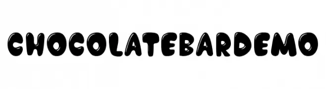
![Chocolate Bar Demo font caratteri gratis]() Scaricare 236 Downloads@WebFont
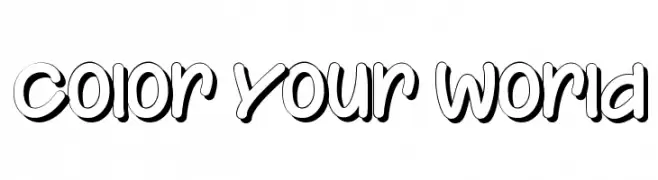
Scaricare 236 Downloads@WebFont -
![Color Your World font caratteri gratis]() Scaricare 236 Downloads@WebFont
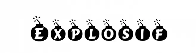
Scaricare 236 Downloads@WebFont -
![Explosif font caratteri gratis]() Scaricare 236 Downloads@WebFont
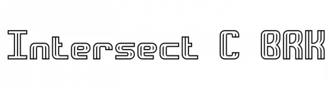
Scaricare 236 Downloads@WebFont -
![Intersect C BRK font caratteri gratis]() Scaricare 236 Downloads@WebFont
Scaricare 236 Downloads@WebFont -
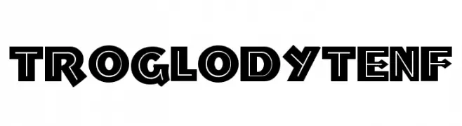
( Fonts by Nick's Fonts )
A bold, geometric font with a modern, edgy style and high contrast.
![TroglodyteNF font caratteri gratis]() Scaricare 236 Downloads@WebFont
Scaricare 236 Downloads@WebFont -
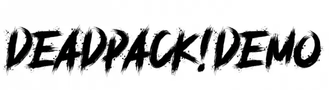
( Fonts by Knackpack Studio - www.knackpack.studio - Personal-use only. For commercial use please contact owner. )
A bold, brush-stroke font with an energetic and dynamic style.
![deadpack! demo font caratteri gratis]() Scaricare 236 Downloads@WebFont
Scaricare 236 Downloads@WebFont -
( Fonts by Daniel Zadorozny - www.iconian.com - Free for personal use )
A bold, italic font with a dynamic and elegant style.
![Hadriatic Bold Italic font caratteri gratis]() Scaricare 236 Downloads@WebFont
Scaricare 236 Downloads@WebFont -
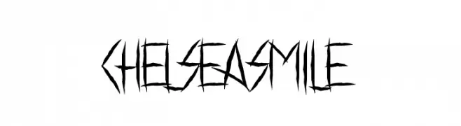
( Fonts by www.chequered.ink - Chequered Ink - Personal-use only. For commercial use please contact owner. )
A jagged, edgy font with sharp, angular lines for a rebellious look.
![Chelsea Smile font caratteri gratis]() Scaricare 236 Downloads@WebFont
Scaricare 236 Downloads@WebFont -
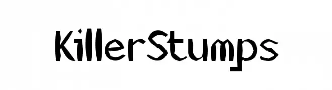
![KillerStumps font caratteri gratis]() Scaricare 236 Downloads@WebFont
Scaricare 236 Downloads@WebFont -
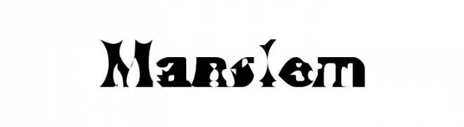
( Fonts by TarmSaft Font Factory - http://www.aska.nu/tarmsaft/ )
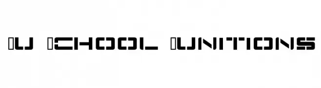
A bold, gothic decorative font with sharp, angular edges and intricate patterns.
![Manslem font caratteri gratis]() Scaricare 236 Downloads@WebFont
Scaricare 236 Downloads@WebFont -
![Nu School Munitions font caratteri gratis]() Scaricare 236 Downloads@WebFont
Scaricare 236 Downloads@WebFont -
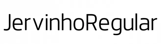
( Fonts by listener Foundry - Soufiane Abid - Personal-use only. For commercial use please contact owner. )
A modern sans-serif font with geometric shapes and uniform strokes.
![JervinhoRegular font caratteri gratis]() Scaricare 236 Downloads@WebFont
Scaricare 236 Downloads@WebFont -
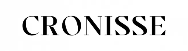
( Fonts by Almarkhatype - Abdul Malik Wisnu - Personal-use only. For commercial use please contact owner. )
A classic serif font with elegant strokes and medium contrast.
![Cronisse font caratteri gratis]() Scaricare 236 Downloads@WebFont
Scaricare 236 Downloads@WebFont -
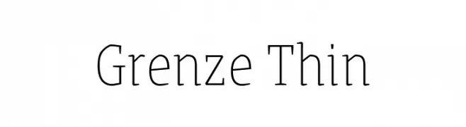
( Copyright 2018 The Grenze Project Authors (https://github.com/Omnibus-Type/Grenze), with Reserved Font Name "Grenze". )
A refined serif font with thin strokes and a classic yet modern aesthetic.
![Grenze Thin font caratteri gratis]() Scaricare 236 Downloads@WebFont
Scaricare 236 Downloads@WebFont -
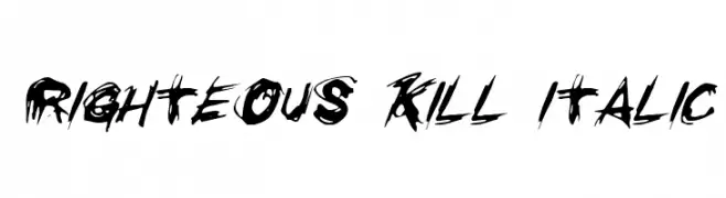
( Fonts by Daniel Zadorozny - www.iconian.com - Free for personal use )
A bold, brush-style font with a distressed, grunge effect.
![Righteous Kill Italic font caratteri gratis]() Scaricare 236 Downloads@WebFont
Scaricare 236 Downloads@WebFont -
![AzoftSans-Italic font caratteri gratis]() Scaricare 236 Downloads@WebFont
Scaricare 236 Downloads@WebFont -
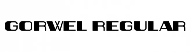
( Fonts by Vladimir Nikolic - www.creativefabrica.com/designer/vladimirnikolic/ - Personal-use only. For commercial use please contact owner. )
A bold, geometric font with a modern, futuristic style.
![Gorwel Regular font caratteri gratis]() Scaricare 236 Downloads@WebFont
Scaricare 236 Downloads@WebFont -
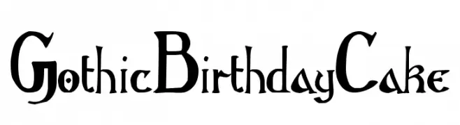
( Free )
A gothic-inspired font with playful, ornate letterforms and dramatic flair.
![GothicBirthdayCake font caratteri gratis]() Scaricare 236 Downloads@WebFont
Scaricare 236 Downloads@WebFont -
![RUFF font caratteri gratis]() Scaricare 236 Downloads@WebFont
Scaricare 236 Downloads@WebFont -
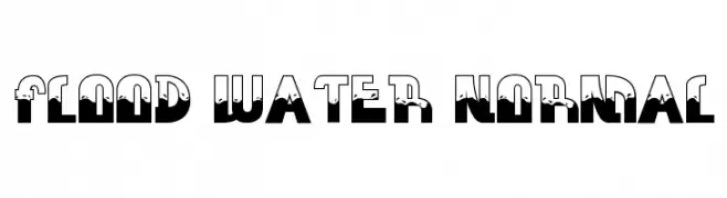
( seck1.blogspot.nl )
A bold, playful font with a dripping water effect, perfect for creative designs.
![FLOOD WATER NORMAL font caratteri gratis]() Scaricare 236 Downloads@WebFont
Scaricare 236 Downloads@WebFont -
![B Sina Bold font caratteri gratis]() Scaricare 236 Downloads@WebFont
Scaricare 236 Downloads@WebFont -
( Fonts by Fizzetica DepokAsiana TypeFoundry - fizzeticatypefoundry.tumblr.com )
A mix of bold, modern, and decorative logotype fonts for branding.
![FTF Cellul@r of Indonesiana Island font caratteri gratis]() Scaricare 236 Downloads@WebFont
Scaricare 236 Downloads@WebFont -
( Fonts by Daniel Zadorozny - www.iconian.com )
A futuristic, geometric font with angular, modular letterforms.
![QuickTech font caratteri gratis]() Scaricare 236 Downloads@WebFont
Scaricare 236 Downloads@WebFont -
( Fonts by sronstudio )
Playful, bold handwritten font.
![Paris Mountain font caratteri gratis]() Scaricare 236 Downloads@WebFont
Scaricare 236 Downloads@WebFont -
( Fonts by Apostrophic Lab )
A whimsical and elegant font with flowing strokes and playful serifs.
![Quixotte font caratteri gratis]() Scaricare 236 Downloads@WebFont
Scaricare 236 Downloads@WebFont


Quali sono i font più popolari adesso?
Poppins, Roboto, Montserrat, Open Sans e Lato sono molto usati per le forme pulite e l'ampia applicabilità — dall'identità di marca alle landing page e ai poster.
Quali font si usano spesso nei loghi?
Le sans serif geometriche (es. Poppins, famiglie in stile Gotham) sono scelte comuni per un branding pulito e scalabile. Per un tocco personale restano valide script e stili manoscritti. Abbina un display deciso per i titoli a un corpo testo neutro per riconoscibilità ed equilibrio.
Ogni quanto si aggiorna la lista?
Con regolarità, in base ai download e all'attività reale. Torna spesso per scoprire in anticipo le nuove preferite.
💡 Consiglio: aggiungi ai preferiti — le tendenze cambiano in fretta e i font top di oggi possono ispirare il rebranding di domani.