Benvenuto nelle Font Più Popolari — dove popolarità e qualità si incontrano. Qui trovi i font più scaricati e usati dell'anno. Se cerchi scelte sicure per logo, web o social, inizia da qui.
Ogni font top si distingue per equilibrio, leggibilità e versatilità. Troverai sans serif moderne, script eleganti, serif vintage e display minimalisti.
-
( K-Type - Keith Bates - www.k-type.com/ )
A classic serif font with elegant strokes and balanced medium weight.
 Scaricare 235 Downloads@WebFont
 -
( Copyright 2018 The Mali Project Authors (https://github.com/cadsondemak/Mali) )
A playful, semi-bold italic font with rounded characters.
![Mali SemiBold Italic font caratteri gratis]() Scaricare 235 Downloads@WebFont
Scaricare 235 Downloads@WebFont -
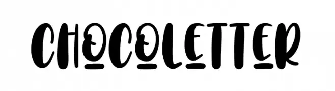
( Fonts by Typefar )
A playful, bold font with rounded, thick strokes and a hand-drawn feel.
![Choco Letter font caratteri gratis]() Scaricare 235 Downloads@WebFont
Scaricare 235 Downloads@WebFont -
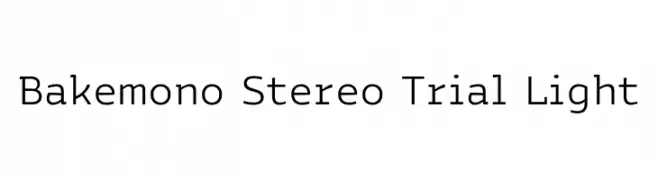
( Fonts by Zetafonts )
A clean, modern monospaced font with geometric simplicity.
![Bakemono Stereo Trial Light font caratteri gratis]() Scaricare 235 Downloads@WebFont
Scaricare 235 Downloads@WebFont -
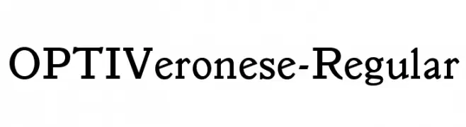
( Fonts by Castcraft Software - OPTI Fonts Archive - opti.netii.net - Personal-use only. For commercial use please contact owner. )
A classic serif font with elegant and refined characteristics.
![OPTIVeronese-Regular font caratteri gratis]() Scaricare 235 Downloads@WebFont
Scaricare 235 Downloads@WebFont -
( Fonts by zone108.main.jp - Personal-use only. For commercial use please contact owner. )
A bold, robust font with strong strokes and a commanding presence.
![Youshun Regular font caratteri gratis]() Scaricare 235 Downloads@WebFont
Scaricare 235 Downloads@WebFont -
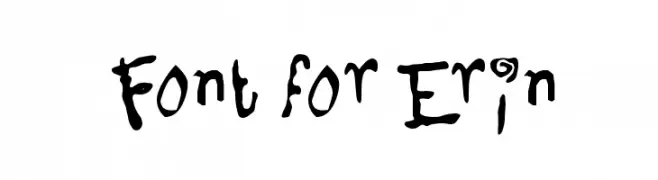
( Fonts by Utopia - www.daleharris.com )
A playful, hand-drawn font with whimsical and dynamic letterforms.
![Font for Erin font caratteri gratis]() Scaricare 235 Downloads@WebFont
Scaricare 235 Downloads@WebFont -
![Draconian MicroLiner font caratteri gratis]() Scaricare 235 Downloads@WebFont
Scaricare 235 Downloads@WebFont -
( INKsTYPIA - Andi Winarno - inkstypia-std.blogspot.com )
A bold, textured font with a rugged, distressed appearance.
![Rumoura TexturesPERSONAL USE font caratteri gratis]() Scaricare 235 Downloads@WebFont
Scaricare 235 Downloads@WebFont -
![Distro II Bats font caratteri gratis]() Scaricare 235 Downloads@WebFont
Scaricare 235 Downloads@WebFont -
( Fonts by Hypefonts )
A tall, narrow font with clean lines and a modern, sleek appearance.
![STARGAZER-demo font caratteri gratis]() Scaricare 235 Downloads@WebFont
Scaricare 235 Downloads@WebFont -
( Fonts by Mike Hind - Stick Fonts )
A bold, playful font with chunky, whimsical characters and a dynamic style.
![Chunky-Times font caratteri gratis]() Scaricare 235 Downloads@WebFont
Scaricare 235 Downloads@WebFont -
( Fonts by Adobe )
A bold, italicized sans-serif font with a modern and dynamic style.
![Source Sans Pro Bold Italic font caratteri gratis]() Scaricare 235 Downloads@WebFont
Scaricare 235 Downloads@WebFont -
( Fonts by Zkhai Creative )
A playful, bold handwritten font with smooth, rounded letterforms.
![FontselfRegular font caratteri gratis]() Scaricare 235 Downloads@WebFont
Scaricare 235 Downloads@WebFont -
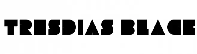
Caratteri di Ascle. For commercial use please contact the owner.
![Tresdias Black font caratteri gratis]() Scaricare 235 Downloads@WebFont
Scaricare 235 Downloads@WebFont -
( Fonts by MonkeyRoodles Fonts )
A playful, handwritten font with a casual and friendly style.
![midnight snacks font caratteri gratis]() Scaricare 235 Downloads@WebFont
Scaricare 235 Downloads@WebFont -
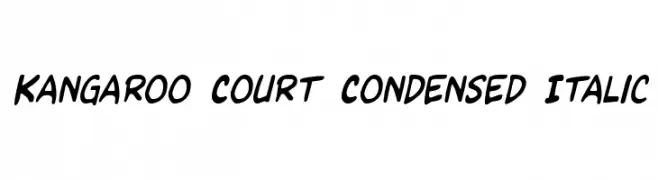
( Iconian Fonts - Daniel Zadorozny - www.iconian.com )
A bold, condensed, and italicized font with a playful and dynamic style.
![Kangaroo Court Condensed Italic font caratteri gratis]() Scaricare 235 Downloads@WebFont
Scaricare 235 Downloads@WebFont -
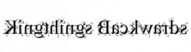
( Font by kingthingsfonts.co.uk )
A whimsical, decorative font with playful swirls and loops.
![Kingthings Backwards font caratteri gratis]() Scaricare 235 Downloads@WebFont
Scaricare 235 Downloads@WebFont -
![Carr Dingbats 1 font caratteri gratis]() Scaricare 235 Downloads@WebFont
Scaricare 235 Downloads@WebFont -
( Fonts by Apostrophic Lab )
A bold, italic sans-serif font with a modern and geometric design.
![Florencesans SC Rev Bold Italic font caratteri gratis]() Scaricare 235 Downloads@WebFont
Scaricare 235 Downloads@WebFont -
( Fonts by Typeline Studio - Yadhie Setiawan - Personal-use only. For commercial use please contact owner. )
A playful, rounded handwritten font with a casual and friendly vibe.
![Sanshine font caratteri gratis]() Scaricare 235 Downloads@WebFont
Scaricare 235 Downloads@WebFont -
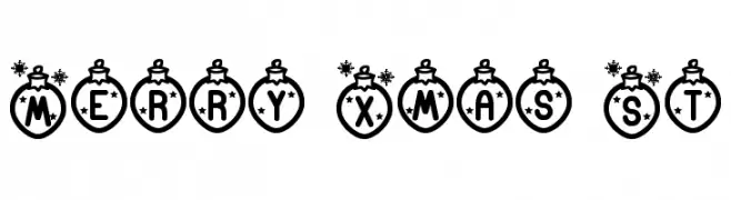
![Merry Xmas St font caratteri gratis]() Scaricare 235 Downloads@WebFont
Scaricare 235 Downloads@WebFont -
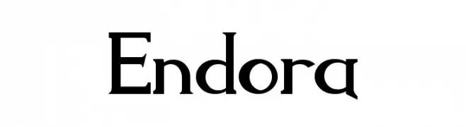
![Endora font caratteri gratis]() Scaricare 235 Downloads@WebFont
Scaricare 235 Downloads@WebFont -
( Fonts by pOPdOG fONTS - Dimitris Kolyris - popdog_fonts.tripod.com Commerciali Caratteri )
A bold, playful font with a hand-drawn, whimsical style.
![Victor Vector font caratteri gratis]() Scaricare 235 Downloads
Scaricare 235 Downloads -
( Fonts by a Neale Davidson - www.pixelsagas.com. Personal-use only. For commercial use please contact owner. )
A bold, angular font with a modern and assertive style.
![Harker Bold font caratteri gratis]() Scaricare 235 Downloads@WebFont
Scaricare 235 Downloads@WebFont -
![Procyon Shadow Italic font caratteri gratis]() Scaricare 235 Downloads@WebFont
Scaricare 235 Downloads@WebFont -
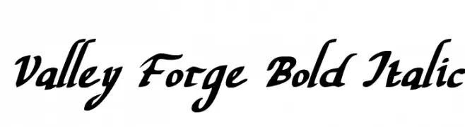
( Fonts by Daniel Zadorozny - www.iconian.com - Free for personal use )
A bold, italic script font with elegant, flowing letterforms.
![Valley Forge Bold Italic font caratteri gratis]() Scaricare 235 Downloads@WebFont
Scaricare 235 Downloads@WebFont -
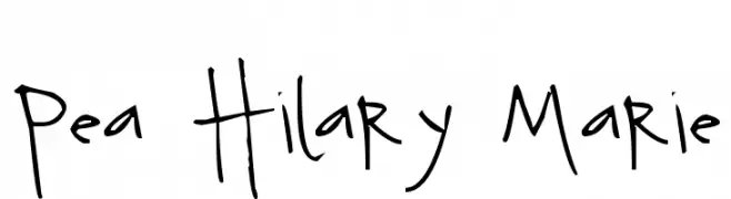
( Free for a personal use. For a commercial use please visit www.kevinandamanda.com )
A playful, hand-drawn font with a whimsical and casual style.
![Pea Hilary Marie font caratteri gratis]() Scaricare 235 Downloads@WebFont
Scaricare 235 Downloads@WebFont -
( Fonts by Jangan Lupa Studio )
A playful, handwritten font with bold, rounded strokes and a casual style.
![PLAYPULL font caratteri gratis]() Scaricare 235 Downloads@WebFont
Scaricare 235 Downloads@WebFont -
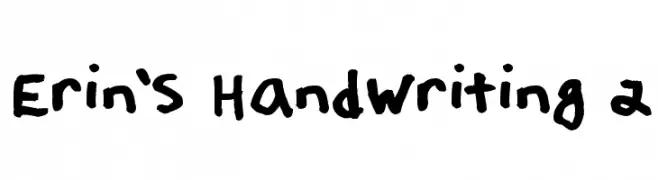
( Fonts by Erin Loper )
A bold, playful handwritten font with thick, consistent strokes and a casual vibe.
![Erin's Handwriting 2 font caratteri gratis]() Scaricare 235 Downloads@WebFont
Scaricare 235 Downloads@WebFont -
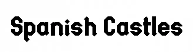
( imagex - www.imagex-fonts.com )
A bold, angular font with Gothic influences, ideal for dramatic and historical themes.
![Spanish Castles font caratteri gratis]() Scaricare 235 Downloads@WebFont
Scaricare 235 Downloads@WebFont -
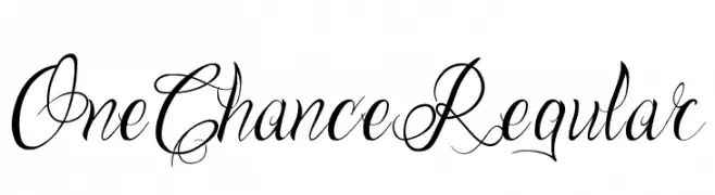
( seandalton.com.au )
An elegant script font with intricate swashes and flourishes.
![One Chance Regular font caratteri gratis]() Scaricare 235 Downloads@WebFont
Scaricare 235 Downloads@WebFont -
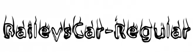
( Fonts by www.typodermicfonts.com - Ray Larabie )
A bold, flame-inspired font with dynamic, energetic characters.
![BaileysCar-Regular font caratteri gratis]() Scaricare 235 Downloads@WebFont
Scaricare 235 Downloads@WebFont -
( Fonts by Balpirick Studio - Personal-use only. For commercial use please contact owner. )
A playful, rounded font with a hand-drawn, friendly appearance.
![Cupid Gummies font caratteri gratis]() Scaricare 235 Downloads@WebFont
Scaricare 235 Downloads@WebFont -
![YR FACE font caratteri gratis]() Scaricare 235 Downloads@WebFont
Scaricare 235 Downloads@WebFont


Quali sono i font più popolari adesso?
Poppins, Roboto, Montserrat, Open Sans e Lato sono molto usati per le forme pulite e l'ampia applicabilità — dall'identità di marca alle landing page e ai poster.
Quali font si usano spesso nei loghi?
Le sans serif geometriche (es. Poppins, famiglie in stile Gotham) sono scelte comuni per un branding pulito e scalabile. Per un tocco personale restano valide script e stili manoscritti. Abbina un display deciso per i titoli a un corpo testo neutro per riconoscibilità ed equilibrio.
Ogni quanto si aggiorna la lista?
Con regolarità, in base ai download e all'attività reale. Torna spesso per scoprire in anticipo le nuove preferite.
💡 Consiglio: aggiungi ai preferiti — le tendenze cambiano in fretta e i font top di oggi possono ispirare il rebranding di domani.