Benvenuto nelle Font Più Popolari — dove popolarità e qualità si incontrano. Qui trovi i font più scaricati e usati dell'anno. Se cerchi scelte sicure per logo, web o social, inizia da qui.
Ogni font top si distingue per equilibrio, leggibilità e versatilità. Troverai sans serif moderne, script eleganti, serif vintage e display minimalisti.
-
Caratteri di danny91194. For commercial use please contact the owner.
( 5 )
A decorative font featuring jungle animals as intricate line art characters.
 Scaricare 232 Downloads@WebFont
 -
( Fonts by Xerographer Fonts )
A playful handwritten font with a casual and friendly style.
![CandyDelish font caratteri gratis]() Scaricare 232 Downloads@WebFont
Scaricare 232 Downloads@WebFont -
( Fonts by a Max Infeld - XEROGRAPHER FONTS - xerographer.blogspot.com . Personal-use only. For commercial use please contact owner. )
A bold, distressed font with a cracked, glitch-like appearance.
![CrackBars font caratteri gratis]() Scaricare 232 Downloads@WebFont
Scaricare 232 Downloads@WebFont -
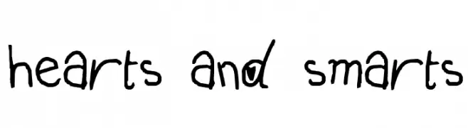
![hearts and smarts font caratteri gratis]() Scaricare 232 Downloads@WebFont
Scaricare 232 Downloads@WebFont -
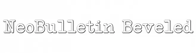
![NeoBulletin Beveled font caratteri gratis]() Scaricare 232 Downloads@WebFont
Scaricare 232 Downloads@WebFont -
( Fonts by a Harry Wakamatsu - http://behance.net/japanyoshi . Personal-use only. For commercial use please contact owner. )
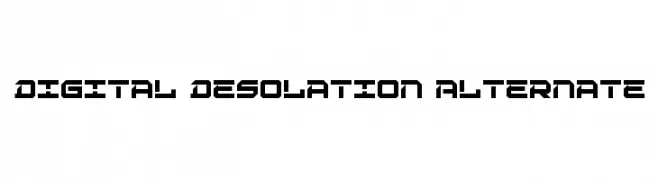
A bold, futuristic font with sharp angles and geometric shapes.
![Digital Desolation Alternate font caratteri gratis]() Scaricare 232 Downloads@WebFont
Scaricare 232 Downloads@WebFont -
( Fonts by Kat`s Fun Fonts - Personal-use only. For commercial use please contact owner. )
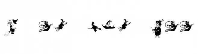
A playful, witch-themed illustrative font perfect for Halloween designs.
![KR Oh Witchy Poo! font caratteri gratis]() Scaricare 232 Downloads@WebFont
Scaricare 232 Downloads@WebFont -
( Fonts by Bykineks )
A playful, bold, and organic font with a hand-drawn feel.
![Wakaba font caratteri gratis]() Scaricare 232 Downloads@WebFont
Scaricare 232 Downloads@WebFont -
( Fonts by Daniel Zadorozny - www.iconian.com - Free for personal use )
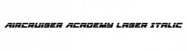
A bold, futuristic italic font with a double-layered outline and geometric shapes.
![Aircruiser Academy Laser Italic font caratteri gratis]() Scaricare 232 Downloads@WebFont
Scaricare 232 Downloads@WebFont -
( Fonts by David Kerkhoff - www.hanodedphotography.com )
A casual handwritten font with a dynamic and lively appearance.
![Oei font caratteri gratis]() Scaricare 232 Downloads@WebFont
Scaricare 232 Downloads@WebFont -
( Fonts by Ahargun Art - https://www.creativefabrica.com/designer/ahargun-art/ - Personal-use only. For commercial use please contact owner. )
A lively, expressive handwritten font with dynamic strokes and playful characteristics.
![Esmeralda font caratteri gratis]() Scaricare 232 Downloads@WebFont
Scaricare 232 Downloads@WebFont -
( Fonts by junkohanhero )
A playful, hand-drawn font with rounded edges and a casual style.
![Lauantaiaamu 7:25 font caratteri gratis]() Scaricare 232 Downloads@WebFont
Scaricare 232 Downloads@WebFont -
( Fonts by a Jayvee Enaguas - harvettfox96.deviantart.com. Personal-use only. For commercial use please contact owner. )
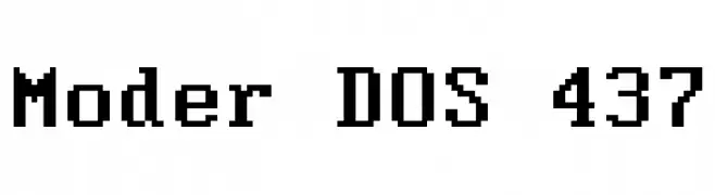
A pixelated, monospaced font with a retro digital aesthetic.
![Moder DOS 437 font caratteri gratis]() Scaricare 232 Downloads@WebFont
Scaricare 232 Downloads@WebFont -
![Titanic Regular font caratteri gratis]() Scaricare 232 Downloads@WebFont
Scaricare 232 Downloads@WebFont -
( Fonts by www.junkohanhero.com )
A bold, distressed font with a hand-drawn, grungy style.
![Pozo font caratteri gratis]() Scaricare 232 Downloads@WebFont
Scaricare 232 Downloads@WebFont -
( Fonts by Ana Svalina )
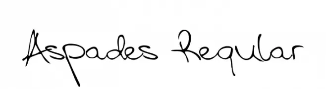
A lively and expressive handwritten font with fluid strokes.
![Aspades Regular font caratteri gratis]() Scaricare 232 Downloads@WebFont
Scaricare 232 Downloads@WebFont -
( Fonts by Dieter Steffmann )
A bold, ornate blackletter font with a medieval, gothic style.
![Courtrai font caratteri gratis]() Scaricare 232 Downloads@WebFont
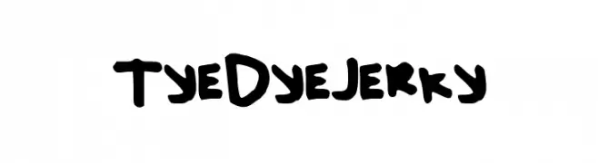
Scaricare 232 Downloads@WebFont -
![TyeDyeJerky font caratteri gratis]() Scaricare 232 Downloads@WebFont
Scaricare 232 Downloads@WebFont -
![remakeoffabulous2 Light font caratteri gratis]() Scaricare 232 Downloads@WebFont
Scaricare 232 Downloads@WebFont -
( Fonts by Kreative Korporation - www.kreativekorp.com )
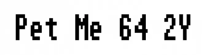
A pixelated, monospaced font with a retro digital style.
![Pet Me 64 2Y font caratteri gratis]() Scaricare 232 Downloads@WebFont
Scaricare 232 Downloads@WebFont -
( Fonts by www.vicfieger.com )
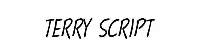
A lively, cursive script font with smooth, flowing lines and a handwritten appearance.
![Terry Script font caratteri gratis]() Scaricare 232 Downloads@WebFont
Scaricare 232 Downloads@WebFont -
( Fonts by Alit Design )
A playful, bold font with a bubbly, hand-drawn appearance.
![Olaf Mate Regular font caratteri gratis]() Scaricare 232 Downloads@WebFont
Scaricare 232 Downloads@WebFont -
![Yaroslav Trial Version font caratteri gratis]() Scaricare 232 Downloads@WebFont
Scaricare 232 Downloads@WebFont -
![MB-RustyIron font caratteri gratis]() Scaricare 232 Downloads@WebFont
Scaricare 232 Downloads@WebFont -
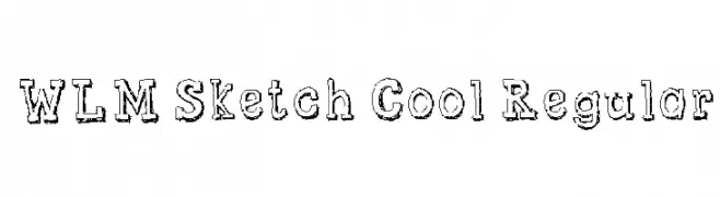
![WLM Sketch Cool Regular font caratteri gratis]() Scaricare 232 Downloads@WebFont
Scaricare 232 Downloads@WebFont -
( Alessandro Caminiti - www.behance.net/AlessandroCaminiti )
A geometric, futuristic font with hexagonal shapes and angular lines.
![HEXAGON cup font Bold font caratteri gratis]() Scaricare 232 Downloads@WebFont
Scaricare 232 Downloads@WebFont -
![Bazzomba font caratteri gratis]() Scaricare 232 Downloads@WebFont
Scaricare 232 Downloads@WebFont -
( Free for a personal use. For a commercial use please visit www.kevinandamanda.com )
A playful, casual handwritten font with bold, uneven strokes.
![Pea Nancy font caratteri gratis]() Scaricare 232 Downloads@WebFont
Scaricare 232 Downloads@WebFont -
( Fonts by fontria - Personal-use only. For commercial use please contact owner. )
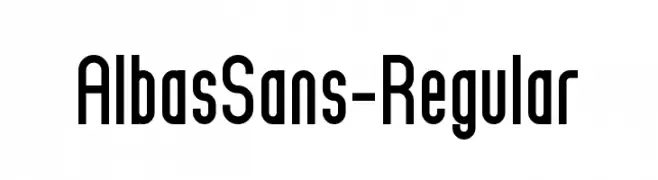
A modern, sans-serif font with tall, narrow characters and consistent stroke width.
![AlbasSans-Regular font caratteri gratis]() Scaricare 232 Downloads@WebFont
Scaricare 232 Downloads@WebFont -
Caratteri di NicholasJudy456. For commercial use please contact the owner.
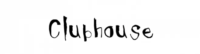
![Clubhouse font caratteri gratis]() Scaricare 232 Downloads@WebFont
Scaricare 232 Downloads@WebFont -
( Fonts by zamjump - Ahmad Zamzami - Personal-use only. For commercial use please contact owner. )
An ornate and gothic blackletter-style font with intricate flourishes.
![Gethucks font caratteri gratis]() Scaricare 232 Downloads@WebFont
Scaricare 232 Downloads@WebFont -
( Fonts by www.typodermicfonts.com - Ray Larabie )
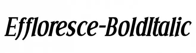
A bold, italic serif font with a dynamic and elegant style.
![Effloresce-BoldItalic font caratteri gratis]() Scaricare 232 Downloads@WebFont
Scaricare 232 Downloads@WebFont -
( Zetafonts - www.zetafonts.com )
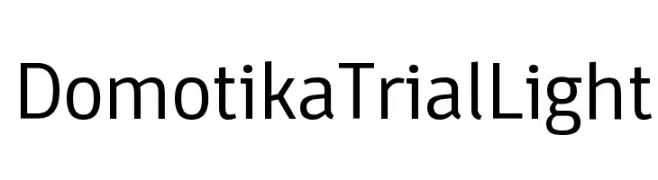
A modern, geometric sans-serif font with clean lines and balanced proportions.
![Domotika Trial Light font caratteri gratis]() Scaricare 232 Downloads@WebFont
Scaricare 232 Downloads@WebFont -
( Fonts by ShyFonts )
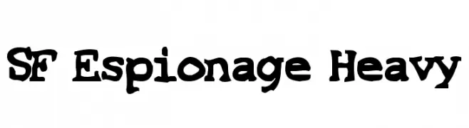
A bold, playful font with a hand-drawn, irregular style.
![SF Espionage Heavy font caratteri gratis]() Scaricare 232 Downloads@WebFont
Scaricare 232 Downloads@WebFont -
( Fonts by Khurasan )
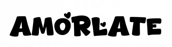
A playful, bold font with heart accents and rounded characters.
![Amorlate font caratteri gratis]() Scaricare 232 Downloads@WebFont
Scaricare 232 Downloads@WebFont


Quali sono i font più popolari adesso?
Poppins, Roboto, Montserrat, Open Sans e Lato sono molto usati per le forme pulite e l'ampia applicabilità — dall'identità di marca alle landing page e ai poster.
Quali font si usano spesso nei loghi?
Le sans serif geometriche (es. Poppins, famiglie in stile Gotham) sono scelte comuni per un branding pulito e scalabile. Per un tocco personale restano valide script e stili manoscritti. Abbina un display deciso per i titoli a un corpo testo neutro per riconoscibilità ed equilibrio.
Ogni quanto si aggiorna la lista?
Con regolarità, in base ai download e all'attività reale. Torna spesso per scoprire in anticipo le nuove preferite.
💡 Consiglio: aggiungi ai preferiti — le tendenze cambiano in fretta e i font top di oggi possono ispirare il rebranding di domani.