Benvenuto nelle Font Più Popolari — dove popolarità e qualità si incontrano. Qui trovi i font più scaricati e usati dell'anno. Se cerchi scelte sicure per logo, web o social, inizia da qui.
Ogni font top si distingue per equilibrio, leggibilità e versatilità. Troverai sans serif moderne, script eleganti, serif vintage e display minimalisti.
-
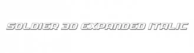
( Fonts by Daniel Zadorozny - www.iconian.com )
A bold, 3D, expanded, and italicized font with a futuristic look.
 Scaricare 231 Downloads@WebFont
 -
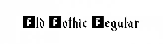
( Fonts by Erico Lebedenco - www.ericolebedenco.com )
A classic Gothic font with intricate, ornate letterforms and high contrast strokes.
![Old Gothic Regular font caratteri gratis]() Scaricare 231 Downloads@WebFont
Scaricare 231 Downloads@WebFont -
![Backoff_times font caratteri gratis]() Scaricare 231 Downloads@WebFont
Scaricare 231 Downloads@WebFont -
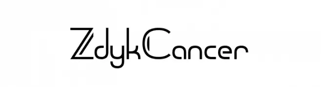
( Fonts by Chequered Ink - chequered.ink - Personal-use only. For commercial use please contact owner. )
A modern, geometric font with a futuristic and sleek design.
![Zdyk Cancer font caratteri gratis]() Scaricare 231 Downloads@WebFont
Scaricare 231 Downloads@WebFont -
( Copyright 2011 The Londrina Outline Authors (https://github.com/marcelommp/Londrina-Typeface), with Reserved Font Name "Londrina Outline" )
A playful, modern outline font with bold, hollow letterforms.
![Londrina Outline Regular font caratteri gratis]() Scaricare 231 Downloads@WebFont
Scaricare 231 Downloads@WebFont -
( Free for personal use - www.TommWarham.com )
A bold, playful font with a hand-drawn, textured style.
![Lost in the fontrest Bold font caratteri gratis]() Scaricare 231 Downloads@WebFont
Scaricare 231 Downloads@WebFont -
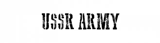
( Fonts by Galdino Otten - galdinootten.com )
A bold, distressed stencil-style font with a rugged, military-inspired look.
![USSR Army font caratteri gratis]() Scaricare 231 Downloads@WebFont
Scaricare 231 Downloads@WebFont -
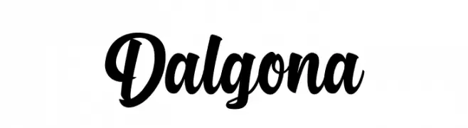
( Fonts by Debut Studio - Ari Fadli - Personal-use only. For commercial use please contact owner. )
A bold, flowing script font with smooth, connected letters.
![Dalgona font caratteri gratis]() Scaricare 231 Downloads@WebFont
Scaricare 231 Downloads@WebFont -
![PANDA ERogo font caratteri gratis]() Scaricare 231 Downloads@WebFont
Scaricare 231 Downloads@WebFont -
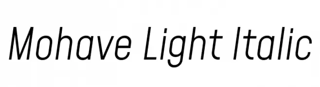
( Copyright 2019 The Mohave Project Authors (https://github.com/bghryct/Mohave-Typefaces) )
A modern, italicized typeface with elongated, narrow characters and consistent stroke width.
![Mohave Light Italic font caratteri gratis]() Scaricare 231 Downloads@WebFont
Scaricare 231 Downloads@WebFont -
![Gleitpfad font caratteri gratis]() Scaricare 231 Downloads@WebFont
Scaricare 231 Downloads@WebFont -
![Blink Ultra Wide font caratteri gratis]() Scaricare 231 Downloads@WebFont
Scaricare 231 Downloads@WebFont -
( Muammar Khalid - creativemarket.com/kang1993 )
A bold, playful font with a hand-drawn, brush-like texture.
![Funbold font caratteri gratis]() Scaricare 231 Downloads@WebFont
Scaricare 231 Downloads@WebFont -
![MB Gravitation font caratteri gratis]() Scaricare 231 Downloads@WebFont
Scaricare 231 Downloads@WebFont -
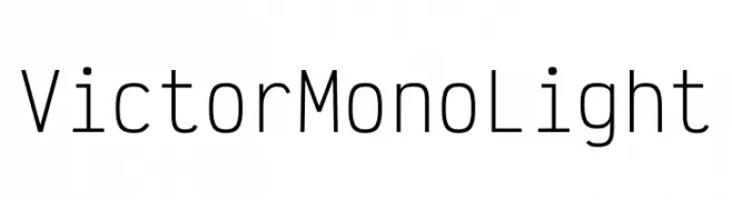
( Fonts by Rune Bjørnerås )
A modern, monospaced font with clean lines and low contrast, perfect for coding.
![Victor Mono Light font caratteri gratis]() Scaricare 231 Downloads@WebFont
Scaricare 231 Downloads@WebFont -
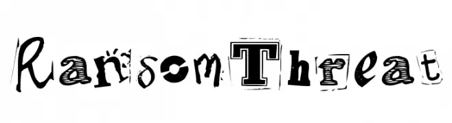
![RansomThreat font caratteri gratis]() Scaricare 231 Downloads@WebFont
Scaricare 231 Downloads@WebFont -
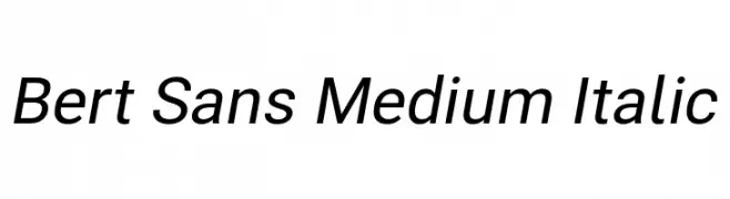
( Fonts by Christian Robertson, Adam Twardoch, & Cristiano Sobral - Personal-use only. For commercial use please contact owner. )
A modern, medium-weight italic sans-serif font with a clean and dynamic style.
![Bert Sans Medium Italic font caratteri gratis]() Scaricare 231 Downloads@WebFont
Scaricare 231 Downloads@WebFont -
( Fonts by www.kimberlygeswein.com - Kimberly Geswein )
A playful and whimsical font with curly, decorative elements.
![Janda Curlygirl Pop font caratteri gratis]() Scaricare 231 Downloads@WebFont
Scaricare 231 Downloads@WebFont -
( Fonts by Nick Curtis - www.nicksfonts.com )
A bold, decorative blackletter font with intricate detailing and a Gothic style.
![HerzogVonGraf ExtraTall font caratteri gratis]() Scaricare 231 Downloads@WebFont
Scaricare 231 Downloads@WebFont -
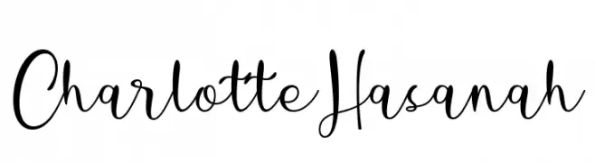
( Fonts by Situjuh Nazara - 7ntypes.com - Personal-use only. For commercial use please contact owner. )
An elegant, flowing script font with a handwritten style.
![Charlotte Hasanah font caratteri gratis]() Scaricare 231 Downloads@WebFont
Scaricare 231 Downloads@WebFont -
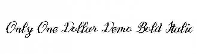
![Only One Dollar Demo Bold Italic font caratteri gratis]() Scaricare 231 Downloads@WebFont
Scaricare 231 Downloads@WebFont -
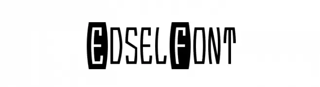
( Fonts by Nick Curtis - www.nicksfonts.com )
A bold, geometric font with a retro flair, featuring blocky uppercase and narrow lowercase letters.
![EdselFont font caratteri gratis]() Scaricare 231 Downloads@WebFont
Scaricare 231 Downloads@WebFont -
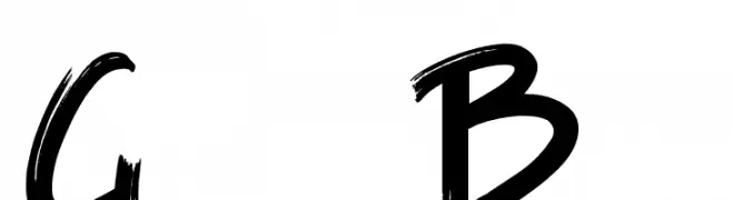
( imagex - www.imagex-fonts.com )
A bold, brush-style font with dynamic, handcrafted strokes.
![Game of Brush font caratteri gratis]() Scaricare 231 Downloads@WebFont
Scaricare 231 Downloads@WebFont -
Caratteri di takuminokami. For commercial use please contact the owner.
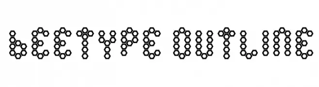
![Beetype Outline font caratteri gratis]() Scaricare 231 Downloads@WebFont
Scaricare 231 Downloads@WebFont -
( Fonts by Mans Greback - Personal-use only. For commercial use please contact owner. )
A bold, angular font with a futuristic and geometric design.
![MollySansXEPERSONAL-Medium font caratteri gratis]() Scaricare 231 Downloads@WebFont
Scaricare 231 Downloads@WebFont -
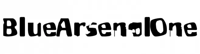
![BlueArsenalOne font caratteri gratis]() Scaricare 231 Downloads
Scaricare 231 Downloads -
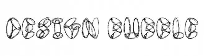
( Font by Jonathan Harris - www.tattoowoo.com )
A playful, bubble-like font with interconnected loops and swirls.
![Design Bubble font caratteri gratis]() Scaricare 231 Downloads@WebFont
Scaricare 231 Downloads@WebFont -
![Bit Lines15 [sRB] font caratteri gratis]() Scaricare 231 Downloads@WebFont
Scaricare 231 Downloads@WebFont -
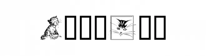
( Fonts by Graham Meade - GemFonts )
A decorative cat illustration dingbat font.
![CattArt font caratteri gratis]() Scaricare 231 Downloads@WebFont
Scaricare 231 Downloads@WebFont -
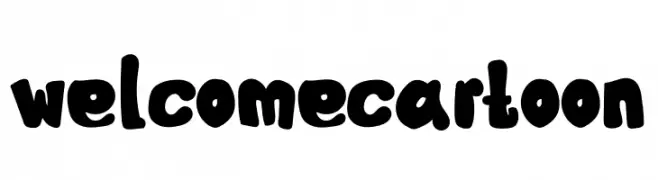
( Fonts by Mr.Soon Design )
A bold, playful font with a cartoonish style and rounded characters.
![Welcome Cartoon font caratteri gratis]() Scaricare 231 Downloads@WebFont
Scaricare 231 Downloads@WebFont -
![Gurulipi3 font caratteri gratis]() Scaricare 231 Downloads@WebFont
Scaricare 231 Downloads@WebFont -
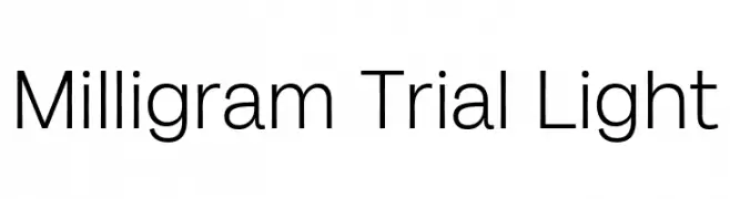
( Fonts by Zetafonts - Personal-use only. For commercial use please contact owner. )
A clean, modern font with a minimalist and balanced design.
![Milligram Trial Light font caratteri gratis]() Scaricare 231 Downloads@WebFont
Scaricare 231 Downloads@WebFont -
( Fonts by Thirtypath - Personal-use only. For commercial use please contact owner. )
A bold, brush-style script font with dynamic, flowing strokes.
![Gold Brush font caratteri gratis]() Scaricare 231 Downloads@WebFont
Scaricare 231 Downloads@WebFont -
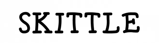
![SKITTLE font caratteri gratis]() Scaricare 231 Downloads@WebFont
Scaricare 231 Downloads@WebFont -
( Caveras - Cliff Modes - caveras.net )
A pixelated, monospaced font with a retro digital style.
![Igiari font caratteri gratis]() Scaricare 231 Downloads@WebFont
Scaricare 231 Downloads@WebFont


![Bit Lines15 [sRB] font caratteri gratis](https://d144mzi0q5mijx.cloudfront.net/img/B/I/Bit-Lines15-sRB.webp)


Quali sono i font più popolari adesso?
Poppins, Roboto, Montserrat, Open Sans e Lato sono molto usati per le forme pulite e l'ampia applicabilità — dall'identità di marca alle landing page e ai poster.
Quali font si usano spesso nei loghi?
Le sans serif geometriche (es. Poppins, famiglie in stile Gotham) sono scelte comuni per un branding pulito e scalabile. Per un tocco personale restano valide script e stili manoscritti. Abbina un display deciso per i titoli a un corpo testo neutro per riconoscibilità ed equilibrio.
Ogni quanto si aggiorna la lista?
Con regolarità, in base ai download e all'attività reale. Torna spesso per scoprire in anticipo le nuove preferite.
💡 Consiglio: aggiungi ai preferiti — le tendenze cambiano in fretta e i font top di oggi possono ispirare il rebranding di domani.