Benvenuto nelle Font Più Popolari — dove popolarità e qualità si incontrano. Qui trovi i font più scaricati e usati dell'anno. Se cerchi scelte sicure per logo, web o social, inizia da qui.
Ogni font top si distingue per equilibrio, leggibilità e versatilità. Troverai sans serif moderne, script eleganti, serif vintage e display minimalisti.
-
 Scaricare 3227 Downloads@WebFont
 -
( Fonts by Matthew Austin Petty - www.disturbed.com )
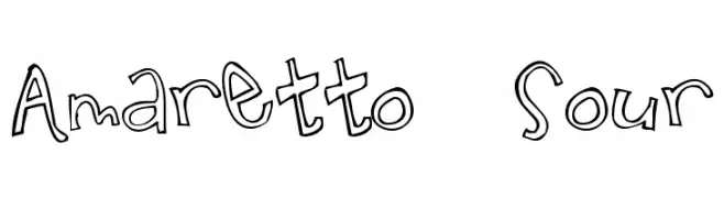
A playful, hand-drawn font with whimsical and irregular characters.
![Amaretto Sour font caratteri gratis]() Scaricare 3227 Downloads@WebFont
Scaricare 3227 Downloads@WebFont -
![Drakon font caratteri gratis]() Scaricare 3227 Downloads@WebFont
Scaricare 3227 Downloads@WebFont -
( Fonts by Castcraft Software - opti.netii.net - check the website before use )
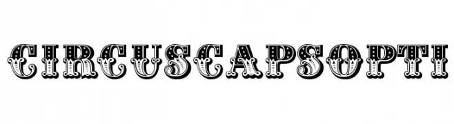
A bold, decorative font with intricate patterns, ideal for vintage-themed designs.
![CIRcusCapsOpti font caratteri gratis]() Scaricare 3226 Downloads@WebFont
Scaricare 3226 Downloads@WebFont -
( Fonts by Castcraft Software - opti.netii.net - check the website before use )
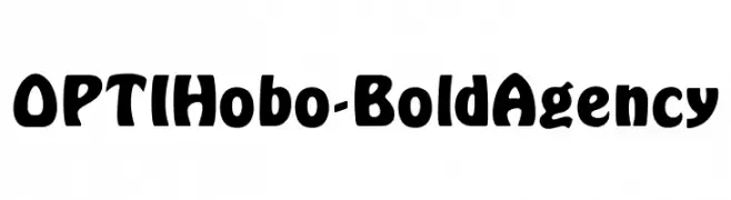
A bold, playful font with rounded strokes and a vintage-modern appeal.
![OPTIHobo-BoldAgency font caratteri gratis]() Scaricare 3226 Downloads@WebFont
Scaricare 3226 Downloads@WebFont -
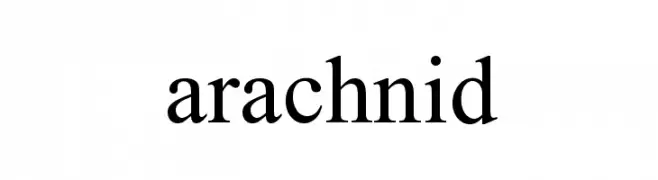
![arachnid font caratteri gratis]() Scaricare 3225 Downloads@WebFont
Scaricare 3225 Downloads@WebFont -
( Fonts by Castcraft Software - OPTI Fonts Archive - opti.netii.net - Personal-use only. For commercial use please contact owner. )
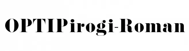
A bold, high-contrast serif font with a modern twist.
![OPTIPirogi-Roman font caratteri gratis]() Scaricare 3224 Downloads@WebFont
Scaricare 3224 Downloads@WebFont -
( Fonts by Manfred Klein. Free for private and charity use. Free for commercial with donation to organizations )
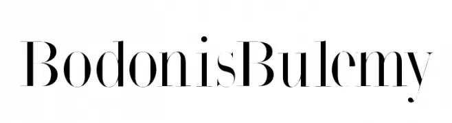
An elegant serif font with high contrast and sharp serifs.
![BodonisBulemy font caratteri gratis]() Scaricare 3224 Downloads@WebFont
Scaricare 3224 Downloads@WebFont -
( Fonts by www.exclamachine.com )
A bold, italicized blackletter-inspired font with sharp, angular lines.
![!The Black Bloc Bold Italic font caratteri gratis]() Scaricare 3224 Downloads@WebFont
Scaricare 3224 Downloads@WebFont -
( Fonts by Youssef Habchi )
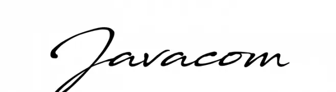
A fluid, cursive script font with a natural handwritten style.
![Javacom font caratteri gratis]() Scaricare 3223 Downloads@WebFont
Scaricare 3223 Downloads@WebFont -
( Fonts by www.26plus-zeichen.de )
A sleek, modern italic font with clean lines and a dynamic slant.
![Acid-Italic font caratteri gratis]() Scaricare 3223 Downloads@WebFont
Scaricare 3223 Downloads@WebFont -
![Bendable BRK font caratteri gratis]() Scaricare 3223 Downloads@WebFont
Scaricare 3223 Downloads@WebFont -
![Tiny Pixy font caratteri gratis]() Scaricare 3222 Downloads@WebFont
Scaricare 3222 Downloads@WebFont -
![Theano Old Style Regular font caratteri gratis]() Scaricare 3222 Downloads@WebFont
Scaricare 3222 Downloads@WebFont -
( Copyright (c) 2016 by Red Hat, Inc. All rights reserved. )
A bold, modern sans-serif font with excellent readability and uniform strokes.
![Overpass Bold font caratteri gratis]() Scaricare 3221 Downloads@WebFont
Scaricare 3221 Downloads@WebFont -
![DejaVu Serif Condensed Bold font caratteri gratis]() Scaricare 3221 Downloads@WebFont
Scaricare 3221 Downloads@WebFont -
( Copyright (c) 2011 by Brian J. Bonislawsky DBA Astigmatic (AOETI) )
A playful and dynamic font with bold, curved letterforms.
![Original Surfer font caratteri gratis]() Scaricare 3221 Downloads@WebFont
Scaricare 3221 Downloads@WebFont -
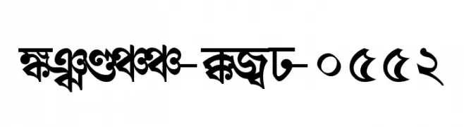
![Shree-Ban-0552 font caratteri gratis]() Scaricare 3221 Downloads@WebFont
Scaricare 3221 Downloads@WebFont -
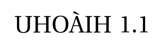
![UHoàiH 1.1 font caratteri gratis]() Scaricare 3221 Downloads
Scaricare 3221 Downloads -
( Fonts by Peter Olexa )
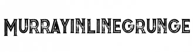
A bold, distressed font with a grunge aesthetic and inline design.
![Murrayinlinegrunge font caratteri gratis]() Scaricare 3220 Downloads@WebFont
Scaricare 3220 Downloads@WebFont -
( Fonts by Dieter Steffmann )
A bold, decorative font with vintage flair and intricate detailing.
![QuentinCaps font caratteri gratis]() Scaricare 3220 Downloads@WebFont
Scaricare 3220 Downloads@WebFont -
( Zetafonts - www.zetafonts.com )
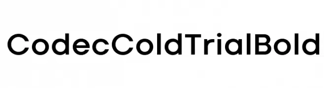
A bold, modern sans-serif font with clean, geometric letterforms.
![Codec Cold Trial Bold font caratteri gratis]() Scaricare 3219 Downloads@WebFont
Scaricare 3219 Downloads@WebFont -
![Serenity font caratteri gratis]() Scaricare 3219 Downloads@WebFont
Scaricare 3219 Downloads@WebFont -
( Fonts by Rick Mueller )
A bold, playful font with rounded, thick strokes and a whimsical style.
![Advert Regular font caratteri gratis]() Scaricare 3219 Downloads@WebFont
Scaricare 3219 Downloads@WebFont -
( JBFoundry - Jean Boyault - jean.boyault.pagesperso-orange.fr/ )
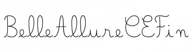
A delicate and elegant script font with flowing, graceful strokes.
![Belle Allure CE Fin font caratteri gratis]() Scaricare 3217 Downloads@WebFont
Scaricare 3217 Downloads@WebFont -
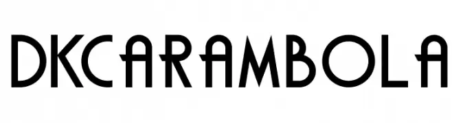
![DKCarambola font caratteri gratis]() Scaricare 3217 Downloads@WebFont
Scaricare 3217 Downloads@WebFont -
( Fonts by Maelle.K - Thomas Boucherie )
An elegant script font with intricate swashes and flowing lines.
![DragonisComing font caratteri gratis]() Scaricare 3217 Downloads@WebFont
Scaricare 3217 Downloads@WebFont -
![imprint font caratteri gratis]() Scaricare 3217 Downloads@WebFont
Scaricare 3217 Downloads@WebFont -
( Google Web Fonts )
A bold, italic serif font with a classic yet modern appeal.
![Droid Serif Bold Italic font caratteri gratis]() Scaricare 3217 Downloads@WebFont
Scaricare 3217 Downloads@WebFont -
( Scott Simpson )
A bold slab serif font with strong, block-like serifs and a modern yet classic appeal.
![Merit font caratteri gratis]() Scaricare 3216 Downloads@WebFont
Scaricare 3216 Downloads@WebFont -
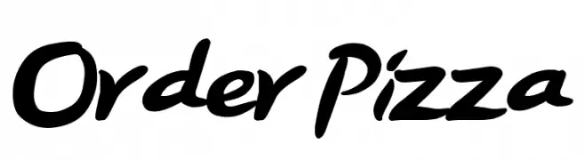
![Order Pizza font caratteri gratis]() Scaricare 3216 Downloads@WebFont
Scaricare 3216 Downloads@WebFont -
( Fonts by Daniel Zadorozny - www.iconian.com )
A modern, italicized font with expanded characters and medium contrast.
![Usuzi Expanded Italic font caratteri gratis]() Scaricare 3214 Downloads@WebFont
Scaricare 3214 Downloads@WebFont -
( Fonts by Leonard Posavec )
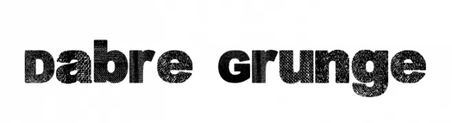
A bold, distressed font with a grunge texture, perfect for edgy designs.
![Dabre Grunge font caratteri gratis]() Scaricare 3214 Downloads@WebFont
Scaricare 3214 Downloads@WebFont -
![Trek TNG Credits font caratteri gratis]() Scaricare 3214 Downloads@WebFont
Scaricare 3214 Downloads@WebFont -
![Bradford font caratteri gratis]() Scaricare 3214 Downloads@WebFont
Scaricare 3214 Downloads@WebFont


Quali sono i font più popolari adesso?
Poppins, Roboto, Montserrat, Open Sans e Lato sono molto usati per le forme pulite e l'ampia applicabilità — dall'identità di marca alle landing page e ai poster.
Quali font si usano spesso nei loghi?
Le sans serif geometriche (es. Poppins, famiglie in stile Gotham) sono scelte comuni per un branding pulito e scalabile. Per un tocco personale restano valide script e stili manoscritti. Abbina un display deciso per i titoli a un corpo testo neutro per riconoscibilità ed equilibrio.
Ogni quanto si aggiorna la lista?
Con regolarità, in base ai download e all'attività reale. Torna spesso per scoprire in anticipo le nuove preferite.
💡 Consiglio: aggiungi ai preferiti — le tendenze cambiano in fretta e i font top di oggi possono ispirare il rebranding di domani.