Benvenuto nelle Font Più Popolari — dove popolarità e qualità si incontrano. Qui trovi i font più scaricati e usati dell'anno. Se cerchi scelte sicure per logo, web o social, inizia da qui.
Ogni font top si distingue per equilibrio, leggibilità e versatilità. Troverai sans serif moderne, script eleganti, serif vintage e display minimalisti.
-
 Scaricare 225 Downloads@WebFont
 -
( Fonts by yosiro - tinyfactory.org - Personal-use only. For commercial use please contact owner. )
A bold, playful font with thick, rounded characters and a bubbly appearance.
![ollo font caratteri gratis]() Scaricare 225 Downloads@WebFont
Scaricare 225 Downloads@WebFont -
( Fonts by Noah Type - noahtype.com - Personal-use only. For commercial use please contact owner. )
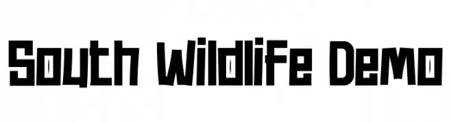
A bold, geometric font with angular, blocky letterforms and a modern, edgy style.
![South Wildlife Demo font caratteri gratis]() Scaricare 225 Downloads@WebFont
Scaricare 225 Downloads@WebFont -
( Fonts by Kong Font - fontkong.com - Personal-use only. For commercial use please contact owner. )
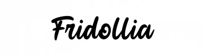
A bold, expressive script font with a flowing, handwritten style.
![Fridollia font caratteri gratis]() Scaricare 225 Downloads@WebFont
Scaricare 225 Downloads@WebFont -
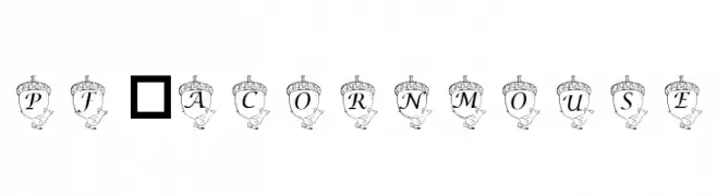
![pf_acornmouse font caratteri gratis]() Scaricare 225 Downloads@WebFont
Scaricare 225 Downloads@WebFont -
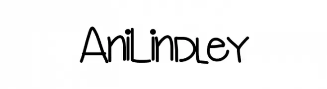
![AniLindley font caratteri gratis]() Scaricare 225 Downloads@WebFont
Scaricare 225 Downloads@WebFont -
( Fonts by Burhan Afif - hanscostudio.com - Personal-use only. For commercial use please contact owner. )
A playful, bold script font with a hand-drawn, energetic style.
![la fiesta font caratteri gratis]() Scaricare 225 Downloads@WebFont
Scaricare 225 Downloads@WebFont -
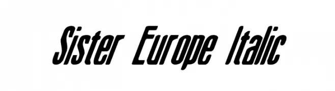
( Fonts by Daniel Zadorozny - www.iconian.com )
A bold, italic, and condensed font with a modern, dynamic style.
![Sister Europe Italic font caratteri gratis]() Scaricare 225 Downloads@WebFont
Scaricare 225 Downloads@WebFont -
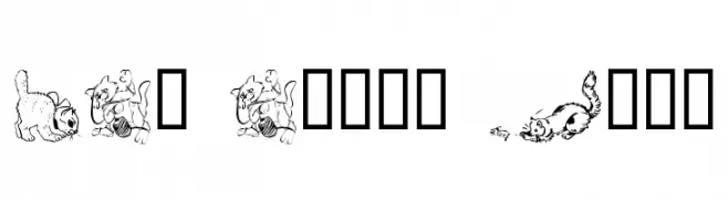
![LCR Cat's Meow font caratteri gratis]() Scaricare 225 Downloads@WebFont
Scaricare 225 Downloads@WebFont -
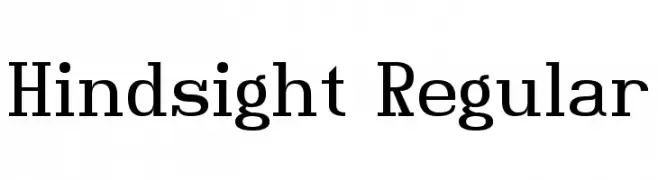
( Fonts by dartcanada.tripod.com - Darren Rigby )
A modern serif font with clean lines and balanced readability.
![Hindsight Regular font caratteri gratis]() Scaricare 225 Downloads@WebFont
Scaricare 225 Downloads@WebFont -
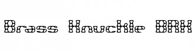
![Brass Knuckle BRK font caratteri gratis]() Scaricare 225 Downloads@WebFont
Scaricare 225 Downloads@WebFont -
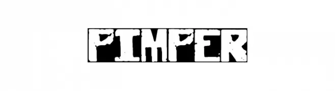
![pimper font caratteri gratis]() Scaricare 225 Downloads@WebFont
Scaricare 225 Downloads@WebFont -
( Fonts by Daniel Zadorozny - www.iconian.com )
A futuristic, condensed italic font with sharp, angular edges.
![Omni Girl Condensed Italic font caratteri gratis]() Scaricare 225 Downloads@WebFont
Scaricare 225 Downloads@WebFont -
( Fonts by Cannot Into Space Fonts )
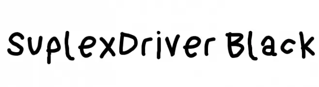
A bold, playful handwritten font with thick, rounded strokes.
![SuplexDriver Black font caratteri gratis]() Scaricare 225 Downloads@WebFont
Scaricare 225 Downloads@WebFont -
( imagex - www.imagex-fonts.com )
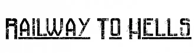
A bold, distressed font with a rugged, industrial style.
![Railway To Hells font caratteri gratis]() Scaricare 225 Downloads@WebFont
Scaricare 225 Downloads@WebFont -
( Fonts by Arkandis Digital Foundry )
A bold, extended italic font with a modern and dynamic style.
![SwitzeraADF-BoldExtItalic font caratteri gratis]() Scaricare 225 Downloads@WebFont
Scaricare 225 Downloads@WebFont -
( FontGrube AH - Andreas Höfeld - www.fontgrube.de/en/ )
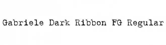
A bold, distressed font with a vintage, textured appearance.
![Gabriele Dark Ribbon FG Regular font caratteri gratis]() Scaricare 225 Downloads@WebFont
Scaricare 225 Downloads@WebFont -
( Fonts by Jeremy Dixon - Personal-use only. For commercial use please contact owner. )
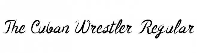
A dynamic and expressive script font with fluid, cursive letterforms.
![The Cuban Wrestler Regular font caratteri gratis]() Scaricare 225 Downloads@WebFont
Scaricare 225 Downloads@WebFont -
( Fonts by dartcanada.tripod.com - Darren Rigby )
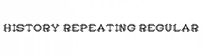
A bold, layered font with intersecting lines creating a dynamic, retro-modern look.
![History Repeating Regular font caratteri gratis]() Scaricare 225 Downloads@WebFont
Scaricare 225 Downloads@WebFont -
( Fonts by dustBUST )
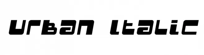
A bold, italicized font with a modern, urban style.
![Urban Italic font caratteri gratis]() Scaricare 225 Downloads@WebFont
Scaricare 225 Downloads@WebFont -
( K-Type Freebies (Free for Personal Use Only) FROM http://www.k-type.com )
A pixelated, blocky font with a retro digital aesthetic.
![PixL font caratteri gratis]() Scaricare 225 Downloads@WebFont
Scaricare 225 Downloads@WebFont -
( TracerTong - Paul Reid - tracertong.co.uk )
A bold, futuristic font with sharp angles and geometric shapes.
![Techno Hideo Bold font caratteri gratis]() Scaricare 225 Downloads@WebFont
Scaricare 225 Downloads@WebFont -
![Fairies Are Real font caratteri gratis]() Scaricare 225 Downloads@WebFont
Scaricare 225 Downloads@WebFont -
( Fonts by Iconian Fonts )
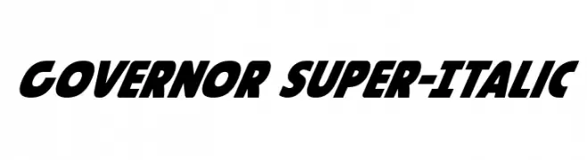
A bold, italicized font with a dynamic and modern style.
![Governor Super-Italic font caratteri gratis]() Scaricare 225 Downloads@WebFont
Scaricare 225 Downloads@WebFont -
( Fonts by Andrew McCluskey - nalgames.com )
A bold, futuristic font with geometric and dynamic design elements.
![DubbingStar Regular font caratteri gratis]() Scaricare 225 Downloads@WebFont
Scaricare 225 Downloads@WebFont -
( Fonts by Daniel Zadorozny - www.iconian.com )
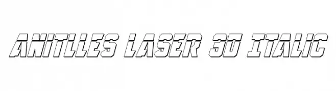
A bold, italicized 3D font with a futuristic and dynamic style.
![Anitlles Laser 3D Italic font caratteri gratis]() Scaricare 225 Downloads@WebFont
Scaricare 225 Downloads@WebFont -
( Fonts by Geronimo Fonts - Personal-use only. For commercial use please contact owner. )
A playful, casual handwritten font with dynamic strokes and a lively appearance.
![Scriptfont font caratteri gratis]() Scaricare 225 Downloads@WebFont
Scaricare 225 Downloads@WebFont -
( Fonts by wepfont - Wahyu Eka Prasetya - Personal-use only. For commercial use please contact owner. )
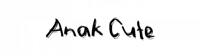
A lively, brush-style font with bold, uneven strokes and a playful, artistic vibe.
![Anak Cute font caratteri gratis]() Scaricare 225 Downloads@WebFont
Scaricare 225 Downloads@WebFont -
Caratteri di spideraysfonts. For commercial use please contact the owner.
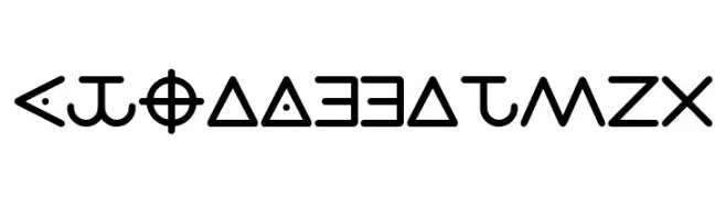
( ZODIAC CIPHER )
A cipher-inspired geometric display font with abstract, symbolic glyphs.
![ZODIACCIPHER font caratteri gratis]() Scaricare 225 Downloads@WebFont
Scaricare 225 Downloads@WebFont -
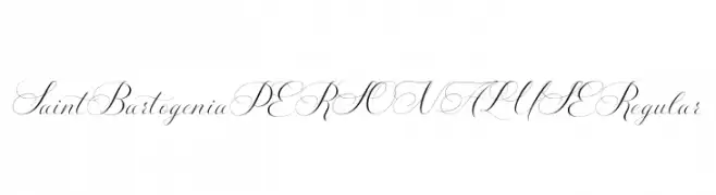
( Fonts by Mans Greback - www.mansgreback.com - Personal-use only. For commercial use please contact owner. )
An elegant script font with flowing, interconnected characters and intricate swashes.
![Saint Bartogenia PERSONAL USE Regular font caratteri gratis]() Scaricare 225 Downloads@WebFont
Scaricare 225 Downloads@WebFont -
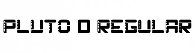
( Bryan Augusto )
A bold, futuristic font with a unique dotted pattern and geometric structure.
![Pluto 0 Regular font caratteri gratis]() Scaricare 225 Downloads@WebFont
Scaricare 225 Downloads@WebFont -
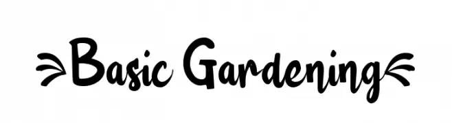
( Fonts by wep - Wahyu Eka Prasetya - Personal-use only. For commercial use please contact owner. )
A playful, bold, and whimsical font with a hand-drawn aesthetic.
![{Basic Gardening} font caratteri gratis]() Scaricare 225 Downloads@WebFont
Scaricare 225 Downloads@WebFont -
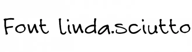
( Fonts by Linda Sciutto )
A playful, casual handwritten font with dynamic, irregular strokes.
![Font linda.sciutto font caratteri gratis]() Scaricare 225 Downloads@WebFont
Scaricare 225 Downloads@WebFont -
![Wet NapkinRegular font caratteri gratis]() Scaricare 225 Downloads@WebFont
Scaricare 225 Downloads@WebFont -
![Font_london eyes font caratteri gratis]() Scaricare 225 Downloads@WebFont
Scaricare 225 Downloads@WebFont


Quali sono i font più popolari adesso?
Poppins, Roboto, Montserrat, Open Sans e Lato sono molto usati per le forme pulite e l'ampia applicabilità — dall'identità di marca alle landing page e ai poster.
Quali font si usano spesso nei loghi?
Le sans serif geometriche (es. Poppins, famiglie in stile Gotham) sono scelte comuni per un branding pulito e scalabile. Per un tocco personale restano valide script e stili manoscritti. Abbina un display deciso per i titoli a un corpo testo neutro per riconoscibilità ed equilibrio.
Ogni quanto si aggiorna la lista?
Con regolarità, in base ai download e all'attività reale. Torna spesso per scoprire in anticipo le nuove preferite.
💡 Consiglio: aggiungi ai preferiti — le tendenze cambiano in fretta e i font top di oggi possono ispirare il rebranding di domani.