Benvenuto nelle Font Più Popolari — dove popolarità e qualità si incontrano. Qui trovi i font più scaricati e usati dell'anno. Se cerchi scelte sicure per logo, web o social, inizia da qui.
Ogni font top si distingue per equilibrio, leggibilità e versatilità. Troverai sans serif moderne, script eleganti, serif vintage e display minimalisti.
-
( Fonts by Press Gang Studios - Andeh Pinkard - www.pressgang-studios.com )
A playful, hand-drawn style font with bold, rounded characters.
 Scaricare 223 Downloads@WebFont
 -
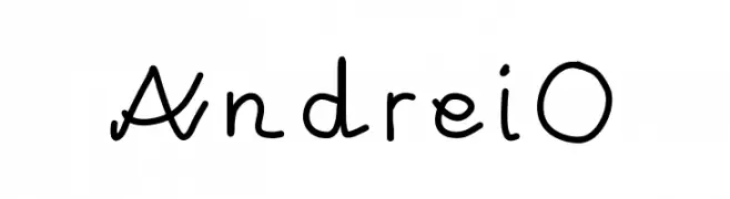
Caratteri di kreativ. For commercial use please contact the owner.
![AndreiO font caratteri gratis]() Scaricare 223 Downloads@WebFont
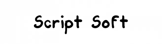
Scaricare 223 Downloads@WebFont -
![Script Soft font caratteri gratis]() Scaricare 223 Downloads@WebFont
Scaricare 223 Downloads@WebFont -
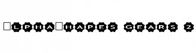
Caratteri di fontsnthings. For commercial use please contact the owner.
![AlphaShapes gears 2 font caratteri gratis]() Scaricare 223 Downloads@WebFont
Scaricare 223 Downloads@WebFont -
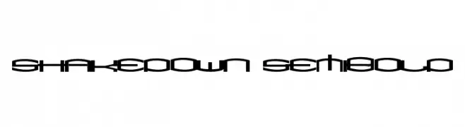
![ShakeDown SemiBold font caratteri gratis]() Scaricare 223 Downloads@WebFont
Scaricare 223 Downloads@WebFont -
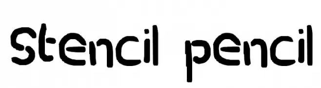
![stencil pencil font caratteri gratis]() Scaricare 223 Downloads@WebFont
Scaricare 223 Downloads@WebFont -
( Fonts by a Max Infeld - XEROGRAPHER FONTS - xerographer.blogspot.com . Personal-use only. For commercial use please contact owner. )
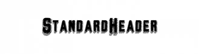
A bold, textured font with a distressed, grunge-like appearance.
![StandardHeader font caratteri gratis]() Scaricare 223 Downloads@WebFont
Scaricare 223 Downloads@WebFont -
( Fonts by Manfred Klein. Free for private and charity use. Free for commercial with donation to organizations )
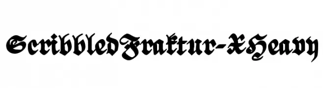
A bold, intricate blackletter style with dramatic, ornate characters.
![ScribbledFraktur-XHeavy font caratteri gratis]() Scaricare 223 Downloads@WebFont
Scaricare 223 Downloads@WebFont -
( Fonts by Four Lines )
A playful, bubbly font with rounded, cartoonish characters.
![Bubble Garden font caratteri gratis]() Scaricare 223 Downloads@WebFont
Scaricare 223 Downloads@WebFont -
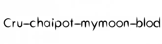
![Cru-chaipot-mymoon-blod font caratteri gratis]() Scaricare 223 Downloads@WebFont
Scaricare 223 Downloads@WebFont -
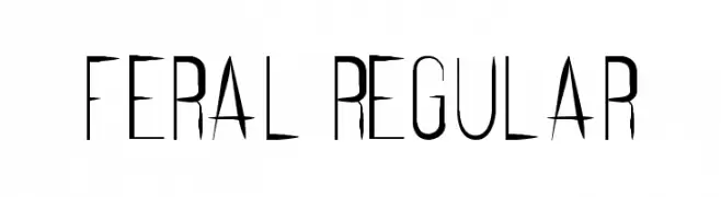
( Fonts by Marcus Lien Gundersen - Personal-use only. For commercial use please contact owner. )
A sharp, high-contrast font with elongated serifs and a dramatic, modern style.
![Feral Regular font caratteri gratis]() Scaricare 223 Downloads@WebFont
Scaricare 223 Downloads@WebFont -
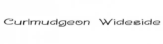
( Fonts by Graham Meade - GemFonts )
A playful and whimsical font with curly, flowing letterforms.
![Curlmudgeon Wideside font caratteri gratis]() Scaricare 223 Downloads@WebFont
Scaricare 223 Downloads@WebFont -
( Fonts by Vladimir Nikolic - www.creativefabrica.com/designer/vladimirnikolic/ - Personal-use only. For commercial use please contact owner. )
A bold, three-dimensional font with a dotted texture and angular design.
![Strike Regular font caratteri gratis]() Scaricare 223 Downloads@WebFont
Scaricare 223 Downloads@WebFont -
( Fonts by a Habib Shaikh. Personal-use only. For commercial use please contact owner. )
A scratchy, hand-drawn font with a textured, artistic style.
![99%LineScratch font caratteri gratis]() Scaricare 223 Downloads@WebFont
Scaricare 223 Downloads@WebFont -
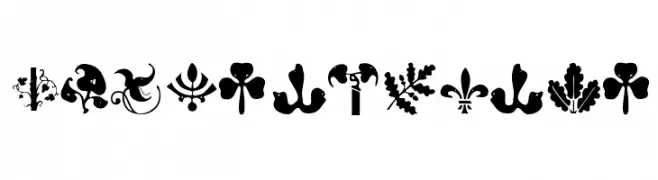
( Fonts by Manfred Klein. Free for private and charity use. Free for commercial with donation to organizations )
Ornate dingbat font with plant and bird motifs.
![BirdsNPlants font caratteri gratis]() Scaricare 223 Downloads@WebFont
Scaricare 223 Downloads@WebFont -
( Fonts by Wino S Kadir - weknow - www.revolge.com/shop/weknow/ - Personal-use only. For commercial use please contact owner. )
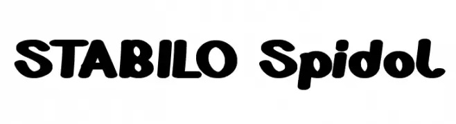
A playful, bold font with rounded, thick strokes and a whimsical touch.
![STABILO Spidol font caratteri gratis]() Scaricare 223 Downloads@WebFont
Scaricare 223 Downloads@WebFont -
![Brieincarnation font caratteri gratis]() Scaricare 223 Downloads@WebFont
Scaricare 223 Downloads@WebFont -
( Fonts by www.lifewithouttaffy.com )
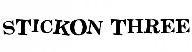
A bold, playful font with dynamic, irregular shapes and exaggerated serifs.
![Stickon Three font caratteri gratis]() Scaricare 223 Downloads@WebFont
Scaricare 223 Downloads@WebFont -
( Fonts by pheist.net - Stefanie Koerner )
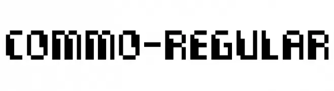
A bold, pixelated font with a geometric, retro digital style.
![Commo-Regular font caratteri gratis]() Scaricare 223 Downloads@WebFont
Scaricare 223 Downloads@WebFont -
( Fonts by Castcraft Software - opti.netii.net - check the website before use )
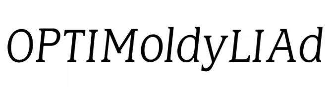
A classic serif font with elegant curves and moderate contrast, perfect for sophisticated designs.
![OPTIMoldyLIAd font caratteri gratis]() Scaricare 223 Downloads@WebFont
Scaricare 223 Downloads@WebFont -
![DeLarge Wired font caratteri gratis]() Scaricare 223 Downloads@WebFont
Scaricare 223 Downloads@WebFont -
( Fonts by blue studio09 - Personal-use only. For commercial use please contact owner. )
A playful and whimsical font with decorative serifs and rounded forms.
![Black Pepper font caratteri gratis]() Scaricare 223 Downloads@WebFont
Scaricare 223 Downloads@WebFont -
( Fonts by Billy Argel Fonts ® )
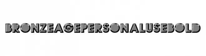
A bold, decorative font with a vintage, three-dimensional style.
![BRONZEAGE PERSONAL USE Bold font caratteri gratis]() Scaricare 223 Downloads@WebFont
Scaricare 223 Downloads@WebFont -
( Noto is a trademark of Google Inc. Noto fonts are open source. All Noto fonts are published under the SIL Open Font License, Version 1.1 )
A modern, clean sans-serif font with excellent readability and balanced proportions.
![Noto Sans Bengali SemiBold font caratteri gratis]() Scaricare 223 Downloads@WebFont
Scaricare 223 Downloads@WebFont -
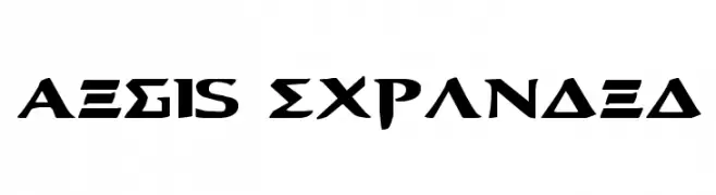
( Fonts by Daniel Zadorozny - www.iconian.com - Free for personal use )
A bold, expanded font with geometric and angular elements, perfect for impactful designs.
![Aegis Expanded font caratteri gratis]() Scaricare 223 Downloads@WebFont
Scaricare 223 Downloads@WebFont -
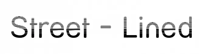
( Fonts by Apostrophic Lab )
A modern, decorative font with a unique lined pattern for dynamic visual appeal.
![Street - Lined font caratteri gratis]() Scaricare 223 Downloads@WebFont
Scaricare 223 Downloads@WebFont -
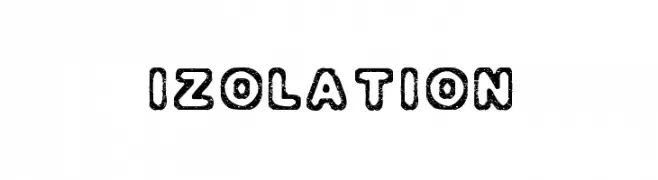
( Fonts by SDFonts - Ritzy )
A bold, textured font with a playful, handcrafted style.
![Izolation font caratteri gratis]() Scaricare 223 Downloads@WebFont
Scaricare 223 Downloads@WebFont -
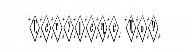
![Terylene Top font caratteri gratis]() Scaricare 223 Downloads@WebFont
Scaricare 223 Downloads@WebFont -
( Iconian Fonts - Daniel Zadorozny - www.iconian.com )
A bold, italicized font with a futuristic and dynamic style.
![Starduster Title Italic font caratteri gratis]() Scaricare 223 Downloads@WebFont
Scaricare 223 Downloads@WebFont -
( Figuree Studio - Icep Fadhil )
A bold, brush-style font with dynamic, hand-drawn strokes.
![DIAVOLO font caratteri gratis]() Scaricare 223 Downloads@WebFont
Scaricare 223 Downloads@WebFont -
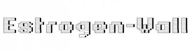
( Fonts by Apostrophic Lab )
A bold, three-dimensional block font with a layered, architectural style.
![Estrogen-Wall font caratteri gratis]() Scaricare 223 Downloads@WebFont
Scaricare 223 Downloads@WebFont -
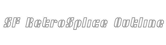
( Fonts by ShyFonts )
A retro-inspired outline font with geometric and angular design elements.
![SF RetroSplice Outline font caratteri gratis]() Scaricare 223 Downloads@WebFont
Scaricare 223 Downloads@WebFont -
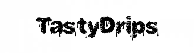
( Fonts by a Max Infeld - XEROGRAPHER FONTS - xerographer.blogspot.com . Personal-use only. For commercial use please contact owner. )
A bold, dripping font with a playful and dynamic style.
![TastyDrips font caratteri gratis]() Scaricare 223 Downloads@WebFont
Scaricare 223 Downloads@WebFont -
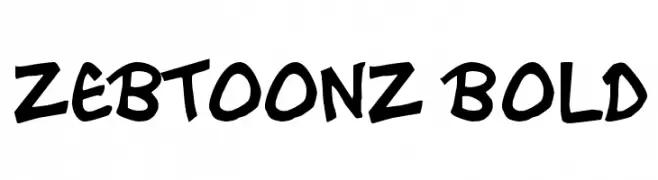
( Free for personal use - www.zebtoonz.com )
A bold, playful handwritten font with thick strokes and dynamic shapes.
![Zebtoonz Bold font caratteri gratis]() Scaricare 223 Downloads@WebFont
Scaricare 223 Downloads@WebFont -
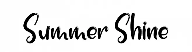
( Fonts by Nirmala Creative - Personal-use only. For commercial use please contact owner. )
Playful and energetic handwritten font.
![Summer Shine font caratteri gratis]() Scaricare 223 Downloads@WebFont
Scaricare 223 Downloads@WebFont


Quali sono i font più popolari adesso?
Poppins, Roboto, Montserrat, Open Sans e Lato sono molto usati per le forme pulite e l'ampia applicabilità — dall'identità di marca alle landing page e ai poster.
Quali font si usano spesso nei loghi?
Le sans serif geometriche (es. Poppins, famiglie in stile Gotham) sono scelte comuni per un branding pulito e scalabile. Per un tocco personale restano valide script e stili manoscritti. Abbina un display deciso per i titoli a un corpo testo neutro per riconoscibilità ed equilibrio.
Ogni quanto si aggiorna la lista?
Con regolarità, in base ai download e all'attività reale. Torna spesso per scoprire in anticipo le nuove preferite.
💡 Consiglio: aggiungi ai preferiti — le tendenze cambiano in fretta e i font top di oggi possono ispirare il rebranding di domani.