Benvenuto nelle Font Più Popolari — dove popolarità e qualità si incontrano. Qui trovi i font più scaricati e usati dell'anno. Se cerchi scelte sicure per logo, web o social, inizia da qui.
Ogni font top si distingue per equilibrio, leggibilità e versatilità. Troverai sans serif moderne, script eleganti, serif vintage e display minimalisti.
-
( Fonts by Balpirick Studio - https://www.creativefabrica.com/designer/balpirick/ref/308299/ - Personal-use only. For commercial use please contact owner. )
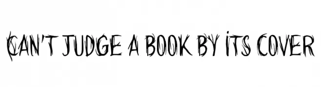
A playful, handwritten font with a casual and friendly style.
 Scaricare 220 Downloads@WebFont
 -
![Can't judge a book by its cover font caratteri gratis]() Scaricare 220 Downloads@WebFont
Scaricare 220 Downloads@WebFont -
( Juan Pablo De Gregorio - www.letritas.info )
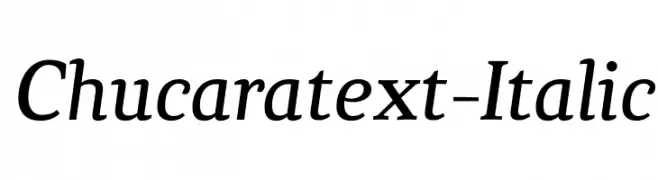
Elegant serif font with an italic slant and classic styling.
![Chucaratext-Italic font caratteri gratis]() Scaricare 220 Downloads@WebFont
Scaricare 220 Downloads@WebFont -
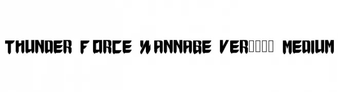
![Thunder Force Wannabe ver.1.1 Medium font caratteri gratis]() Scaricare 220 Downloads@WebFont
Scaricare 220 Downloads@WebFont -
( Fonts by Vladimir Nikolic )
A bold, geometric font with a three-dimensional, futuristic style.
![Leverkusen Regular font caratteri gratis]() Scaricare 220 Downloads@WebFont
Scaricare 220 Downloads@WebFont -
( Fonts by Castcraft Software - OPTI Fonts Archive - opti.netii.net - Personal-use only. For commercial use please contact owner. )
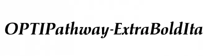
A bold, italic serif font with high contrast and dynamic elegance.
![OPTIPathway-ExtraBoldIta font caratteri gratis]() Scaricare 220 Downloads@WebFont
Scaricare 220 Downloads@WebFont -
![u27fog font caratteri gratis]() Scaricare 220 Downloads@WebFont
Scaricare 220 Downloads@WebFont -
( Fonts by Daniel Zadorozny - www.iconian.com - Free for personal use )
A bold, italicized font with dynamic strokes and a striking appearance.
![Mystic Singler ExpItalic font caratteri gratis]() Scaricare 220 Downloads@WebFont
Scaricare 220 Downloads@WebFont -
( Fonts by Dieter Steffmann )
A decorative blackletter font with bold, intricate designs and high contrast.
![TypographerGotischSchmuck font caratteri gratis]() Scaricare 220 Downloads@WebFont
Scaricare 220 Downloads@WebFont -
( Free for a personal use. For a commercial use please visit www.kevinandamanda.com )
A lively handwritten font with a casual, dynamic style.
![Pea Girly Girls Print font caratteri gratis]() Scaricare 220 Downloads@WebFont
Scaricare 220 Downloads@WebFont -
( Sronstudio - Yusron Billah )
A playful handwritten font with bold, rounded characters and a whimsical style.
![Black Butter font caratteri gratis]() Scaricare 220 Downloads@WebFont
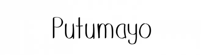
Scaricare 220 Downloads@WebFont -
![Putumayo font caratteri gratis]() Scaricare 220 Downloads@WebFont
Scaricare 220 Downloads@WebFont -
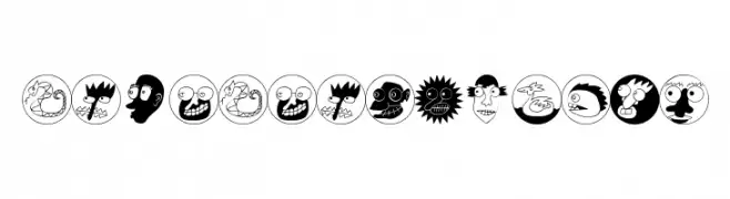
( Fonts by Manfred Klein. Free for private and charity use. Free for commercial with donation to organizations )
A decorative font with quirky character illustrations in circles, offering a playful and humorous style.
![NiceNeighbours font caratteri gratis]() Scaricare 220 Downloads@WebFont
Scaricare 220 Downloads@WebFont -
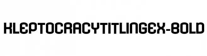
( Typodermic Fonts - Ray Larabie - www.typodermicfonts.com/ )
A bold, geometric, and modern font with a strong presence.
![KleptocracyTitlingEx-Bold font caratteri gratis]() Scaricare 220 Downloads@WebFont
Scaricare 220 Downloads@WebFont -
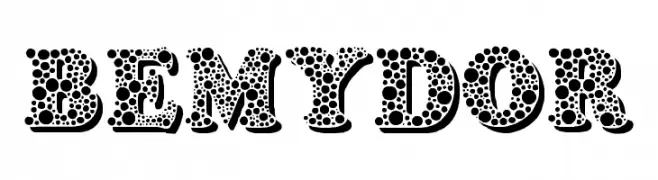
( Fonts by EvasUniqueFonts )
A playful, polka dot patterned decorative font with bold, rounded characters.
![Bemydor font caratteri gratis]() Scaricare 220 Downloads@WebFont
Scaricare 220 Downloads@WebFont -
( Please check the owner website: http://www.billie.grosse.is-a-geek.com )
A modern, ultra-thin font with wide spacing and a sleek, minimalist design.
![Gurvetica a0 Ultra Thin font caratteri gratis]() Scaricare 220 Downloads@WebFont
Scaricare 220 Downloads@WebFont -
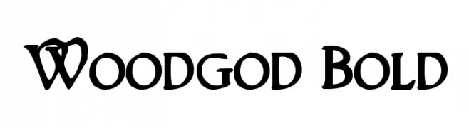
( Fonts by Daniel Zadorozny - www.iconian.com )
A bold, decorative serif font with unique flourishes and strong character presence.
![Woodgod Bold font caratteri gratis]() Scaricare 220 Downloads@WebFont
Scaricare 220 Downloads@WebFont -
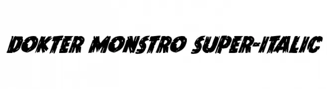
( Iconian Fonts - Daniel Zadorozny - www.iconian.com )
A bold, jagged, and italicized font with a dynamic, comic book style.
![Dokter Monstro Super-Italic font caratteri gratis]() Scaricare 220 Downloads@WebFont
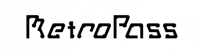
Scaricare 220 Downloads@WebFont -
![MetroPass font caratteri gratis]() Scaricare 220 Downloads@WebFont
Scaricare 220 Downloads@WebFont -
( Fonts by Daniel Zadorozny - www.iconian.com - Free for personal use )
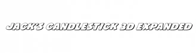
A bold, 3D-styled font with a strong, impactful presence and thick outlines.
![Jack's Candlestick 3D Expanded font caratteri gratis]() Scaricare 220 Downloads@WebFont
Scaricare 220 Downloads@WebFont -
![Erial font caratteri gratis]() Scaricare 220 Downloads@WebFont
Scaricare 220 Downloads@WebFont -
( Fonts by Daniel Zadorozny - www.iconian.com - Free for personal use )
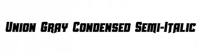
A bold, condensed, semi-italic font with a modern and dynamic style.
![Union Gray Condensed Semi-Italic font caratteri gratis]() Scaricare 220 Downloads@WebFont
Scaricare 220 Downloads@WebFont -
( illustrateddaydreams.tumblr.com/ )
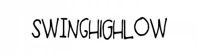
A playful, handwritten font with a casual and lively style.
![SWiNgHIGHloW font caratteri gratis]() Scaricare 220 Downloads@WebFont
Scaricare 220 Downloads@WebFont -
( Fonts by VinType )
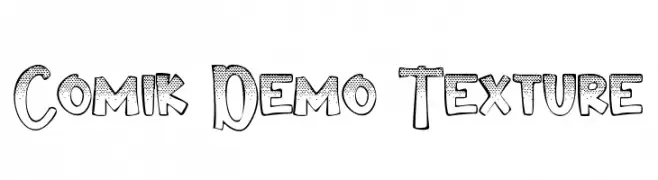
A bold, textured comic-inspired font with a playful, hand-drawn style.
![Comik Demo Texture font caratteri gratis]() Scaricare 220 Downloads@WebFont
Scaricare 220 Downloads@WebFont -
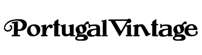
( Fonts by Woodcutter Manero - www.woodcutter.es - Personal-use only. For commercial use please contact owner. )
A vintage-style font with ornate serifs and decorative elements.
![Portugal Vintage font caratteri gratis]() Scaricare 220 Downloads@WebFont
Scaricare 220 Downloads@WebFont -
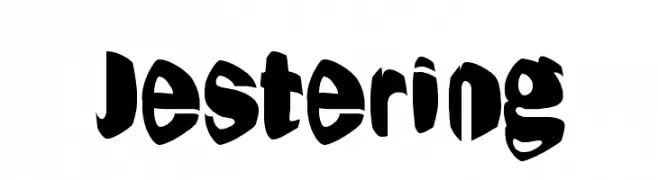
![Jestering font caratteri gratis]() Scaricare 220 Downloads@WebFont
Scaricare 220 Downloads@WebFont -
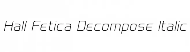
( Fonts by Graham Meade - GemFonts )
A sleek, modern italic font with geometric precision and clean lines.
![Hall Fetica Decompose Italic font caratteri gratis]() Scaricare 220 Downloads@WebFont
Scaricare 220 Downloads@WebFont -
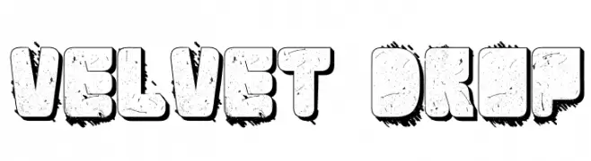
![Velvet Drop font caratteri gratis]() Scaricare 220 Downloads@WebFont
Scaricare 220 Downloads@WebFont -
( Fonts by Graphix Line Studio - Personal-use only. For commercial use please contact owner. )
A flowing, cursive font with elegant, interconnected letters.
![Wellness font caratteri gratis]() Scaricare 220 Downloads@WebFont
Scaricare 220 Downloads@WebFont -
( Fonts by Skiiller Studio )
A bold, playful font with rounded edges and consistent stroke width.
![Deurne font caratteri gratis]() Scaricare 220 Downloads@WebFont
Scaricare 220 Downloads@WebFont -
( Fonts by Punchform - Personal-use only. For commercial use please contact owner. )
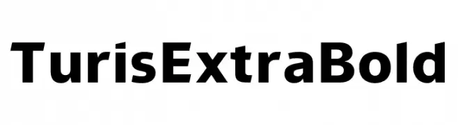
A bold, modern sans-serif font with strong, uniform strokes.
![Turis ExtraBold font caratteri gratis]() Scaricare 220 Downloads@WebFont
Scaricare 220 Downloads@WebFont -
( Fonts by www.blambot.com )
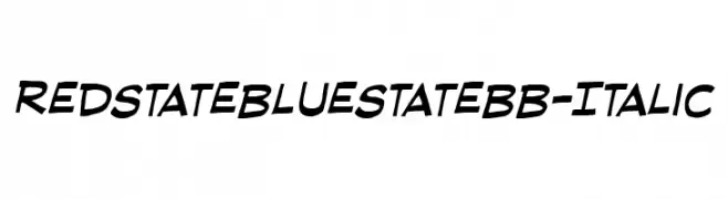
A dynamic italic font with playful, slanted letterforms and a modern, informal style.
![RedStateBlueStateBB-Italic font caratteri gratis]() Scaricare 220 Downloads@WebFont
Scaricare 220 Downloads@WebFont -
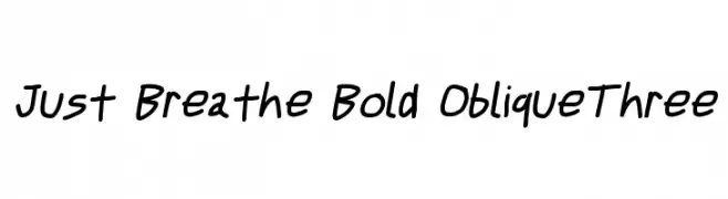
![Just Breathe Bold ObliqueThree font caratteri gratis]() Scaricare 220 Downloads@WebFont
Scaricare 220 Downloads@WebFont -
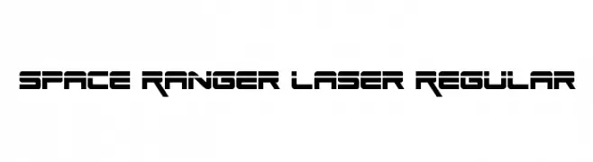
( Fonts by Daniel Zadorozny - www.iconian.com )
A futuristic, angular font with bold geometric shapes.
![Space Ranger Laser Regular font caratteri gratis]() Scaricare 220 Downloads@WebFont
Scaricare 220 Downloads@WebFont -
( Fonts by Roman Gornitsky - Personal-use only. For commercial use please contact owner. )
A modern, italic sans-serif font with balanced proportions and medium weight.
![VremenaGroteskMediumItalic font caratteri gratis]() Scaricare 220 Downloads@WebFont
Scaricare 220 Downloads@WebFont


Quali sono i font più popolari adesso?
Poppins, Roboto, Montserrat, Open Sans e Lato sono molto usati per le forme pulite e l'ampia applicabilità — dall'identità di marca alle landing page e ai poster.
Quali font si usano spesso nei loghi?
Le sans serif geometriche (es. Poppins, famiglie in stile Gotham) sono scelte comuni per un branding pulito e scalabile. Per un tocco personale restano valide script e stili manoscritti. Abbina un display deciso per i titoli a un corpo testo neutro per riconoscibilità ed equilibrio.
Ogni quanto si aggiorna la lista?
Con regolarità, in base ai download e all'attività reale. Torna spesso per scoprire in anticipo le nuove preferite.
💡 Consiglio: aggiungi ai preferiti — le tendenze cambiano in fretta e i font top di oggi possono ispirare il rebranding di domani.