Benvenuto nelle Font Più Popolari — dove popolarità e qualità si incontrano. Qui trovi i font più scaricati e usati dell'anno. Se cerchi scelte sicure per logo, web o social, inizia da qui.
Ogni font top si distingue per equilibrio, leggibilità e versatilità. Troverai sans serif moderne, script eleganti, serif vintage e display minimalisti.
-
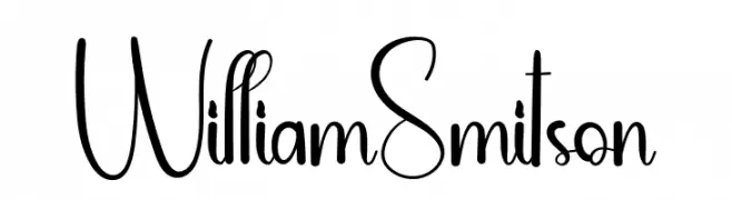
( Fonts by Andi Moz )
A whimsical and elegant font with tall, narrow letters and playful loops.
 Scaricare 217 Downloads@WebFont
 -
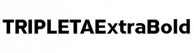
( Fonts by deFharo - Fernando Haro - Personal-use only. For commercial use please contact owner. )
A bold, modern typeface with clean lines and uniform strokes.
![TRIPLETAExtraBold font caratteri gratis]() Scaricare 217 Downloads@WebFont
Scaricare 217 Downloads@WebFont -
![Panforte Pro Light Italic font caratteri gratis]() Scaricare 217 Downloads@WebFont
Scaricare 217 Downloads@WebFont -
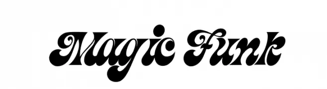
( Fonts by Burhan Afif - hanscostudio.com - Personal-use only. For commercial use please contact owner. )
A bold, retro-inspired font with playful curves and swirls.
![Magic Funk font caratteri gratis]() Scaricare 217 Downloads@WebFont
Scaricare 217 Downloads@WebFont -
![KonanurKaps Kaps:001.001 font caratteri gratis]() Scaricare 217 Downloads@WebFont
Scaricare 217 Downloads@WebFont -
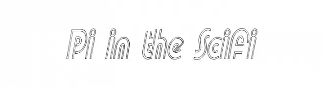
( Fonts by Graham Meade - GemFonts )
A futuristic, geometric font with a double-line structure and consistent stroke width.
![Pi in the SciFi font caratteri gratis]() Scaricare 217 Downloads@WebFont
Scaricare 217 Downloads@WebFont -
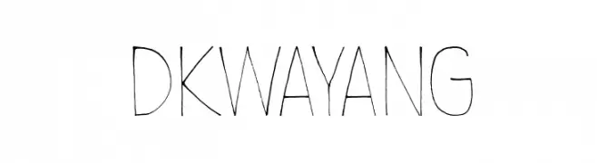
( Fonts by David Kerkhoff - www.hanodedphotography.com )
A hand-drawn, artistic font with tall, slender characters and a playful style.
![DKWayang font caratteri gratis]() Scaricare 217 Downloads@WebFont
Scaricare 217 Downloads@WebFont -
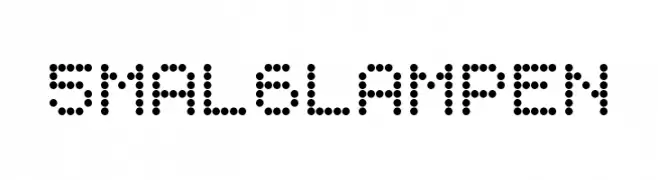
( Fonts by Peter Wiegel - www.peter-wiegel.de - Personal-use only. For commercial use please contact owner. )
A dot matrix style font with a modern, digital aesthetic.
![5mal6Lampen font caratteri gratis]() Scaricare 217 Downloads@WebFont
Scaricare 217 Downloads@WebFont -
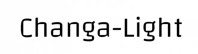
( Copyright 2011 Eduardo Tunni (www.tipo.net.ar) )
A modern, geometric sans-serif font with a clean and versatile design.
![Changa-Light font caratteri gratis]() Scaricare 217 Downloads@WebFont
Scaricare 217 Downloads@WebFont -
( Fonts by David Rakowski )
No valid font glyphs are visible.
![EileensMediumZodiac Regular font caratteri gratis]() Scaricare 217 Downloads@WebFont
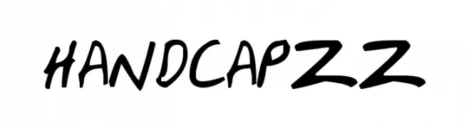
Scaricare 217 Downloads@WebFont -
![HandCapzz font caratteri gratis]() Scaricare 217 Downloads@WebFont
Scaricare 217 Downloads@WebFont -
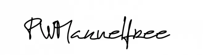
( Fonts by Peax Webdesign - www.peax-webdesign.com. Personal-use only. For commercial use please contact owner. )
A dynamic, handwritten-style font with a lively and informal appearance.
![PWManuelfree font caratteri gratis]() Scaricare 217 Downloads@WebFont
Scaricare 217 Downloads@WebFont -
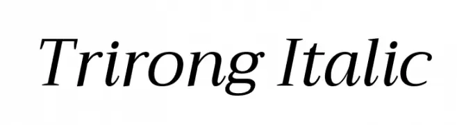
( Copyright (c) 2015, Cadson Demak (info@cadsondemak.com) )
An elegant serif italic font with smooth curves and a classic style.
![Trirong Italic font caratteri gratis]() Scaricare 217 Downloads@WebFont
Scaricare 217 Downloads@WebFont -
( Fonts by Disaster Fonts )
A futuristic, geometric font with rounded edges and a sleek design.
![Futurespore font caratteri gratis]() Scaricare 217 Downloads@WebFont
Scaricare 217 Downloads@WebFont -
( Jair Andrade )
An elegant script font with fluid, cursive strokes and delicate flourishes.
![curve font font caratteri gratis]() Scaricare 217 Downloads@WebFont
Scaricare 217 Downloads@WebFont -
( Fonts by www.kimberlygeswein.com - Kimberly Geswein )
A playful, handwritten font with bold, rounded characters and a whimsical style.
![KG Later AllieGator font caratteri gratis]() Scaricare 217 Downloads@WebFont
Scaricare 217 Downloads@WebFont -
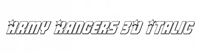
( Fonts by Daniel Zadorozny - www.iconian.com )
A bold, 3D italic font with star motifs and strong geometric shapes.
![Army Rangers 3D Italic font caratteri gratis]() Scaricare 217 Downloads@WebFont
Scaricare 217 Downloads@WebFont -
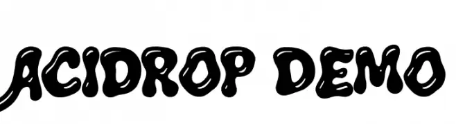
( Fonts by The Branded Quotes )
A bold, playful font with a bubbly, liquid-like appearance.
![Acidrop Demo font caratteri gratis]() Scaricare 217 Downloads@WebFont
Scaricare 217 Downloads@WebFont -
![Gabrial Ator Bold Italic font caratteri gratis]() Scaricare 217 Downloads@WebFont
Scaricare 217 Downloads@WebFont -
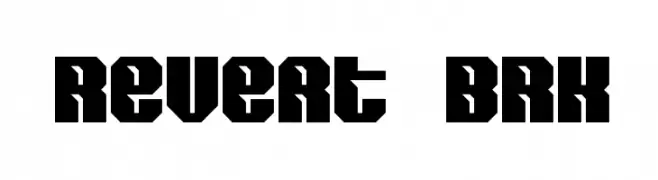
( Fonts by www.aenigmafonts.com )
A bold, geometric font with a modern, industrial feel.
![Revert BRK font caratteri gratis]() Scaricare 217 Downloads@WebFont
Scaricare 217 Downloads@WebFont -
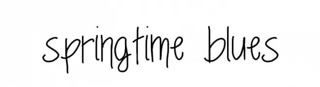
( Fonts by MonkeyRoodles Fonts )
A playful, casual handwritten font with tall, narrow letters and irregular strokes.
![springtime blues font caratteri gratis]() Scaricare 217 Downloads@WebFont
Scaricare 217 Downloads@WebFont -
( Fonts by a Max Infeld - XEROGRAPHER FONTS - xerographer.blogspot.com . Personal-use only. For commercial use please contact owner. )
A bold, textured font with a playful, hand-drawn style.
![BigPrint font caratteri gratis]() Scaricare 217 Downloads@WebFont
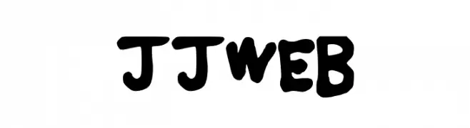
Scaricare 217 Downloads@WebFont -
![JJWEB font caratteri gratis]() Scaricare 217 Downloads@WebFont
Scaricare 217 Downloads@WebFont -
( Fonts by Daniel Zadorozny - www.iconian.com )
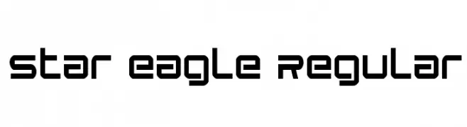
A futuristic, geometric font with bold, rounded letterforms.
![Star Eagle Regular font caratteri gratis]() Scaricare 217 Downloads@WebFont
Scaricare 217 Downloads@WebFont -
( Fonts by LyonsType - Daniel Lyons - Personal-use only. For commercial use please contact owner. )
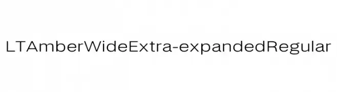
A modern, wide, extra-expanded sans-serif font with low contrast and geometric shapes.
![LT Amber Wide Extra-expanded Regular font caratteri gratis]() Scaricare 217 Downloads@WebFont
Scaricare 217 Downloads@WebFont -
( Fonts by Mans Greback - Personal-use only. For commercial use please contact owner. )
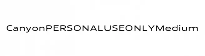
A modern sans-serif font with clean lines and balanced structure.
![Canyon PERSONAL USE ONLY Medium font caratteri gratis]() Scaricare 217 Downloads@WebFont
Scaricare 217 Downloads@WebFont -
( Fonts by Situjuh Nazara - 7ntypes.com - Personal-use only. For commercial use please contact owner. )
A playful, bold handwritten font with rounded, whimsical letterforms.
![Christed font caratteri gratis]() Scaricare 217 Downloads@WebFont
Scaricare 217 Downloads@WebFont -
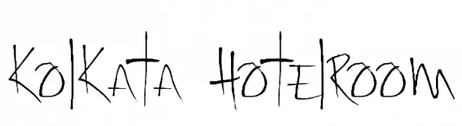
( Fonts by David Kerkhoff - www.hanodedphotography.com )
A dynamic, handwritten font with irregular strokes and artistic flair.
![Kolkata Hotelroom font caratteri gratis]() Scaricare 217 Downloads@WebFont
Scaricare 217 Downloads@WebFont -
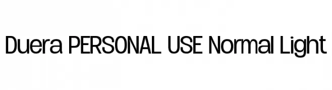
( Måns Grebäck - www.mansgreback.com )
A modern sans-serif font with clean lines and uniform stroke widths.
![Duera PERSONAL USE Normal Light font caratteri gratis]() Scaricare 217 Downloads@WebFont
Scaricare 217 Downloads@WebFont -
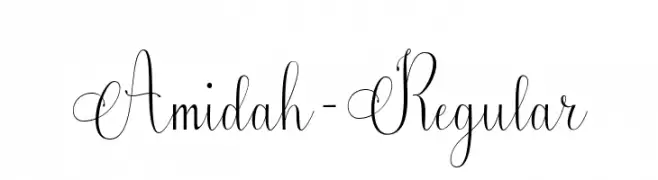
( Fonts by Aqeela Studio - Muhammad Nasir - Personal-use only. For commercial use please contact owner. )
An elegant script font with flowing, ornate cursive letters and intricate flourishes.
![Amidah-Regular font caratteri gratis]() Scaricare 217 Downloads@WebFont
Scaricare 217 Downloads@WebFont -
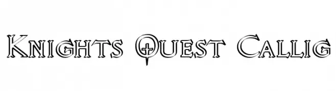
( Fonts by Graham Meade - GemFonts )
A bold, decorative font with medieval influences and intricate detailing.
![Knights Quest Callig font caratteri gratis]() Scaricare 217 Downloads@WebFont
Scaricare 217 Downloads@WebFont -
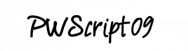
( Fonts by Peax Webdesign - www.peax-webdesign.com. Personal-use only. For commercial use please contact owner. )
A casual, handwritten font with a playful and energetic style.
![PWScript09 font caratteri gratis]() Scaricare 217 Downloads@WebFont
Scaricare 217 Downloads@WebFont -
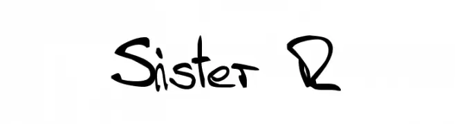
![Sister R font caratteri gratis]() Scaricare 217 Downloads@WebFont
Scaricare 217 Downloads@WebFont -
( Fonts by Baka - Kyakirun - bakafonts.kyakirun.com )
A bold, geometric font with sharp angles and a futuristic, industrial style.
![Kakudaron-B font caratteri gratis]() Scaricare 217 Downloads@WebFont
Scaricare 217 Downloads@WebFont -
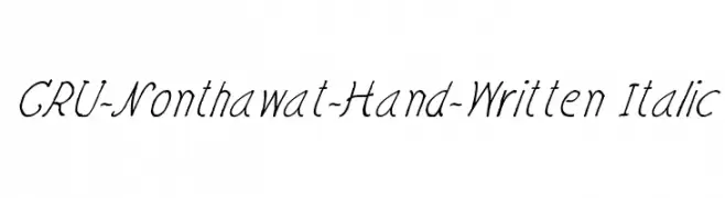
![CRU-Nonthawat-Hand-Written Italic font caratteri gratis]() Scaricare 217 Downloads@WebFont
Scaricare 217 Downloads@WebFont


Quali sono i font più popolari adesso?
Poppins, Roboto, Montserrat, Open Sans e Lato sono molto usati per le forme pulite e l'ampia applicabilità — dall'identità di marca alle landing page e ai poster.
Quali font si usano spesso nei loghi?
Le sans serif geometriche (es. Poppins, famiglie in stile Gotham) sono scelte comuni per un branding pulito e scalabile. Per un tocco personale restano valide script e stili manoscritti. Abbina un display deciso per i titoli a un corpo testo neutro per riconoscibilità ed equilibrio.
Ogni quanto si aggiorna la lista?
Con regolarità, in base ai download e all'attività reale. Torna spesso per scoprire in anticipo le nuove preferite.
💡 Consiglio: aggiungi ai preferiti — le tendenze cambiano in fretta e i font top di oggi possono ispirare il rebranding di domani.