Benvenuto nelle Font Più Popolari — dove popolarità e qualità si incontrano. Qui trovi i font più scaricati e usati dell'anno. Se cerchi scelte sicure per logo, web o social, inizia da qui.
Ogni font top si distingue per equilibrio, leggibilità e versatilità. Troverai sans serif moderne, script eleganti, serif vintage e display minimalisti.
-
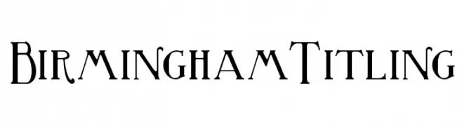
( Fonts by Paul Lloyd )
An elegant and refined font with tall, narrow uppercase letters and uniquely styled numerals.
 Scaricare 1022 Downloads@WebFont
 -
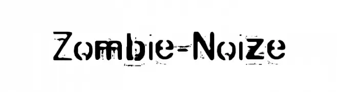
( Fonts by Mr Fisk - Mike Larsson - fontorama.net )
A distressed, grunge-style font with a bold, rugged appearance.
![Zombie-Noize font caratteri gratis]() Scaricare 1022 Downloads@WebFont
Scaricare 1022 Downloads@WebFont -
![Opticon One1 font caratteri gratis]() Scaricare 1022 Downloads@WebFont
Scaricare 1022 Downloads@WebFont -
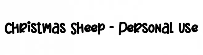
( Fonts by Stefani Letter )
A playful, bold, and rounded font with a hand-drawn feel.
![Christmas Sheep - Personal Use font caratteri gratis]() Scaricare 1021 Downloads@WebFont
Scaricare 1021 Downloads@WebFont -
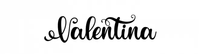
( Fonts by Bilqis Studio )
An elegant script font with ornate swirls and decorative flair.
![Valentina font caratteri gratis]() Scaricare 1021 Downloads@WebFont
Scaricare 1021 Downloads@WebFont -
-
Caratteri di danny91194. For commercial use please contact the owner.
( Byieshination )
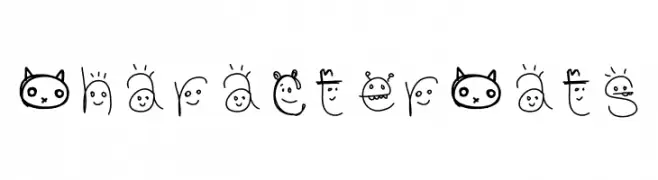
A playful, cat-themed font with hand-drawn, whimsical characters.
![CharacterCats font caratteri gratis]() Scaricare 1021 Downloads@WebFont
Scaricare 1021 Downloads@WebFont -
( Font-a-licious - www.fontalicious.com/ )
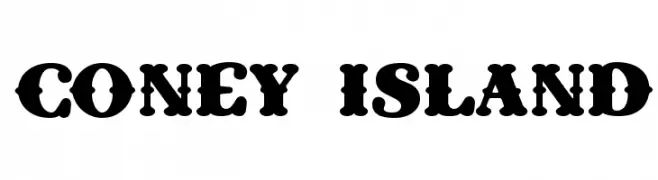
A bold, decorative font with a playful and vintage style.
![Coney Island font caratteri gratis]() Scaricare 1021 Downloads@WebFont
Scaricare 1021 Downloads@WebFont -
( Dirtyline Studio - Hendra Maulia - creativemarket.com/h_m )
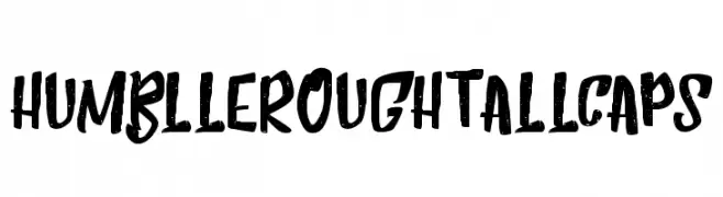
A bold, hand-drawn font with a rough, textured appearance.
![HumblleRoughtAllCaps font caratteri gratis]() Scaricare 1021 Downloads@WebFont
Scaricare 1021 Downloads@WebFont -
( Copyright 2017 The Sedgwick Ave Project Authors (https://github.com/googlefonts/sedgwickave) )
A bold, brush-style font with a playful and energetic character.
![Sedgwick Ave Display Regular font caratteri gratis]() Scaricare 1021 Downloads@WebFont
Scaricare 1021 Downloads@WebFont -
( Copyright (c) 2016 by Red Hat, Inc. All rights reserved. )
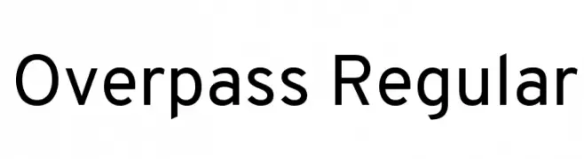
A modern, geometric sans-serif font with uniform stroke widths.
![Overpass Regular font caratteri gratis]() Scaricare 1021 Downloads@WebFont
Scaricare 1021 Downloads@WebFont


Quali sono i font più popolari adesso?
Poppins, Roboto, Montserrat, Open Sans e Lato sono molto usati per le forme pulite e l'ampia applicabilità — dall'identità di marca alle landing page e ai poster.
Quali font si usano spesso nei loghi?
Le sans serif geometriche (es. Poppins, famiglie in stile Gotham) sono scelte comuni per un branding pulito e scalabile. Per un tocco personale restano valide script e stili manoscritti. Abbina un display deciso per i titoli a un corpo testo neutro per riconoscibilità ed equilibrio.
Ogni quanto si aggiorna la lista?
Con regolarità, in base ai download e all'attività reale. Torna spesso per scoprire in anticipo le nuove preferite.
💡 Consiglio: aggiungi ai preferiti — le tendenze cambiano in fretta e i font top di oggi possono ispirare il rebranding di domani.