Benvenuto nelle Font Più Popolari — dove popolarità e qualità si incontrano. Qui trovi i font più scaricati e usati dell'anno. Se cerchi scelte sicure per logo, web o social, inizia da qui.
Ogni font top si distingue per equilibrio, leggibilità e versatilità. Troverai sans serif moderne, script eleganti, serif vintage e display minimalisti.
-
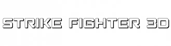
( Fonts by Iconian Fonts )
A bold, geometric font with a 3D effect, perfect for modern and dynamic designs.
 Scaricare 209 Downloads@WebFont
 -
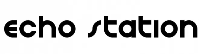
( Iconian Fonts - Daniel Zadorozny - www.iconian.com )
A bold, geometric font with a modern, futuristic style.
![Echo Station font caratteri gratis]() Scaricare 209 Downloads@WebFont
Scaricare 209 Downloads@WebFont -
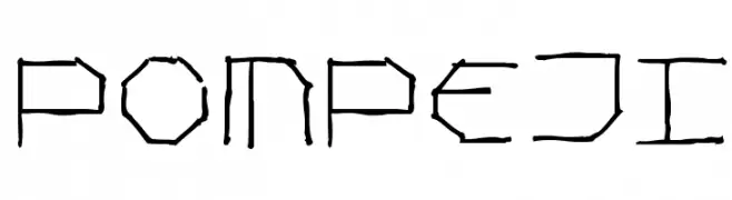
( Fonts by Manfred Klein. Free for private and charity use. Free for commercial with donation to organizations )
A hand-drawn, geometric font inspired by ancient inscriptions.
![Pompeji font caratteri gratis]() Scaricare 209 Downloads@WebFont
Scaricare 209 Downloads@WebFont -
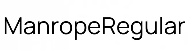
( Fonts by Michael Sharanda )
A modern, geometric sans-serif font with a clean and professional appearance.
![Manrope Regular font caratteri gratis]() Scaricare 209 Downloads@WebFont
Scaricare 209 Downloads@WebFont -
( Fonts by Miss Tiina at www.misstiina.com (please check the website before use) )
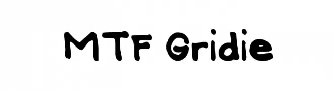
A playful, hand-drawn font with bold, irregular strokes.
![MTF Gridie font caratteri gratis]() Scaricare 209 Downloads@WebFont
Scaricare 209 Downloads@WebFont -
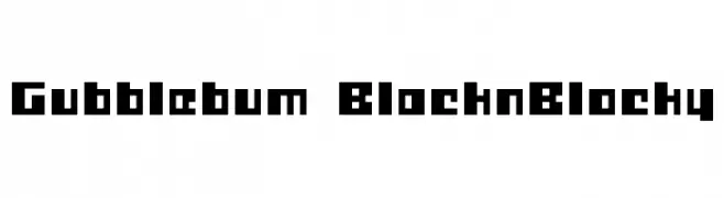
![Gubblebum BlacknBlocky font caratteri gratis]() Scaricare 209 Downloads@WebFont
Scaricare 209 Downloads@WebFont -
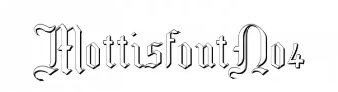
( Fonts by Paul Lloyd )
A decorative blackletter font with intricate, medieval-inspired letterforms.
![MottisfontNo4 font caratteri gratis]() Scaricare 209 Downloads@WebFont
Scaricare 209 Downloads@WebFont -
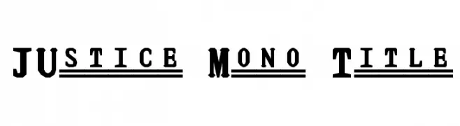
( Fonts by www.smeltery.net )
A bold, monospaced font with slab serifs and a vintage-modern appeal.
![JUstice Mono Title font caratteri gratis]() Scaricare 209 Downloads@WebFont
Scaricare 209 Downloads@WebFont -
![morito-font font caratteri gratis]() Scaricare 209 Downloads@WebFont
Scaricare 209 Downloads@WebFont -
( Fonts by a Des Gomez. Personal-use only. For commercial use please contact owner. )
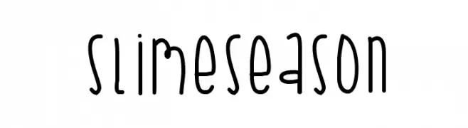
A playful, hand-drawn font with tall, narrow letters and a whimsical style.
![SlimeSeason font caratteri gratis]() Scaricare 209 Downloads@WebFont
Scaricare 209 Downloads@WebFont -
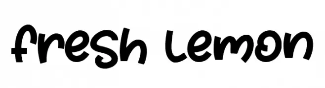
( Fonts by AZ Std )
A playful, bold handwritten font with a whimsical and friendly style.
![Fresh Lemon font caratteri gratis]() Scaricare 209 Downloads@WebFont
Scaricare 209 Downloads@WebFont -
![SakabePeople07 font caratteri gratis]() Scaricare 209 Downloads@WebFont
Scaricare 209 Downloads@WebFont -
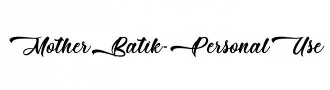
( Fonts by Typhoon Type - Suthi Srisopha - www.typhoontype.net - Personal-use only. For commercial use please contact owner. )
A flowing, elegant cursive font with decorative flourishes.
![Mother Batik - Personal Use font caratteri gratis]() Scaricare 209 Downloads@WebFont
Scaricare 209 Downloads@WebFont -
![SMITHCHERRYOPEDA font caratteri gratis]() Scaricare 209 Downloads@WebFont
Scaricare 209 Downloads@WebFont -
( Fonts by Jester Font Studio )
An ornate, decorative font with intricate lace-like patterns.
![JFIvyLaceAlt font caratteri gratis]() Scaricare 209 Downloads@WebFont
Scaricare 209 Downloads@WebFont -
![Child_Serial_Killer Medium font caratteri gratis]() Scaricare 209 Downloads@WebFont
Scaricare 209 Downloads@WebFont -
![KR On The Farm font caratteri gratis]() Scaricare 209 Downloads@WebFont
Scaricare 209 Downloads@WebFont -
![DKZestyLime font caratteri gratis]() Scaricare 209 Downloads@WebFont
Scaricare 209 Downloads@WebFont -
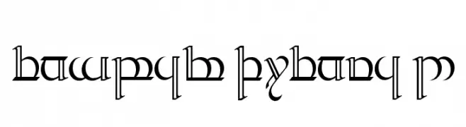
( Fonts by www.norfok.com - Norfok® Incredible Font Design - Thomas W. Otto )
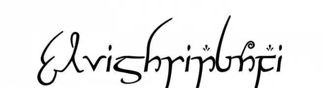
A decorative script font with a fantasy and mystical style.
![ElvishRingNFI font caratteri gratis]() Scaricare 209 Downloads@WebFont
Scaricare 209 Downloads@WebFont -
![Heliosphan font caratteri gratis]() Scaricare 209 Downloads@WebFont
Scaricare 209 Downloads@WebFont -
( Fonts by www.smeltery.net )
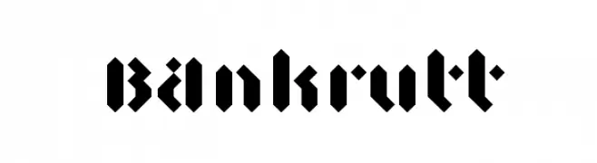
A bold blackletter font with sharp, angular lines and high contrast.
![BAnkrutt font caratteri gratis]() Scaricare 209 Downloads@WebFont
Scaricare 209 Downloads@WebFont -
( www.junkohanhero.com )
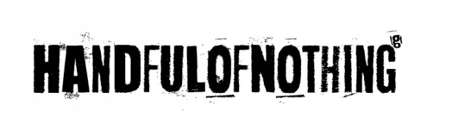
A bold, distressed font with a grunge aesthetic and textured appearance.
![Handful of Nothing font caratteri gratis]() Scaricare 209 Downloads@WebFont
Scaricare 209 Downloads@WebFont -
( Free for personal use - daeynerys.tumblr.com )
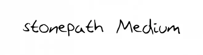
A playful handwritten font with irregular strokes and a casual, organic flow.
![stonepath Medium font caratteri gratis]() Scaricare 209 Downloads@WebFont
Scaricare 209 Downloads@WebFont -
( Fonts by Anglynn )
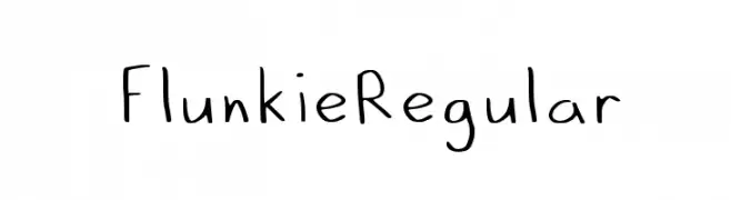
A playful, handwritten font with a casual and informal style.
![Flunkie_Regular font caratteri gratis]() Scaricare 209 Downloads@WebFont
Scaricare 209 Downloads@WebFont -
( Fonts by Daniel Zadorozny - www.iconian.com )
A dynamic italic font with smooth, handwritten-style strokes.
![Drafting Table Italic font caratteri gratis]() Scaricare 209 Downloads@WebFont
Scaricare 209 Downloads@WebFont -
( Out of Step Font Company - Dan Steinbok - outofstepfontco.com )
A bold, textured, and decorative font with a hand-drawn, three-dimensional appearance.
![Backtrack Regular font caratteri gratis]() Scaricare 209 Downloads@WebFont
Scaricare 209 Downloads@WebFont -
( Fonts by Iconian Fonts )
A bold, italicized 3D font with sharp, angular lines and a modern, dynamic appearance.
![Y-Files 3D Italic font caratteri gratis]() Scaricare 209 Downloads@WebFont
Scaricare 209 Downloads@WebFont -
![Tengwar Quenya 2 font caratteri gratis]() Scaricare 209 Downloads
Scaricare 209 Downloads -
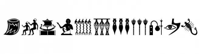
( Fonts by Manfred Klein. Free for private and charity use. Free for commercial with donation to organizations )
Pictorial font inspired by Egyptian hieroglyphs.
![EgyptHieros font caratteri gratis]() Scaricare 209 Downloads@WebFont
Scaricare 209 Downloads@WebFont -
( Fonts by Daniel Zadorozny - www.iconian.com - Free for personal use )
A bold, 3D geometric font with a futuristic and tech-inspired design.
![Astropolis 3D font caratteri gratis]() Scaricare 209 Downloads@WebFont
Scaricare 209 Downloads@WebFont -
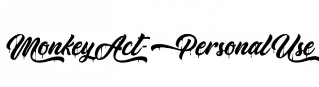
( Fonts by Typhoon Type - Suthi Srisopha - www.typhoontype.net - Personal-use only. For commercial use please contact owner. )
A bold, expressive script font with fluid, cursive letterforms and high contrast.
![MonkeyAct-PersonalUse font caratteri gratis]() Scaricare 209 Downloads@WebFont
Scaricare 209 Downloads@WebFont -
( Fonts by Daniel Gauthier )
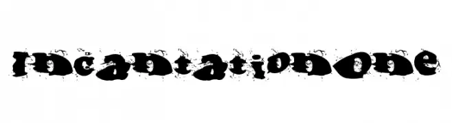
A bold, distressed font with a grunge, graffiti-inspired style.
![IncantationOne font caratteri gratis]() Scaricare 209 Downloads@WebFont
Scaricare 209 Downloads@WebFont -
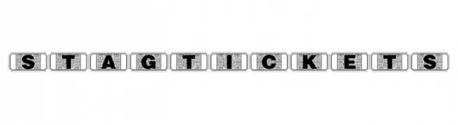
( Fonts by Daniel Gauthier )
A decorative, vintage-style font with characters enclosed in ticket-like borders.
![StagTickets font caratteri gratis]() Scaricare 209 Downloads@WebFont
Scaricare 209 Downloads@WebFont -
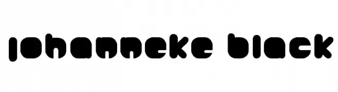
( Fonts by www.lars-manenschijn.nl )
A bold, rounded, and playful font with a modern style.
![Johanneke Black font caratteri gratis]() Scaricare 209 Downloads@WebFont
Scaricare 209 Downloads@WebFont -
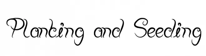
![Planting and Seeding font caratteri gratis]() Scaricare 209 Downloads@WebFont
Scaricare 209 Downloads@WebFont


Quali sono i font più popolari adesso?
Poppins, Roboto, Montserrat, Open Sans e Lato sono molto usati per le forme pulite e l'ampia applicabilità — dall'identità di marca alle landing page e ai poster.
Quali font si usano spesso nei loghi?
Le sans serif geometriche (es. Poppins, famiglie in stile Gotham) sono scelte comuni per un branding pulito e scalabile. Per un tocco personale restano valide script e stili manoscritti. Abbina un display deciso per i titoli a un corpo testo neutro per riconoscibilità ed equilibrio.
Ogni quanto si aggiorna la lista?
Con regolarità, in base ai download e all'attività reale. Torna spesso per scoprire in anticipo le nuove preferite.
💡 Consiglio: aggiungi ai preferiti — le tendenze cambiano in fretta e i font top di oggi possono ispirare il rebranding di domani.