Benvenuto nelle Font Più Popolari — dove popolarità e qualità si incontrano. Qui trovi i font più scaricati e usati dell'anno. Se cerchi scelte sicure per logo, web o social, inizia da qui.
Ogni font top si distingue per equilibrio, leggibilità e versatilità. Troverai sans serif moderne, script eleganti, serif vintage e display minimalisti.
-
 Scaricare 209 Downloads@WebFont
 -
![Summers Country Jars font caratteri gratis]() Scaricare 209 Downloads@WebFont
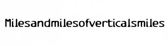
Scaricare 209 Downloads@WebFont -
![Milesandmilesofverticalsmiles font caratteri gratis]() Scaricare 209 Downloads@WebFont
Scaricare 209 Downloads@WebFont -
( Fonts by Hendrick Rolandez - www.moinzek.com - Personal-use only. For commercial use please contact owner. )
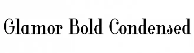
A bold, condensed font with high contrast and elegant styling.
![Glamor Bold Condensed font caratteri gratis]() Scaricare 209 Downloads@WebFont
Scaricare 209 Downloads@WebFont -
( Free for personal use - new.myfonts.com/foundry/Intellecta_Design/?refby=paulow )
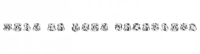
An intricate, decorative monogram font with elaborate swirls and flourishes.
![Hard to Read Monograms font caratteri gratis]() Scaricare 209 Downloads@WebFont
Scaricare 209 Downloads@WebFont -
( www.graphicsbykateri.tumblr.com/ )
A playful, casual handwritten font with irregular strokes and a friendly appearance.
![Neatte font caratteri gratis]() Scaricare 209 Downloads@WebFont
Scaricare 209 Downloads@WebFont -
![Story Telling font caratteri gratis]() Scaricare 209 Downloads@WebFont
Scaricare 209 Downloads@WebFont -
( Fonts by www.aenigmafonts.com )
A digital, binary-inspired font with a geometric, pixelated style.
![Binary X BRK font caratteri gratis]() Scaricare 209 Downloads@WebFont
Scaricare 209 Downloads@WebFont -
( Fonts by PampaType - Personal-use only. For commercial use please contact owner. )
A modern serif font with an elegant italic style.
![Reforma 1969 Gris Italica font caratteri gratis]() Scaricare 209 Downloads@WebFont
Scaricare 209 Downloads@WebFont -
( Fonts by Erik Studio - Personal-use only. For commercial use please contact owner. )
A bold, playful script font with a whimsical, hand-drawn style.
![Aquarius font caratteri gratis]() Scaricare 208 Downloads@WebFont
Scaricare 208 Downloads@WebFont -
( Fonts by Klaus Johansen - www.listemageren.dK )
A bold, italicized font styled like domino tiles with dots.
![Domino bred kursiv font caratteri gratis]() Scaricare 208 Downloads@WebFont
Scaricare 208 Downloads@WebFont -
Caratteri di spideraysfonts. For commercial use please contact the owner.
( OMICRON VARIANT )
![OMICRON VARIANT font caratteri gratis]() Scaricare 208 Downloads@WebFont
Scaricare 208 Downloads@WebFont -
( Fonts by Vladimir Nikolic - www.creativefabrica.com/designer/vladimirnikolic/ - Personal-use only. For commercial use please contact owner. )
A modern, geometric font with a futuristic and sleek design.
![Nagoya Book font caratteri gratis]() Scaricare 208 Downloads@WebFont
Scaricare 208 Downloads@WebFont -
( Fonts by Symphony Studio - Personal-use only. For commercial use please contact owner. )
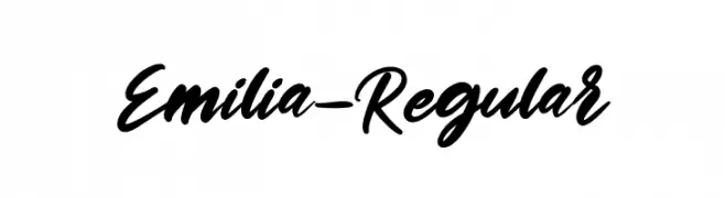
A dynamic and fluid script font with elegant curves and a handwritten feel.
![Emilia-Regular font caratteri gratis]() Scaricare 208 Downloads@WebFont
Scaricare 208 Downloads@WebFont -
( www.behance.net/camiloruano )
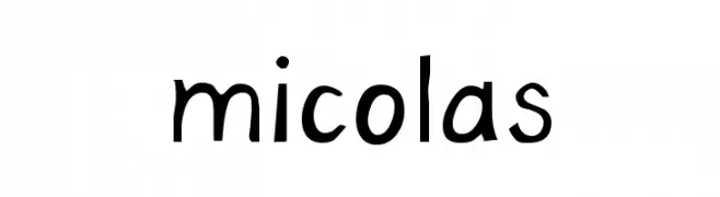
A playful, handwritten-style font with a casual and friendly appearance.
![micolas font caratteri gratis]() Scaricare 208 Downloads@WebFont
Scaricare 208 Downloads@WebFont -
( Fonts by Village Type and Design LLC & Cristiano Sobral - Personal-use only. For commercial use please contact owner. )
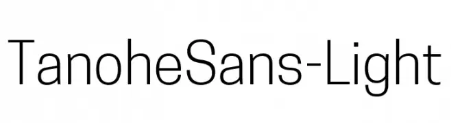
A modern, light sans-serif font with clean lines and excellent readability.
![TanoheSans-Light font caratteri gratis]() Scaricare 208 Downloads@WebFont
Scaricare 208 Downloads@WebFont -
( Fonts by a Max Infeld - XEROGRAPHER FONTS - xerographer.blogspot.com . Personal-use only. For commercial use please contact owner. )
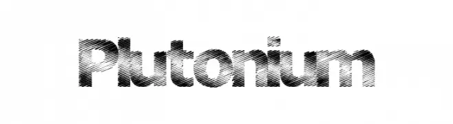
A bold, textured font with diagonal lines for a dynamic and energetic appearance.
![Plutonium font caratteri gratis]() Scaricare 208 Downloads@WebFont
Scaricare 208 Downloads@WebFont -
( Fonts by Kong Font )
A playful and whimsical font with elegant loops and swirls.
![Babyface font caratteri gratis]() Scaricare 208 Downloads@WebFont
Scaricare 208 Downloads@WebFont -
( Angoes25 - www.facebook.com/Angoes25 )
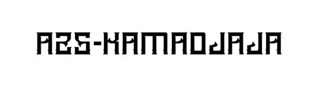
A bold, geometric font with sharp angles and an industrial feel.
![A25-KAMADJAJA font caratteri gratis]() Scaricare 208 Downloads@WebFont
Scaricare 208 Downloads@WebFont -
( Fonts by Typodermic Fonts )
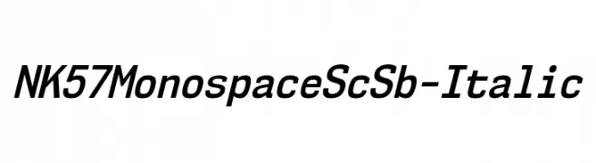
A modern, monospaced italic font with a sleek and professional look.
![NK57MonospaceScSb-Italic font caratteri gratis]() Scaricare 208 Downloads@WebFont
Scaricare 208 Downloads@WebFont -
Caratteri di JamboFonts. For commercial use please contact the owner.
![ButtonT. font caratteri gratis]() Scaricare 208 Downloads@WebFont
Scaricare 208 Downloads@WebFont -
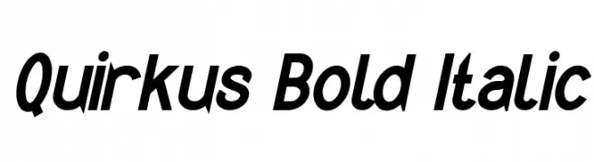
( Fonts by www.peter-wiegel.de. Personal-use only. For commercial use please contact owner. )
A bold, italicized font with a modern and energetic style.
![Quirkus Bold Italic font caratteri gratis]() Scaricare 208 Downloads@WebFont
Scaricare 208 Downloads@WebFont -
( Fonts by Daniel Zadorozny - www.iconian.com )
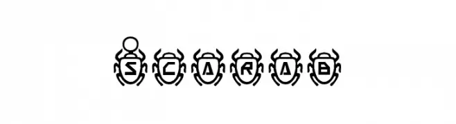
A decorative font with characters inside stylized scarab beetles.
![Scarab font caratteri gratis]() Scaricare 208 Downloads@WebFont
Scaricare 208 Downloads@WebFont -
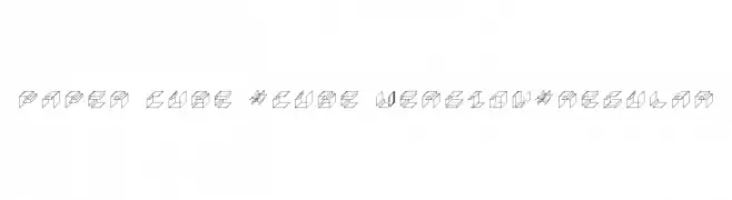
![Paper Cube *cube version*Regular font caratteri gratis]() Scaricare 208 Downloads@WebFont
Scaricare 208 Downloads@WebFont -
( Roch Art )
A playful and whimsical handwritten font with dynamic strokes.
![Berthy font caratteri gratis]() Scaricare 208 Downloads@WebFont
Scaricare 208 Downloads@WebFont -
( Please visit www.fontsite.com before you use! )
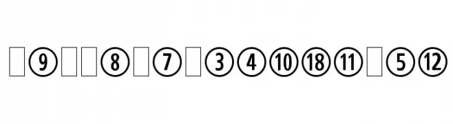
A bold numeral font enclosed in geometric shapes, offering a modern and decorative style.
![CombiNumeralsLtd font caratteri gratis]() Scaricare 208 Downloads@WebFont
Scaricare 208 Downloads@WebFont -
( Fonts by www.paintblackeditions.org )
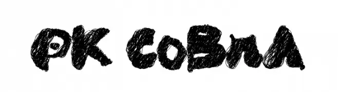
A bold, textured font with a hand-drawn, artistic style.
![PK CoBrA font caratteri gratis]() Scaricare 208 Downloads@WebFont
Scaricare 208 Downloads@WebFont -
( Fonts by www.dcoxy.com )
A flowing, elegant cursive font with decorative flourishes.
![Lady Bohemia font caratteri gratis]() Scaricare 208 Downloads@WebFont
Scaricare 208 Downloads@WebFont -
( Fonts by Geronimo Fonts - Personal-use only. For commercial use please contact owner. )
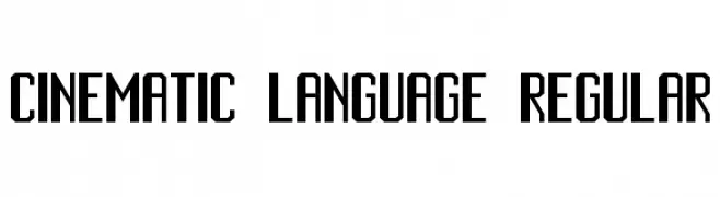
A bold, geometric font with a modern, cinematic style.
![Cinematic Language Regular font caratteri gratis]() Scaricare 208 Downloads@WebFont
Scaricare 208 Downloads@WebFont -
( Fonts by Rantautype - Yudi Pratama Chandra - Personal-use only. For commercial use please contact owner. )
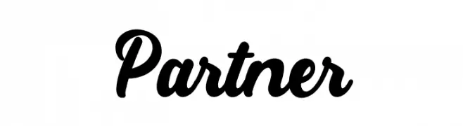
A bold, cursive font with elegant, flowing lines and a handwritten style.
![Partner font caratteri gratis]() Scaricare 208 Downloads@WebFont
Scaricare 208 Downloads@WebFont -
( Fonts by Daniel Zadorozny - www.iconian.com - Free for personal use )
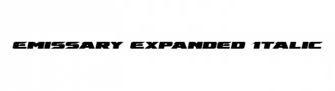
A bold, italic, and expanded font with a futuristic and dynamic style.
![Emissary Expanded Italic font caratteri gratis]() Scaricare 208 Downloads@WebFont
Scaricare 208 Downloads@WebFont -
( Fonts by Daniel Zadorozny - www.iconian.com )
A bold, geometric font with a modern and expansive style.
![Anakefka Expanded font caratteri gratis]() Scaricare 208 Downloads@WebFont
Scaricare 208 Downloads@WebFont -
( Please check the owner website: http://www.billie.grosse.is-a-geek.com )
A bold, geometric font with a modern and striking design.
![Magaz Bold font caratteri gratis]() Scaricare 208 Downloads@WebFont
Scaricare 208 Downloads@WebFont -
( Fonts by Peter Wiegel - www.peter-wiegel.de - Personal-use only. For commercial use please contact owner. )
A classic monospaced font with a clean, structured design.
![Erica Type Regular font caratteri gratis]() Scaricare 208 Downloads@WebFont
Scaricare 208 Downloads@WebFont -
( Fonts by Daniel Zadorozny - www.iconian.com - Free for personal use )
A bold, italicized font with a futuristic and dynamic design.
![Quark Storm Academy Italic font caratteri gratis]() Scaricare 208 Downloads@WebFont
Scaricare 208 Downloads@WebFont


Quali sono i font più popolari adesso?
Poppins, Roboto, Montserrat, Open Sans e Lato sono molto usati per le forme pulite e l'ampia applicabilità — dall'identità di marca alle landing page e ai poster.
Quali font si usano spesso nei loghi?
Le sans serif geometriche (es. Poppins, famiglie in stile Gotham) sono scelte comuni per un branding pulito e scalabile. Per un tocco personale restano valide script e stili manoscritti. Abbina un display deciso per i titoli a un corpo testo neutro per riconoscibilità ed equilibrio.
Ogni quanto si aggiorna la lista?
Con regolarità, in base ai download e all'attività reale. Torna spesso per scoprire in anticipo le nuove preferite.
💡 Consiglio: aggiungi ai preferiti — le tendenze cambiano in fretta e i font top di oggi possono ispirare il rebranding di domani.